woody-alert-me is a lightweight library for creating customizable alert boxes with animations.

You can install woody-alert-me via cdn link: for css:
<link rel="stylesheet" href="https://cdn.jsdelivr.net/gh/sayrgyiwoody/alertMe-npm-package@8cfb41f/src/woody-alert-me.css"></link>
for js:
<script src="https://cdn.jsdelivr.net/gh/sayrgyiwoody/alertMe-npm-package@8cfb41f/src/woody-alert-me.js"></script>
Or You can install woody-alert-me via npm:
npm i woody-alert-me
First, link the CSS and JavaScript provided with Woody's AlertMe library:
<link rel="stylesheet" href="./path/to/woody-alert-me.css">
<script src="./path/to/woody-alert-me.js"></script>
Example 1 : Basic Alert with the desired message

alertMe('Alert', 'This is a basic alert.');
Example 2 : Customized alerts by passing an options object to the alertMe function
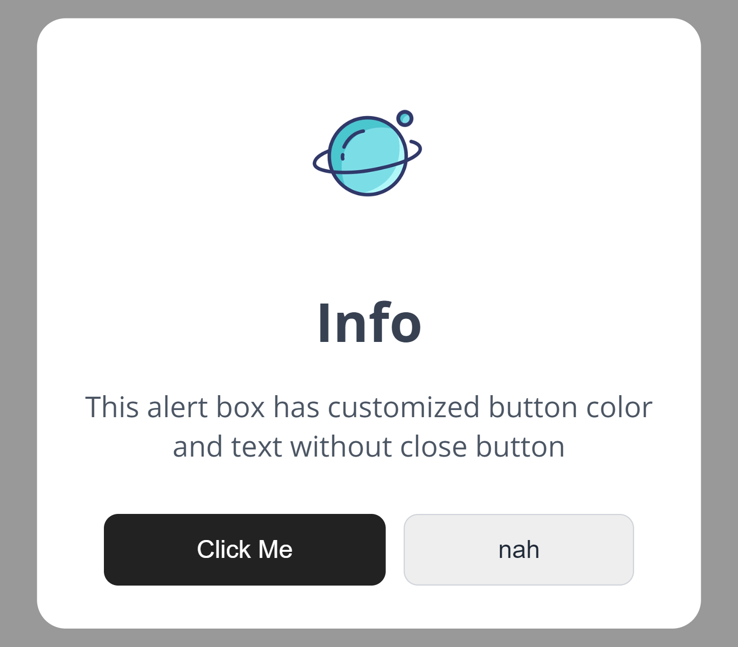
alertMe({
    title: 'Customized Alert',
    text: "This alert box has customized button text and without close button ",
    icon: 'info',
    showCancelButton: true,
    showCloseButton:false,
    confirmButtonColor : "#222222",
    cancelButtonColor : "#eeeeee",
    confirmButtonText : "Click Me",
    cancelButtonText : "nah",
    });
Example 3 : Confirm or Cancel Alert, allowing users to take actions based on their choices:

alertMe({
            title: "Loading",
            text: "Select accept or cancel. ",
            icon: "loading",
            showCancelButton: true,
            confirmButtonText:'Accept',
            onConfirm: function () {
            alertMe({
                title: "Confirmed!",
                text: "Your action has been confirmed.",
                icon: "success",
            });
            },
            onCancel: function () {
                alertMe({
                title: "Canceled!",
                text: "Action is canceled.",
                icon: "error",
            });
            }
        });
Example 4 : Custom text color and bg color

alertMe({
    title: "Custom Alert",
    text: "This is a custom alert box with specified text color and background color.",
    color: '#ffffff', // Text color
    bgColor: '#222222', // Background color
})
Example 5 :Using Image inside alert box

alertMe({
    title: "Custom Alert with Image",
    text: "This is a custom alert box with an image.",
    imageUrl: "./path/to/image.png", // Image URL
    //imageWidth: 300, // Adjust image width if necessary
    //imageHeight: 200, // Adjust image height if necessary
    imageAlt: "New Image", // Alt text for the image
})
Example 6 : Using HTML content in alert box
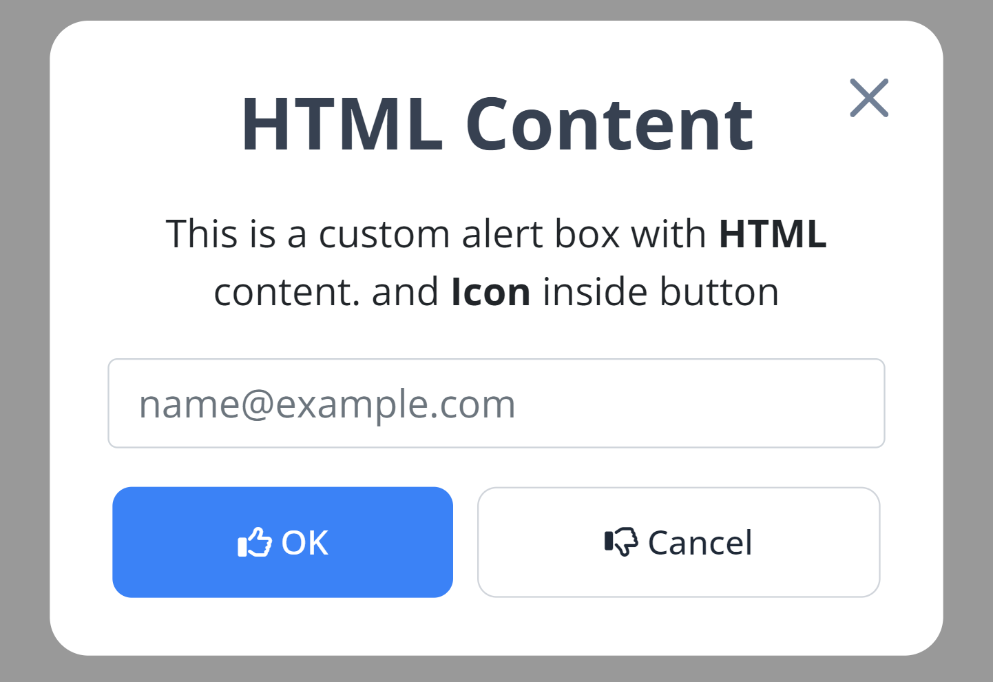
alertMe({
    title: "HTML Content",
    html: `
        <p class="text-center">This is a custom alert box with <b>HTML</b> content. and <b>Icon</b> inside button</p>
        <input type="email" class="form-control mb-3" id="exampleFormControlInput1" placeholder="name@example.com">
    `,
    confirmButtonText : `<i class="fa-regular fa-thumbs-up"></i> OK`,
    cancelButtonText : `<i class="fa-regular fa-thumbs-down"></i> Cancel`,
    showCancelButton : true,
})
The following icons are available for use:
- Success
- Error
- Info
- Loading
- Question
|
| success | error | info | loading | question |
|---|---|---|---|---|
 |
 |
 |
 |
 |
Woody's AlertMe library simplifies adding alerts to web projects. Whether basic or complex, AlertMe has you covered.