orientation change causes page to zoom beyond viewport #2
Comments
|
Also see this version: https://gist.github.com/901295#file_ios_viewport_scaling_bug_fix.js |
|
thanks! |
|
So, i'm probably going to sound really dense here but what is the problem with just letting the viewport adjust to the manufacturer-chosen setting? We typically side-step this iOS 'bug' by simply setting the viewport as follows. Content loads at default (manufacturer-chosen) viewport size (on all devices...which for iOS/iPhone means 320px...but this is the manufacturer default, and the behaviour that users are used to). Zooming is not disabled...and the content doesn't overshoot the viewport. I realize that initial scale=1 and minimum scale=1 are different things but the end result is still a page that loads at the correct initial scale. The fact that Apple has chosen to force the iPhone landscape viewport to 320px is no different from many Android OEMs choosing a default browser viewport value that is smaller/larger than the hardware pixel value to adjust legibility in reference to screen size and pixel density (thereby improving the overall user experience). Certain OEM tweaks (or lack thereof) have been unfortunate. The Kindle Fire is a great example. This device could seriously benefit from a viewport adjustment (compare the poor UX on the 7" Fire to the possibly overtly-legible Galaxy Tab 1.0). Overall though, I see these adjustments as features rather than bugs. It's been our experience that the most consistent default meta-tag value if you want to support all current smartphones, with full user control over zooming and as little device-specific tweaking as possible is the combination chosen above. |

|
Hey Stephanie! Thanks for chiming in. Please correct me if I'm wrong, but I believe We've found that effect to be undesirable both for users and for developers. For one thing, it causes all of the typography and other layout assets on the page to be zoomed to a much larger scale than they were intended to be viewed as a default. As a result, images and video are blurry, and it's quite difficult to design for comfortable font sizes, since the difference between orientations on a single device is so dramatic. Less critically, it prevents us from taking advantage of the additional horizontal real-estate in landscape by potentially shifting elements around via a breakpoint, or merely reflowing text that's already set in a fluid column. I've updated the demo with the Let me know if this demo doesn't follow the markup you were suggesting. Screenshot: I've found iOS to be the only browser that gets hung up on the As for feature vs. bug, in this case I respectfully disagree. The issue mentioned above only occurs when switching from portrait to landscape, but the scale renderes as expected when flipping the other way. Also, if you load a page in landscape orientation, it'll be zoomed properly as well, so the bug merely deals with the flip from portrait to landscape. Apple accepted this bug in their tracker when I submitted it 2 years ago (and apparently closed many duplicate submissions since), but it doesn't appear to be high on their list so far, unfortunately. |

|
I forgot to add that disabling user scaling tends to be the most foolproof workaround for preventing the zoom issue, but as Jeremy mentioned, that's the cure that kills the patient. In lieu of disabling scaling that at all times, most of the workarounds listed above attempt to disable user scaling ONLY during orientation change, either by listening to devicemotion events or otherwise, and are ideally targeted only at iOS lte5 (until the next release comes out with no fix...). |
|
Overshooting the viewport is certainly a bug, but are you saying that you think Apple's initial decision to zoom the viewport on reorientation (as you accurately described) was also a bug? I see the zooming on reorientation as a chosen default browser behaviour (and given that when the iPhone was first released few sites weren't mobile optimised, it wasn't a bad decision overall). I'm surprised they've stuck with it so long given that all other OEMs have opted to make use of the wider viewport and reflow the content, but Apple rarely goes back and changes prior design decisions (...until they're good and ready that is). I know some designers don't like it (although our clients have so far been happy to leave it as is....the less OS-specific tweaking to maintain the better), but i'm not convinced users care given that the vast majority of sites they experience on that device will exhibit this "auto-zoom on reorientation" behaviour. Would be interesting to see if prior iOS owners who have switched to Android have this sudden epiphany over the newfound space, or whether they actually miss the auto-zoom. (I do see how it could be a pain with video however. It probably didn't factor into the design decision back in 2007 given that at that point, 99.9% of video would have been experienced in the native standalone player...and I suspect Apple is secretly annoyed that we can now view video media directly in the browser :-). PS - Agreed on disabling zoom, rarely a good idea and i've seen it backfire too many times. Accessibly/productivity features are there for a reason. Disabling them presumes you can predict all future conditions. |
|
Thanks, Stephanie. Can you point me to a site that renders desirably with the min-scale setting as you describe? Particularly one with images and set typography, would be best. Scaling assets to 150% their default resolution seems like a undesirable default for users and developers, but I'm interested in seeing examples that avoid the problem without a workaround. In truth, we've encountered most pushback on this from clients who use iOS devices, themselves ("The crop bug is disorienting, disabling zoom is over-the-top, and zooming the portrait to landscape makes everything too big.") It definitely was a major complaint at the Boston Globe during development, and as a result, they chose to disable user scaling for launch - their images, typography, and videos all appeared blown-out and pixelated in landscape otherwise. I think today we'd advice them to use the first workaround listed above, but that didn't exist back then. In general, I agree about letting go on little bugs when workarounds are costly, but I'm not against doing a little extra work on behalf of a better experience either. In this case, 300 bytes of JS can go a long way to a better experience for iOS users. Targeted and protected well, it seems like a responsible choice to consider. On Mar 27, 2012, at 3:45 PM, Stephanie Rieger wrote:
|
|
I guess I've been unclear. For whatever reason, our clients (so far) haven't felt the auto-zooming behaviour on iOS was disruptive. It was considered default browser behaviour and we haven't attempted to work around it. We've just let it do what it's going to do (to be clear...i'm referring here to the auto-zoom behaviour...not the issue where the content overshoots the viewport). I completely accept that some clients may be of the opposite opinion (if purely from an image quality point of view) and have no objections using a well-tested workaround to free up that additional viewport space if needed. We've always considered this behaviour "just another (OEM-dictated) design variance" and one that was unobtrusive enough that it didn't automatically warrant a workaround. It's probably just a difference in interpretation, but as our clients haven't seen this as a priority either (especially in relation to far thornier issues such as false positives when detecting geolocation support)...we've so far been comfortable with the decision. |
|
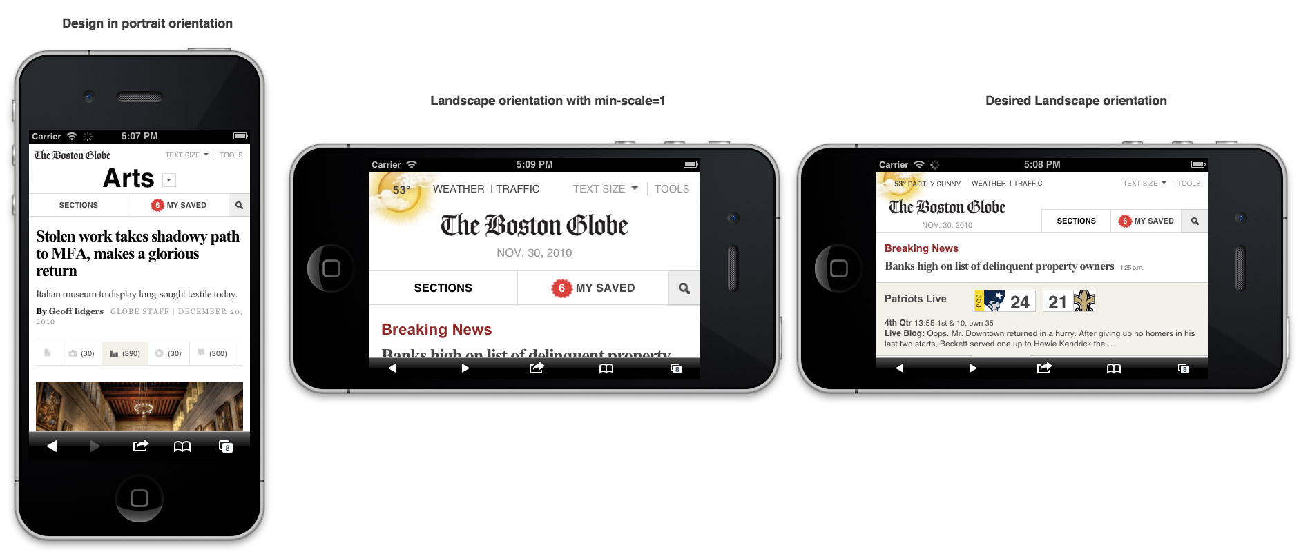
I forgot to answer this part: "... are you saying that you think Apple's initial decision to zoom the viewport on reorientation (as you accurately described) was also a bug?" That doesn't seem like a bug to me, no. Or at least, it's not related to this one. The situation you describe is what happens when no meta viewport width is set (for example, when viewing a non-mobile-optimized layout), while the bug described in this thread is specifically concerned with the overshooting when the viewport width is set to device width, which is expected to match the device's width depending on its orientation (there's a bug in Apple's tracker for window.orientation not doing that right either, fwiw). To speak more concretely, I've attached screenshots of the Globe site with our intended design in both orientations, and the shot in the middle is viewed in landscape with While it's perhaps true that users would not have known that a "worse" experience could have been improved, we decided we'd rather deliver a relatively better experience anyway. Even if the client hadn't complained, I think we would have gone this route in this case, but I agree in principle that no workaround should ever be used impulsively. http://filamentgroup.com/images/globe-iosbug-screenshots.png This conversation got me thinking, though it's unrelated: if web content didn't reflow on orientation, for what reason would I change orientation on my device? I'm sure there are many reasons, but reflowing content in different orientations seems like something I've come to expect on any device. I think you'd agree that most mobile OSs are very "responsive" in their homescreen designs. My Nokia 603, for example, has a dramatically different use of space in both orientations and the experience is much better for it. Anyway, we've diverged far from the bug. :) Whether one decides to work around this one or not, it seems we have reached consensus that yes, it's a bug of certain severity. Thanks Stephanie - I hope to see more of you in this tracker - you and Bryan both have a wealth of information folks would surely love to learn. |
|
Update: the screenshot above didn't load, but it's here: http://filamentgroup.com/images/globe-iosbug-screenshots.png |
|
Just to clarify... re: "The situation you describe is what happens when no meta viewport width is set" The behaviour i'm discussing does pertain to the meta viewport width being set (to "device-width") What I'm saying is that clients requesting an implementation that matches your example labelled "desired landscape orientation" isn't a foregone conclusion. Many are quite happy with the version you've shown to the left and labelled "Landscape orientation at min-scale=1". The text has indeed been zoomed in, and there is indeed less space for the content but it doesn't automatically warrant a 'fix'. It's no different to the experience that a user will receive on many Android devices where the viewport width is set fairly high, or the experience they may end up with if they choose a different Android zoom setting. To your last point however, I agree that the goal of reorientation is typically to gain more space. But it can also be a comfort thing (moreso lately as devices get larger and it becomes easier to balance them on a knee, table etc in landscape mode). What is interesting however is that, as an iOS user (and unless a developer has disabled the auto-zoom on landscape) one of my common use cases for reorienting the device is to trigger that very zoom behaviour you want to disable. Depending on the site/content, double-tapping and pinching may not generate as good an experience as slightly upping the zoom level. Almost like those reading glasses they sell in pharmacies with a rating of +1 or +2 magnification. That's what the reorientation achieves on the iPhone and I think it does so quite well. This also compensates for the fact that unlike Android, there is no implicit zoom level/font size control (...that impacts the browser...iOS Accessibility controls currently only impact certain pre-installed apps). As a designer, I think that disabling this quick +1 gesture actually lessens the overall experience. Thanks for the opportunity to chat about this! |
|
Does anyone know if the filament group fix stands up to repeated orientation changes? I need to investigate the other workarounds too when time permits. |
|
it should hold up in those situations, per my testing, yes. On Apr 7, 2012, at 3:53 AM, Brian Muenzenmeyer wrote:
|
|
Hi, I'm new to GitHub. I'm developing a mobile site. The issue that I'm facing is - the web pages open with an initial zoom-in level and then re-size to fit the device. This issue is prevalent only in Galaxy S3. I've tried with the view port meta tags. Then managing the view port with jquery for android and iPhone. Please do try and help me to the right path. |
|
Just wanted to note that this issue is fixed in iOS6 and hopefully later. Keeping it alive for older browser support, though :) |
Unfortunately, a nasty usability bug exists on iOS that causes a user-zoomable page to scale beyond the width of the viewport when the device's orientation changes from portrait to landscape. As a result, the page ends up cropped by the viewport, and users have to manually zoom the page back out again after changing orientation: annoying at best, confusing at worst.
Platforms:
How to reproduce:
Reduced Example:
http://filamentgroup.com/examples/iosScaleBug/
Bug Tracker ticket(s):
Filed with Apple in 2009.
Workarounds:
The text was updated successfully, but these errors were encountered: