This project comprises a complete redesign of an out-dated retail portal and modernize the site.
Product Overview --Built by Gene Yang
Related Products and Outfits --Built by Amrinder Singh
Questions and Answers --Built by Andrew Sawadichai
Ratings and Reviews --Built by Danting (Serena) Huang
Built by Gene Yang
The product overview component presents the current selected product and allows the user to browse through the available images for the associated styles. Users are able to select from the available sizes and quantities. Products can be added to user “Outfits”, which are integrated with the Related Products component. Future implementation of a cart system integrating POS is available via POST request routing. Product Overview is broken into the following sections:
- Image Gallery
Here users are presented with the main image along with a thumbnail list of available images for the selected product and style. For a larger view, the main image can be expanded to cover the style selector section.
A maximum of 7 thumbnails are presented to the user. If more thumbnails are available, up and down arrows are shown to allow scrolling. The arrows are hidden when scrolling is unavailable or the end of the list is reached.
There are also left and right arrows to allow scrolling through the main image. If thumbnail scrolling is available, scrolling through the main image will automatically scroll up/down to keep the selected main image in view.
- Style Selector
The style selector section presents the following details of the current product:
- Product rating: If available the product’s star rating and number of reviews are provided
- Category
- Name
- Price: Original price is shown in red strikethrough if style is on sale
- Styles: selectable styles shown in rows of 4
- Sizes: selectable dropdown of available sizes. Will display “Sold out” if unavailable.
- Quantity: Selectable quantity up to 15. Will display “Sold out” if unavailable
- Outfit: Toggleable “add to outfit” function.
- Product Information
Displays available product description and features.
Built by Amrinder Singh
In this section, there are 2 components: Related Products and Outfits.
- The related products are determined internally and stored on an API. The related products change every time you change your overview product. The related products are showcased on a deck in which each card presents a star icon, image, detailed name, price, and rating.
- Each card is clickable. Clicking on the card will change the URL and ultimately the product that is being viewed in the Overview Component.
- Clicking on the star icon of a card will display a popup. This popup will compare and contrast the features of the product in the overview section and the item of the star that was clicked.
- The outfits component is unique to each user. A user can assemble and add stuff to their outfit to see how it will look together. By clicking the first card, “Add to Outfit”, or the star in the overview section, the current item in the overview section will be added to a user’s outfit. The outfit is showcased on a deck in which each card presents an “X” icon, image, detailed name, price, and rating.
- Clicking on the “X” icon of a card will remove it from the outfit list.
Built by Andrew Sawadichai
The questions and answers component allows shoppers to ask questions and answer questions about the selected product. It displays the questions and answers shoppers have posted for the currently selected product and allows shoppers to provide feedback on the questions asked.
The functionality of the questions and answers component can be broken down into several pieces:
-
Questions and Answers List:
The main function of the questions and answers component, this module displays questions shoppers have asked about the product. The questions are sorted by helpfulness with a default of 2 questions loaded. If there are more than 2 questions, shoppers can load additional questions by clicking the “More Answered Questions” button until there are no more questions to be loaded.
Answers for the individual question are displayed under the question sorted by helpfulness. If there has been a response made by the seller, their response will be displayed at the top above any other answers. The default number of answers loaded is 2. Shoppers have the option to load more answers or collapse the answers.
Shoppers have the option to provide feedback to the questions and answers through voting with the helpful button. If a shopper deems a response is inappropriate, they have the ability to report the question to the moderation team for review.
-
Question Search:
At the top of the component is the search bar. The search bar allows shoppers to narrow down their question topic and view the responses. Shoppers must enter a keyword greater than 3 characters to begin the search functions. If there are no questions asked about the product then the search functionality will be disabled.
-
Asking a Question:
Shoppers have the ability to submit a question for others to answer. Clicking the “Add a Question +” button opens a new modal where they will be required to enter their question, username, and email to be submitted to the api.
-
Answering a Question:
After each question, shoppers can choose to respond and answer the question. Clicking “Add Answer” opens a new popup modal where the shopper can submit a form for the individual question. The answer, username, and email inputs are mandatory while the photo upload is optional. Shoppers can upload up to 5 photos before the form prevents you from adding more.
Built by Serena Huang
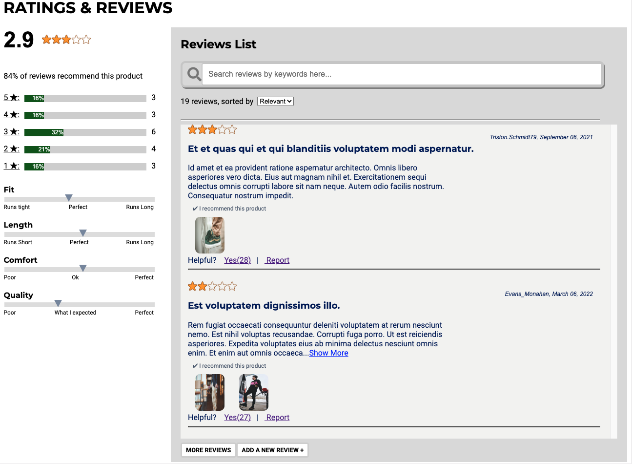
Features
- Ratings:
- Display average star rating, rating distribution, recommendation rate and characteristics rating information.
- Filtering reviews by the star ratings
- the filters are additive and can be toggled.
- the filter can be combined with other sorting or searching features.

- Reviews:
- Display reviews containing star ratings, username, review date, review summary, review body, response from seller(if any), recommendation and images(if any).
- By default the first 250 characters of review body will display. For long reviews, the full content will display by clicking the ‘Show more’ link.
- Reviews pagination: initial display is two reviews and will display two more upon each click of ‘load more’ button and the ‘load more’ button will disappear once all the reviews are loaded.

- Searching: search reviews by keywords and the search can be combined with other filtering or sorting features to narrow down the results;

- Sorting by Relevant, Newest and helpful:
- Default sorting selection is ‘relevant’.
- The sorting can be combined with filtering and searching features.

- Add new reviews:
- users can add overall 1 to 5 star rating, characteristics rating, recommendation, review summary(optional), review body, review photos, nicknames and emails.
- users can upload up to 5 photos for each review.
- If the any of mandatory parts are not filled or if there is error with photo uploading or email format, the submission will be denied and error messages will display.

- “Helpful” vote and report reviews
- A user can provide feedback on any review without signing in
- ‘Helpful’ button click will add the helpful count by 1 but won’t allow the second vote.
- ‘Report’ button won’t delete the review in the API but will not let the review display in the review list anymore.

- Fork the project and clone to your local repository
- Install all the packages and dependencies by running:
npm install- Run webpack at local development mode:
npm run react-dev- Start server:
npm run server-dev- create
config.jsfile and add your github token - Visit http://localhost:3000 to start the page
- You will need to create a free account at https://imgbb.com/ and get an API key for the image upload feature. The key will be stored in the
config.js