. #928
Comments
|
Thank you for the detail report, it is really helpful. We want to drop the Oscar theme to maintain only one theme ;
it is going to be fixed with #894 (commit 6352496)
Currently when Javascript is enabled:
... I see that it can works without javascript (need some tests).
What is your screen resolution? Can you try to set the zoom at 90%? |
|
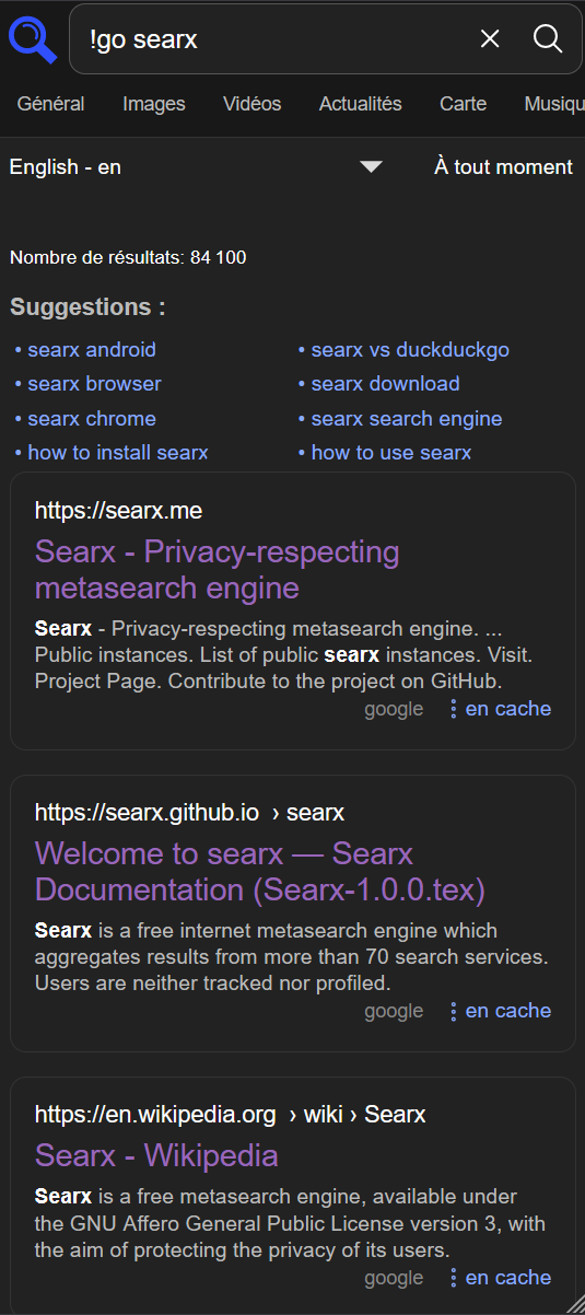
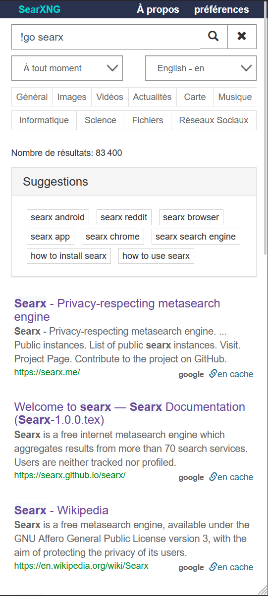
Simple is much nicer, especially for people not liking JS, IMHO. See Image results as an example for it. |
|
Proposed fixes:
Place suggestions in a single column to the left.
Place categories in a single row. |
|
I see what the problems are when JS is disabled and when using mobile interface. |
|
@worthless133 on desktop, can you try to set the zoom at 90%? The issue seems related to #874 , and there is a fix for this issue. |
|
What is your screen resolution? |
|
Thank for the information. Currently the layout switches to the desktop layout according to the screen width:
But there are other way to detect a tablet, however it requires some other changes to fit screen widths below 1280px. In meantime, do you use a public instance? or your own instance? If you use your own instance, you can use this use_default_settings: true # inherit from the default settings.yml
server:
default_theme: oscar # but override the default theme |
👍 It is not documented, so it's hard to guess. It can be discover by resizing the window ... if the screen resolution allows it. |
You can, use Greasemonkey or Tampermonkey to make arbitrary changes. |
 throwaway26425
changed the title
throwaway26425
changed the title
|
Lit bit of a different request here. Would it be possible to provide a toggle in the settings or settings.yml to permanently hide the suggestions and search URL boxes? I use a private instance and have never had the need to use either one and not to mention the result's page does look cleaner. My use case is a bit limited so IDK! |
|
Yes you are right about the simple theme moving the suggestions to the middle of the screen on landscape mode on mobile devices; The reason is that we only use screenwidths with CSS for the different layouts... Here you can the screen size definitions: searxng/searx/static/themes/simple/src/less/definitions.less Lines 236 to 254 in 27adcc7 Basically on desktop the suggestions and everything are on the right and all other platforms (tablet and phone) the suggestions are in the middle. As you can see the results on simple theme are much wider than oscar and therefor the suggestions (and infobar) are not moved to the right. This is a design decision to make the simple theme well simpler and I believe that is not that big of a deal you can just scroll down a bit on mobile and the results themselves show more content then oscar since they are wider... If we would really want to patch this we could make the results on tablet (since landscape phone is already falling into tablet width) smaller and move the suggestions to the right and the results to the left, but I am like them centered more and are kinda meh about that change tbh. |
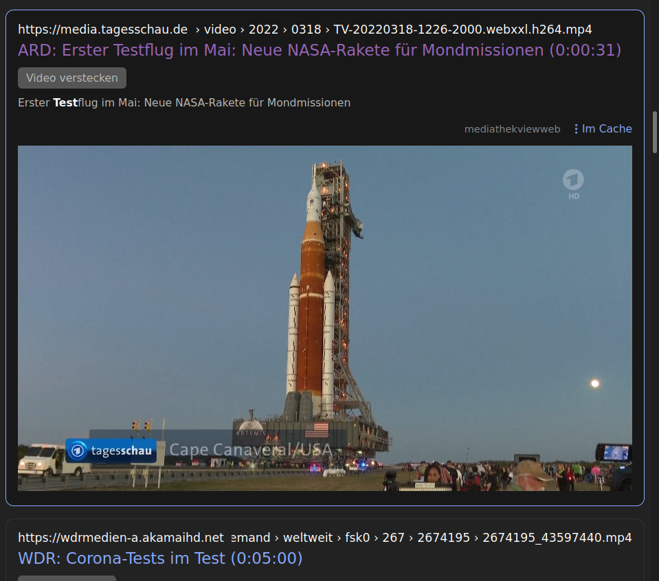
I agree with with @mrpaulblack / it is better to have a full with result list on devices other than desktop. Especial embedded videos should be shown in full with:
|
for me it is OK to scroll as long I have full width result list .. did you ever tried google? .. they have only 3 results at the end of the page. |
No description provided.
The text was updated successfully, but these errors were encountered: