Height on form components (mobile and desktop) #16
Comments
|
Personally I think it makes sense to support different sizes but I'm against making the smallest size 44px but perhaps normal/default could be increased. Currently in bootstrap we use the following: small 31px This applies to input fields, dropdowns, buttons and everything you can use in a form and all components that use these components internally like the datepicker which uses buttons internally, tables etc. Why not use even numbers? |
|
@hjalmers The 44 px is only for the medium (default) button. The small (that in Design Library is 32 px not 31) and the large button will be as is. For desktop. For tablet and mobile only the medium (default) one should be used. The clickable area on mobile should always be at least 44 px right? |
|
Status update 2019-01-30 This issue was reviewed today in Design Working Group. We decided the following change:
The reasoning for this change is that when labels got bigger, the form components follow in size to harmonise and match. Also, the mobile click area needed to be bigger so we want them to be the same size to simplify and have fewer options (and easier to do it right). I will create new issues for this matter and add it to our developers repos. /Ulrika, Design Management |
 ulde01
moved this from Discussion (active)
to Development (see sebgroup's board)
in Design discussions
ulde01
added
developing
ulde01
changed the title
ulde01
moved this from Discussion (active)
to Development (see sebgroup's board)
in Design discussions
ulde01
added
developing
ulde01
changed the title
|
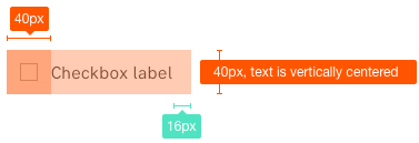
Hi, I just wanted to follow up on this since Check boxes and radio buttons are not included in this sizing standard. There are a lot of times when we put a checkbox side by side with an input field to be enabled based on the state of the checkbox. Since the design library guidelines states that the checkbox height is The expected behavior should be aligned like this (both (check box But since there is a difference between the heights of the two form elements, not only they look weird but when it's toggled in there will be a little bit of a jump ( Same behavior would also happen with Radio buttons |


|
Yes @yousifalraheem You are correct. When we did the update of input fields we agreed that we need to updated the related form-components also.... but we never had the time! |
|
We ran out of time last round but now we are back. Thank you @yousifalraheem - keep giving us feedback! Recap: The following form components were all made 44px high previously:
Now we also want to add these components to the 44 px height list:
|
Q: Increase the height of input fields and medium buttons to 44 px. First, explore contexts. Are there any consequences?
A: Design change 2019-01-30
The reasoning for this is that when labels got bigger, the form components follow in size to harmonise and match. Also, the mobile click area needed to be bigger so we want them to be the same size, to simplify and have fewer options (=easier to do it right).
See:
The text was updated successfully, but these errors were encountered: