We read every piece of feedback, and take your input very seriously.
To see all available qualifiers, see our documentation.
Have a question about this project? Sign up for a free GitHub account to open an issue and contact its maintainers and the community.
By clicking “Sign up for GitHub”, you agree to our terms of service and privacy statement. We’ll occasionally send you account related emails.
Already on GitHub? Sign in to your account
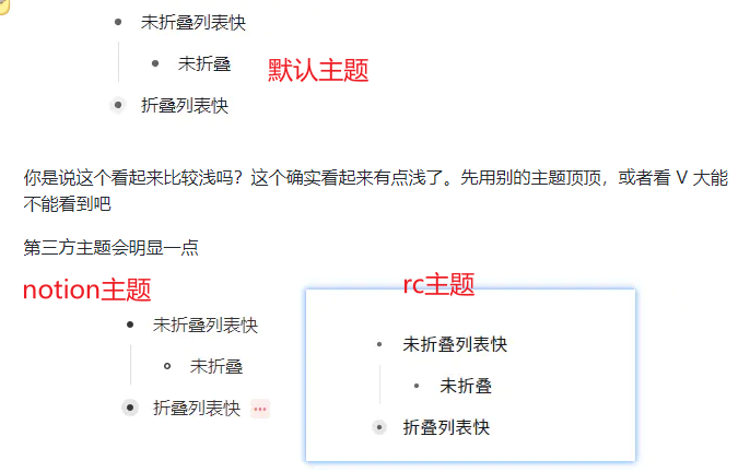
改版后的默认主题,列表折叠状态下的那一圈状态色有点浅,显示器差一点的可能无法区分是否折叠,如下图:
非列表折叠而是菜单上的折叠则更难分辨出是否被折叠
列表小三角折叠状态下,加深折叠状态下圈圈颜色 .protyle-wysiwyg [data-node-id].li[fold="1"]>.protyle-action:after { background-color: var(--b3-theme-surface-lighter); 这里的颜色要深一些。建议改成与面包屑聚焦颜色一致或者更深一些 .protyle-breadcrumb__item:hover, .protyle-breadcrumb__item--active { color: var(--b3-theme-on-background); background-color: var(--b3-list-hover); }
菜单折叠,建议能像notion这样有个区分
No response
The text was updated successfully, but these errors were encountered:
💄 fix #6402
fbe8e8c
Vanessa219
No branches or pull requests
在什么情况下你需要该特性?In what scenarios do you need this feature?
改版后的默认主题,列表折叠状态下的那一圈状态色有点浅,显示器差一点的可能无法区分是否折叠,如下图:
非列表折叠而是菜单上的折叠则更难分辨出是否被折叠

描述可能的最优解决方案 Describe the optimal solution
列表小三角折叠状态下,加深折叠状态下圈圈颜色
.protyle-wysiwyg [data-node-id].li[fold="1"]>.protyle-action:after {
background-color: var(--b3-theme-surface-lighter);
这里的颜色要深一些。建议改成与面包屑聚焦颜色一致或者更深一些
.protyle-breadcrumb__item:hover, .protyle-breadcrumb__item--active {
color: var(--b3-theme-on-background);
background-color: var(--b3-list-hover);
}
菜单折叠,建议能像notion这样有个区分
描述候选的解决方案 Describe the candidate solution
No response
其他信息 Other information
No response
The text was updated successfully, but these errors were encountered: