Skip to content
New issue

Have a question about this project? Sign up for a free GitHub account to open an issue and contact its maintainers and the community.

By clicking “Sign up for GitHub”, you agree to our terms of service and privacy statement. We’ll occasionally send you account related emails.

Already on GitHub? Sign in to your account

Add spacing and titles to homepage #596

Merged
merged 15 commits into from
Apr 29, 2021
Merged

Add spacing and titles to homepage #596

merged 15 commits into from
Apr 29, 2021

Conversation

MaggieAppleton
Copy link
Contributor

@MaggieAppleton MaggieAppleton commented Apr 28, 2021

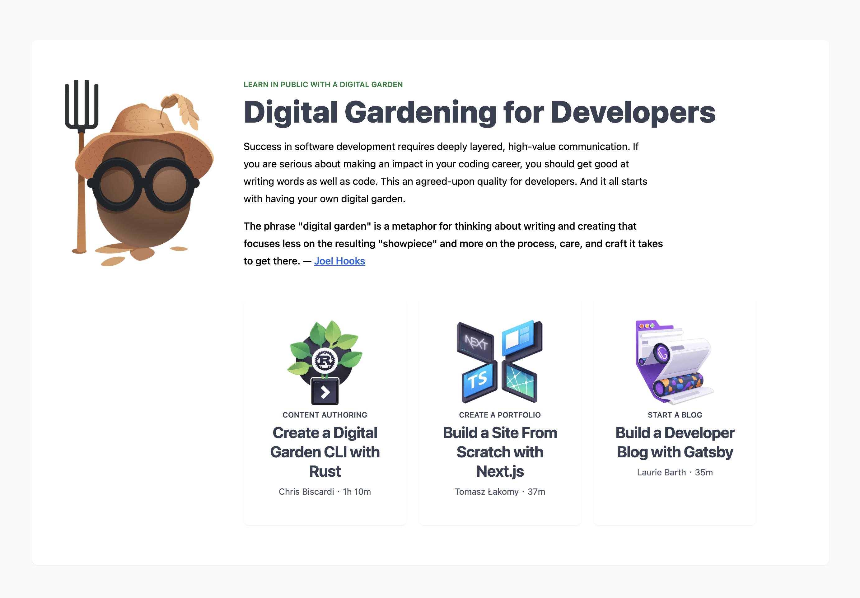
This divides the cards on the homepage into sections and adds titles to each group of resources.

Build the portfolio you need to be a badass web developer   egghead io


Some of the section layouts are still a bit awkward (portfolio clubs and gardening), and we still need to do some gardening work making the section titles match the content, but it feels presentable for now.

@vercel
Copy link

vercel bot commented Apr 28, 2021

This pull request is being automatically deployed with Vercel (learn more).
To see the status of your deployments, click below or on the icon next to each commit.

egghead-io-nextjs – ./

🔍 Inspect: https://vercel.com/eggheadio/egghead-io-nextjs/8DQQBGERCMknFB575a2iiLC3xrxj
✅ Preview: https://egghead-io-nextjs-git-ma-new-homepage-sections-eggheadio1.vercel.app

egghead-next-storybook – ./

🔍 Inspect: https://vercel.com/eggheadio/egghead-next-storybook/FXSRYv8qVM1BXPQsHBnmDW2PxKHQ
✅ Preview: https://egghead-next-storybook-git-ma-new-homepage-sections-eggheadio1.vercel.app

@vojtaholik
Copy link
Contributor

vojtaholik commented Apr 28, 2021

nit: from the screenshot it feels like headings are quite inconsistent and differ in letter spacing, size, and alignment.

super nit: I would also say that space between sections are bit too large, especially on smaller screens (13" and smaller), mostly apparent when there is no heading present to visually divide given sections. Feels off. Using vh units instead of just padding might give interesting results.

@MaggieAppleton
Copy link
Contributor Author

MaggieAppleton commented Apr 28, 2021

The headings are indeed different sizings and alignments on purpose 😉
Generally when we have standard sections like "What's New," "Staff picks," and "Most popular" all the sizing is consistent.
For the two special features (currently build a dev portfolio and digital gardening) I think we should have room to play with different layouts and typography. These kind of feature sections should stand out from the other categories.
Perhaps we can do that while keeping typography consistent if we find another way to differentiate them?

I readjusted to make both of the 'special' sections have the same size typography.

I initially used mt-32 for all the section breaks, but I can't figure out a way for tailwinds to let to me vh for margin values.
I swapped it out for mt-24 sm:mt-28 so it's smaller overall, and a bit more compact on mobile

@MaggieAppleton
Copy link
Contributor Author

Just updated the two feature sections to be less awkward and stand out more

image

image

Sign up for free to join this conversation on GitHub. Already have an account? Sign in to comment
Labels
None yet
Projects
None yet
Development

Successfully merging this pull request may close these issues.

None yet

4 participants