
Sumukh Kumble, Jia Na (Gina) and Sean Pei
Given that the world is currently focussed on the events pertaining to COVID-19, there are many issues that are effecting many countries in different areas such as Agriculture, Environment and Healthcare (non-COVID-19 related). Whilst there are a number of interactive Dashboards available relating to Covid-19 rates in different countries and their regions, the purpose of this Dashboard is to provide users with information relating to other matters relating to non-Covid-19 related issues such as health, agricultural and the environment so that individuals can obtain the latest information related to various countries.
Dashboard Design
Data Extraction
The datasets were obtained from a number of different sources that was accessible in a CSV format. For all health related datasets pertaining to the human immune deficiency virus (HIV), obesity and mental health were all obtained from "Our World in Data".

Datasets relating to agricultural output were obtained from the Food and Agriculture Organisation of the United Nations.

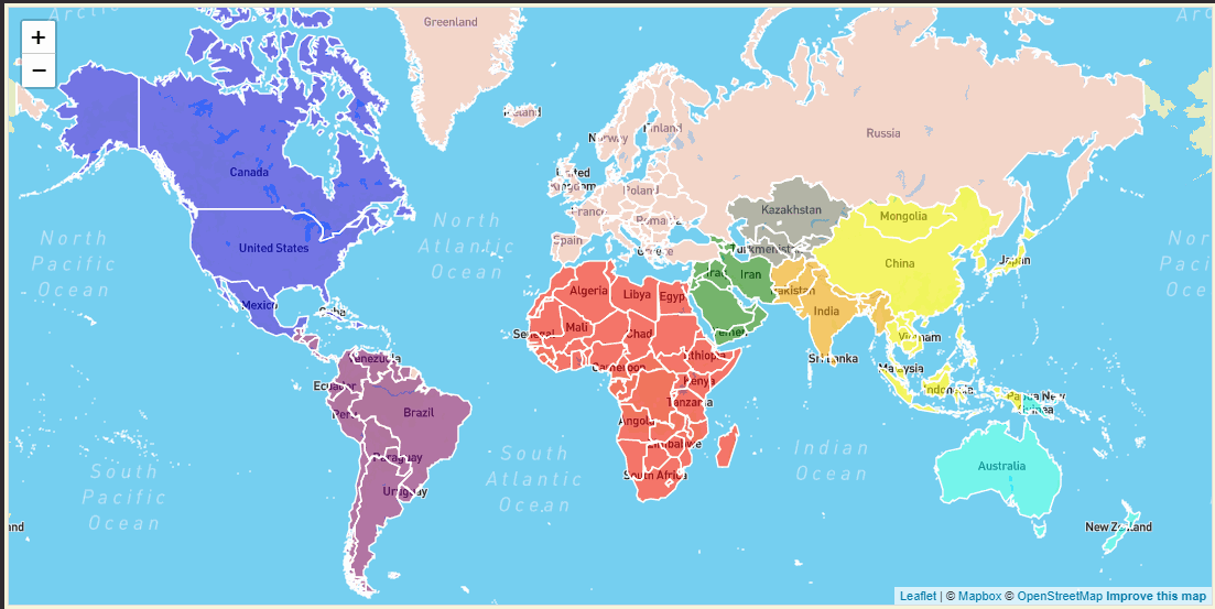
In order to build the interactive maps on the webdashboard, a customised global polygon Geojson dataset was built and deployed onto the website (source:https://geojson-maps.ash.ms/)
The Datasets were subsequently transformed, cleaned and edited and loaded into the Heroku PostgreSQL cloud database, which in turn, can be accessed with the JavaScript applications which will be discussed later in this document.
Website development
The HTML and CSS scripts were utilised in order to build and format the website for subsequent user interactivity. The animated heading of the website, as seen in the image below, was constructed using the anime js library for visual appeal.

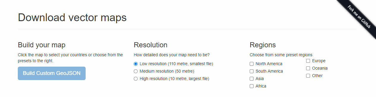
The Interactive map was developed utilising the Leaflet JavaScript library where users have the option to click on a country to obtain information on that nations performance in key areas. Continents and regions have been colour coded accordingly.
Interactive Data Dashboard
With the use of the JavaScript Language, an interactive web dashboard was developed wherein users have the option of selecting a country of interest and then viewing the information pertaining to those regions. In this manner, users can get a quick glimpse of the issues relating to various countries apart from the primary focus that has been Covid-19.
Launching the website
The web-based application was developed, compiled and launched through the Heroku Development Portal. In a streamlined process, the previously cleaned datasets relating to each country were loaded onto the Heroku PostgreSQL cloud database.
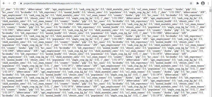
Through the Python Flask application, the Heroku PostgreSQL database was accessed, rendered into a Json object and dumped onto the web server.
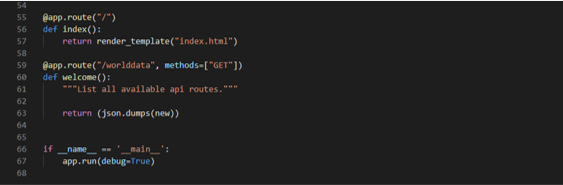
Once rendered through Flask, the Jsonified dataset is available on the server.
Final Web Application Dashboard
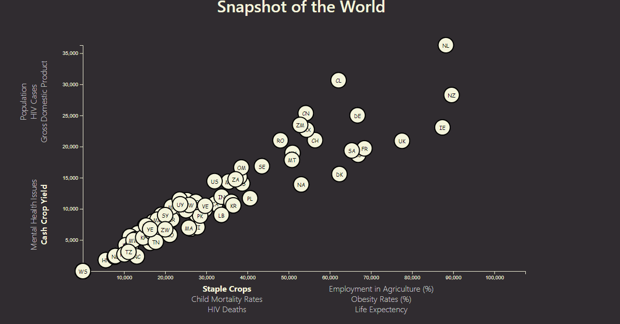
The final Dashboard consists of the following components that have been built using several JavaScript Libraries. The first interactive dashboard was built using the D3 JavaScript library where a snapshot of the world, based on the latest data relating to Health, Agriculture and the Environment, are available. Users have the option of selecting a specific axis to view the relationships between different parameters, for instance GDP vs Life Expectancy. A sample demonstration has been provided below:
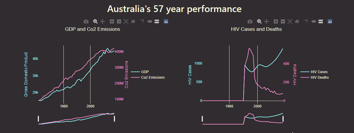
Time Series Chart
Datasets for each country have been developed that provides the country's performance over 57 years start from 1961. By utilising the Plotly JavaScript Library, users can utilise the Time slider to zoom into a particular time range to obtain different perspective on the trends that occur between a specific time period. A sample of the process has been provided below.
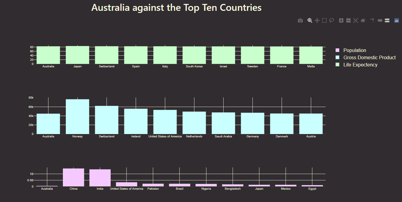
An additional chart has been developed in which the selected country can be compared to the top ten nations in terms of Population, Gross Domestic Product as well as Life Expectancy.
The health of a nation can be accessed here.