Update page component to match v1.10.2 #78
Conversation
addon/components/polaris-page.js
Outdated
| * @type {boolean} | ||
| * @default false | ||
| */ | ||
| separator: false, |
There was a problem hiding this comment.
can we list here actionGroups property and add a TODO?
|
|
||
| hasActions: or('primaryAction', 'secondaryActions'), | ||
|
|
||
| hasRollup: computed('secondaryActions.[]', function() { |
| import layout from '../templates/components/polaris-breadcrumbs'; | ||
|
|
||
| export default Component.extend({ | ||
| classNames: [ 'Polaris-Page__Navigation' ], |
There was a problem hiding this comment.
the Polaris breadcrumbs uses a nav for the tag and doesn't has this class? Should we update like in polaris and move the class in a div in the page-header component?
or is there something I'm missing?
| --}} | ||
| {{#with (if primaryAction | ||
| (component "polaris-button" | ||
| primary=(not primaryAction.destructive) |
There was a problem hiding this comment.
don't see this destructive condition in Polaris
| {{/if}} | ||
|
|
||
| <div class="Polaris-Page__IndividualActions"> | ||
| {{#each secondaryActions as |secondaryAction|}} |
There was a problem hiding this comment.
should this each be wrapper in a if secondaryActions?
| {{polaris-breadcrumbs breadcrumbs=breadcrumbs}} | ||
| {{/if}} | ||
|
|
||
| {{#wrapper-element |
There was a problem hiding this comment.
all these wrapper elements are super neat....but I wonder if it wouldn't be much more readable if we'd just use if else statements even if that means a bit of duplication
There was a problem hiding this comment.
It'd mean a lot of duplication, basically the entire template. That'd make maintaining any future updates (which are likely to be fairly minor I'd guess since the React implementation seems to have matured a lot) trickier, both in terms of knowing that each update has to be added twice, and from the extra amount of code the maintainer will have to scroll through. I do see where you're coming from though, so I'll add comments to each of the potentially confusing wrapper-element usages so that their intent can be seen instantly 👍
| layout, | ||
|
|
||
| /* | ||
| * Public attributes. |
There was a problem hiding this comment.
same, can we drop this and just use @private/@public for doc
| @@ -21,6 +27,8 @@ export default Component.extend({ | |||
| */ | |||
| action: null, | |||
|
|
|||
| type: 'button', | |||
There was a problem hiding this comment.
can we list above for action properties supported...seems some are not supported, mark them as TODO
There was a problem hiding this comment.
@vladucu I'll do this under a separate PR where I'm going to remove the inconsistencies between using text/content and onAction/action for action hashes 👍
| class=(if primaryAction "Polaris-Page__MainContent") | ||
| }} | ||
| {{!-- | ||
| Create a reusable button component for the primary action if we have one, |
 andrewpye
changed the base branch from
update/action-list
to
update-to-polaris-1.10.2
andrewpye
changed the base branch from
update/action-list
to
update-to-polaris-1.10.2
Brings
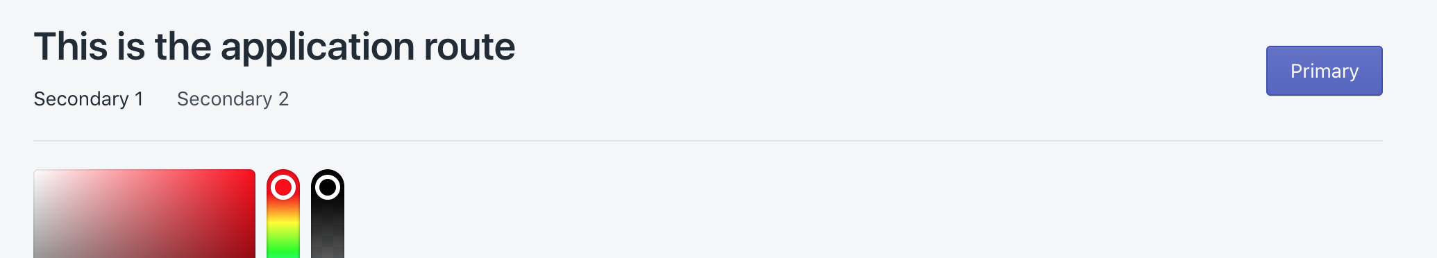
polaris-pagein line with the latest Polaris release and tidies up the component's structure. New features include responsiveness for page actions, an optionalseparatorbetween page header and content, and asingleColumnwidth option.Separator:
Example of actions responsiveness in the dummy app (N.B. the caret for the secondary actions list doesn't render because the icon's not included in the dummy app and didn't seem worth adding just for this):
P.S. template source for the above GIF is just a simple page with a primary action and a couple of secondary ones: