How to work better for DirectWrite only apps? #401
Comments
|
MacTypePatch appears to fix this particular issue. It would be nice if you considered integrating the changes in MacTypePatch into the regular build of MacType. The offending setting that makes text in Metro apps look horrible is called "GrayscaleEnhancedContrast", and if you set GrayscaleEnhancedContrast= 0 in MacTypePatch's UserParams.ini, this is the result:
It would still be nice to be able to force RGB mode everywhere, because the grayscale mode that Metro uses still looks worse than native Win32 apps. |
|
We need another parameter for GrayscaleEnhancedContrast. It's as same as EnhancedContrast, by the source Line 182 in f4f1cd3 |
|
@extratype do you think LCD (ClearType) AA can be forced for all apps including Metro stuff in the code somewhere? For tablets we could implement a rotation callback so that the RGB orientation is adjusted for 90, 180 and 270 degree rotations. I also tried to find the source code for MacTypePatch 1.26 but the source on GitHub only goes up to version 1.18. |
|
@extratype It won't work as you expected. i.e. There are some programs that are designed to run with grayscaled text, and they can only run with grayscaled text (for example the famous (or infamous?) Word 2013/2016). If you force the text antialias mode to ClearType, all texts just disappear. |
|
@snowie2000 Thank you for clarification. I just set |
|
@extratype Wow that is an interesting rabbit hole to dive into. It looks like Microsoft engineers are completely oblivious to how subpixel alpha blending can be done on the GPU, and instead the font engine is asked to render opaque text over a static background, and all ClearType functionality is disabled when the destination surface contains an alpha channel. Of course subpixel alpha blending is perfectly possible, but you need an RGB alpha buffer rather than monochromatic alpha. It looks like the folks over at freetype-gl have successfully implemented that in OpenGL using a two-pass pixel shader. Maybe we can hook Direct2D surface rendering to render text on translucent surfaces by keeping track of an RGB alpha buffer and blending it using the two-pass pixel shader? I'm thinking whenever a Direct2D surface is rendered to using a hooked MacType function, a corresponding RGB alpha surface is created for it, if it does not already exist. Then in the hooked Present() or whatever D2D uses, any surface that has been "touched" by MacType in this way is rendered with the two-pass shader, and every other surface is just rendered as it always would be. |
|
Updating to the latest beta of mainline MacType coming from MacTypePatch has DirectWrite working in Chrome but UWP/Settings don't seem to be affected by MacType at all any more. How much of MacTypePatch has been merged into mainline MacType at this point? |
|
I think MacTypePatch has already been merged into MacType 2017.628.0. But, you know, |
|
I leave comment here as issues have been merged into this one. I tried CentBrowser, DirectWrite could be turned off but still parameters was not applied as Chrome. So I just went back to Chrome. I digged Chromium repository a bit to see what's happening. Chromium uses Skia to render text across platforms. The rendering part for Windows is The Chromium issue I mentioned above suggests changing For now MacType can be used to force body {
-webkit-text-stroke-width: 0.24px;
text-shadow: 0 0 rgba(128,128,128,0.2);
/* text-rendering: geometricPrecision; */
}This makes text look comparable to GDI rendering in MacType for me. It's still rendered in DirectWrite, slightly thicker and brighter, but it looks smooth 😄 |
|
Thanks @extratype ... Just FYI CentBrowser does use GDI (and hence MacType) for UI and the chrome if you follow the steps in the beta4 release notes https://github.com/snowie2000/mactype/releases/tag/v1.2018.10.19-beta4 |
|
For reference, the screenshot in my 24 feb comment were created with the following settings: And the following UserParams (MacTypePatch): I understand that font rendering preferences are subject to personal taste, but at least as far as fonts' internal metrics, as well as a technical standpoint of mathematically & visually correct gamma, this is the most "true to life" rendering of fonts, assuming an sRGB or Rec709 display. Any thickening or thinning of fonts beyond this would be "incorrect", although as mentioned before, personal taste can vary. |
|
@extratype i really like these settings! |
|
@sammilucia Those settings are for MacTypePatch. They are translated to... [General]
HintingMode=1
AntiAliasMode=4
[DirectWrite]
GammaValue=1.8
Contrast=0
ClearTypeLevel=1.0
RenderingMode=5But |
|
@extratype right! thank you.... so far i've avoided using DirectWrite! 😜 |
|
@extratype can I please add your profile to the official MacType distribution? 😊 😊 |
|
@sammilucia Sure! 😄 |
|
Done! Thank you 😊. I've credited it to extratype. Please let me know if you want any changes? |
|
@sammilucia Oops I didn't write it. Please recheck the comments. |
|
@extratype I have, I can't see who wrote it .. please tell me? |
|
@silight-jp wrote MacTypePatch, if that's what you mean. |
|
@sammilucia @mufunyo wrote #401 (comment). Here's my profile (without app, font-specific settings): [General]
HookChildProcesses=1
HintingMode=1
AntiAliasMode=4
NormalWeight=6
BoldWeight=3
ItalicSlant=0
Saturation=0
UseMapping=0
GammaMode=0
GammaValue=1.4
Contrast=1.1
RenderWeight=1.2
TextTuning=0
TextTuningR=1
TextTuningG=1
TextTuningB=1
BolderMode=0
FontLoader=0
FontLink=1
FontSubstitutes=2
LcdFilter=2
EnableKerning=1
HintSmallFont=0
Shadow=0,0,0,0x0,0,0x0
LoadOnDemand=1
CacheMaxFaces=32
CacheMaxSizes=768
CacheMaxBytes=50331648
MaxBitmap=0
DirectWrite=1
[DirectWrite]
RenderingMode=5
GammaValue=1.4
Contrast=0.625
ClearTypeLevel=0.75 |
|
Oh! I'm so sorry @mufunyo! @mufunyo would you mind if I include your profile in the main release? It's quite unlike any of the other profiles so I think it's a good option for people. Thanks @extratype I'll try yours too! I will say I'm looking for profiles which are substantially different from the other ones bundled with MacType, so I'll give it a try. Your cache settings look unusual @extratype, you're a dev, so I assume there's a good reason for them? |
|
Ohh, we're talking about who wrote the profile, not the patch, haha. I'm sorry, I only quickly skimmed the comments today and missed what this was about. Yeah, I wrote that profile. Feel free to include it! I think the gamma difference between FreeType (1.8) and DirectWrite (1.4) is probably because of a bug/quirk in DirectWrite (not unusual for Microsoft), as they visually match each other. 2.2 or 2.4 would be the closest pure power-law gamma value to sRGB or Rec709 respectively, however it is immediately obvious this is an incorrect value for both FreeType and DirectWrite, so manual (visual) tuning was used to reach the final values of 1.8 and 1.4 respectively. It might be because near black sRGB gamma slopes towards 1.0, but I'm really not well versed enough in the maths behind it to be sure. Also, the story behind why Courier New needs an override is pretty interesting. Microsoft's ClearType rendering actually has a hard-coded exception for this, and I had to re-create this exception in MacType. |
|
@mufunyo thank you! It will be included in the next beta! I compared your DW and FT gamma and agreed with it visually. It will be the non MacType-Patch version that's included. We've asked @silight-jp to join the team a couple of times but can't seem to get a response 😞 Yes, Microsoft don't seem to care about how fonts look... 😜 |
|
@sammilucia I wanted to make fonts smooth and more easier to read like Mac. I chose Source Han Sans (converted to ttf) as an alternative system default font. I tried built-in profiles but they looked too thick and some parameters felt like extreme to me. I googled for some good articles and heuristically tweaked parameters like them to meet my taste and make fonts similar to Mac. I was not rigorous and actually it ended a bit thinner than Mac but I felt comfortable so I am sticking with it. Regarding cache settings, Source Han Sans was heavy so I just adjusted them bigger, hoping for lower latency. |
|
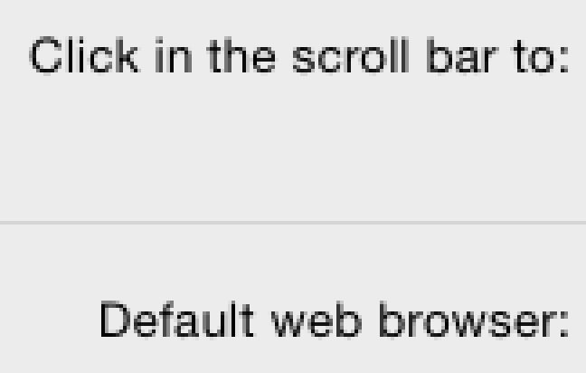
As an aside, I tested El Capitan a while back in a VM and none of the MacType profiles came even close to matching what Apple does with small type fonts today. I can't even say I really like it, because there is very strong grid fitting, but in a radically different way than how Microsoft or FreeType do it. It seems to be either blending a grid fitted version with a non grid fitted version, or dilating the font weight after grid fitting. Curiously this behaviour is disabled when LCD anti-aliasing is disabled. For reference, here is the same text twice, once with LCD anti-aliasing enabled (and converted to greyscale for comparison) and once with it disabled. With it disabled, the appearance matches what you would expect for a non grid fitted rendering of small type. With it enabled however, there is strong grid fitting (note the capital C in Click) but there are still fractional pixels outside the grid. By default, the gamma setting is also much darker.
Apparently this behaviour started with Yosemite, and versions before that match the way FreeType renders with grid fitting disabled. |

|
@extratype to me your DirectWrite settings look quite different from GDI ... but then viewing English not Chinese ... ? |
|
@mufunyo yes I'm not a fan of tight grid alignment either. It ruins the integrity of the font. Would never have happened if Steve was still alive! 😂 😭 |
|
@sammilucia I can't match it with GDI while keeping letters clear. You can't make them thicker without ruining the anti-aliasing (DirectWrite sucks again). So I took a compromise. |
|
Right. So maybe we could describe this profile as Soft and clear (or something) for Chinese text? |
|
I think the reason Apple does this strange behavior is to accomplish both readability and sharpness. When you turned off the LCD AA, it fell back to grayscale rendering which is a whole pixel anti-aliasing tech. Grid fitting with whole pixel is way worse than subpixel rendering. That's all what I guessed. |
|
@sammilucia I didn't care about languages when I wrote my profile. I speak Korean though. |
|
@snowie2000 Personally I think it accomplishes neither; it doesn't follow the original shapes of the font because it's grid fitted, and the dilation or blending (whichever method is actually used) makes the font fuzzy regardless. It seems like the kind of compromise-by-committee that produces the ugly cars you see on the road today. Like @sammilucia said, wouldn't have happened if Steve was still alive. Greyscale rendering also doesn't have anything to do with it other than the fact that Apple seems to fall back to old method of non grid fitted rendering in greyscale mode. If you look at Mavericks, aside from the different system font (Lucida Grande was later replaced by a new font that supposedly looks better on Retina displays) there is a combination of LCD subpixel rendering and non grid fitted rendering, which is what OS X prior to Yosemite has always used:
|

|
@extratype What is the saturation setting you have mentioned #401 (comment) |
|
This is a setting in GDIPlus helium version it doesn't work in mactype |
|
I set Edit: Also set [DirectWrite]
RenderingMode=5
GammaValue=1.3
Contrast=0.6
ClearTypeLevel=0.7 |
|
That reminds me, I recently finally installed 2018.1-beta5 because I was reinstalling Windows anyway, and I noticed the "hint small fonts" option is either broken, or the threshold for when fonts get hinted is set to a smaller font size than previously. I've gotten used to it by now, but it does hurt legibility in apps like Explorer slightly. |
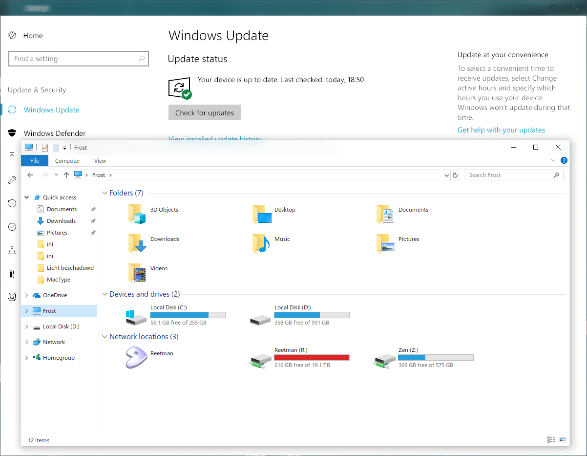
A picture says more than a thousand words... I think something is messing with the gamma on Metro apps. Also, would be nice to be able to force RGB (LCD) mode for Metro apps as well, if possible.
The text was updated successfully, but these errors were encountered: