PR: Enhance the display of warnings and errors #9422
Conversation
|
Hello @goanpeca! Thanks for updating this PR. We checked the lines you've touched for PEP 8 issues, and found:
Comment last updated at 2019-05-25 02:41:47 UTC |
|
@ccordoba12 currently the line number area is not changing size when zooming in/out. I think it perhaps should? |
|
@goanpeca I cannot properly test this due to #9425 , which I've repro'd on multiple branches consistently. However, some initial comments:
Also, how do you enable those pylint errors? They don't show up, even after running static code analysis. |
|
Thanks for the review @CAM-Gerlach
Yep
They do have error codes http://flake8.pycqa.org/en/2.5.5/warnings.html
Not sure, @ccordoba12 wanted it to be obvious so I will defer to his judgement.
You have to use the latest pyls (but spyder will complain you need a lower version) |
|
|

|
I assume you're aware, but just in case, |
|
|
@goanpeca Okay, but I'm a little confused that's |
|
@CAM-Gerlach you are right, my bad! |
|
|

|
Thanks @goanpeca for this! Things look really nice!! I have a couple of quick comments:
|
I disagree. In six years of maintaining Spyder nobody has complained about it. Besides, it's much better to be explicit than a bit vague about those messages too. So in my role as BDFL of Spyder I say that stays. |
Ok, I will post a screenshot to see how it looks |
@ccordoba12, I was referring to the word |
Ok, sorry. Perhaps they should stay? I mean it's hard to understand what those messages mean without the word |

|
If you want to keep "code" repeated in every message for the sake of explicitness, its not a big deal, though I'd prefer it without it since the user can reasonably infer what it means (at worst, they have to google it their first time, which is exactly what they likely want to do anyway). However, I do strongly disagree with the green color for information. Blue has long been the standard color for this across all the UIs I'm familiar with, while Green means "Good"/"Ok", which is not the case here. For example, the first four relevant results for |
|
I really like this change!
I would go back to the blue for the info.
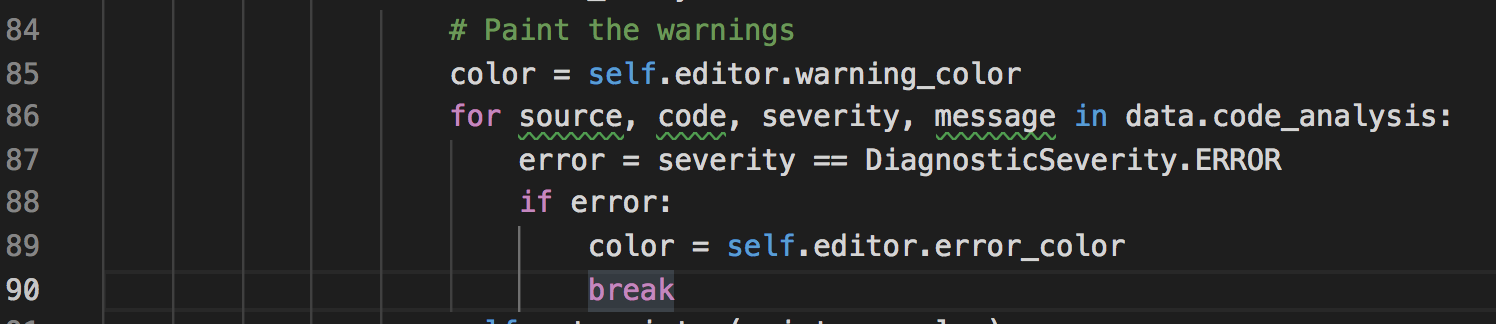
I think I also think that the error codes are in general a little distracting and not too important on first glance or for new users. Can we make the error stand out from the error code with a different brightness or maybe color. For example have the |
We have a lot of things that are blue in the editor panels: the TODO's symbol (as I said before) and the debugger arrow. So if you want blue for info, we really need to change to green those other symbols. @goanpeca, please do that as part of this PR, but you also need to change those colors in
Ok, fair enough. I agree with this suggestion.
This is a good suggestion too. I think the error code should be lighter to make it less relevant than the rest of the text. |
TODOs/etc can be grey or (if not visible enough) purple. Debugger error can be green.
Agreed as well (though to be really nitpicky, its
I agree with having it a different shade, but in our default dark theme, having it lighter would make it much more visible/prominent, not less. If we wanted something that would work across our themes, we could just use italic instead (though that might not look quite as clean)? |
|
Thoughts @bcolsen @ccordoba12 ? |


|
We will still need to go over all the colors in Spyder at some point before the official release of 4.0 so I suggest we do not take more time than it is needed to get this functionality going. We should be moving faster and leave all the color and style discussions for another issue/PR and focus on the actual tooltip (what this PR is about) and not on the icons and colors on the LineNumber/ScrollBar area. |
|
On another note, do we plan to add additional highlights to the code editor words to indicate the problems (errors, warning, info, hint) on the text itself, using curly underline and colors?
|

Beautiful!! I really like it! I was about to suggest using magenta for TODOs, so that's really cool.
Ok, agreed. Please open a new issue about it so we don't forget to address that, either in beta3 or beta4. We should do two things about that: define a central place to import different colors and (in my opinion) change the debugger arrow to green.
Yes, I was also about to suggest that. Please open another issue about it. |
Description of Changes
Issue(s) Resolved
Fixes #9247
Affirmation
By submitting this Pull Request or typing my (user)name below,
I affirm the Developer Certificate of Origin
with respect to all commits and content included in this PR,
and understand I am releasing the same under Spyder's MIT (Expat) license.
I certify the above statement is true and correct: @goanpeca