Skip to content
New issue

Have a question about this project? Sign up for a free GitHub account to open an issue and contact its maintainers and the community.

By clicking “Sign up for GitHub”, you agree to our terms of service and privacy statement. We’ll occasionally send you account related emails.

Already on GitHub? Sign in to your account

Chrome breaks layout if system language is Chinese #911

Closed
cyent opened this issue Nov 1, 2018 · 39 comments
Closed

Chrome breaks layout if system language is Chinese #911

cyent opened this issue Nov 1, 2018 · 39 comments
Labels
bug Issue reports a bug resolved Issue is resolved, yet unreleased if open

Comments

@cyent
Copy link

cyent commented Nov 1, 2018

Description

Only chrome meet the bug,safari and firefox are correct.

the case include my "mkdocs serve" and your "https://squidfunk.github.io/mkdocs-material/"

this is chrome:

image

this is firefox:

image

Package versions

  • Python: 2.7.10
  • MkDocs: 1.0.4
  • Material: 3.0.6

Project configuration

site_name: My Docs
theme:
  name: material

System information

  • OS: macos 10.13.4
  • Browser: chrome
@squidfunk
Copy link
Owner

I'm gonna need a little more than this. What resolution does this happen, for example? Please, please, please stick to the issue template when reporting new issues and provide everything that is necessary to reproduce the issue.

@squidfunk squidfunk added the needs reproduction Issue lacks a minimal reproduction .zip file label Nov 2, 2018
@cyent
Copy link
Author

cyent commented Nov 3, 2018

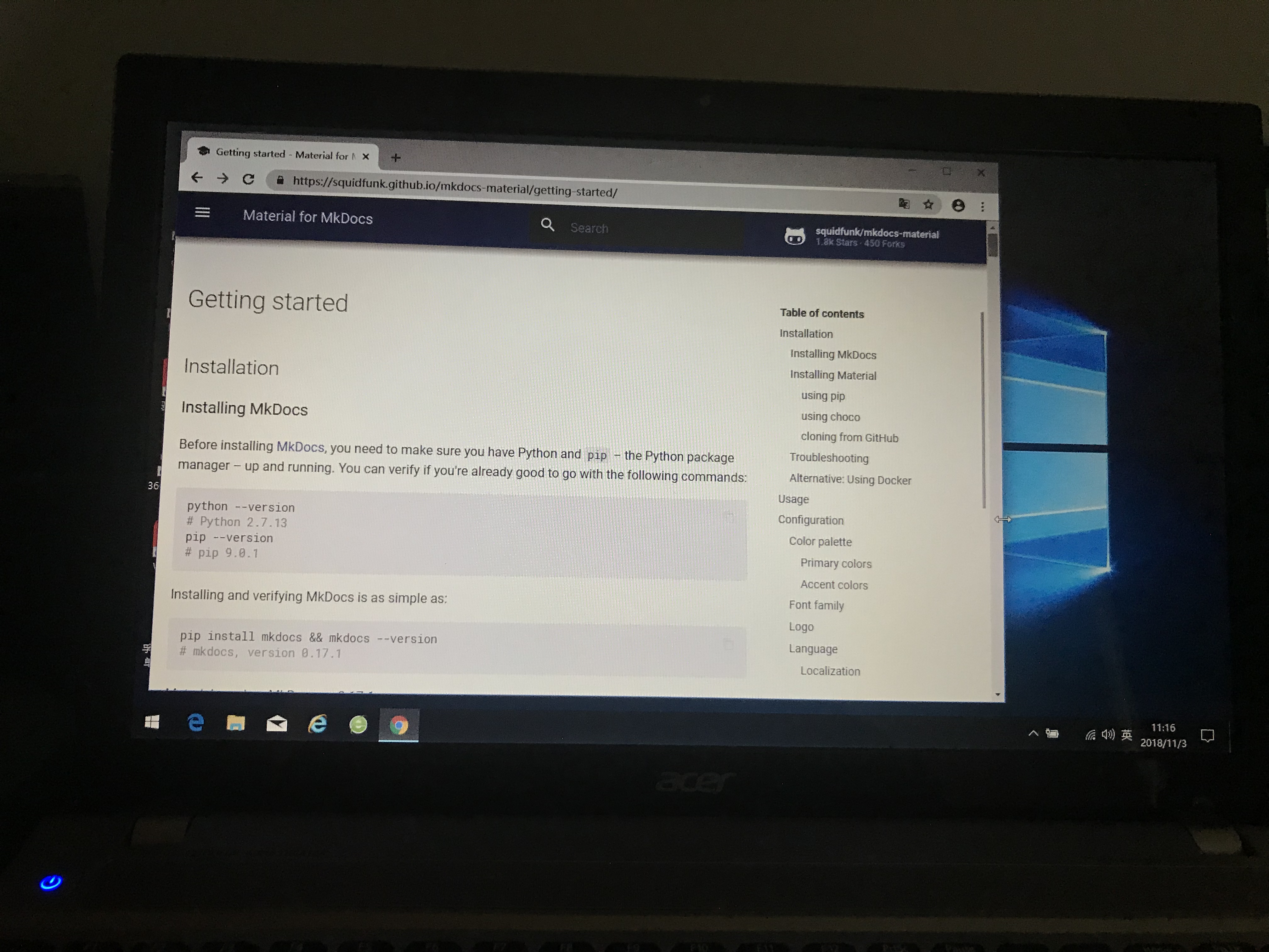
I mean, in the chrome, some size display correct, some size have problem. Now, I take 3 screenshots in another windows computer,the chrome version is 70.0.3538.67.

Now, let me visit https://squidfunk.github.io/mkdocs-material/getting-started/

screenshot 1:the same as mobilephone,it is correct

image

screenshot 2:the size is bigger than screenshot 1,it is correct

image

screenshot 3:the size is bigger than screenshot 2,it has problem:I can't see the Right sidebar fully

image

So, Mkdocs-material does not fit perfectly into multiple sizes in chrome browser.

@squidfunk
Copy link
Owner

I'm afraid I cannot reproduce this. Is this the latest Chrome version? Somebody experiencing the same problem?

@cyent
Copy link
Author

cyent commented Nov 3, 2018

eh, eh, actually, the problem appear at least 1.5 years(at that time, I just learn mkdocs-material)...

You can try turn up the brower size slowly

@squidfunk
Copy link
Owner

As said before, I'm not able to reproduce it on Chrome macOS. It's very strange that this is happening for you. Maybe somebody else has experienced the same, we need a way to reproduce it.

@cyent
Copy link
Author

cyent commented Nov 7, 2018

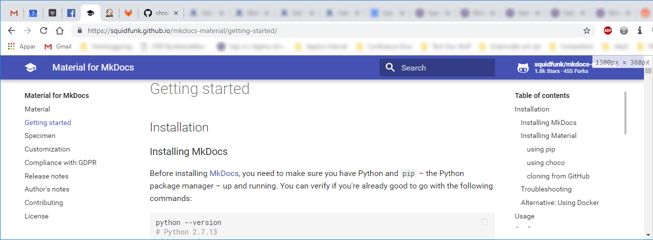
other people's computer still the problem. But,

Oh, yeah, I know how to reproduce it.

Test 1: when chrome brower size is 1219px * 368px, it display ok.
Test 2: when chrome brower size is in (1220px - 1436px) * 368px, it display abnormal.

So, you can reproduce it in exmaple 1300px * 368px.

image

@squidfunk
Copy link
Owner

Still (macOS, latest Chrome):

bildschirmfoto 2018-11-07 um 10 18 47

@martinbira
Copy link
Sponsor Contributor

martinbira commented Nov 7, 2018

Windows 10, latest Chrome here @ 1300x368
material-mkdocs-1300x368

Edit: Also now tried this on Win 10 with Firefox (latest), Vivalid (latest), and Microsoft Edge, all with the same expected working results.

@cyent
Copy link
Author

cyent commented Nov 7, 2018

I reinstall the latest chrome, but the problem still exists, these days I will try a few more times in more other peoples.

@cyent
Copy link
Author

cyent commented Nov 9, 2018

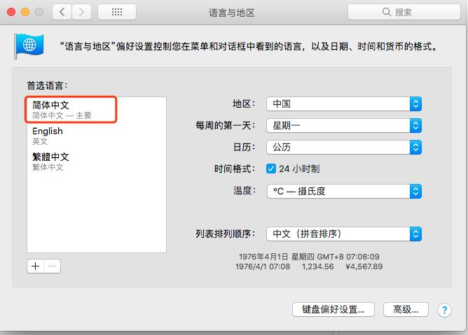
I can reproduce it, it is the OS Language(not chrome Language).

When the os language is chinese simplified, it will reproduce the problem
When the os language is english, it is very ok.

example macos
image
If you set it like this, you can reproduce it. (I haven't tried it on Windows yet)

@squidfunk
Copy link
Owner

Thanks for investigating! However, when I change my system language to Chinese I'm unable to use my computer 😐

@squidfunk
Copy link
Owner

Can maybe somebody else using Chinese as a system language reproduce (or even debug) it?

@walkccc
Copy link

walkccc commented Nov 9, 2018

  • In MacBook Pro 13" (2013 mid) with resolution = 2560 * 1600, there's the same issue in Chrome.
  • In MacBook Pro 15" (2017 mid) with resolution = 2880 * 1800, it's kind of awkward in Chrome but it's normal in Safari.

Following are the comparisons in different browsers and screen sizes:

13" model (Chrome)

issue

15" model (Chrome, full screen)

2018-11-10 04 03 22

15" model (Safari)

2018-11-10 04 03 36

@squidfunk
Copy link
Owner

Well, this has to be induced by some deeper cause than OS language or Notebook model. We need to find the cause and fix it. Assistance would be great from the people who can reproduce this error, because up to now I can't. A great start would be looking at the DOM, the specs/properties of the elements and see if there's something applied that makes it break.

@squidfunk
Copy link
Owner

Closing, as its still not reproducible. If somebody manages to debug (and maybe fix it) you are most welcome to submit a PR.

@smancill
Copy link

smancill commented Feb 4, 2019

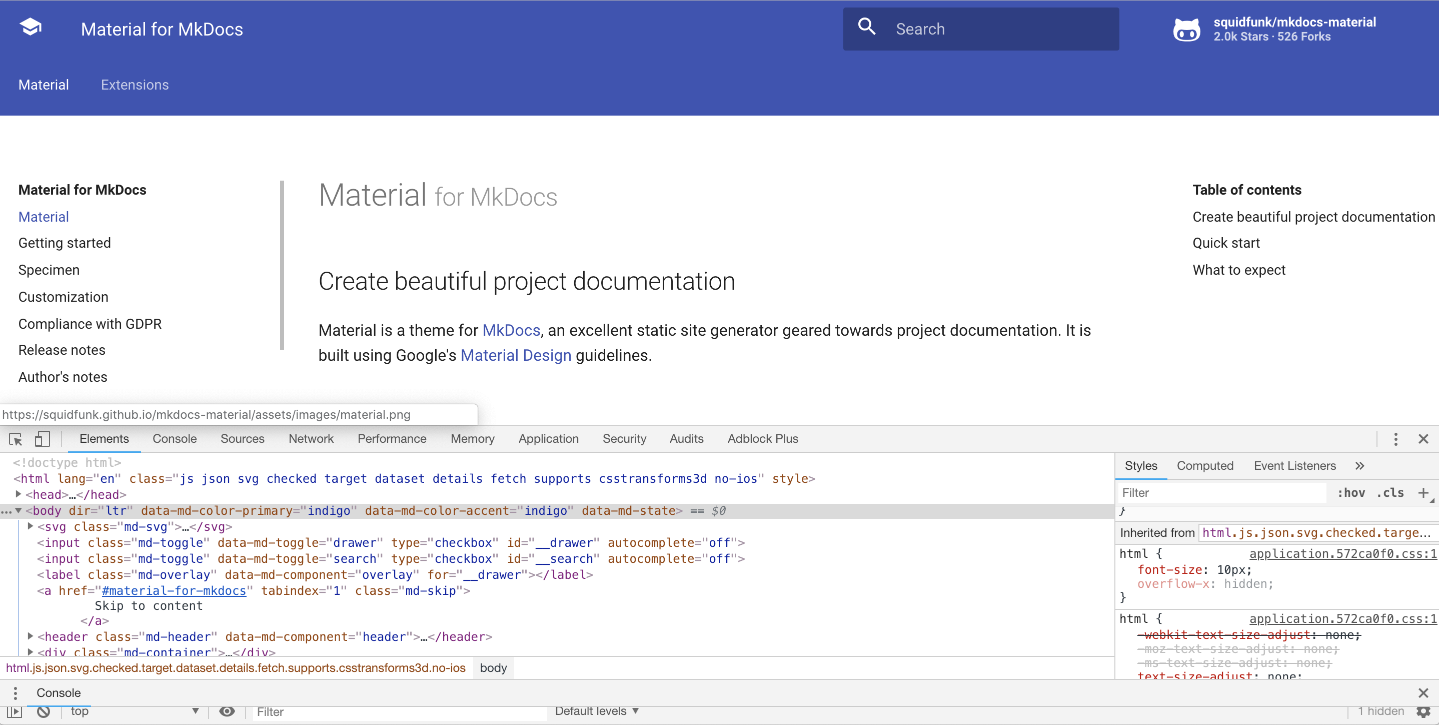
I can reproduce the problem with Chrome on macOS:

captura de pantalla 2019-02-04 a la s 04 43 52

The margin-left of md-sidebar--secondary is set to the wrong value.

@squidfunk
Copy link
Owner

@smancill - did you use browser zoom? What's your base font size?

@smancill
Copy link

smancill commented Feb 4, 2019

The base font size is the browser default (medium, 16pt).

And no zoom (even though the above screenshot in responsive mode was at 75%).

Here is another one, this time at 100%:

captura de pantalla 2019-02-04 a la s 16 36 32

By the way, my system language is Spanish but I changed it to English and the problem was still present.

@squidfunk
Copy link
Owner

Still, I cannot reproduce it on Chrome macOS. What the...

@smancill
Copy link

smancill commented Feb 4, 2019

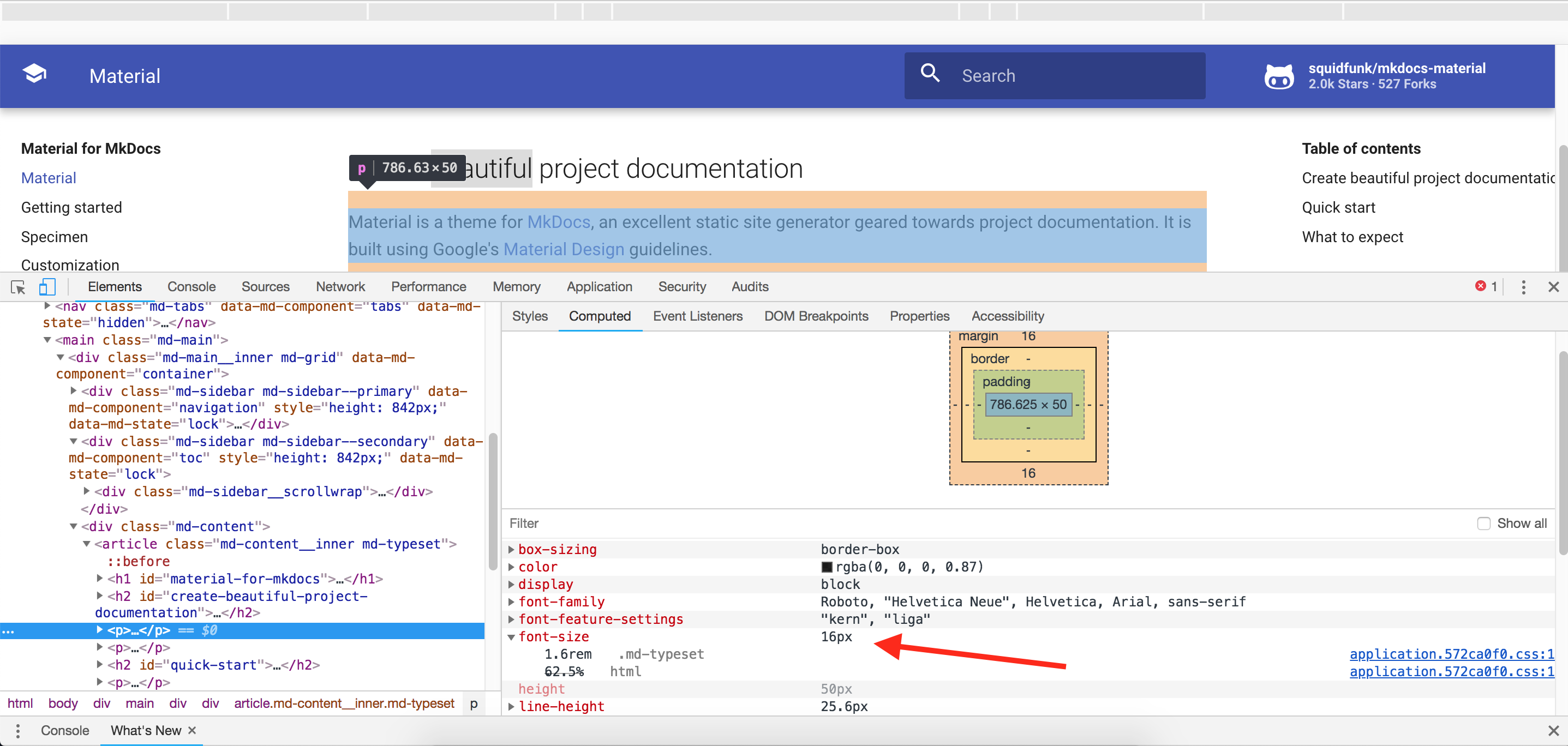
Ok, The problem is that font-size is set to 12px in Chrome for the sidebar, while in Firefox is properly set to 10px. Then all the rem-based sizes are displayed incorrectly in Chrome.

captura de pantalla 2019-02-04 a la s 18 12 06

But I do have all the font sizes in Chrome set to the default recommended medium size (16px).

Also, the size in pixels for all text elements is actually the same in both Chrome and Firefox:

captura de pantalla 2019-02-04 a la s 18 13 26

@squidfunk
Copy link
Owner

Awesome, thanks! Setting the minimum font size to 12px I can finally reproduce it! For me the value was set to 6px and I never tweaked it, so it should not be the default I guess. I will see if we can do something about it, but I would consider it an edge case.

@squidfunk squidfunk added bug Issue reports a bug and removed needs reproduction Issue lacks a minimal reproduction .zip file labels Feb 4, 2019
@squidfunk squidfunk reopened this Feb 4, 2019
@squidfunk squidfunk changed the title chrome display abnormality Minimum font size in Chrome may break layout Feb 4, 2019
@smancill
Copy link

smancill commented Feb 4, 2019

I actually found another issue with Chrome if reducing the minimum font size still doesn't work. There is a hidden setting in Chrome that I cannot change from the preferences panel UI:

$ jq '.' ~/Library/Application\ Support/Google/Chrome/Default/Preferences | grep font_size
      "default_fixed_font_size": 13,
      "default_font_size": 16,
      "minimum_font_size": 10,
      "minimum_logical_font_size": 10,

I had both minimum_font_size and minimum_logical_font_size set to 12, but from the UI I can only change minimum_font_size to 10, and minimum_logical_font_size was still at 12 and the problem still persisted.

I had to quit Chrome, edit the preferences file manually to set minimum_logical_font_size to 10 and finally the layout was correct.

@squidfunk
Copy link
Owner

@cyent and @walkccc - can you please look into your minimum font size settings and verify whether the issue persists if you set it to 10px?

@walkccc
Copy link

walkccc commented Feb 10, 2019

I think the issue still persists. Changing the font-size doesn't affect the layout.

  • font-size: 10px

    10
  • font-size: 12px

    12

@squidfunk
Copy link
Owner

@walkccc you have to set the font size within Chrome settings, not DevTools. However @smancill research led to an unresolved issue I found which may explain why the issue for some users only appears for Chinese:

By default, chrome sets the minimum font size as 1px for most UI locale, but for some special UI locale like Simp/Trad Chinese, Japanese, Korea and Thai, Chrome uses 10px/12px as default minimum font size. That is why Chrome does not display font which size is less than 12px in Chinese UI.

@walkccc
Copy link

walkccc commented Feb 10, 2019

OS language = Trad Chinese.

  • Very small
    2019-02-10 3 57 40

  • Small
    2019-02-10 3 58 13

  • Medium (Recommended)
    2019-02-10 3 58 23

  • Big
    2019-02-10 3 58 34

  • Very big
    2019-02-10 3 58 42

@squidfunk
Copy link
Owner

Thanks, I will see if we can fix it somehow.

@squidfunk
Copy link
Owner

Only Chinese should be affected, as Material sets the root font size to 10 for an efficient usage of rem (see here):

Set the default minimum font size webkit pref to 12 for Chinese and 10 for ja,ko,ar and th.

@squidfunk
Copy link
Owner

squidfunk commented Feb 10, 2019

So, the problem is definitely triggered by the fact that the minimal font size for Chinese cannot be smaller than 12. The issue was reported 9 (!!!) years ago and still remains present in Chromium and Chrome, see here and here.

This year-standing "fix" in Chrome greatly hinders accessibility. Material puts a huge effort in being as accessible as possible by defining every dimension in rem or em and Media Queries in em. If a user has set a bigger base font size (like it would be practical for elderly people), the whole page will just appear as if it is zoomed. This ensures that the layout always looks as intended. The problem is that a minimal font size of 12 breaks all rem values, as the factor is now 1.2 and not 1.0. However, the minimal font size does not seem to impact the base font size for the Media Query computations, as they stay at their positions which is the reason why the sidebar is way of the screen (Media Query now triggers too early).

We could try to provide a "good enough" experience by somehow working around this issue in the CSS or base all computations on a base font size of 12 (and not 10) which would require some rewriting of the SASS code (probably using a helper function). The problem will persist if a user sets the minimal font size to a value larger than 12. It is not fixable with the current architecture without sacrificing accessibility.

I really do not want to lock out the whole Chinese community and I'm really shocked that such a fundamental issue remains unsolved for such a long time, impacting a huge part of the world's population. Refactoring all rem values to be based on a factor of 1.2 to catch the minimal font size for Chinese will lead to regressions for users which applied customizations in rem, as their calculations are now off. This is a tricky issue.

@squidfunk squidfunk changed the title Minimum font size in Chrome may break layout Chrome breaks layout if system language is Chinese Feb 10, 2019
@masterstevelu
Copy link

I'm afraid I cannot reproduce this. Is this the latest Chrome version? Somebody experiencing the same problem?

So, the problem is definitely triggered by the fact that the minimal font size for Chinese cannot be smaller than 12. The issue was reported 9 (!!!) years ago and still remains present in Chromium and Chrome, see here and here.

This year-standing "fix" in Chrome greatly hinders accessibility. Material puts a huge effort in being as accessible as possible by defining every dimension in rem or em and Media Queries in em. If a user has set a bigger base font size (like it would be practical for elderly people), the whole page will just appear as if it is zoomed. This ensures that the layout always looks as intended. The problem is that a minimal font size of 12 breaks all rem values, as the factor is now 1.2 and not 1.0. However, the minimal font size does not seem to impact the base font size for the Media Query computations, as they stay at their positions which is the reason why the sidebar is way of the screen (Media Query now triggers too early).

We could try to provide a "good enough" experience by somehow working around this issue in the CSS or base all computations on a base font size of 12 (and not 10) which would require some rewriting of the SASS code (probably using a helper function). The problem will persist if a user sets the minimal font size to a value larger than 12. It is not fixable with the current architecture without sacrificing accessibility.

I really do not want to lock out the whole Chinese community and I'm really shocked that such a fundamental issue remains unsolved for such a long time, impacting a huge part of the world's population. Refactoring all rem values to be based on a factor of 1.2 to catch the minimal font size for Chinese will lead to regressions for users which applied customizations in rem, as their calculations are now off. This is a tricky issue.

I encountered the same problem today. And thank you for your efforts on fixing this bug!

@squidfunk
Copy link
Owner

I tried to write something up in a few tweets about this problem and would kindly ask everybody to retweet it, so we maybe get some attention by the Chrome dev team: https://twitter.com/squidfunk/status/1095246562664607744

@squidfunk
Copy link
Owner

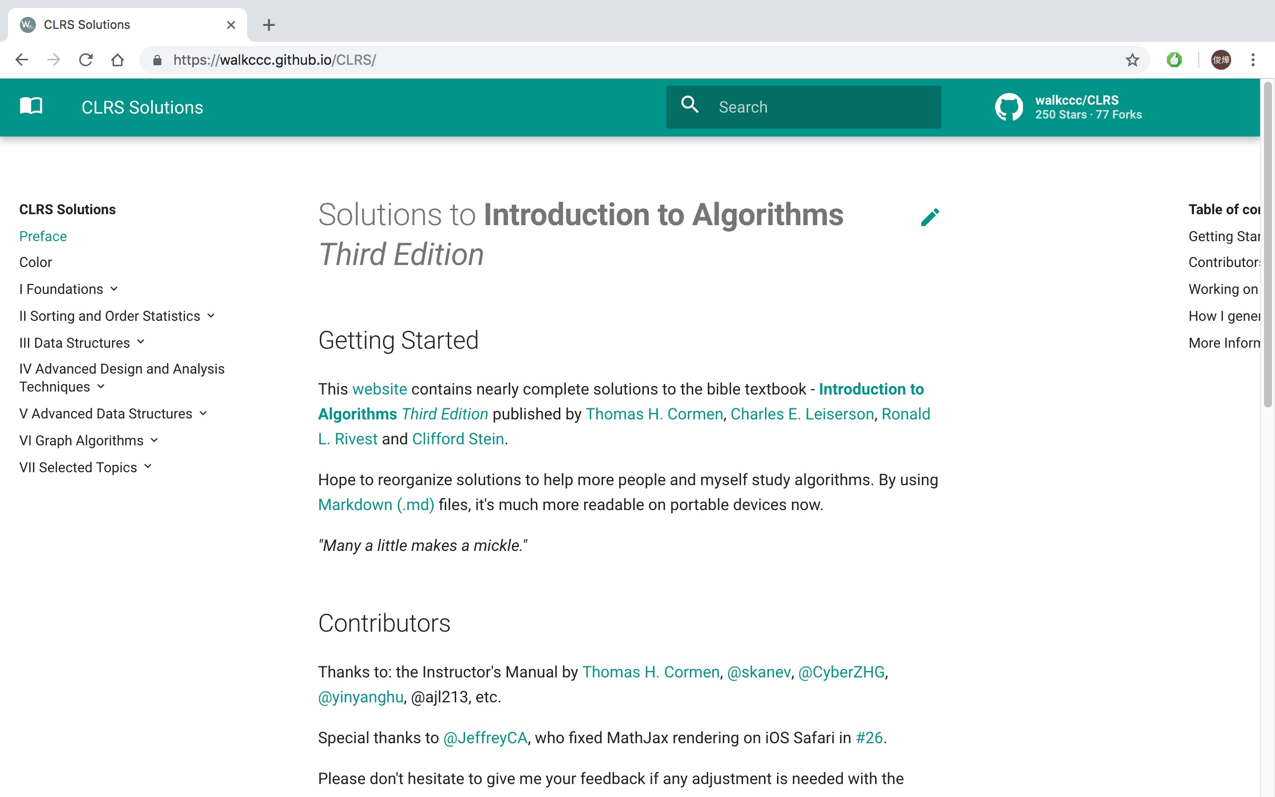
Looks like I have good news – I just pushed a potential workaround in 2007484 and 946f4f1 to master. The gist:

  • Move all rem calculations to a new helper function px2rem and define all values in px. The helper function will take the px value and return the appropriate rem value using the base font-size.
  • Double the base font-size on the html element from 62.5% (= 10px) to 125% (= 20px) and adjust px2rem accordingly. This works around the problem that Chrome will internally change 10px to 12px and should work for a minimal font size of up to 20px.
  • Reset the base font size to 10px by defining 0.5rem on the body, so that implicit inline spacing is as it was before.

My testing shows that the issue is indeed fixed. The site looks exactly the same when I set the minimal font size to 12px so if my theory is correct it should now work for Chinese systems.

The change is already deployed to the live site, so everyone experiencing the problem please visit https://squidfunk.github.io/mkdocs-material/ to check if the problem is gone

Before:

bildschirmfoto 2019-02-12 um 19 15 27

After:

bildschirmfoto 2019-02-12 um 19 15 29

If we come to the conclusion that the issue is fixed, the next steps are:

  1. I would kindly ask somebody to review commit 2007484 which changes 0.4rem to px2rem(4px) etc. I double checked and it seems that I made no mistakes but there are A LOT of changes, so it's always better to double check.
  2. I will issue a major release, i.e. version 4, because this change has the potential to break some projects using customization. If a project uses rem values, the resulting values are now twice as big. From my experience only very few people use rem, so it shouldn't break a lot of projects, but it still has the potential to do so.

What. A. Journey.

I think we're all much wiser now and it seems that we're actually the first discovering the problem of minimal font size in respect to rem values.

@squidfunk
Copy link
Owner

@masterstevelu @walkccc @cyent @smancill – could someone of you please verify, whether the issue is now gone when visiting the official Material docs?

https://squidfunk.github.io/mkdocs-material/

@masterstevelu
Copy link

@masterstevelu @walkccc @cyent @smancill – could someone of you please verify, whether the issue is now gone when visiting the official Material docs?

https://squidfunk.github.io/mkdocs-material/

The bug is fixed on my Chrome. Thannk you!

@masterstevelu
Copy link

@squidfunk Hi Martin, when can I use your newest build if I install it using pip?

@walkccc
Copy link

walkccc commented Feb 13, 2019

It's gone!

@squidfunk
Copy link
Owner

squidfunk commented Feb 13, 2019

Awesome! As described above, I would like someone to review 2007484 before I will issue a new major release. We need to make sure that all rem units were correctly converted to px:

  • 0.1rem => px2rem(1px)
  • 0.9rem => px2rem(9px)
  • 1rem => px2rem(10px)
  • 1.1rem => px2rem(11px)
  • 24.2rem => px2rem(242px)
  • etc.

If we missed something, it will break some projects down the line. Better safe than sorry. I will prepare the release notes and upgrade instructions, so we can issue a new release as soon as we're sure we won't break anything.

@squidfunk squidfunk added the resolved Issue is resolved, yet unreleased if open label Feb 13, 2019
@max-ci
Copy link

max-ci commented Feb 13, 2019

I don't see any mistakes in 2007484

@squidfunk
Copy link
Owner

Released as part of 4.0.0! I want to thank you all for your effort on helping fix this issue. Material should now finally look as it it should in China :-)

@squidfunk squidfunk mentioned this issue Oct 14, 2019
53 tasks
Sign up for free to join this conversation on GitHub. Already have an account? Sign in to comment
Labels
bug Issue reports a bug resolved Issue is resolved, yet unreleased if open
Projects
None yet
Development

No branches or pull requests

7 participants