new card layout for web and app? #298
Comments
|
cc @juliushaertl and @jancborchardt I thought at the last hackweek we came to the conclusion that the web interface will adapt the new layout we defined at the hackweek? I am still against showing the full title because we have smartphones with samller screens here. When editing, the full title is shown and on desktop we simply have much more space. Would be nice if we three could decide a final layout here 🙂 |
|
can you please post a link/image for "the new layout we defined at the hackweek" |
|
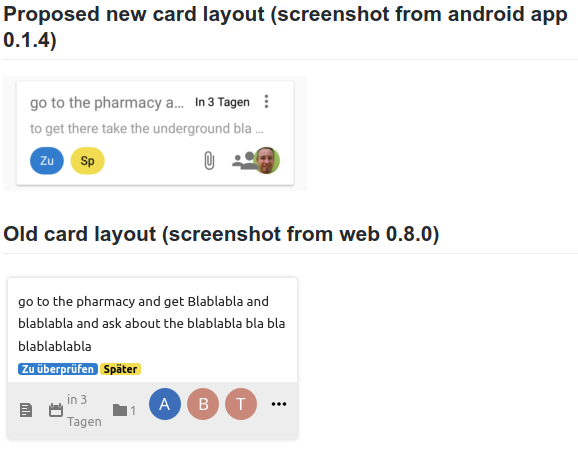
It's basically exactly what you can see in the android app. Avatars bottom right, labels bottom left, title top left, description in second line, menu & duedate top right. |
WIth all due respect, I think the duedate top right is absolutely a bad choice. It takes this space away from the card title, which is often hard to understand already because it is truncated when running out of horizontal space. And 99,9% of the time I still have tons of horizontal space in the bottom left because I mostly use 1 label at a time ... |
|
The due date is on the top right because
Don't think we didn't ponder over it. In fact there is no layout, that will fit the use-case of each user, but we had to start at a point. I agree, that the layout should match the server, this is very important, but about everything else i have to commit that we have currently way more important issues than reinventing the card layout. With all due respect of course 😄 |
|
@kbeerepoot what about you crate a draft of your desired card layout having everything well placed and we'll ask @jancborchardt and @juliushaertl about their opinion? In the end we all want a nice app, but we have to find a way not to ignore anyone elses use cases. We really tried to make it the nicest we could! Just think about it and and you will see, that this topic isn't just that easy. Make a draft and we'll see, what the main UI designer from nextcloud and the original server app developer will say. Deal? |
|
Again, with all due respect :
... which is probably quite often in an app that is aiming to help people getting things done (in time)
In my opinion the title of a card, that tells you what actually needs to get done, is even more important than the due date. I now regularly see cards with a due date in the near future where I can not see immediately what I need to get done soon.
I absolutely understand that, and I am most certainly not trying to demand that things are done my way. If I make that impression on you, I am sincerely sorry. I am just sharing my experiences. It is the simpler approach of Deck when compared to Tasks that makes me choose for Deck, and not being able to immediately see the task at hand seriously impairs the usability in my opinion.
I would not dare, and I do understand.
Again, I do understand that. I am not making demands, just stating my opinion(s). |
|
No offense 🙂 Can you do a mock-up like @desperateCoder suggested? We need the following components:
We need variants for each optional case in a matrix, where e.g. labels are present, but no due date. or users are there, but no description and so on. The layout has to fit each possible combination of the given properties without changing the position. 🤔 |
I am not very good with graphic applications, and the only thing I would like to see happen is that duedate moves from top right to bottom left.
I have great respect and admiration for the efforts of all the people that participate in this project, because I can not program my way out of a wet paper bag, and I do understand that the topic just isn't that easy. I will therefore take a step back in this discussion for a while. |
I'll try, but it might take a while and I'm not even sure that I can pull it off. But rest assured that I do appreciate all your efforts ... |
|
@kbeerepoot Point taken! And you have absolutely the right to tell us your opinion! In the end text based communication can't transport emotions and expressions that well so I'd suggest we all calm down and stay friends. I'm kind of a potato in UI design as well, that's why I'm responsible for the sync and don't have a valuable opinion in this topic, so I just try to find a solution for our problem. In this case I'd suggest you try to mock up a draft, no matter how long it takes. Maybe @jancborchardt could just tell us his opinion on this as well, maybe it helps you and/or us to get this solved. We have a bunch of work left and nobody would die, if this isn't solved the next week's or months. |
|
What was the problem with the old layout? (Which is still in use in deck web view) The only problem I see is that the full title should be visible during editing (nextcloud/deck#865). Details should be in details view IMHO, not on the card. If you guys have a long discussion and make a decision at a hack week, it would be good to document it and publish it somewhere (blog, or help.nextcloud.com) Also, I suggest that changes like this should be rolled out in app and web view at the same time. Users should always find the same layout in app and web. Agree? |
|
No, there is in fact no documentation. We will try to do it better next time and work on our communication. At the time of thr last hackweek we did not publish the app at the Play Store and the F-Droid version was an early alpha preview - We didn't even thought we had real users at this time. Disclaimer: We are not working for or are directly related to Nextcloud, this is a freetime project from volunteers 😉 That's why communication is not always that easy.
Absolutely agree that this should be the case (as long as it makes sense regarding the different environments desktop/mobile) 👍 We take your feedback serious though and will discuss the layout at the next hackweek again with the Nextcloud guys. |
|
In general, let’s take things step by step. One big issue with a lot of things will just overflow with different takes on things. :) So let’s start with what @kbeerepoot said:
I do remember we also talked about that at the hackweek @stefan-niedermann @desperateCoder and we just decided to go with the placement in the top right for now. Looking at the screenshot in the readme for example, bottom left would actually be quite a fitting position for the due date. Avatars are already nicely overlaid, labels are truncated – that is the space for "metadata". I’d say it’s worth trying out moving the position of that so the title always has enough space. |

 alexanderdd
changed the title
alexanderdd
changed the title
|
I changed the title and edited my first post, please have a look. Is it possible to move this issue to https://github.com/nextcloud/deck/ ? I think it should be discussed there because this is a big decision in where Nextcloud Deck is going, and the people at Nextcloud Deck should be able to see this discussion. If it is not possible to move I will create a new thread over there and close this one. I disagree with "taking it step by step" and talking only about "moving due date from top right to bottom left.". This issue is for discussing the whole card layout. A decision to completely restructure the card layout has been made at a hack week. For me, the new layout is a big step backwards in many ways concerning UX. If you wanna change something, you need good reasons imho. I would like to know: What are the reasons for the new layout? In particular:
for easy reference: I am writing all of this because I care a lot about Nextcloud, Nextcloud Deck, and UX. I think this can become THE productivity tool of the masses, so we need to make a great product. |
 alexanderdd
changed the title
alexanderdd
changed the title
|
@alexanderdd I don't know if we can move this there, but I'd ask in general: @juliushaertl @jancborchardt are you willing to discuss this in generally (again)? As far as I can tell, @juliushaertl is about to implement the frontend (porting to vue.js) and more features, I don't know if he'd like to reconsider this right now. |
|
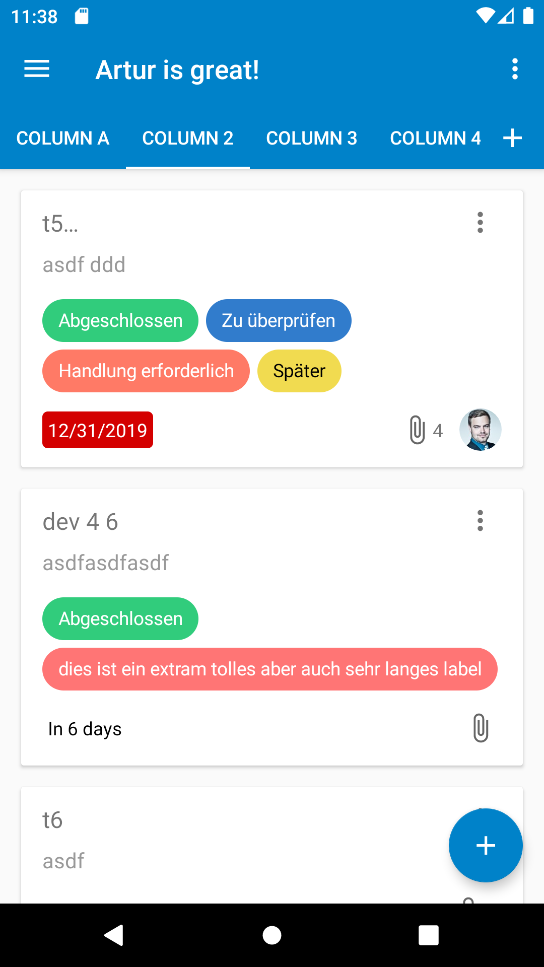
I adjusted the layout to what i can see in the (not yet released) alpha version of the deck app.
Basically compared to the latest released version of the Deck app the following changes were made:
Personally i think that's one huge mess (in german we say it looks like "Kraut und Rüben" 😄 ). All the important information are flooded by the huge presence of the labels, the duedate can easily be interpreted as a label and gets lost though, especially if it's red, it should be the most prominent item. So, let us know, what you think about the changes and how they feel in reality.
|

|
Just my two cents :
Thanks for all your efforts ! |
|
So we definitely need to make the duedate more distinguishable from the labels if we place them in the same area. Maybe by placing an icon of an alarm clock next to it? @jancborchardt |
Apart from that, I think both web and app plans look amazing! Still waiting for a reply by @jancborchardt @juliushaertl if they are ok with discussing this in https://github.com/nextcloud/deck/ - to me it feels really bad to have this discussion in a hidden room at the back of the club. I am so excited we are shaping the productivity tool that thousands of people will use to get stuff done =) |
|
Sorry, I was out of commission because of travel last week. I’m not going to read through every single thing because @stefan-niedermann summarized it quite well and the screenshots show it clearly: It’s a whole mess. Right now, the Android app is the standard when it comes to the interface of the Deck app as this is the last we discussed. Yes we should sit together again, but we won’t question everything again. We are at a reasonably good spot, now we move step by step.
Yes, this is agreed, so why bring it up again?
This can also be done.
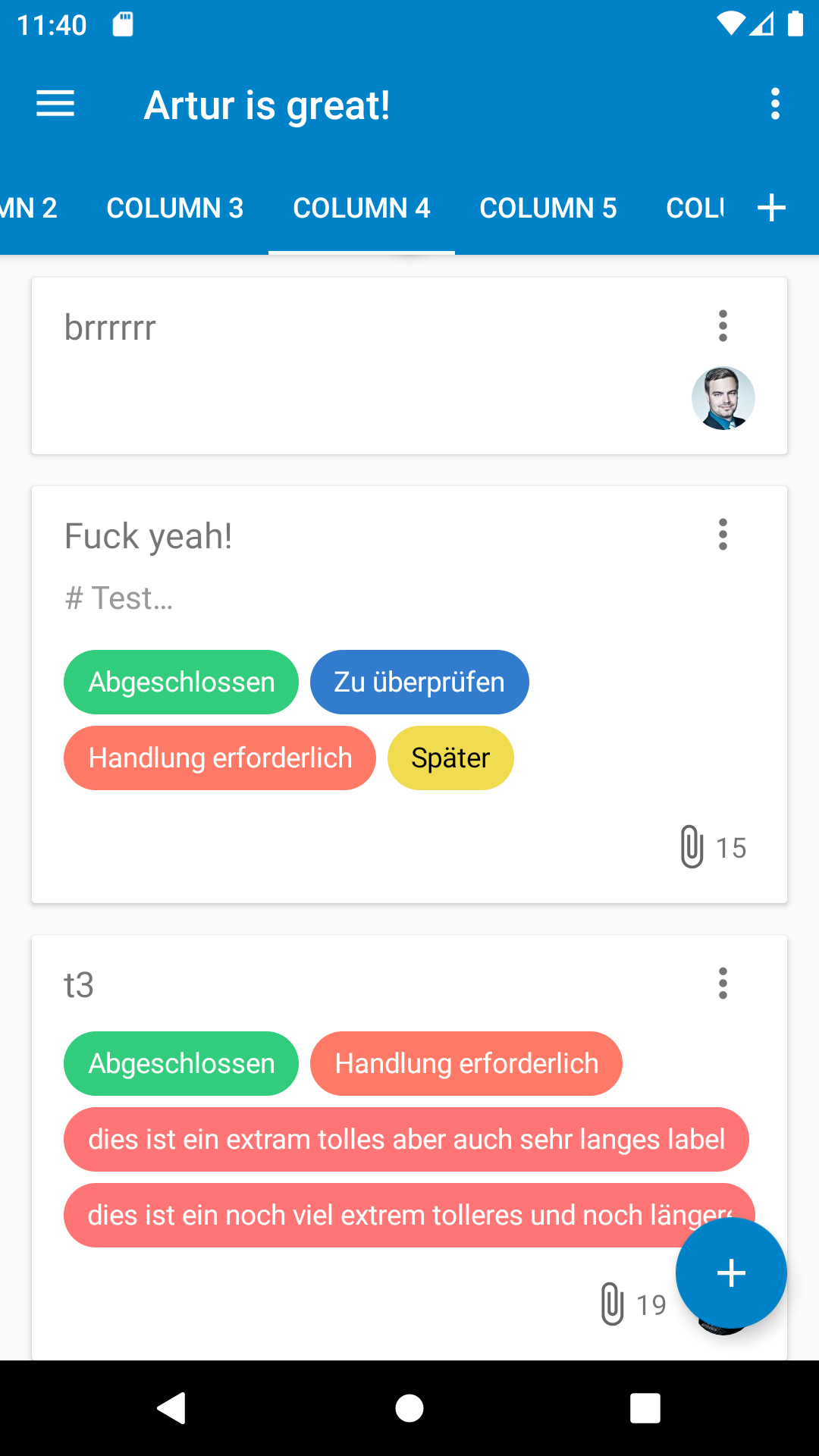
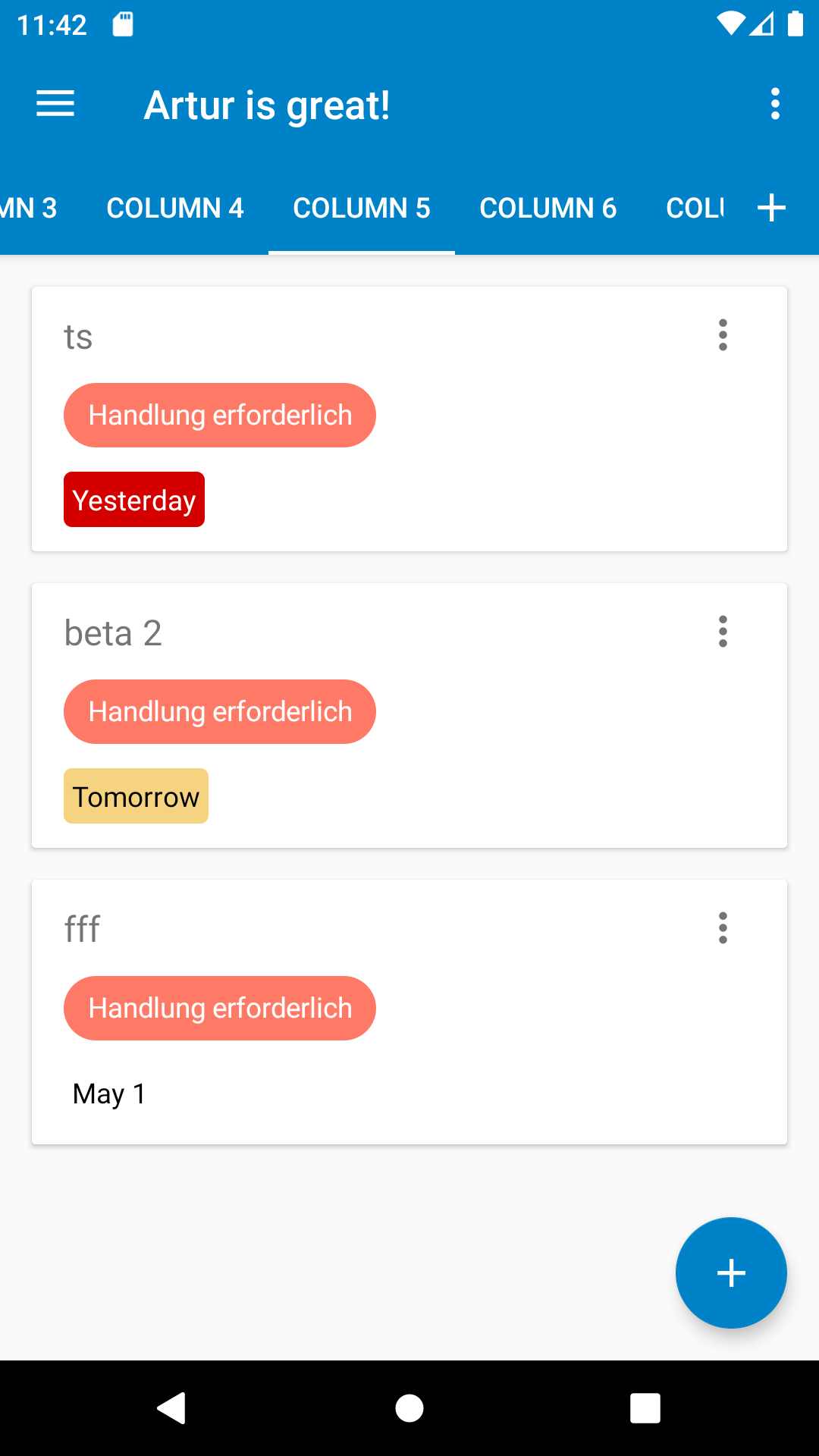
This is illustrated fairly well by @stefan-niedermann’s screenshots.
Because the grey background looks quite dated.
Because tooltips are really not obvious. First line of description gives way better context and directly shows what’s there. |
What do you mean with this can be done? 😉 I generally agree that the title should not be cut off.
As mentioned in #192, I really think labels are a key component in organizing cards, so cutting of is removing important information here.
Personally I don't see much value in showing the first line of the description, I would even argue that we could remove the description indicator icon in the web app, since that only helps if you use it with the tooltip. Regarding the duedate I think that makes totally sense to move it to the top right as it is currently done, I just didn't remember that discussion when rewriting the web ui for Deck 1.0, so I'll see if we can adjust that. |
I totally agree. The title is the most important part of any card, because it is supposed to tell you WHAT needs to be done.
With all due respect, in my opinion the most important component in organizing cards is the stack that it is located in. I do not really care to see the full labels on the card, as long as I can use the full labels to make a selection of cards to be shown (a feature I hope will be developed soon)
Agree. If I really want to know all the information concerning a card I will open it.
I beg to differ if it means the duedate in the top right interferes with showing the full title (or as least as much as possible of the title) of the card. |
|
I’m also fine to remove the preview of the description in favor of showing more of the title, even if multiline. @juliushaertl @stefan-niedermann we should probably ellipsize / fade it at some point e.g. at 3–5 lines, otherwise one card can occupy the whole view? |
|
Hi people, (reminder for newcomers: this applies to the future card layout of android app and web version)
Is this the time to create issues for the individual points above in the deck repository? Or should we make decisions here first? I worry that people walk away, thinking that everything is clear, when actually people understood very different things. Also, I asked twice above if we can have this discussion in the repository of Deck web because that would be the appropriate place. I got the reply "not possible to move" but I never got "don't bring it to official deck repository", so I opened an issue over there just to link to this discussion here: nextcloud/deck#1667 In general, I feel like you made some very smart design decisions for the old layout (web version 0.8.0), then you wanted to change things for the worse without good reasons. |
I don't think that everything is clear ;) For example i still think that tags and duedate are not enough distinguishable from each other (#298). Of course all those topics are connected in some way. If we have 2-letter-labels with less height, they will be more distinguishable from the due date. This was our reason to move the duedate to the top right in the first place. |
I tent to say that reducing the margin here would be fine since it is not a click/tab target, but up to you imo. I've played a bit with margins and rounding on the server and actually think adjusting to the android styles is nicer (see screenshot below).
👍 I also gave that a try and it helps to distinquish between the labels a bit, however this makes the first card line pretty limited, so I started moving the 3-dots menu to the card badge row. We have quite some space left there since the due date is no longer part of it. Let me summarize what the outcome for the server app would be for me based on the discussion above:
Remaing issues as shown below:
|
|
Don’t have anything to add to what @stefan-niedermann and @juliushaertl said. 👍 Let’s wrap this one up as it’s touching too many different topics and is just a confusing discussion for everyone. → Julius’ proposal is great and we can continue in the individual issues. |
|
Web PR in nextcloud/deck#1669 |
|
I adjusted the android app based on what you created in #298 (comment) and this is the result:
Funny thing, i am facing the same issues on android 😄 |

Signed-off-by: Stefan Niedermann <info@niedermann.it>
Signed-off-by: Stefan Niedermann <info@niedermann.it>
|
Btw just a detail on both web and Android: The avatars overlaying need a bit of separation. In the Text app we have this 2px white/background-colored border which looks very nice. :) |
|
@jancborchardt please open a new issue for that :) |
|
@stefan-niedermann didn’t we use to have that though? With the white border around the circular avatars? |
|
Please also open an issue in the deck app itself, so it doesn't get lost in a closed pull request. |
|
@jancborchardt no, we didn't have it yet in the deck android app nor in the deck web app :) just open two reminders in both repositories please, so we don't forget it. |
This comment has been minimized.
This comment has been minimized.
This comment has been minimized.
This comment has been minimized.
This comment has been minimized.
This comment has been minimized.
This comment has been minimized.
This comment has been minimized.
This comment has been minimized.
This comment has been minimized.
This comment has been minimized.
This comment has been minimized.
This comment has been minimized.
This comment has been minimized.
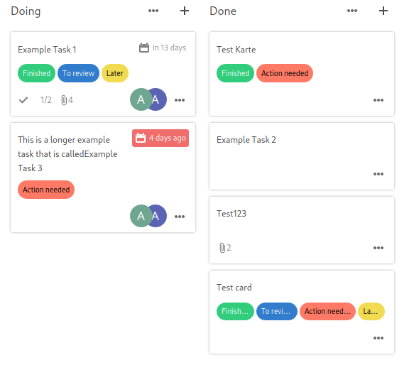
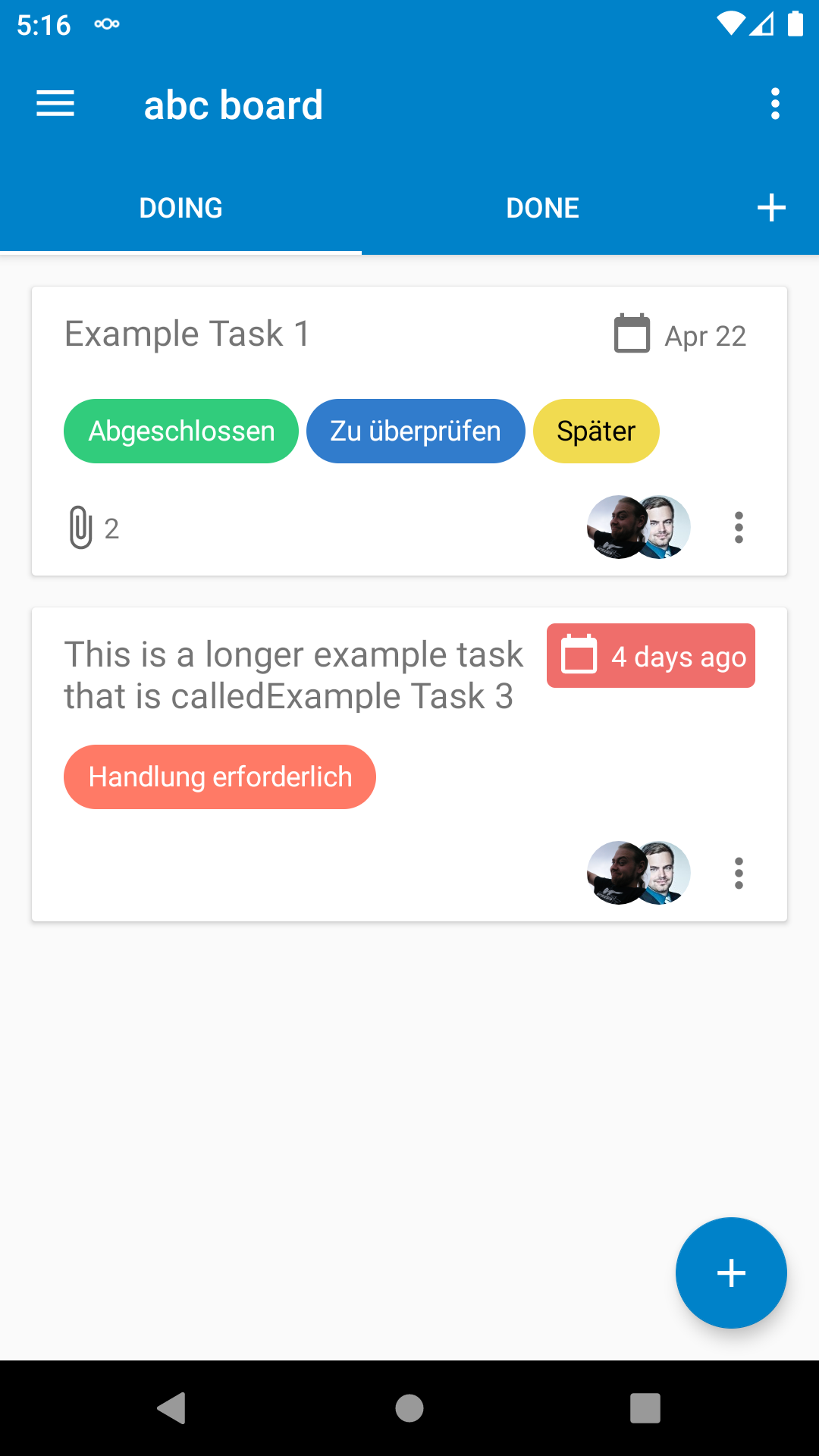
EDIT: everyone agrees that the card layout should be the same in web and app. Now, this thread is for discussing the new card layout which was created by deck developers in a hack week. It is already implemented in the app and is supposed to be rolled out to web. Some users are unhappy with the new layout.
Proposed new card layout (screenshot from android app 0.1.4)
Old card layout (screenshot from web 0.8.0)
ORIGINAL FIRST POST:
I propose to use the exact same card layout as in the web view (https://github.com/nextcloud/deck/), now and in the future.
Particular changes that are necessary:
Reasons
I heard that this is going to be discussed at the next hackweek, maybe the community can give some input/opinions here beforehand.
The text was updated successfully, but these errors were encountered: