Documentation: Dealing with HOCs #12576
Comments
|
Another way to fix the snippet without messing with our source code is to transform the snippet string using parameters/transformSource. For example this turn MUI |
|
Very elegant, keeping it out of the code. I'll start using that. Thanks @wztech0192 :) |
np, I really hope they can post something that describe all the properties of parameters somewhere. Right now I have to trace through their code to know that property exist... |
|
The transformSource solution breaks in production build due to uglify/minify... However, after some more headache I came up with a more robust fix by using a resolveDisplayName function. for each stories or globally |
Storybook did not show the argsTable for my HOC propTypesis there any other approach to do this apart from above approach? System: |
|
@wztech0192 Where does this params object need to go? Have tried adding it to Seems to be the wrong spot. |
Under .storybook/preview.js, we will do export const parameters =.... to set global parameters |
|
I have issue with export default forwardRef(Component)However, I've discovered that this one works: const Component = forwardRef((props: Props, ref: Ref) => /* implementation */)
export default Component(Setting |
|
In case you are wrapping your component with some properties (say, styles), you will need to import in your story the default component also. For example, in my component Avatar.jsx: In Avatar.stories.jsx: I have imported both the wrapped component (Default) and the original component (Avatar), because:
Result:
|

|
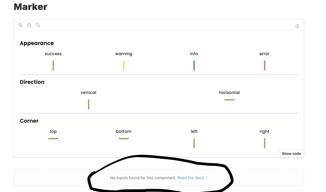
Closing this for now as this requires a bit more investigation on the integration. Later on, the documentation will be updated for CSS libraries and once it's worked on this issue will be factored in as well. Hope you all have a great week and thank you for raising the issue and your input. Stay safe |
|
The interesting thing is that Styleguidist is able to figure out the props with a HOC. For the exact same component, where the component is not even exported, just a single default export with the wrapped component. And they use the same module.exports = {
propsParser: (filePath) => {
return require("react-docgen-typescript")
.withCustomConfig("./tsconfig.json", {
shouldExtractLiteralValuesFromEnum: true,
})
.parse(filePath);
},
// ... other config
}
// styleguide.config.jsHere's the docs for that: https://react-styleguidist.js.org/docs/configuration/#propsparser Tried to do the same directly with @shilman Is there any Storybook limitation why it's not working? Is there any way I can help with this issue? Here's a quick codesandbox with a HOC wrapper and no named export and |
|
@JuhG responded in the other issue 👍 |
|
This is another workaround to avoid exporting twice: Original component code (where export const MyComponent = withDiv(({ ...props }) => {
// ...
return <>...</>;
});Workaround: export const MyComponent = (props) => <>{_MyComponent(props)}</>;
const _MyComponent = withDiv(({ ...props }) => {
// ...
return <>...</>;
});With this, I can see properly my component documentation and props documentation on Storybook 7.
|
Originally posted by @thclark in #4143 (comment)
[complaints redacted]
I've worked around the two aspects of this:
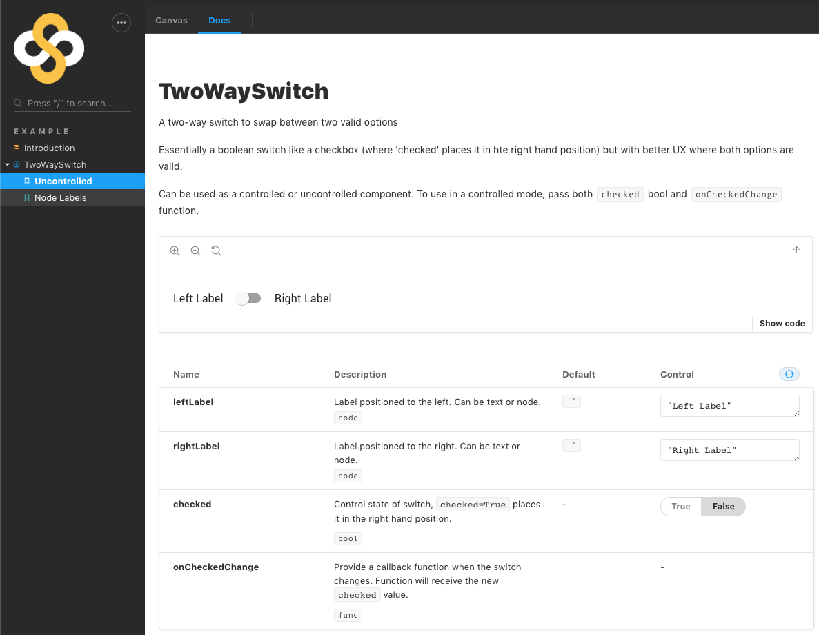
The workaround requires that the unwrapped component must also be exported, so I've adopted a pattern of exporting the unwrapped component as a named export, and the wrapped as the default component.
Here's a complete working example (for a custom MUI component), for which the use of the
react-controllablesHOC is causing this issue.TwoWaySwitch.jsx
TwoWaySwitch.stories.js
As per your normal story file, except:
End result
This produces documentation as expected:
The text was updated successfully, but these errors were encountered: