Documenting design systems: Support for tabs in component pages / more examples for layouts #1170
Comments
|
I guess we need to add a new page to the docs that would explain how to show non-component docs. It would be super awesome if you or someone else start that and send a pull request, that we can improve later. Here you can find an example of showing design tokens: colors, whitespace and typography: |
|
hey, is this issue available? I'd like to take it up |
|
@eragon512 yup, feel free to do it! Ping me if you have any questions ;-) |
|
@sapegin i am assuming from the links given that the new doc page should have 3 sections - colors, whitespace and typography. |
|
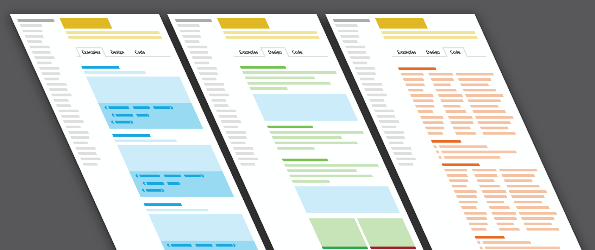
Adding design-only pages is quite easy with Markdown format. What I want usually want to do is to mix design documentation and examples and language/localization instructions with the components. Sometimes this can be done with just div classnames, but sometimes something like subtabs (see the design-examples-code tabs in the medium article) are needed. I guess i could do that with markdown + css+html tab structure, but that would make the markdown files cluttered. Not sure what optimal solution would be, maybe something like examples or way to add component.design.md, component.code.md and component.examples.md and have those appear in different tabs. https://cdn-images-1.medium.com/max/2000/1*eZe7ol-LrfMafNBaywOb8A.png |
|
@jkarttunen I would love to see something like this. It's exactly the issue we're facing at the moment. |
|
@jkarttunen regarding the code-design view mix, the Medium link @sapegin contains an interesting way of implementing it: having a Design/Code toggle to switch between the views Link: http://uniform.hudl.com/components/forms/checkbox/code/ |
|
Guys! Any news on that Issue? @jkarttunen / @sapegin or anyone already started? We plan to use styleguidist on our company and open to collaborating on that issue :) |
|
@petry Not just guys here. https://github.com/component-driven/react-design-tokens might be what you need. |
The problem
When using styleguidist for design system docs, not just as a component library, there is a lot of additional content that one want's to add to styleguidist. See article from Nathan Curtis here: https://medium.com/eightshapes-llc/documenting-components-9fe59b80c015
Styleguidist default templates are a bit tuned towards documenting component api and code examples. Eg. having props and methods first
In general I'd like to see a few more examples of themes for document page and for sidenav too. E.g. how to arrange stuff to tabs / paragraphs and prioritize.
I'm not sure if this needs actual new features, or just more examples.
The text was updated successfully, but these errors were encountered: