Inputs placeholder in Adaptive theme #5768
Comments
|
Input fields are basically special kinds of views and therefore share settings and source of colors. They support syntax highlighting (see regexp, ...) and therefore colors need to be taken from color scheme. That said, placeholders probably deserve a special global variable such as |
|
Hi deathaxe, Yes I know you guys have your reasons. Just my opinion, I have to write something on bug report template (required field). I think some settings on theme would make easier for both, theme and scheme. About Thanks for reply. |
|
An alternative way to control placeholder highlighting independently would be: A theme can specify dedicated color scheme for widgets and therefore control any highlighting aspect. The downside is those not being related with a user color scheme and thus wouldn't follow global highlighting in any way. Widget - <Theme Name>.sublime-settings {
"color_scheme": "Widget - <Theme Name>.hidden-color-scheme",
}Widget - <Theme Name>.hidden-color-scheme {
"name": "Widgets",
"variables":
{
},
"globals":
{
"rulers": "grey";
},
"rules":
[
]
} |
|
Hi deathaxe, Yes, Dark and Light themes placeholders do not change because has widgets. Even if no |
Description of the bug
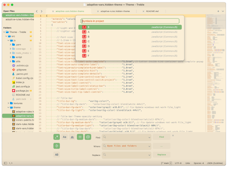
I am trying to complete my personal st theme/color scheme. And after finishing color scheme, I notice that on my adaptive theme, the input placeholder (Find in Files / Goto Symbol in Project / Select Color Scheme...) started getting a different color. It is happening on adaptive default too. On dark and light theme it does not happen, since I am using widgets and setting foreground color (no variables>rulers defined).
Screenshot Treble Adaptive
Screenshot Adaptive Default

Steps to reproduce
Expected behavior
I think it should be defined in theme. Imo it is hard having some parts you define in color scheme that is related to theme. Like this placeholder or console background, popup css...
Actual behavior
The input placeholder color on Adaptive is coming from color-scheme > variables > rulers. On Dark and Light theme it does not happen.
Sublime Text build number
4143
Operating system & version
macOS 11.6.8 or 12.6
(Linux) Desktop environment and/or window manager
No response
Additional information
No response
OpenGL context information
No response
The text was updated successfully, but these errors were encountered: