

This is a skateboard brand's website that I created from scratch; concept, design, and code.
(This is a fictional brand)
Monsquad-website
Practice responsive design & development
HTML, CSS, Javascript
- Quantity display button
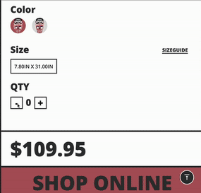
<div class="qtydetails">
  <h1>QTY</h1>
  <div class="qtynumbers">
    <input type="button" onclick='count("minus")' value="-" />
    <div id="result">0</div>
    <input type="button" onclick='count("plus")' value="+" />
  </div>
  <div class="stock"></div>
</div>

<div class="pricedetails">
  <h1>$109.95</h1>
</div>
function count(type) {
// display result value
const resultElement = document.querySelector("#result");
// current value
let number = resultElement.innerText;
// plus/minus
if (type === "plus") {
number = parseInt(number) + 1;
} else if (type === "minus") {
number = parseInt(number) - 1;
if (number < 0) {
return;
}
}
// updated result
resultElement.innerText = number;
const stockEl = document.querySelector(".stock");
const priceEl = document.querySelector(".pricedetails h1");
if (number >= 2) {
stockEl.innerHTML =
"<img src='/PRODUCTDETAILS/details_img/error.png'> Opps, Sorry! It is out of stock";
// stockEl.innerText = "out of stock"
priceEl.style.color = "red";
} else if (number > 0 && number < 2) {
stockEl.innerHTML =
"<img src='/PRODUCTDETAILS/details_img/check.png'> Available on Amazon";
priceEl.style.color = "#333"; //so that users can get an alert visually
} else if (number === 0) {
stockEl.innerHTML = "";
// return;
}
}- Unique left side menu bar with sliding animation and when users click the button, it transitions into a skull's finger
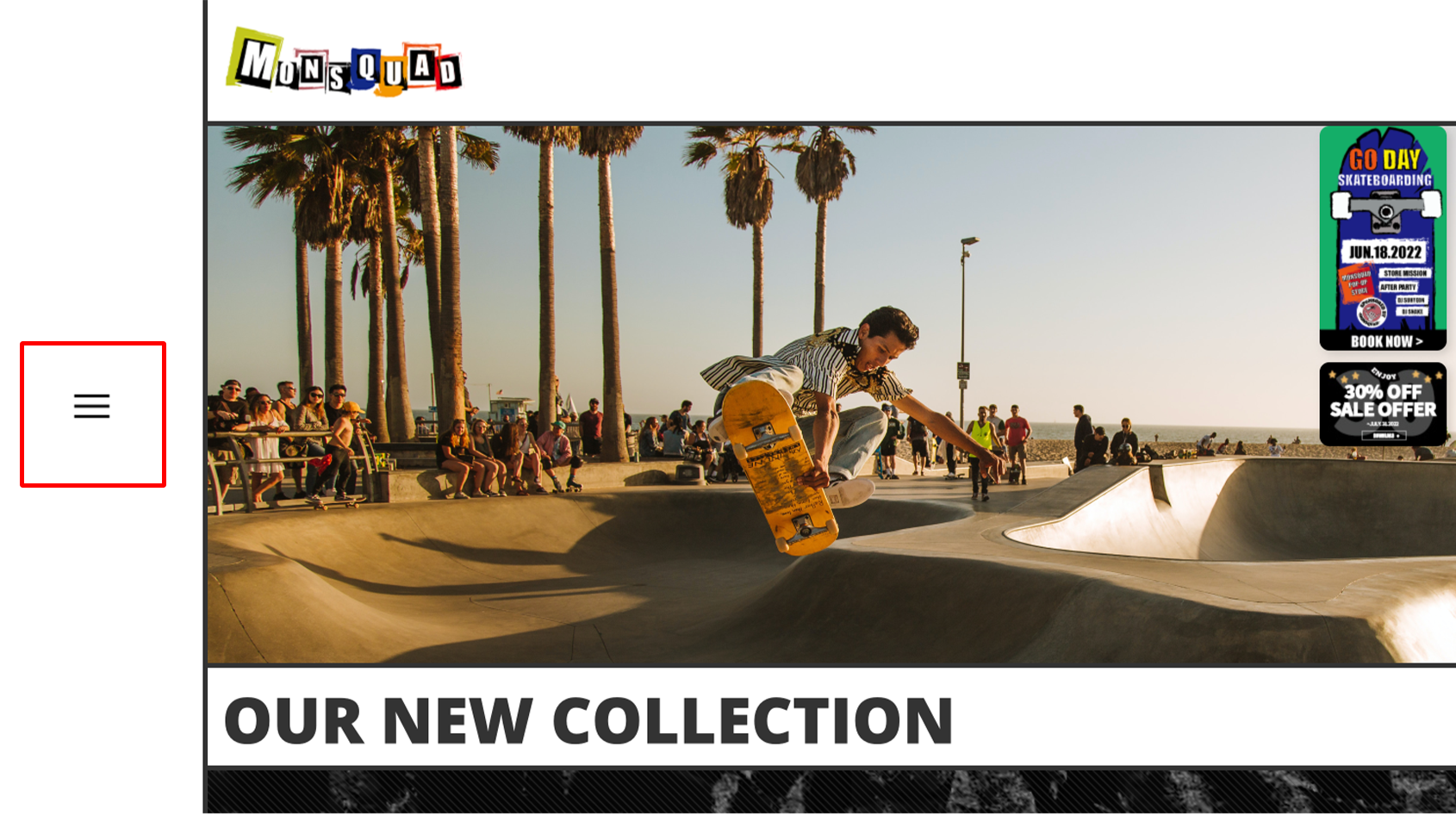

const menuIcon = document.querySelector("#menubtn");
const rightMenuBar = document.querySelector(".rightmenubar");

menuIcon.addEventListener("click", (e) => {
  if (rightMenuBar.classList.contains("active")) {
    //menu slide off
    rightMenuBar.classList.remove("active");
    document.getElementById("menubtn").src = "/menuicon.png";
    menuIcon.classList.add("btnreverse");
    menuIcon.classList.remove("btnrotate");
  } else {
    //menu slide on
    rightMenuBar.classList.add("active");
    document.getElementById("menubtn").src = "/menuicon2.png";
    menuIcon.classList.add("btnrotate");
    menuIcon.classList.remove("btnreverse");
  }
});- Using input's radio type, created the collection's menu with HTML and CSS only.
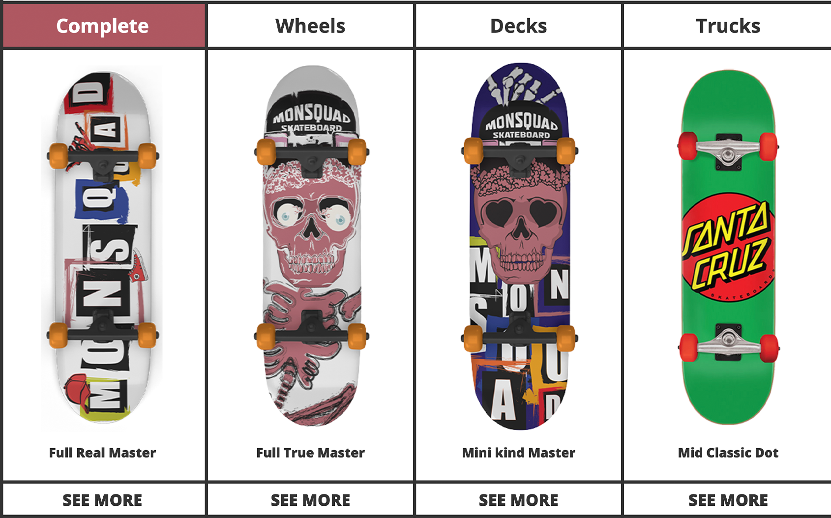

<input type="radio" id="tab-1" name="show" checked />
<input type="radio" id="tab-2" name="show" />
<input type="radio" id="tab-3" name="show" />
<input type="radio" id="tab-4" name="show" />

<div class="tab">
  <label for="tab-1">Complete</label>
  <label for="tab-2">Wheels</label>
  <label for="tab-3">Decks</label>
  <label for="tab-4">Trucks</label>
</div>.collecmenu input[type="radio"] {
display: none;
}
#tab-1:checked ~ .tab label:nth-child(1),
#tab-2:checked ~ .tab label:nth-child(2),
#tab-3:checked ~ .tab label:nth-child(3),
#tab-4:checked ~ .tab label:nth-child(4) {
background-color: #ae5761;
box-shadow: none;
color: #fff;
}
.content > div {
display: none;
}
#tab-1:checked ~ .content div:nth-child(1),
#tab-2:checked ~ .content div:nth-child(2),
#tab-3:checked ~ .content div:nth-child(3),
#tab-4:checked ~ .content div:nth-child(4) {
display: block;
}
#tab-2:checked ~ .content div:nth-child(2),
#tab-3:checked ~ .content div:nth-child(3),
#tab-4:checked ~ .content div:nth-child(4) {
border-bottom: 5px solid #333;
min-height: 200px;
margin-left: 0;
margin-right: 0;
}This project took me around a month of planning, designing, and implementing the branding. This included designing the logo, deciding on the color palette, character design, all for a target audience of teenage-aged boys.
I always wanted to make new a branded website that is responsive so I'm happy with the results of my first responsive branded project. It was really tricky to set all the different sizes that devices require.
I will do further research the next time I make a responsive site, including about the various devices and focusing on their different viewports.
10.02.2022) These days I have been working on my own portfolio website so I have checked my old code and readme files. I realized that there's some smelly code that I don't understand why I used it and missed some bugs that I was supposed to reset the value... whenever I have some time I better keep refactoring.