Visual Distinction between Preview Connector types #3201
Comments
 sjcox-rh
added
cat/design
sjcox-rh
added
cat/design
 pure-bot
bot
added
the
notif/triage
pure-bot
bot
added
the
notif/triage
 dongniwang
added
group/uxd
dongniwang
added
group/uxd
|
Wanted to find out if the indicator would show up only for connector cards or for both connector and connection cards? |
|
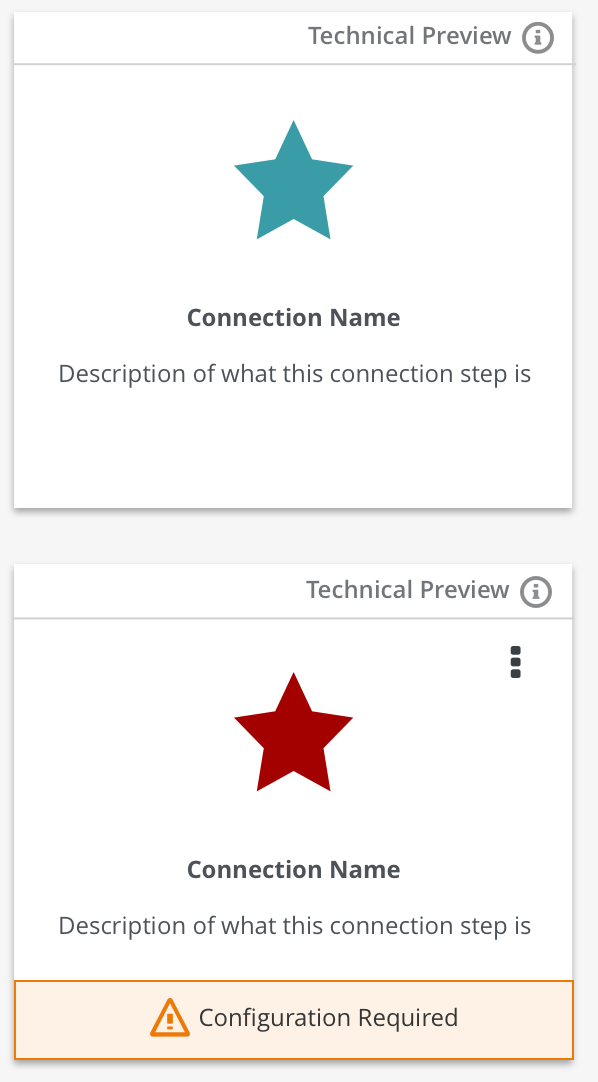
@dongniwang and I discussed the best approach for this as well as asked for suggestions from another visual designer. We ultimately decided on the visual treatment below:
The top image is an example of how the connector card would appear in the connection creation workflow. The bottom card shows an example of a connection card (connection list view). Please note that not every connection card view will show a kabob menu or the config required notice. We just wanted to provide an example of what it would look like with all variations. This approach is subtle enough to not distract the user from their flow, but informs the user that it's a preview connector. The info icon would trigger a popover that would briefly explain what a preview connector is and how it's different from the rest. @TovaCohen Is this something you can help with? @kcbabo @gashcrumb @paoloantinori @zregvart @heiko-braun @valdar @avano Please review and let us know if you have any feedback! FYI: @amysueg @michael-coker @seanforyou23 |
|
SHIP. IT. |
|
+1 |
1 similar comment
|
+1 |
|
@gashcrumb Can you pair with @zregvart for the implementation? |
 heiko-braun
removed
the
notif/triage
heiko-braun
removed
the
notif/triage
|
Of course! @zregvart maybe we can just add a metatdata item to the connector if it supports metadata. If not maybe we should sort that :-) |
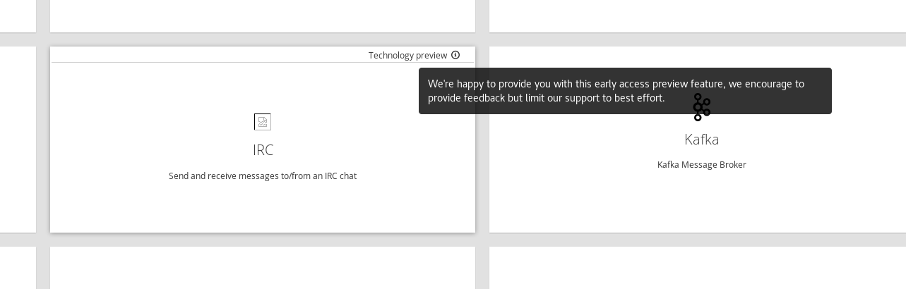
Adds a new tag `tech-preview` that can be added to connectors that are
provided for early access technology preview.

First such Connector is the IRC Connector.

Visually when Connection is displayed the top of the Connection card
will contain `Technology preview` text, which is also displayed during
connection creation.

Fixes syndesisio#3201
|
Customer Content Services has boilerplate text for describing Technology Preview features. Based on that: Replace "Technical Preview" with "Technology Preview". This is the standard Red Hat term. For the popover, depending on whether you want to be more cautious or more encouraging: Cautious Option 1: Technology Preview features are not supported with Red Hat production service-level agreements and might not be functionally complete. Red Hat does not recommend them for production. Encouraging Option 2: Technology Preview features provide early access to features that are not supported. Whichever option you choose, the first two words, "Technology Preview" should be a link to more information here: |
|
Here's the PF popover pattern https://www.patternfly.org/pattern-library/widgets/#popover If we can link to more information via "Technology Preview", then my vote is the encouraging option 2. |
Adds a new tag `tech-preview` that can be added to connectors that are
provided for early access technology preview.

First such Connector is the IRC Connector.

Visually when Connection is displayed the top of the Connection card
will contain `Technology preview` text, which is also displayed during
connection creation.

Fixes syndesisio#3201
|
@TovaCohen currently we have: @dongniwang I opted to work with the tooltips we already have, it looks like this: Does that work? |
|
@zregvart - The issue with using tooltip is that we can't have links in tooltips and tooltips only appear on hover. I agreed with Tova that having the link to that page is a good idea since it provides a comprehensive explanation. In terms of wording, I would recommend following suggestions provided by @TovaCohen. Also, is there a reason why we're using lowercase p? I can't tell what color we're using for the word and the icon, but please make sure they're using pf-black-600 #72767b (see https://www.patternfly.org/styles/color-palette/) since we want that line to be less intrusive to the users. Maybe @michael-coker could help with this? |
|
I think that the link to the details is a requirement. The user needs to be able to easily learn that Technology Preview features do not have support, are not recommended for production, could change in the future, and might not be completely documented. Please make sure that both Technology and Preview always have an initial cap. How do you want users to provide the feedback? Open a support request? Click Help > Contact Us? Send an email to fuse-online-evaluation@redhat.com? Assuming that the first two words in the text is a link to the URL in my previous comment, for the text in the UI popover, how about: Technology Previews provide early access to features that are not yet supported. Feedback about these features is welcome. Send a message to fuse-online-evaluation@redhat.com. |
|
@TovaCohen not sure about it being a link I think if you interact with the tooltip as it is now it will dismiss the tooltip, let me try. |
|
@zregvart - can we change tooltip to popover? I believe you can have links in popover. https://www.patternfly.org/pattern-library/widgets/#popover cc: @michael-coker |
|
@dongniwang that popover impl isn't applicable here, it uses jquery. @zregvart we'd want to use the ngx-bootstrap implementation -> https://valor-software.com/ngx-bootstrap/#/popover should be a matter of replacing |
|
I was checking the implementation on staging site and noticed we didn't link the first two words to https://access.redhat.com/support/offerings/techpreview. Please link the two words to the above link. cc: @michael-coker
|

This is a...
The problem
There are essentially two types of connectors:
Full Support connectors
Preview connectors
Need to visually differentiate the two groups. Preview connectors would be labeled "Preview"
Expected behavior
Preview connectors would be indicated as being a "Preview". Determine best visual indicator.
Screenshot
Request and Response Data
API Endpoints and Schemas
Tasks involved / Steps to Reproduce
The text was updated successfully, but these errors were encountered: