An angular directive to implement a css blurred effec over an image. Fluid, responsive, and pluggable.
http://szhangpitt.github.io/blurred-effect/
Use directive 'fuzzy-fluid', and use ptop(or pbottom), pleft, pwidth, and pheight. Values are float number 0 - 1, relative to image width or height. pheight can have the trailing * or + , where * means the height of the content panel will auto size itself, but will not go over designated ratio of image height. '+' means the panel will never go under designated ratio of image height, but can size up if there is more content.
Current implementation does not prevent overflow of the content in .fuzzy-panel-content outside of the wrapper. This is in case you need this flow from design perspective. But changes can be made based on feedback.
The wrapper size will always equal to the image size. The overflowed content will not push content in HTML.
A half-transparent content panel over an image is just ugly (visual noice, color conflict, etc.) And as a photograph hobbyist I'm always a fan of creamy bokeh.
0 - Generate a blurred version of your original image. You want to use Guassian blur for the best effect.
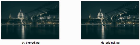
Note the  <img>s with blurred verion first and then original version.
You can use any content inside <div class="fuzzy-panel-content"></div>
<div class="fuzzy-wrapper" fuzzy-fluid ptop="0.5" pleft="0.3" pwidth="0.7" pheight="0.4*"><!-- -->
<div class="fuzzy-images">
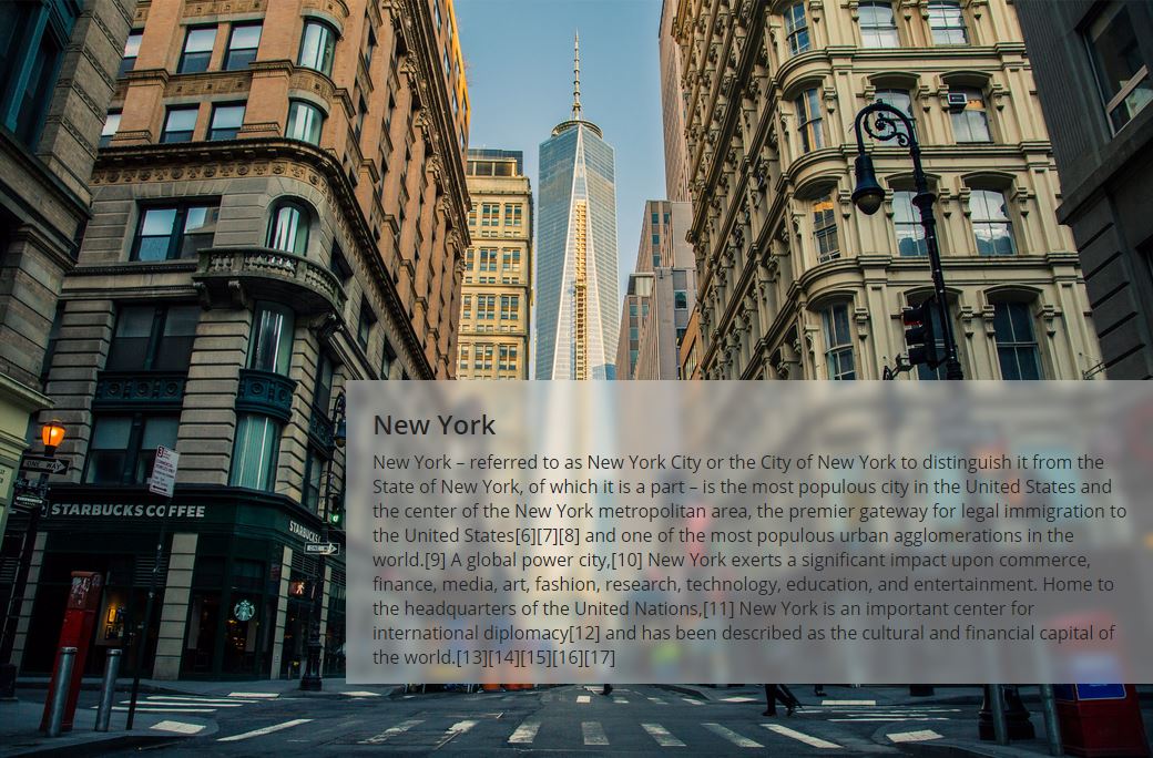
<img class="fuzzy-blurred" src="/assets/images/nyc_blurred.jpg" alt="unsplash.com/license">
<img class="fuzzy-original" src="/assets/images/nyc_original.jpg" alt="unsplash.com/license">
</div>
<div class="fuzzy-panel" >
<div class="fuzzy-panel-content">
<h3>New York</h3>
<p>New York – referred to as New York City or the City of New York...</p>
</div>
</div>
</div>.fuzzy-wrapper {
position: relative;
font-size: 1em;
color: #222; }
.fuzzy-wrapper .fuzzy-images {
font-size: 1em;
position: relative; }
.fuzzy-wrapper .fuzzy-images img {
width: 100%; }
.fuzzy-wrapper .fuzzy-images .fuzzy-blurred {
font-size: 1em;
position: absolute;
top: 0;
left: 0;
right: 0;
bottom: 0; }
.fuzzy-wrapper .fuzzy-images .fuzzy-original {
font-size: 1em; }
.fuzzy-wrapper .fuzzy-panel {
font-size: 1em;
position: absolute;
overflow: hidden;
background: rgba(255, 255, 255, 0.4); }
.fuzzy-wrapper .fuzzy-panel .fuzzy-panel-content {
font-size: 1em;
padding: 0.5em 1.5em; }angular.module('blurdemo', ['shaopeng.blur'])
......
N - Use fuzzy directive with ftop, fleft, fwidth and fheight if you want fixed pixel based positioning.
<div class="fuzzy-wrapper" fuzzy ftop="130" fleft="120" fwidth="300" fheight="400" >
	<div class="fuzzy-images">
		<img class="fuzzy-blurred" src="/assets/images/sf_blurred.jpg" alt="unsplash.com/license">
		<img class="fuzzy-original" src="/assets/images/sf_original.jpg" alt="unsplash.com/license">
	</div>
	<div class="fuzzy-panel" >
		<div class="fuzzy-panel-content">
			<h3>San Francisco</h3>
			<p>San Francisco Listeni/sæn frənˈsɪskoʊ/, officially ...</p>
		</div>
	</div>
</div>