Getting SSR dark mode, ThemeProvider, and Storybook to work together.
👉 site with ssr "dark mode" (color mode) here: https://gatsby-starter-ssr-dark-mode-storybook.vercel.app/
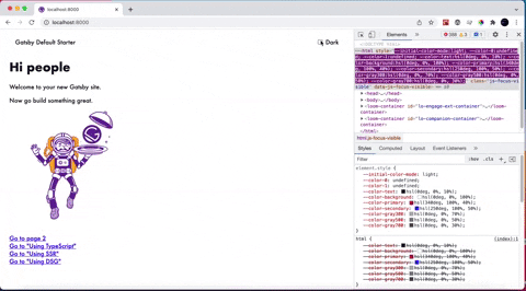
👉 storybook using site's ThemeProvider here (illustrates the defect): https://sb-gatsby-starter-ssr-dark-mode-storybook.vercel.app/?path=/story/components-testcomponent--test-component
-
fork this repo and clone a local copy
-
install dependencies using package manager of your choice
yarn

// or

npm install
- Run Gatsby:
yarn start
- Run Storybook:
yarn storybook
Josh Comeau's Gatsby SSR color-mode implementation lets us use CSS variables to implement theming and inject those variables into the <head> at compile time. Is it possible to achieve the same thing in Storybook? E.g.:
• When Gatsby SSR generates HTML at compile-time, inject a <script> tag before all of our content (which in the case of Storybook, I assume would be Storybook Preview, which is the place components related to stories are rendered. You can read about how this works here.
• In that script tag, work out what the user's color preferences are
• Update the CSS variables using JavaScript
In Storybook, we want to import our ThemeProvider component in preview.js; we want to pass our colorMode value into the Storybook iFrame and access SSR-generated CSS variables that have been injected into the <head> at compile time.
Our CSS variables are stored in constants.js. We want to inject those into the <head> of the Storybook instance so that our <ThemeProvider> component can access them, based on the colorMode passed into the <ThemeProvider> each story is wrapped in.
It's possible to take a styled-system-like approach, by making our <ThemeProvider> accept a theme object that we can import as a CommonJS module using @preval. We can pass that theme object in to Storybook stories or anywhere else. That all involves a bunch of extra stuff like existential getter functions that look up styles in dot-delimited objects, based on the theme.
That's fine, but it would be nice to get to take advantage of CSS variables instead.
Like this:
Nothing, really. We're using our <ThemeProvider> component in preview.js, but right now, its logic is almost entirely focused on doing all its work on the server.

Note that the "correct" theme value is being passed into the iFrame'd <Story>, but nothing is happening, as expected, because the iFrame has no notion of the contextValue that the <ThemeProvider> creates in gatsby-ssr.js.
Seems like there's ongoing discussion on this here.