Just for fun.
Steps component inspired by Jean Verster's Chakra UI Steps with all Chakra dependencies, Chakra components, and Chakra-dependent logic removed.
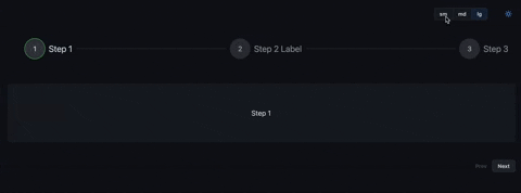
For visual design, I applied Github Primer but any design system could be used to apply to this interaction pattern.
- Multiple orientations
- Render step content
- Custom icons
- Size variants
Yarn:
yarn add @primer-steps/primer-stepsNPM:
npm i @primer-steps/primer-stepsIn order to get started, import the Primer React ThemeProvider:
import { ThemeProvider } from "@primer/react";

const theme = extendTheme({
  components: {
    Steps,
  },
});

export const App = () => {
  return (
    <ThemeProvider>
      <YourApp />
    </ThemeProvider>
  );
};import { Step, Steps, useSteps } from "primer-steps";
const content = (
<Box sx={{ display: "flex" }} py={4}>
<LoremIpsum p={1} />
</Box>
);
const steps = [
{ label: "Step 1", content },
{ label: "Step 2", content },
{ label: "Step 3", content },
];
export const StepsExample = () => {
const { nextStep, prevStep, setStep, reset, activeStep } = useSteps({
initialStep: 0,
});
return (
<Box display="flex" flexDirection="column" width="100%">
<Steps activeStep={activeStep}>
{steps.map(({ label, content }) => (
<Step label={label} key={label}>
{content}
</Step>
))}
</Steps>
{activeStep === steps.length ? (
<Box p={4}>
<Button mx="auto" size="sm" onClick={reset}>
Reset
</Button>
</Box>
) : (
<Box width="100%" justify="flex-end">
<Button
isDisabled={activeStep === 0}
mr={4}
onClick={prevStep}
size="small"
variant="invisible"
>
Prev
</Button>
<Button size="sm" onClick={nextStep}>
{activeStep === steps.length - 1 ? "Finish" : "Next"}
</Button>
</Box>
)}
</Box>
);
};Note: Both the
StepandStepscomponent extend the PrimerBoxcomponent so they accept all the default styling props.
| Prop | Type | Required | Description | Default |
|---|---|---|---|---|
activeStep |
number | yes | Currently active step | 0 |
orientation |
string | no | Sets the orientation of the Steps component | horizontal |
responsive |
boolean | no | Sets whether the component auto switches to vertical orientation on mobile | true |
checkIcon |
React.ComponentType | no | Allows you to provide a custom check icon | undefined |
onClickStep |
() => void | no | If defined, allows you to click on the step icons | undefined |
labelOrientation |
string | no | Switch between horizontal and vertical label orientation | undefined |
state |
'loading' | 'error' | no | Let's you set the state to error or loading | undefined |
| Prop | Type | Required | Description | Default |
|---|---|---|---|---|
label |
string | no | Sets the title of the step | '' |
description |
string | no | Provides extra info about the step | '' |
icon |
React.ComponentType | no | Custom icon to overwrite the default numerical indicator of the step | undefined |
isCompletedStep |
boolean | no | Individually control each step state, defaults to active step | undefined |
isKeepError |
boolean | no | Individually control if each step should keep showing the error state | undefined |
checkIcon |
React.ComponentType | no | Allows you to provide a custom check icon that will override the one provided to Steps | undefined |
state |
'loading' | 'error' | no | Lets you set the state in a specific Step, if defined it will override the one provided to Steps | undefined |