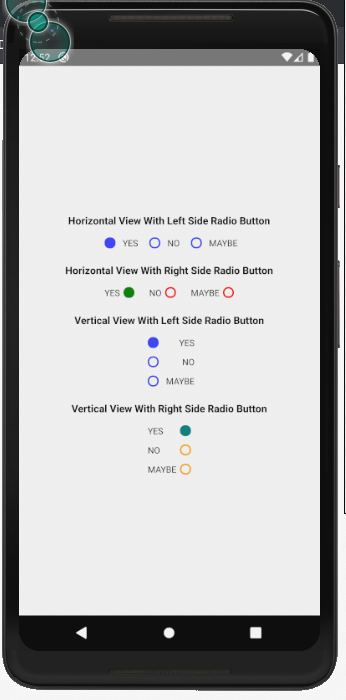
One can customize the radio buttons using custom color, button styles, orientation or button positions. The developer has full control to customize all the properties of the radio buttons.
npm i rn-customizable-radio-button
import { RadioButton } from 'rn-customizable-radio-button';
<RadioButton selectedIndex={selectedIndex} onPress={(item, index) => { setSelectedIndex(index); }} items={itemList} orientation={'center-horizontal'} textStyle={styles.textStyleRadio} />
| Prop | Type | default | Required | Note |
|---|---|---|---|---|
| items | Array | NA | Required | The Array of the items or check checklist with key-value pair |
| selectedIndex | String | Empty String | Required | The key of the selected item |
| onPress | Function | NA | Required | Function Called onpress of the radio button |
| orientation | String | center-horizontal | Optional | Orientation of the Radio Button View, can be set to vertical or center-horizontal |
| buttonPosition | String | left | Optional | Position of the radio button with respect to the text, can be set to right or left |
| selectedButtonStyle | Object | NA | Optional | styles for the selected radio button |
| buttonStyle | Object | NA | Optional | styles for all radio buttonsof the array |
| textStyle | Object | NA | Optional | styles for radio button label |
| style | Object | NA | Optional | pass the style object |
| containerStyle | Object | NA | Optional | styles for radio containers |
| errorMessage | String | NA | Optional | Pass the error Message you want to show |
| errorTextStyle | Object | NA | Optional | Pass the style object for the error Message |