Reducing the orange - making orange more elegant #289
Comments
|
Other sidebars are orange too - Settings, Tweaks, file chooser. |
|
Yes, sorry. I meant sidebars but used the example for nautilus-sidebars. You are right. All sidebars use orange highlights. For consistency: Shouldn't they behave more like pressed buttons? |
|
I'm not a designer, but (IMVHO) no they should not look like buttons. To me they're like elements from a list, where one is selected - and selected list items have an orange background. |
|
I know that this is the number one criticism when people try the theme. We discussed this earlier and tried a few things but landed on this pure orange. I'll leave it up to the other guys whether this issue should be closed or needs further discussion. IMHO this is a won't fix |
|
Most themes, including adwaita which is the base for this theme, don't theme the sidebar as selected toggle buttons. I would also encourage everyone to not start an issue for every bit that comes into their mind. There is already a lot of stuff to fix. Let the designers do the design and let us try to fix the issues or report actual issues. This would be just my suggestion since we all want to stay on the road, don't we? Closing this now. |
|
Sidebars when clicked -> get orange |
|
I never said it should be themed like a button. Only the colours should behave like one. |
|
At least we should try to understand each other. It is not fair to react like this when people try to help. This is a question of consistency. Similar elements react different. |
|
@madsrh @clobrano feel free to re-open this |
@nusinusi I think there's a little misunderstanding on orange in nautilus' sidebar. The list item in sidebar is not just pressed, like a button, is also selected. You can see that once pressed even buttons get a orange highlight, so I don't see a problem of consistency here. In the picture you posted of a contextual menu, the label is hovered, not clicked, nor selected. |
|
Can we reopen this? |
|
Reopened because of the recent discussion in |
|
Is it okay, when we discuss all "reducing orange"-stuff here? We could open concrete tickets after a decision?
And yes... there are places we could still add orange. EDIT: By the way this is 1px thickness. |

|
@nusinusi First of all - wrong project :-) that screenshot belongs to https://github.com/ubuntu/gnome-shell-communitheme . Second - Single is too thin, perhaps a 2px thick line? (I think it's something like 3px at the moment) Also, there is not that much orange. I get it you don't like orange, but it is part of the colour scheme. |
|
@CDrummond I asked in my post if it is okay to discuss all that stuff here. Or else we would have to open a ticket for every element we want to reduce, rethink or refine orange. @clobrano should we open a new ticket for this? It all belongs to one topic "reducing orange or make it more elegant/mature". And sorry but this is simply not fair:
Why are you saying that? So any discussion is not necessary? We should discuss how we make the use of orange more elegant. I do not understand why you make it so personal. I told the reasons in my post and not that i don't like it. Tell me reasons why it should be kept how it is. That is the way we discuss this. With arguments. |
|
I actually thought that the orange highlights are OK, but (too) many orange folder icons are too much orange. 🍊🍊🍊🍊🍊🍊🍊🍊🍊🍊😜 Isn't there a chance to change the folder icon color (instead of reducing orange highlights of the theme)? |
|
I absolutely love the Suru folder icons including the orange. Let's first see how the incoming nautilus selection will feel when seeing it "live" and then move on and see if there is any other orange that reaaally needs to be changed. Personally, I feel that this whole discussion went somehow out of place :) |
|
I think nearly every clickable element gets grey(er) when hover. Only in gnome-shell the windows get an orange hover. I made a mockup to show another possible solution: |


|
@nusinusi sorry - no offence intended. Almost all styles use the highlight colour in the sidebars, as they highlight an item in a list. So, its consistent for Communitheme to use this. You take things too personally. My opionion is no more, or less, valid than yours. Sorry if I got the wrong impression - but you do seem to be trying to reduce the amount of orange. Hence my (incorrectly it seems) assuming you did not like this colour. |
|
@CDrummond I really think we should reduce the amount of orange. But at the same time i accept (now) that it is part of the color-scheme. IMHO orange can be more attractive when we use it more minimalistic. Giving the theme orange accents rather than orange blocks. At the moment the communitheme seems to have at most part the following rules:
Should this be followed for the whole theme? That means for gnome-shell too (see my mockup in last post.) What do you think? The close-button is at least for me a serious problem. Maybe it is because i wear glasses but after a time it looks like the x is moving more to the left side of the orange cirlce. When i turn my head from left to right and back the x is moving inside the circle from left to right too. When working at night the orange dot really bothers me because it takes to much attention in my field of vision. So reducing the orange here is not a matter of taste. It's about usability. What do you think about this? |

|
Some thoughts on reducing orange: Orange really isn't the an easy color for UI design, but this is part of the palette that we've been dealt.
Sure, but 1px might be too thin though.
Yes, the orange is too much here. Wasn't there already an issue regarding this? 🤔
Like the sidebar, we again already spend a lot of time discussing the window controls and landed on the orange close button. I think I personally have a foot in each camp (both for and against).
Doesn't it already do this???
As @clobrano already mentioned this is the plan. @Luxamman also had some other changes to the shell design pending, but he is currently busy out in the real world 🌎 One of the few requirements that the theme has to meet, is that it is easily recognisable. By looking at a random screenshot for one second, a linux user should be able to tell that this is Ubuntu! I have a suggestion for reduced orange myself - the selected text color. @godlyranchdressing already suggested this a few months ago, but I guess I missed that 😳 Sorry! Taken from Unity8 design here, right? Also the dropdown (font, size,...) in Libreoffice is orange but gray in widget-factory. I'm guessing that's a bug? One final thing, is the Calendar. IMO we should (as mentioned)never use the lower opacity orange, so I would suggest: Solid orange border for selected and gray background for the current day.
@clobrano @godlyranchdressing and others, let us know if you feel that issues should be opened for any of these. |


|
I feel that is whole topic is getting out of control and I hope that we do not end up having just another generic "elegant" theme. Like @madsrh said this should be the ubuntu theme and everyone should know that it is ubuntu. There are a lot of ideas and I think that is great, but it is quiet hard to filter when the design process is allready finnished long ago. Also, does commuitheme have really MORE orange than adwaita has blue? I don't think so. Anyways... I'll check for reducing the orange selection width in shell and make some screenshots. Is there allready an issue in shell repo for this? |
|
I still don't want to create an issue for this until the nautilus sidebar change is live. Maybe this whole topic will calm down a bit then. On the overview: Let's keep in mind that what the user does in this overview - he wants to SELECT a window - hence he needs to know which window is SELECTED. He does not hang around in this overview for more than 10 secs getting depressed about orange. Some screenshots of variations of the overview selection to get an impression in which direction we could go, if we really need to.... A) 1px border B) 4px border C) Transparent orange border D) Same thickness as "live" but with $ash border |


On doubt, please write on the Forum. I am not interested in reducing orange more than we already did. The only place where I feel too much of it is maybe Nautilus, because of the folders, but Suru Icons are out of our control. What if someone changes just the icon set and keep communitheme?
I agree. I'd like to try the new mockup, because it looks nice, not because it reduces the orange.
I wear glasses too.
There was an action to change from grey to orange and that's what we did :D @nusinusi, this is similar as sidebar's items. Selection and hover are not mutually exclusive. In activities you both hover and select at the same time. So, to me it's OK to keep the color, and also agree that the border might be too thick. I like the first mockup by @Feichtmeier, but I should try it on the real thing and double check if it isn't too thin. @Feichtmeier if you like, please open a PR.
Correct, this is the ticket. It does not mention directly the entries, but it's the same thing.
Totally forgot that, you're right, I think we should make an exception to the rule of selection color here. Do you mind open a bug for this? Finally, I agree with @madsrh and @Feichtmeier, "reducing orange" is not a topic for me. |
Yes, another solution would be some kind of glow. This way it would be thicker and at the same time lose the somehow blocky look. I am +1 for making them thinner. 1px or more.
Yes, i was saying it in the context of changing the highlight-color to gray. I wanted to avoid a misunderstanding i could mean the close-button too.
Hm... I am not sure about this. In activities i hover when mouse-over. When i select it i click on it and then the window gets in focus. When you go to the right the selected desktop has an orange frame. Here it is logic because it is selected. When i select another desktop by clicking on it then it gets the orange frame instead.
A little google-research showed me that it could be a little optical illusion. When you look a the x in the close-button and move your head to the left and to the right, the x will move too inside the orange circle. You do not have this in Ambiance. I think because the x is black and the orange is darker? Another reason for removing the orange button (or make it more subtle) is that it seems like a very strong distraction. It "screams" for attention. The reason for this could be the white x which make the close-button somehow "shine" much more. Especially when working late the "shiny" orange dot on the right corner is too big of a distraction. I recommend to make it only orange on mouse-over/hover. This is the only situation when it need my attention but not when i am writing a text. This way we could keep the look of it and a complete redesign would not be necessary? At the same time we would avoid two orange dots next to each other in gnome-shell: IMHO this looks much cleaner: @Feichtmeier Thank you for your mockups. IMHO version D is consistency- and usability-wise the best solution. Version C would be my next choice but IMHO it would be a design-choice because it would break consistency. |


|
Imho grey just does not make sense. Grey means something not so important for me. It is the workspace overview - this is what you do here:
So this is really all more important than hovering above toggle buttons - which are grey when hovered. |
|
|

|
Sorry, but What do you mean by "subtly changed"? |
|
@jim3872 The folder icons actually consist of two orange shades. One in the back is (almost) excatly the orange of the rest of the UI and the brighter orange makes this folder look a bit more "3D". So no need to change anything, especially since we discussed another change incoming soon -> the orange box will eventually become an orange border, which you can see when you scroll up :) Edit: oh my fault it's in a different issue :| It's somewhere believe me! Maybe even on the forum |
|
@clobrano as in a 'fine' shade change. As described in the points raised above the ubuntu orange is monochromatic so choosing a more subtle shade/tint is doable. I don't think the folder icons are in the palette so we can forget that. But how about EB6536 (90%) over E95420 (100%) Throwing this out there but how about light shades of Aubergine
The theme is looking very good overall so apologies if this comes across as nitpicking/pedantic/irritating @Feichtmeier Will keep an eye out for for the orange box thanks |


|
@jim3872 This is what is going to come: |
|
OK ill shut up then because that looks excellent :) |
|
@nusinusi, I can't find the thread that mockup was posted in. Is that for all sidebars or just Nautilus? |
|
@godlyranchdressing #184 for consistency on all sidebars. Thank you |
|
+1 for changing it everywhere if we change it |
|
The state so far So lots of refinements have landed in the theme and i want to give you a little summary of the use of orange in the communitheme. As already stated orange is a very attention-graby color. Now the theme uses orange most times to underline something "selected" or "active" (am i using the right term?):
All (selected) fields (entryfields) where the user can enter something are using orange border (please note: without glow!):
4.(Re)naming Files on gtk (imagine without glow - going to update the screenshots) The shell uses orange for a "selected" desktop too: So these are the places / items that use orange lines / underlines / or borders (without glow) to show the user something is selected or active. Reasons to keep this: Another way the theme uses orange is by using it as some kind of little warning: The selection of elements in nautilus uses a different kind of orange selection. Instead of lines/underlines/borders an orange background is used. This is at least a striking use of orange: As a office-user the system looks like this at the moment: EDIT: I have still some ideas where to add orange. I can share my ideas later if you wish. |


|
@nusinusi Nicely summed up. |
+1 👍 I've thought about the underline in #4 before and forgot about it again, but IMO this isn't perfect. Why not use a dot like the dock or if it has to be a line, why is it so short? There's also the app-in-a-box design that uses a semi-transparent background behind the running application, but that might not fit with the rest of our design. BTW I also think the ALT+TAB (app-switching) should be added to the todo list. I was pretty confident that we made a good decision with the new close button in the window controls - at least using the OS feels very Ubuntu to me - but looking at @nusinusi's office-user screenshot above, has got me a bit concerned about the lack/feeling of branding (again) 🤔I don't want to sidetrack the conversation here, just sharing my thoughts ;) |
|
@madsrh well, I would call LO look almost "a mess" at the moment. I believe you can only fix it by heavily app-theming, which we don't want to do. Also, since ubuntu switched to GNOME LO uses that GNOME icons, previously they used the libreoffice-style-human. I tried some stuff with the alt tab switcher. A 2 px border with medium_radius, but the problem is that the text labels beneath the icons get cuted by the border :| I can try some more versions later after "Feierabend" |

|
@madsrh about ALT-Tab switching: should i open a ticket? I can understand that you worry about the branding but the orange is still very noticeable in the theme. When you do nothing you have a lot of orange in the wallpaper and when you interact with the UI orange dots and lines appear everywhere. Orange is just too intrusive. Nr. 4 (the underline in gnome-shell): do you want to open a ticket? Already an idea for it? I am open for both ideas: making it a dot like in the dock or making the underline longer. Even an 2px border like @Feichtmeier proposed could look ok. From me always +1 when orange gets used in lines and dots 👍 The close-button: i love it that we changed it and i fear you want to change it back. What do you think about an orange x (on hover)? |

|
Or just a stripe |


|
The notifications have an icon which is difficult to recognize on first sight because of the bad contrast. The color gray is used for the icons. I am going to open a ticket for it to ask increase the visibility. Making it orange increases visibility strongly: I already suggested this and you did not like it but it seemed you only gave attention to my first mockup with the orange circle. EDIT: ticket for increasing visibility + mockup (without asking for orange): ubuntu/gnome-shell-communitheme#121 |


|
I believe we reduced the orange enough now =P |
|
Yeah we reduced enough. And it looks beautiful. And now: I hoped we could talk about where we could make tiny orange refinements: see my last post about the icons in notifications. If this is for you and the other a no-go-zone we can close this here and reopen if necessary. |


|
Nono, just for organisation purpose. And my comment was actually a late commit/compliment on the truth of your complaints. Hope you didn't understand this wrong! |
|
Sorry for being so penetrative 😄 I think this "ticket" is a very good example of how much thought is put into this theme. Every tiny element of the theme is being discussed and put thought on. The theme is not just a product of combined tastes but a theme that looks good and can be used for productive working without annoying the user. Not sure if this was ever done for a linux-theme. |
Do not worry. I am not really asking for a different highlight-color. But the orange could be reduced. The theme is taking a very classy, clean and mature direction. But this is how the theme can look too:


I think it is too much of one color.
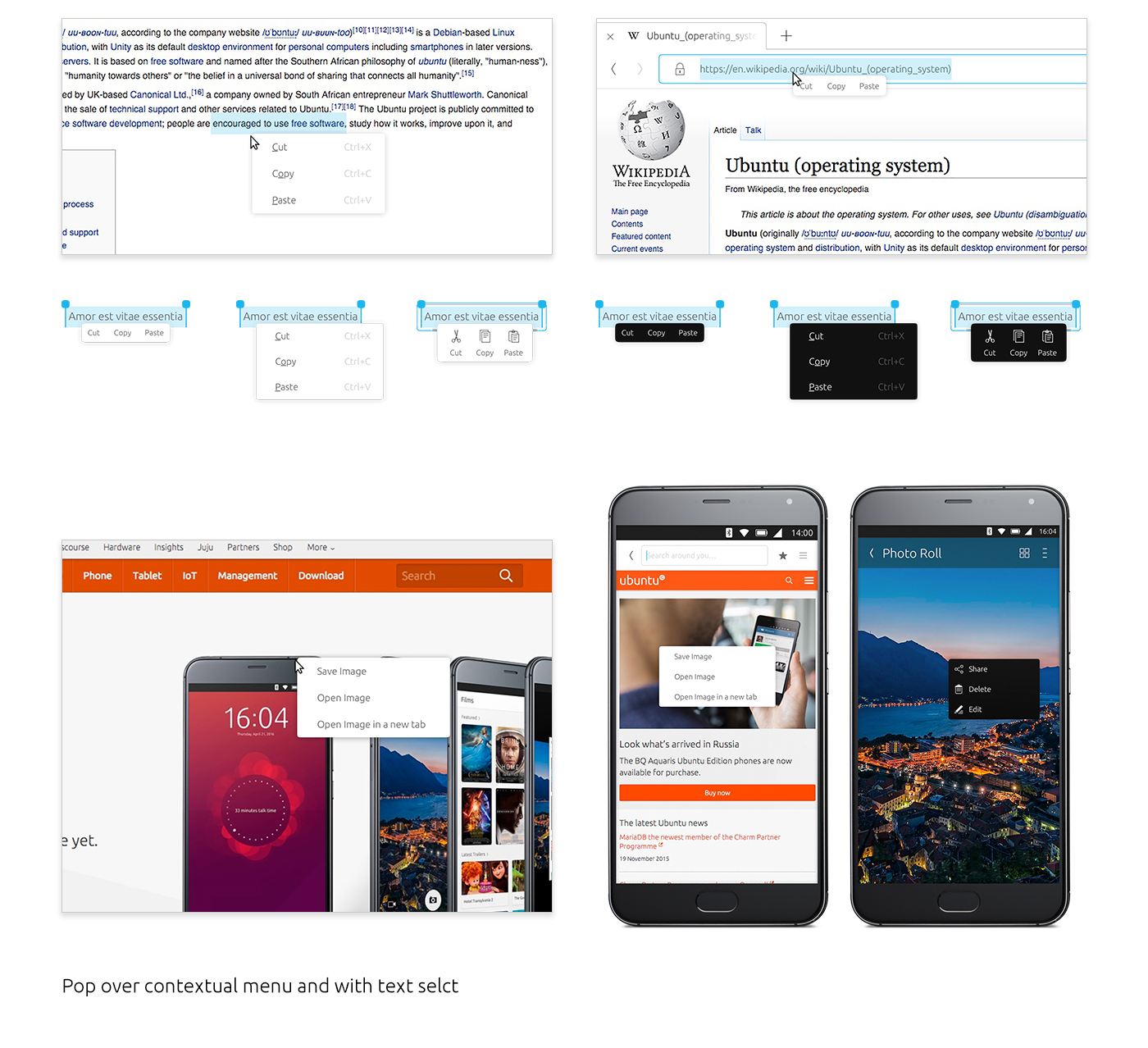
The highlight in the nautilus-sidebar is orange. Could it behave more like a clicked button?
That would mean a stronger grey. It would be more consistent to how buttons behave even when the clickable elements in the sidebar are no buttons.
The menus have a grey highlight too:
The nautilus-sidebar is the only element with this behavior (getting orange when clicked).
The text was updated successfully, but these errors were encountered: