Testing PR: reduce the orange in selected rows #1303
Conversation
|
Does it impact the firefox theme as well? I guess the change should be everywhere then (firefox, libreoffice and such, if they don't use the default value). I would have that reviewed by mpt as well, having no strong opinion myself, but I liked personnally that bit of branding (I think we found the right balance) :) |
|
It is just selected rows in GtkListBoxes |
+1
I agree. As you know, we tried this style for at while earlier and it didn't grow on us. Many months later I'm still not in love, but I see your very valid point. Personally I would miss the solid orange, BUT if we keep this suggested style/design I think there's too many indicators:
IMHO that is too much. The bold font might be hardcoded (in Nautilus). Anyway, with the current PR I find the gray background too dark (if it should be there at all):
OR play with the text color of the sidebar items that isn't selected, like this:
|


|
+1 to what Didrocks and Mads said. |
|
Nope the bold font is not hardcoded.
I have 0 problems to see the selection in the various software I posted, which I actually all use on my computer, apart from gmail for tablets and windows 10 (ofc ;D) |
|
|

lighter gray bg, normal font, darker fg_color, lighter fg_color for not selected rows
IMO the gray should be much lighter.
I see your point, but as @Feichtmeier illustrated above that is the design trend 🤷♂️Our current orange solution is perfect in terms of accessibility and maybe less could work. I know @clobrano will strongly disagree but after looking at this for a while, I'm starting to like this one 🙈 (if we can't keep the current). |
|
I'll try the one you suggested! |
I see, but just do not sacrifice usability to trends. Selected bookmark is harder to spot at a first glance, which is a -1 for me, and even more if the only reason to change this is a personal view about the orange being "too much" in this specific use case.
I hope the current is still an option, though :) I also think that all rows should keep the same hightlight style. Moreover, from my point of view, this is a sofistication that doesn't get along with the rest of Nautilus' style, which is nice for it's simplicity. About the other use cases: all of them uses both border and text color/bold and if not, they highlight the full row anyway. I think it is not by chance that other OSes very user centric like OSX and Elementary cdo not ship with this kind of sidebar's row selection style. |
|
The problem is the colour, not the filled bg styling |


|
@madsrh I hope this fits to your fav: |


I don't agree, but I understood what the problem is for you, however we're testing a half backed solution respect the one listed above, this is what I was saying |
|
Why is this solution half backed, because you don't like it? It works in different apps and it works in nautilus. Also, could we please stop with this usability argument? You can not seriously tell me that you can not 100% say what the selected row is. |
Nope, because respect the other example there's only the colored border and not the background color, nor colored/bold text.
That's what I meant by usability. Of course I can "see" what's selected, but it's not easy to spot as before No need to be aggressive though, I am only speaking my voice since I don't see the need for this change. However, if the rest of the team agrees, as I always did, I won't stop this PR. |
|
It's still a testing pr and I tried to implement mads mock-up. I'm not being aggressive I'm throwing back the ball of your passively aggressive attempts to wreck through three obvious problems with this full coloured bright orange bar with the usability argument. Ofc usability matters. And many times we dropped an idea because usability would have been lost. In this case it's not lost it's maybe reduced by a small amount. It's not like the stripe is the only solution possible. It's just that the 1) bright orange 2) full colour solution is bad. |
I think you misunderstood and this is quite unfair. Usability is reduced too much from my point of view, that's all I wanted to say. Of course I am discussing a work in progress, if it was already fixed there won't be no point in discussing. But anyway, I think I already replied enough, for the current state of the work my idea is written above, I'll try to figure out something that can please anybody and if I can't peace. |
|
Alright, just push it in this branch. I pause here until then, or just tell me that you want to change and I'll do it |
|
"Of course I can 'see' what's selected, but it's not easy to spot as before" For me it's about peripheral vision, and knowing where to look before I even look. The advantage of the full coloured or shaded background is it draws your eye and you immediately know where to glance. In screenshots that don't have it, it's obvious when you're looking directly, but my eyes jump up/down the side bar to find it. It's a miniscule difference, but there's a split second when my eyes are "hunting" for the visual clue, whereas you can't miss it when it's a big stripe :) Also the orange "stub" is more eye-catching when the window is in front of another window, because then it's surrounded by white. I find it jumps out less when the window is on top of gaily coloured wallpaper. I think stub highlights with no other clue work better for apps that are normally full screen (e.g. mobile apps) because the edge of the screen already draws the eye and the coloured accent is usually next to black or white. This doesn't mean I'm opposed to the orange stub at all, but I probably prefer the versions that combine it with a neutral fill across the full width (which some of the style exemplars have) and which looks fairly smart IMO. |
|
Looking at the examples, when there's no fill, the text is more strikingly different for the selected item. Either through having a different colour:
...or through a more pronounced difference in boldness:
It might work to copy the style of the Ubuntu website and make unselected items a lot fainter?
|


Yes, I was aiming for something similar here but I think if the unselected items are too faint, it sacrifices the readability and makes it look disabled.
It does @Feichtmeier 😄 It's perfect in the sense that it reduces the orange in selected rows but I still love the current stub, so I won't "vote" for either ⚖️ |
|
@ubuntujaggers the problem with the lighter text is that this is often used to indicate that an item is disabled. I have the same issue with inactive tabs - where also a lighter text colour is used (making them look disabled). Active tabs have a bold font and border, I can't see the point of the ligher text for inactive ones as well. So, even here, a bolder font for the active item, and standard for in-active (but not disabled) would be better (IMVHO). Also, using a gray sripe would match the active menu item. |
|
Variations in comparison:
|


|
Always a good idea with a poll 😂 |
|
Haha I just wanted to sum it up :p |
+1. For number 1, my "old man" effect :) is even more pronounced for dark theme. The way I test it is to look at the files area rather than the sidebar, to see how obvious it is (out of the corner of my eye) where the sidebar selection is. |
|
I don't want to pretend to be the smart-ass, but to see where you are, one should rather look on the pathbar! Because that is the widget that shows where you are, no matter how far you navigated.
Then press Crl+D to bookmark it and THEN nautilus notices that you are inside a bookmarked location again and displays the selection |


This is true, but it's like to test the breaking system looking whether the speedometer goes down :D |


|
I'm sorry, I should've been more specific. I meant that the orange border is barely visible, the background color is OK, and in effect this is the same in all the variants that use this border IMO. |
|
It should be just an accent, and by this definition it is visible "enough" even if this might be subjective again... |
👍 |
|
Okay, that are pretty many -1 and some neutrals so I'd say let's skip it again? :) |
In the opening post/pr description are three good reasons to change it.
The orange bar is almost burning through the screen. I'd say it looks horrible and that this is a very obvious improvement |

|
After agreement on telegram discussions I merge the gray selection without the orange stripe to master now to test it again for some months before "the hot 19.10 phase" |
I'd say : What a noisy horrible wallpaper you have there 😄 |
[humor] |
|
No!? That's sad :( We are not really satisfied with the gray row and might come up with something different soon |
Edit: updated with mads correction
@madsrh @ubuntujaggers @clobrano @mpt 😇
Why?
We love our orange but it is a problematic color - especially when it is used as a big surface like the rows. Staring at it every day using ubuntu as my daily driver on my private PC, it becomes really hard for the eyes.
The full color selection is a little bit dated, when you comepare it to...


Spotify
Vscode
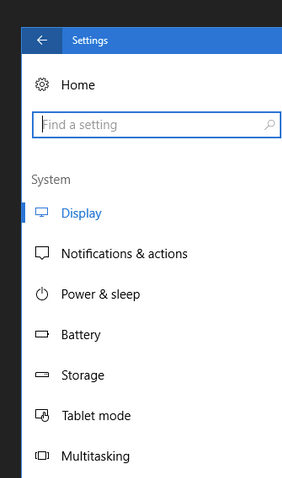
Windows10 settings
Gmail on tablets
Battle.net Client
Imgur settings
discourse settings
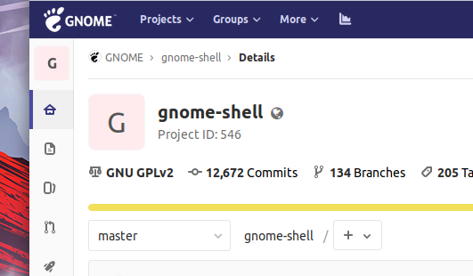
gnome gitlab
it "fits" somehow to firefox tabs design

and To our gnome shell panel button selection
and to our gnome shell workspace selections