| layout | title | categories | comments | tags | ||
|---|---|---|---|---|---|---|
post |
PL03-Topic02, Matplotlib |
|
true |
|
Back to the previous page |page management
List of posts to read before reading this article
{:.no_toc}
- ToC {:toc}
$
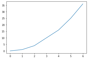
% matplotlib inline
% matplotlib qt5[my_data.txt][1]
import matplotlib.pyplot as plt
X, Y = [], []
for line in open('my_data.txt', 'r'):
     values = [float(s) for s in line.split()]
     X.append(values[0])
     Y.append(values[1])

plt.plot(X, Y)
plt.show()
OUTPUT
Another example
[my_data.txt][1] ```python import numpy as np import matplotlib.pyplot as plt
data = np.loadtxt('my_data.txt')
plt.plot(data[:,0], data[:,1]) plt.show()

<br>
[my_data2.txt][2]
```python
import numpy as np
import matplotlib.pyplot as plt
data = np.loadtxt('my_data2.txt')
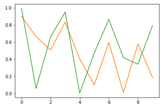
for column in data.T:
plt.plot(data[:,0], column)
plt.show()

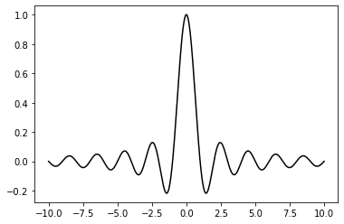
import numpy as np
from matplotlib import pyplot as plt
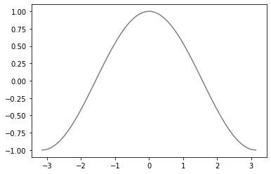
X = np.linspace(-10, 10, 1024)
Y = np.sinc(X)
plt.plot(X, Y)
plt.savefig('sinc.png', c = 'k')
plt.show()OUTPUT

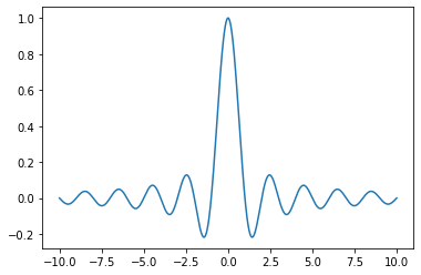
# Rendering a figure to a PNG file with a transparent background
import numpy as np
import matplotlib.pyplot as plt
X = np.linspace(-10, 10, 1024)
Y = np.sinc(X)
plt.plot(X, Y, c = 'k')
plt.savefig('sinc.png', transparent = True)
OUTPUT
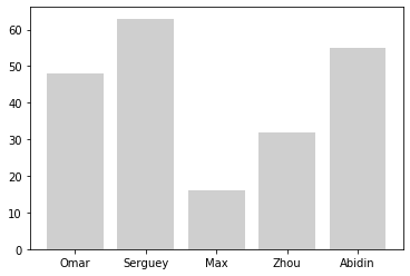
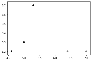
```python import numpy as np import matplotlib.pyplot as plt
name_list = ('Omar', 'Serguey', 'Max', 'Zhou', 'Abidin') value_list = np.random.randint(99, size=len(name_list)) pos_list = np.arange(len(name_list))
plt.bar(pos_list, value_list, alpha = .75, color = '.75', align ='center') plt.xticks(pos_list, name_list) plt.savefig('bar.png', transparent = True)
<details markdown="1">
<summary class='jb-small' style="color:blue">OUTPUT</summary>
<hr class='division3'>
<hr class='division3'>
</details>
<br><br><br>
#### Controlling the output resolution
```python
import numpy as np
from matplotlib import pyplot as plt
X = np.linspace(-10, 10, 1024)
Y = np.sinc(X)
plt.plot(X, Y)
plt.savefig('sinc.png', dpi = 300)
OUTPUT
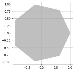
```python import numpy as np import matplotlib.pyplot as plt
theta = np.linspace(0, 2 * np.pi, 8) points = np.vstack((np.cos(theta), np.sin(theta))).transpose()
plt.figure(figsize=(4., 4.)) plt.gca().add_patch(plt.Polygon(points, color = '.75')) plt.grid(True) plt.axis('scaled') plt.savefig('polygon.png', dpi = 128)
<details markdown="1">
<summary class='jb-small' style="color:blue">OUTPUT</summary>
<hr class='division3'>
<hr class='division3'>
</details>
<br><br><br>
#### Generating PDF or SVG documents
```python
import numpy as np
from matplotlib import pyplot as plt
X = np.linspace(-10, 10, 1024)
Y = np.sinc(X)
plt.plot(X, Y)
plt.savefig('sinc.pdf')
OUTPUT

import numpy as np
from matplotlib import pyplot as plt
from matplotlib.backends.backend_pdf import PdfPages
# Generate the data
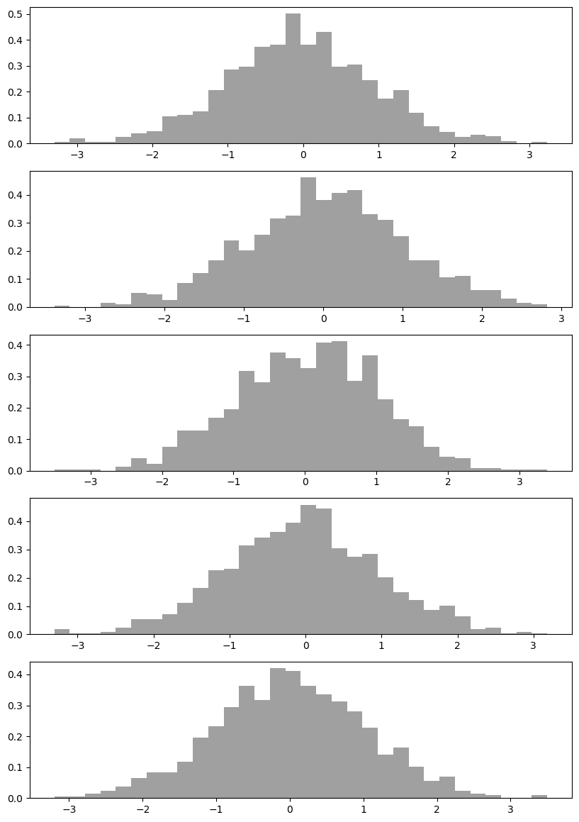
data = np.random.randn(15, 1024)
# The PDF document
pdf_pages = PdfPages('barcharts.pdf')
# Generate the pages
plots_count = data.shape[0]
plots_per_page = 5
pages_count = int(np.ceil(plots_count / float(plots_per_page)))
grid_size = (plots_per_page, 1)
for i, samples in enumerate(data):
# Create a figure instance (ie. a new page) if needed
if i % plots_per_page == 0:
fig = plt.figure(figsize=(8.27, 11.69), dpi=100)
# Plot one bar chart
plt.subplot2grid(grid_size, (i % plots_per_page, 0))
plt.hist(samples, 32, normed=1, facecolor='.5', alpha=0.75)
# Close the page if needed
if (i + 1) % plots_per_page == 0 or (i + 1) == plots_count:
plt.tight_layout()
pdf_pages.savefig(fig)
# Write the PDF document to the disk
pdf_pages.close()OUTPUT
%matplotlib inline
import matplotlib.pyplot as plt
import numpy as np
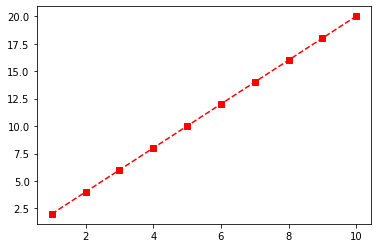
x = np.linspace(1,10,10)
y = np.linspace(2,20,10)
plt.plot(x,y, 'rs--')
plt.show()OUTPUT
%matplotlib inline
import matplotlib.pyplot as plt
import numpy as np
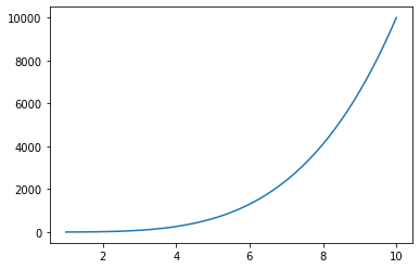
x = np.linspace(1,10,100)
y = x**4 + x
plt.plot(x,y)
plt.show()OUTPUT
import matplotlib.pyplot as plt

plt.style.use('ggplot')print(plt.style.available)OUTPUT
``` ['Solarize_Light2', '_classic_test_patch', 'bmh', 'classic', 'dark_background', 'fast', 'fivethirtyeight', 'ggplot', 'grayscale', 'seaborn', 'seaborn-bright', 'seaborn-colorblind', 'seaborn-dark', 'seaborn-dark-palette', 'seaborn-darkgrid', 'seaborn-deep', 'seaborn-muted', 'seaborn-notebook', 'seaborn-paper', 'seaborn-pastel', 'seaborn-poster', 'seaborn-talk', 'seaborn-ticks', 'seaborn-white', 'seaborn-whitegrid', 'tableau-colorblind10'] ```
windows version, font download
rcParam
import platform
import sys
import matplotlib as mpl
import matplotlib.pyplot as plt

print('* OS :', platform.platform())
print('* Python version : ', sys.version_info)
print('* matplotlib version : ', mpl.__version__)
print('* matplotlib setup : ', mpl.__file__)
print('* matplotlib config : ', mpl.get_configdir())
print('* matplotlib cache : ', mpl.get_cachedir())
print('* matplotlib rc : ', mpl.matplotlib_fname())
print('  - figsize : ', plt.rcParams["figure.figsize"])
print('  - grid : ', plt.rcParams["axes.grid"])
print('  - labelsize : ', plt.rcParams['axes.labelsize'])
print('  - ticksize_x : ', plt.rcParams['xtick.labelsize'])
print('  - ticksize_y : ', plt.rcParams['ytick.labelsize'])
print('  - fontsize : ', plt.rcParams['font.size'] )
print(' - fontfamily : ', plt.rcParams['font.family'] )import numpy as np
import matplotlib.pyplot as plt
import matplotlib.font_manager as fm
data = np.random.randint(-100, 100, 50).cumsum()
font_path = 'C:/Windows/Fonts/EBS훈민정음R.ttf'
fontprop = fm.FontProperties(fname=font_path, size=18)
plt.ylabel('가격', fontproperties=fontprop)
plt.title('가격변동 추이', fontproperties=fontprop)
plt.plot(range(50), data, 'r')
plt.show()matplotlib rcParams API
Copy .ttf files in this directory
~/Anaconda3/.../site-packages/matplotlib/mpl-data/fonts/ttffonts/ttf
$ cp ./*.ttf ~/Anaconda3/.../site-packages/matplotlib/mpl-data/fonts/ttffonts/ttfSuplementary : PATH
```python import matplotlib as mpl print('* matplotlib rc : ', mpl.matplotlib_fname()) ```
Delete cache files in matplotlib
~/.cache
$ rm -rf ~/.cache/matplotlibSuplementary : PATH
```python import matplotlib as mpl print('* matplotlib cache : ', mpl.get_cachedir()) ```
Set rcParams
import matplotlib.pyplot as plt
import matplotlib.font_manager as fm

#print([f.name for f in fm.fontManager.ttflist])
plt.rcParams["font.family"] = 'NanumBarunGothic.ttf'
Or
```python import matplotlib.pyplot as plt import matplotlib.font_manager as fm
font_path = './NanumBarunGothic.ttf' font_family = fm.FontProperties(fname=font_fname).get_name() plt.rcParams["font.family"] = font_family
<hr class='division3'>
</details>
<br><br><br>
---
### ***Working with Annotations***
<a href="https://matplotlib.org/3.1.1/tutorials/text/annotations.html" target="_blank" class="jb-medium">annotations API </a> | <a href="https://userdyk-github.github.io/pl03-topic02/PL03-Topic02-Matplotlib-Annotation.html" class="jb-medium">Annotation</a>
<br><br><br>
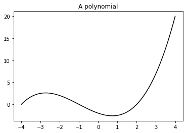
#### Adding a title
```python
import numpy as np
import matplotlib.pyplot as plt
X = np.linspace(-4, 4, 1024)
Y = .25 * (X + 4.) * (X + 1.) * (X - 2.)
plt.title('A polynomial')
plt.plot(X, Y, c = 'k')
plt.show()
OUTPUT
title position
```python import numpy as np import matplotlib.pyplot as plt
X = np.linspace(-4, 4, 1024) Y = .25 * (X + 4.) * (X + 1.) * (X - 2.)
plt.title('A polynomial', x=1, y=1) plt.plot(X, Y, c = 'k') plt.show()
<hr class='division3'>
</details>
<br><br><br>
---
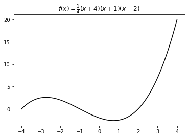
#### Using LaTeX-style notations
```python
import numpy as np
import matplotlib.pyplot as plt
X = np.linspace(-4, 4, 1024)
Y = .25 * (X + 4.) * (X + 1.) * (X - 2.)
plt.title('$f(x)=\\frac{1}{4}(x+4)(x+1)(x-2)$')
plt.plot(X, Y, c = 'k')
plt.show()
OUTPUT
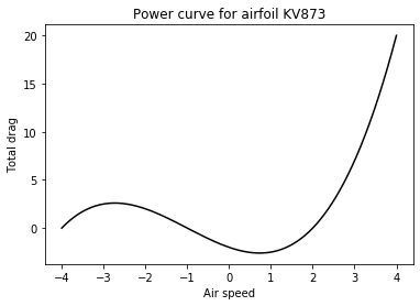
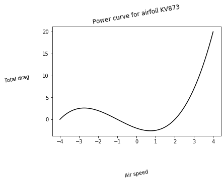
Adding a label to each axis
import numpy as np
import matplotlib.pyplot as plt

X = np.linspace(-4, 4, 1024)
Y = .25 * (X + 4.) * (X + 1.) * (X - 2.)

plt.title('Power curve for airfoil KV873')
plt.xlabel('Air speed')
plt.ylabel('Total drag')
plt.plot(X, Y, c = 'k')
plt.show()
OUTPUT
Rotation, labelpad
```python import numpy as np import matplotlib.pyplot as plt
X = np.linspace(-4, 4, 1024) Y = .25 * (X + 4.) * (X + 1.) * (X - 2.)
plt.title('Power curve for airfoil KV873', rotation=10) plt.xlabel('Air speed', rotation=10 ,labelpad=50) plt.ylabel('Total drag', rotation=10 ,labelpad=50) plt.plot(X, Y, c = 'k') plt.show()
<hr class='division3'>
</details>
<br><br><br>
---
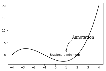
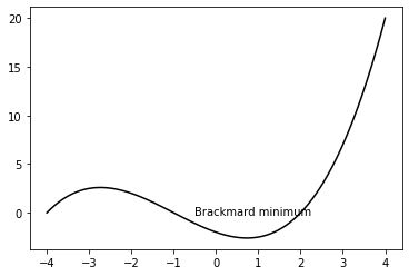
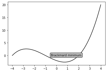
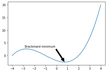
#### Adding text
```python
import numpy as np
import matplotlib.pyplot as plt
X = np.linspace(-4, 4, 1024)
Y = .25 * (X + 4.) * (X + 1.) * (X - 2.)
plt.plot(X, Y, c = 'k')
plt.text(-0.5, -0.25, 'Brackmard minimum')
plt.show()
Annotate
```python import numpy as np import matplotlib.pyplot as plt
X = np.linspace(-4, 4, 1024) Y = .25 * (X + 4.) * (X + 1.) * (X - 2.)
plt.plot(X, Y, c = 'k') plt.text(-0.5, -0.25, 'Brackmard minimum') plt.annotate("Annotation", fontsize=14, family="serif", xy=(1, 1), xycoords="data", xytext=(+20, +50), textcoords="offset points", arrowprops=dict(arrowstyle="->", connectionstyle="arc3, rad=.5"))
plt.show()
<hr class='division3'>
</details>
<details open markdown="1">
<summary class='jb-small' style="color:blue">OUTPUT</summary>
<hr class='division3'>
<hr class='division3'>
</details>
<br><br><br>
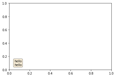
```python
import matplotlib.pyplot as plt
fig, ax = plt.subplots(1,1)
ax.text(0.05, 0.05,
"hello\nhello",
transform=ax.transAxes,
fontsize=10,
horizontalalignment='left',
verticalalignment='bottom',
bbox=dict(boxstyle='round',
facecolor='wheat',
alpha=0.5))
OUTPUT
# Bounding box control
import numpy as np
import matplotlib.pyplot as plt

X = np.linspace(-4, 4, 1024)
Y = .25 * (X + 4.) * (X + 1.) * (X - 2.)

box = {
 'facecolor' : '.75',
 'edgecolor' : 'k',
 'boxstyle' : 'round'
}
plt.text(-0.5, -0.20, 'Brackmard minimum', bbox = box)
plt.plot(X, Y, c='k')
plt.show()
Box options
- 'edgecolor': This is the color used for the edges of the box's shape
- 'alpha': This is used to set the transparency level so that the box blends with the background
- 'boxstyle': This sets the style of the box, which can either be 'round' or 'square'
- 'pad': If 'boxstyle' is set to 'square', it defines the amount of padding between the text and the box's sides
OUTPUT
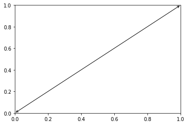
Adding arrows
with arrowstyle
import matplotlib.pyplot as plt

plt.annotate(s='', xy=(1,1), xytext=(0,0), arrowprops=dict(arrowstyle='<->'))
plt.show()
OUTPUT
CAUTION 1 : arrowstyle
If arrowstyle is used, another keys are fobbiden 
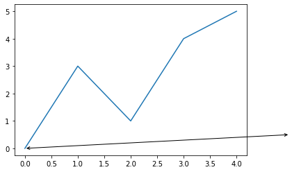
CAUTION 2 : annotation_clip
```python import matplotlib.pyplot as plt
plt.plot([0,1,2,3,4],[0,3,1,4,5]) plt.annotate(s='', xy = (5,.5), xytext = (0,0), arrowprops=dict(arrowstyle='<->'), annotation_clip=False) plt.show()
<div class="jb-medium">
<strong>annotation_clip</strong> : bool or None, optional<br>
Whether to draw the annotation when the annotation point xy is outside the axes area.<br><br>
If <strong>True</strong>, the annotation will only be drawn when xy is within the axes.<br>
If <strong>False</strong>, the annotation will always be drawn.<br>
If <strong>None</strong>, the annotation will only be drawn when xy is within the axes and xycoords is 'data'.<br>
Defaults to None.<br>
</div>
<hr class='division3'>
</details>
<br><br><br>
<span class="frame3">without arrowstyle</span>
```python
import numpy as np
import matplotlib.pyplot as plt
X = np.linspace(-4, 4, 1024)
Y = .25 * (X + 4.) * (X + 1.) * (X - 2.)
plt.annotate('Brackmard minimum',
ha = 'center', va = 'bottom',
xytext = (-1.5, 3.),
xy = (0.75, -2.7),
arrowprops = { 'facecolor' : 'black',
'edgecolor' : 'black',
'shrink' : 0.05 })
plt.plot(X, Y)
plt.show()
Arrow options
- 'facecolor': This is the color used for the arrow. It will be used to set the background and the edge color
- 'edgecolor': This is the color used for the edges of the arrow's shape
- 'alpha': This is used to set the transparency level so that the arrow blends with the background
OUTPUT
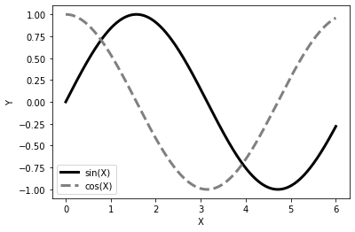
Adding a legend
import numpy as np
import matplotlib.pyplot as plt

X = np.linspace(0, 6, 1024)
Y1 = np.sin(X)
Y2 = np.cos(X)

plt.xlabel('X')
plt.ylabel('Y')
plt.plot(X, Y1, c = 'k', lw = 3., label = 'sin(X)')
plt.plot(X, Y2, c = '.5', lw = 3., ls = '--', label = 'cos(X)')
plt.legend()
plt.show()
Legend options
- 'shadow': This can be either True or False, and it renders the legend with a shadow effect.
- 'fancybox': This can be either True or False and renders the legend with a rounded box.
- 'title': This renders the legend with the title passed as a parameter.
- 'ncol': This forces the passed value to be the number of columns for the legend
OUTPUT
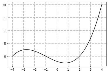
Adding a grid
import numpy as np
import matplotlib.pyplot as plt

X = np.linspace(-4, 4, 1024)
Y = .25 * (X + 4.) * (X + 1.) * (X - 2.)

plt.plot(X, Y, c = 'k')
plt.grid(True, lw = 2, ls = '--', c = '.75')
plt.show()
OUTPUT
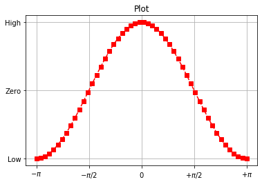
%matplotlib inline
import matplotlib.pyplot as plt
import numpy as np

# numpy plot
# grid 설정 : grid
x = np.linspace(-np.pi, np.pi, 50)
y = np.cos(x)

plt.title("Plot")
plt.plot(x, y, 'rs--')
plt.xticks([-np.pi, -np.pi / 2, 0, np.pi / 2, np.pi],
           [r'$-\pi$', r'$-\pi/2$', r'$0$', r'$+\pi/2$', r'$+\pni$'])
plt.yticks([-1, 0, 1], ["Low", "Zero", "High"])
plt.grid(True)

plt.show()
OUTPUT
Adding lines
import numpy as np
import matplotlib.pyplot as plt
import seaborn as sns

x = np.array([165., 180., 190., 188., 163., 178., 177., 172., 164., 182., 143.,
              163., 168., 160., 172., 165., 208., 175., 181., 160., 154., 169.,
              120., 184., 180., 175., 174., 175., 160., 155., 156., 161., 184.,
              171., 150., 154., 153., 177., 184., 172., 156., 153., 145., 150.,
              175., 165., 190., 156., 196., 161., 185., 159., 153., 155., 173.,
              173., 191., 162., 152., 158., 190., 136., 171., 173., 146., 158.,
              158., 159., 169., 145., 193., 178., 160., 153., 142., 143., 172.,
              170., 130., 165., 177., 190., 164., 167., 172., 160., 184., 158.,
              152., 175., 158., 156., 171., 164., 165., 160., 162., 140., 172.,
              148.])

sns.set();
plt.hist(x)
plt.axhline(y=5, ls="--", c="r", linewidth=2, label="Quartile 50%")
plt.axvline(x=165, ls="--", c="y", linewidth=2, label="sample median")
plt.legend()

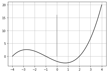
import matplotlib.pyplot as plt
import numpy as np

X = np.linspace(-4, 4, 1024)
Y = .25 * (X + 4.) * (X + 1.) * (X - 2.)

plt.plot(X, Y, c = 'k')
plt.gca().add_line(plt.Line2D((0, 0), (16, 0), c='.5'))
plt.grid()
OUTPUT
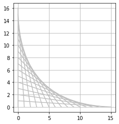
import matplotlib.pyplot as plt

N = 16
for i in range(N):
     plt.gca().add_line(plt.Line2D((0, i), (N - i, 0), color = '.75'))

plt.grid(True)
plt.axis('scaled')
plt.show()
OUTPUT
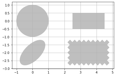
Adding shapes
import matplotlib.patches as patches
import matplotlib.pyplot as plt

# Circle
shape = patches.Circle((0, 0), radius = 1., color = '.75')
plt.gca().add_patch(shape)

# Rectangle
shape = patches.Rectangle((2.5, -.5), 2., 1., color = '.75')
plt.gca().add_patch(shape)

# Ellipse
shape = patches.Ellipse((0, -2.), 2., 1., angle = 45., color =
 '.75')
plt.gca().add_patch(shape)

# Fancy box
shape = patches.FancyBboxPatch((2.5, -2.5), 2., 1., boxstyle =
 'sawtooth', color = '.75')
plt.gca().add_patch(shape)

# Display all
plt.grid(True)
plt.axis('scaled')
plt.show()
Shape options
- Rectangle: This takes the coordinates of its lower-left corner and its size as the parameters
- Ellipse: This takes the coordinates of its center and the half-length of its two axes as the parameters
- FancyBox: This is like a rectangle but takes an additional boxstyle parameter (either 'larrow', 'rarrow', 'round', 'round4', 'roundtooth', 'sawtooth', or 'square')
OUTPUT
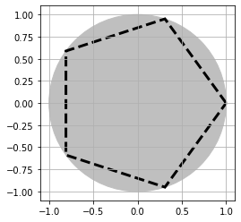
# Working with polygons
import numpy as np
import matplotlib.patches as patches
import matplotlib.pyplot as plt

theta = np.linspace(0, 2 * np.pi, 8)
points = np.vstack((np.cos(theta), np.sin(theta))).transpose()

plt.gca().add_patch(patches.Polygon(points, color = '.75'))
plt.grid(True)
plt.axis('scaled')
plt.show()
OUTPUT

# Working with path attributes
import numpy as np
import matplotlib.patches as patches
import matplotlib.pyplot as plt

theta = np.linspace(0, 2 * np.pi, 6)
points = np.vstack((np.cos(theta), np.sin(theta))).transpose()

plt.gca().add_patch(plt.Circle((0, 0), radius = 1., color =
 '.75'))
plt.gca().add_patch(plt.Polygon(points, closed=None, fill=None,
 lw = 3., ls = 'dashed', edgecolor = 'k'))
plt.grid(True)
plt.axis('scaled')
plt.show()
OUTPUT
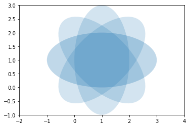
import matplotlib.pyplot as plt
import numpy as np
from matplotlib.patches import Ellipse

delta = 45.0  # degrees

angles = np.arange(0, 360 + delta, delta)
ells = [Ellipse((1, 1), 4, 2, a) for a in angles]

a = plt.subplot(111, aspect='equal')

for e in ells:
    #e.set_clip_box(a.bbox)
    e.set_alpha(0.1)
    a.add_artist(e)

plt.xlim(-2, 4)
plt.ylim(-1, 3)

plt.show()
OUTPUT
Figure
Figure object and plot commands
Graphs plot in general
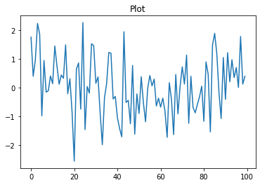
%matplotlib inline
import matplotlib.pyplot as plt
import numpy as np

np.random.seed(0)

plt.title("Plot")
plt.plot(np.random.randn(100))
plt.show()
OUTPUT
Graphs plot in principle
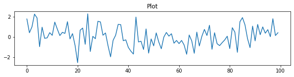
%matplotlib inline
import matplotlib.pyplot as plt
import numpy as np

np.random.seed(0)
plt.figure(figsize=(10, 2))    # Simultaneously resize graph while defining objects

plt.title("Plot")
plt.plot(np.random.randn(100))
plt.show()
OUTPUT
Identification for the currently allocated figure object
%matplotlib inline
import matplotlib.pyplot as plt
import numpy as np

f1 = plt.figure(1)

plt.title("Plot")
plt.plot([1, 2, 3, 4], 'ro:')

f2 = plt.gcf()
print(f1, id(f1))             # identification1 for object directly using id
print(f2, id(f2))             # identification2 for object using gcf and id(in principle)
plt.show()
OUTPUT
``` Figure(432x288) 2045494563280 Figure(432x288) 2045494563280 ``` 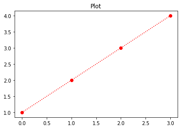
A variety of plot
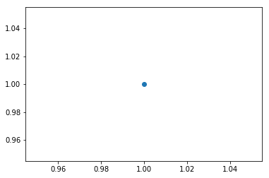
Point plot
Single point plot
%matplotlib inline
import matplotlib.pyplot as plt

plt.plot(1,1,marker="o")
plt.show()
OUTPUT
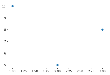
Multiple point plot
%matplotlib inline
import matplotlib.pyplot as plt

plt.plot([1,2,3],[10,5,8],marker="o", lw=0)
plt.show()
OUTPUT
Line plot
list plot : [0,1,2,3] → [1,4,9,16]
%matplotlib inline
import matplotlib.pyplot as plt

plt.plot([1,4,9,16])
plt.show()
OUTPUT

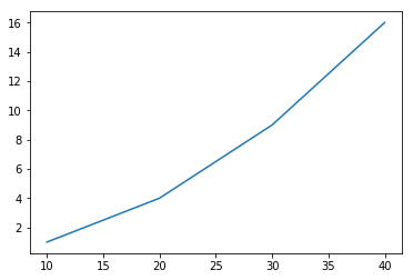
list plot : [10,20,30,40] → [1,4,9,16]
%matplotlib inline
import matplotlib.pyplot as plt

plt.plot([10,20,30,40],[1,4,9,16])
plt.show()
OUTPUT
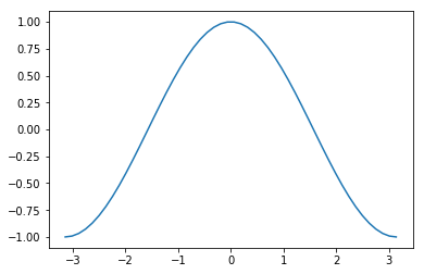
numpy array plot :
%matplotlib inline
import matplotlib.pyplot as plt
import numpy as np

x = np.linspace(-np.pi, np.pi, 50)
y = np.cos(x)

plt.plot(x, y)
plt.show()
OUTPUT
Customizing the Color and Styles
Defining your own colors ```python %matplotlib inline import matplotlib.pyplot as plt import numpy as np
x = np.linspace(-np.pi, np.pi, 50) y = np.cos(x)
plt.plot(x, y, c = '.5') plt.show()
<span class="jb-medium">c='x', x ∈ [0(black), 1(white)] </span>
<br>
<span class="frame3">Controlling a line pattern and thickness</span>
```python
import numpy as np
import matplotlib.pyplot as plt
def pdf(X, mu, sigma):
a = 1. / (sigma * np.sqrt(2. * np.pi))
b = -1. / (2. * sigma ** 2)
return a * np.exp(b * (X - mu) ** 2)
X = np.linspace(-6, 6, 1000)
for i in range(5):
samples = np.random.standard_normal(50)
mu, sigma = np.mean(samples), np.std(samples)
plt.plot(X, pdf(X, mu, sigma), color = '.75')
plt.plot(X, pdf(X, 0., 1.), color = 'k')
plt.show()

import numpy as np
import matplotlib.pyplot as plt

def pdf(X, mu, sigma):
     a = 1. / (sigma * np.sqrt(2. * np.pi))
     b = -1. / (2. * sigma ** 2)
     return a * np.exp(b * (X - mu) ** 2)

X = np.linspace(-6, 6, 1024)

# linestyle : Solid, Dashed, Dotted, Dashdot
plt.plot(X, pdf(X, 0., 1.), color = 'k', linestyle = 'solid')
plt.plot(X, pdf(X, 0., .5), color = 'k', linestyle = 'dashed')
plt.plot(X, pdf(X, 0., .25), color = 'k', linestyle = 'dashdot')

plt.show()

# The line width
import numpy as np
import matplotlib.pyplot as plt

def pdf(X, mu, sigma):
     a = 1. / (sigma * np.sqrt(2. * np.pi))
     b = -1. / (2. * sigma ** 2)
     return a * np.exp(b * (X - mu) ** 2)

X = np.linspace(-6, 6, 1024)
for i in range(64):
    samples = np.random.standard_normal(50)
    mu, sigma = np.mean(samples), np.std(samples)
    plt.plot(X, pdf(X, mu, sigma), color = '.75', linewidth = .5)

plt.plot(X, pdf(X, 0., 1.), color = 'y', linewidth = 3.)
plt.show()

Controlling a marker's style
Predefined markers: They can be predefined shapes, represented as a number in the [0, 8] range, or some strings Vertices list: This is a list of value pairs, used as coordinates for the path of a shape Regular polygon: It represents a triplet (N, 0, angle) for an N sided regular polygon, with a rotation of angle degrees Start polygon: It represents a triplet (N, 1, angle) for an N sided regular star, with a rotation of angle degrees
import numpy as np
import matplotlib.pyplot as plt

X = np.linspace(-6, 6, 1024)
Y1 = np.sinc(X)
Y2 = np.sinc(X) + 1

plt.plot(X, Y1, marker = 'o', color = '.75')
plt.plot(X, Y2, marker = 'o', color = 'k', markevery = 32)
plt.show()

Getting more control over markers
import numpy as np
import matplotlib.pyplot as plt
X = np.linspace(-6, 6, 1024)
Y = np.sinc(X)
plt.plot(X, Y,
    linewidth = 3.,
    color = 'k',
    markersize = 9,
    markeredgewidth = 1.5,
    markerfacecolor = '.75',
    markeredgecolor = 'k',
    marker = 'o',
    markevery = 32)
plt.show()

Scatter plot
Plotting points
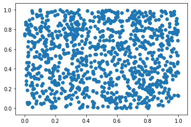
import numpy as np
import matplotlib.pyplot as plt

data = np.random.rand(1024, 2)

plt.scatter(data[:,0], data[:,1])
plt.show()
OUTPUT
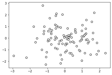
Another scatter plot
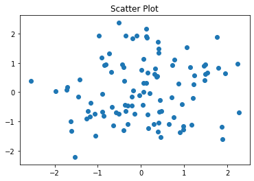
```python %matplotlib inline import matplotlib.pyplot as plt import numpy as np
np.random.seed(0) X = np.random.normal(0, 1, 100) Y = np.random.normal(0, 1, 100)
plt.title("Scatter Plot") plt.scatter(X, Y) plt.show()
<br>
```python
%matplotlib inline
import matplotlib.pyplot as plt
import numpy as np
N = 30
np.random.seed(0)
x = np.random.rand(N)
y1 = np.random.rand(N)
y2 = np.random.rand(N)
y3 = np.pi * (15 * np.random.rand(N))**2
plt.title("Bubble Chart")
plt.scatter(x, y1, c=y2, s=y3) # s : size, c : color
plt.show()

Using custom colors for scatter plots
Individual color for each dot: If the color parameter is a sequence of a valid matplotlib color definition, the ith dot will appear in the ith color. Of course, we have to give the required colors for each dot.
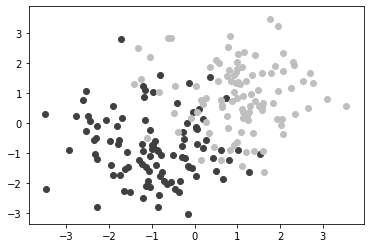
A = np.random.standard_normal((100, 2)) A += np.array((-1, -1)) # Center the distrib. at <-1, -1>
B = np.random.standard_normal((100, 2)) B += np.array((1, 1)) # Center the distrib. at <1, 1>
plt.scatter(A[:,0], A[:,1], color = '.25') plt.scatter(B[:,0], B[:,1], color = '.75') plt.show()
<details open markdown="1">
<summary class='jb-small' style="color:blue">OUTPUT</summary>
<hr class='division3'>
<hr class='division3'>
</details>
```python
import numpy as np
import matplotlib.pyplot as plt
label_set = (
b'Iris-setosa',
b'Iris-versicolor',
b'Iris-virginica',
)
def read_label(label):
return label_set.index(label)
data = np.loadtxt('iris.data.txt',
delimiter = ',',
converters = { 4 : read_label })
color_set = ('.00', '.50', '.75')
color_list = [color_set[int(label)] for label in data[:,4]]
plt.scatter(data[:,0], data[:,1], color = color_list)
plt.show()
OUTPUT
import numpy as np
import matplotlib.pyplot as plt

data = np.random.standard_normal((100, 2))

plt.scatter(data[:,0], data[:,1], color = '1.0', edgecolor='0.0')
plt.show()
OUTPUT
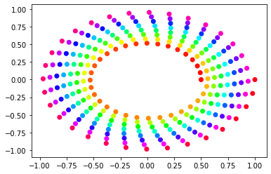
Using colormaps for scatter plots
%matplotlib inline
import matplotlib.cm as cm
import matplotlib.pyplot as plt
import numpy as np

N = 256
angle = np.linspace(0, 8 * 2 * np.pi, N)
radius = np.linspace(.5, 1., N)

X = radius * np.cos(angle)
Y = radius * np.sin(angle)

plt.scatter(X, Y, c = angle, cmap = cm.hsv)
plt.show()
OUTPUT
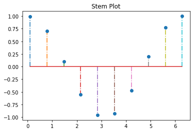
Stem plot
%matplotlib inline
import matplotlib.pyplot as plt
import numpy as np

x = np.linspace(0.1, 2 * np.pi, 10)
plt.title("Stem Plot")
plt.stem(x, np.cos(x), '-.')
plt.show()
OUTPUT
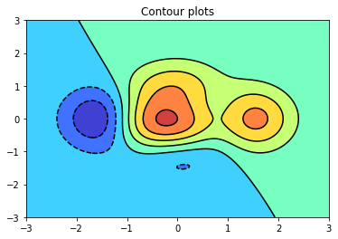
Contour plot
%matplotlib inline
import matplotlib.pyplot as plt
import numpy as np

def f(x, y):
    return (1 - x / 2 + x ** 5 + y ** 3) * np.exp(-x ** 2 - y ** 2)

n = 256
x = np.linspace(-3, 3, n)
y = np.linspace(-3, 3, n)
XX, YY = np.meshgrid(x, y)
ZZ = f(XX, YY)

plt.title("Contour plots")
plt.contourf(XX, YY, ZZ, alpha=.75, cmap='jet')   # inside color
plt.contour(XX, YY, ZZ, colors='black')           # boundary line
plt.show()
OUTPUT
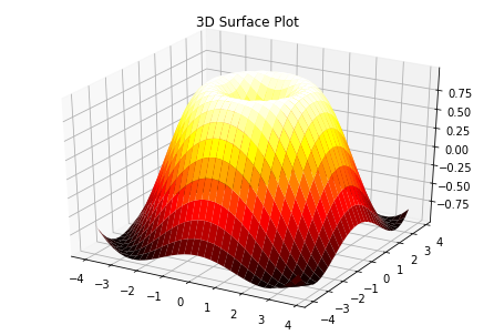
Surface plot
%matplotlib inline
from mpl_toolkits.mplot3d import Axes3D
import matplotlib.pyplot as plt
import numpy as np

X = np.arange(-4, 4, 0.25)
Y = np.arange(-4, 4, 0.25)
XX, YY = np.meshgrid(X, Y)
RR = np.sqrt(XX**2 + YY**2)
ZZ = np.sin(RR)

fig = plt.figure()
ax = Axes3D(fig)
ax.set_title("3D Surface Plot")
ax.plot_surface(XX, YY, ZZ, rstride=1, cstride=1, cmap='hot')
plt.show()
OUTPUT
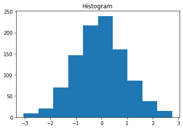
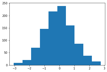
Histogram
%matplotlib inline
import matplotlib.pyplot as plt
import numpy as np

np.random.seed(0)
x = np.random.randn(1000)
plt.title("Histogram")
arrays, bins, patches = plt.hist(x, bins=10)
   # arrays is the count in each bin,
   # bins is the lower-limit of the bin(Interval to aggregate data)
plt.show()
OUTPUT
Customizing
`STEP1` ```python %matplotlib inline import matplotlib.pyplot as plt import numpy as np
np.random.seed(0) x = np.random.randn(1000) plt.hist(x, bins=10)
<br>
`STEP2 : color`
```python
%matplotlib inline
import matplotlib.pyplot as plt
import numpy as np
from matplotlib import colors
np.random.seed(0)
x = np.random.randn(1000)
arrays, bins, patches = plt.hist(x, bins=10) # arrays is the count in each bin,
# bins is the lower-limit of the bin(Interval to aggregate data)
# We'll color code by height, but you could use any scalar
fracs = arrays / arrays.max()
# we need to normalize the data to 0..1 for the full range of the colormap
norm = colors.Normalize(fracs.min(), fracs.max())
# Now, we'll loop through our objects and set the color of each accordingly
for thisfrac, thispatch in zip(fracs, patches):
color = plt.cm.viridis(norm(thisfrac))
thispatch.set_facecolor(color)

STEP3 : grid
%matplotlib inline
import matplotlib.pyplot as plt
import numpy as np
from matplotlib import colors

np.random.seed(0)
x = np.random.randn(1000)
arrays, bins, patches = plt.hist(x, bins=10)

# We'll color code by height, but you could use any scalar
fracs = arrays / arrays.max()

# we need to normalize the data to 0..1 for the full range of the colormap
norm = colors.Normalize(fracs.min(), fracs.max())

# Now, we'll loop through our objects and set the color of each accordingly
for thisfrac, thispatch in zip(fracs, patches):
    color = plt.cm.viridis(norm(thisfrac))
    thispatch.set_facecolor(color)
plt.grid()

All at once
%matplotlib inline
import matplotlib.pyplot as plt
import numpy as np
from matplotlib import colors

# hist with color, grid
def cghist(x, bins=None):
    arrays, bins, patches = plt.hist(x, bins=bins)
    fracs = arrays / arrays.max()
    norm = colors.Normalize(fracs.min(), fracs.max())
    for thisfrac, thispatch in zip(fracs, patches):
        color = plt.cm.viridis(norm(thisfrac))
        thispatch.set_facecolor(color)
    plt.grid()
    plt.show()

np.random.seed(0)
x = np.random.randn(1000)
cghist(x, 10)
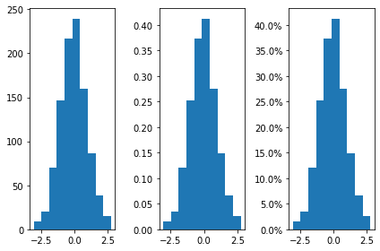
Format the y-axis to display percentage
```python %matplotlib inline import matplotlib.pyplot as plt from matplotlib.ticker import PercentFormatter import numpy as np
np.random.seed(0) x = np.random.randn(1000)
fig, axes = plt.subplots(1, 3, tight_layout=True) axes[0].hist(x, bins=10) axes[1].hist(x, bins=10, density=True) axes[2].hist(x, bins=10, density=True) axes[2].yaxis.set_major_formatter(PercentFormatter(xmax=1))
<hr class='division3'>
</details>
<br>
```python
arrays # arrays is the count in each bin
OUTPUT
``` array([ 9., 20., 70., 146., 217., 239., 160., 86., 38., 15.]) ```
bins # bins is the lower-limit of the bin
OUTPUT
``` array([-3.04614305, -2.46559324, -1.88504342, -1.3044936 , -0.72394379, -0.14339397, 0.43715585, 1.01770566, 1.59825548, 2.1788053 , 2.75935511]) ```
Bar chart
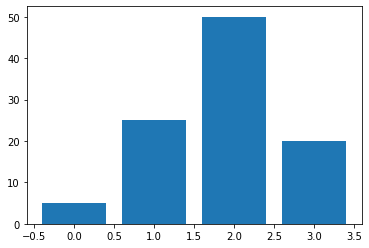
Plotting bar charts
import matplotlib.pyplot as plt

data = [5., 25., 50., 20.]
plt.bar(range(len(data)), data)
plt.show()
OUTPUT
Another bar chart
`The thickness of a bar` ```python import matplotlib.pyplot as plt
data = [5., 25., 50., 20.]
plt.bar(range(len(data)), data, width = 1.) plt.show()

<br>
`Labeled bar chart`
```python
%matplotlib inline
import matplotlib.pyplot as plt
import numpy as np
y = [2, 3, 1]
x = np.arange(len(y))
xlabel = ['a', 'b', 'c']
plt.title("Bar Chart")
plt.bar(x, y)
plt.xticks(x, xlabel)
plt.yticks(sorted(y))
plt.xlabel("abc")
plt.ylabel("frequency")
plt.show()

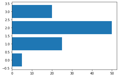
Horizontal bar charts
# Horizontal bars
import matplotlib.pyplot as plt

data = [5., 25., 50., 20.]

plt.barh(range(len(data)), data)
plt.show()
OUTPUT
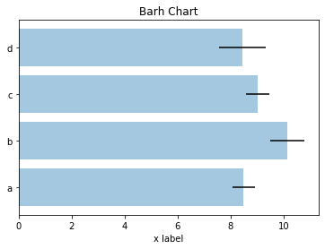
Another horizontalbar chart
```python %matplotlib inline import matplotlib.pyplot as plt import numpy as np
np.random.seed(0)
people = ['a', 'b', 'c', 'd'] y_pos = np.arange(len(people)) performance = 3 + 10 * np.random.rand(len(people)) error = np.random.rand(len(people))
plt.title("Barh Chart") plt.barh(y_pos, performance, xerr=error, alpha=0.4) # alpha : transparency [0,1] plt.yticks(y_pos, people) plt.xlabel('x label') plt.show()
<hr class='division3'>
</details>
<details markdown="1">
<summary class='jb-small' style="color:blue">Interactive horizontalbar chart</summary>
<hr class='division3'>
```python
import matplotlib.pyplot as plt
import numpy as np
#print(plt.style.available)
plt.style.use('seaborn-ticks')
fig = plt.figure()
ax = fig.add_subplot(1,1,1)
for i in range(20):
ax.barh([0,1,2,3], abs(np.random.randn(4)))
ax.grid(True)
plt.ion()
plt.draw()
plt.pause(0.1)
ax.clear()
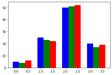
Plotting multiple bar charts
import numpy as np
import matplotlib.pyplot as plt

data = [[5., 25., 50., 20.],
 [4., 23., 51., 17.],
 [6., 22., 52., 19.]]
X = np.arange(4)

plt.bar(X + 0.00, data[0], color = 'b', width = 0.25)
plt.bar(X + 0.25, data[1], color = 'g', width = 0.25)
plt.bar(X + 0.50, data[2], color = 'r', width = 0.25)
plt.show()
OUTPUT
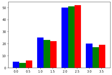
Another multibple bar chart
```python import numpy as np import matplotlib.pyplot as plt
data = [[5., 25., 50., 20.], [4., 23., 51., 17.], [6., 22., 52., 19.]]
color_list = ['b', 'g', 'r'] gap = .8 / len(data) for i, row in enumerate(data): X = np.arange(len(row)) plt.bar(X + i * gap, row, width = gap, color = color_list[i % len(color_list)])
plt.show()
<hr class='division3'>
</details>
<br><br><br>
<span class="frame3">Plotting stacked bar charts</span>
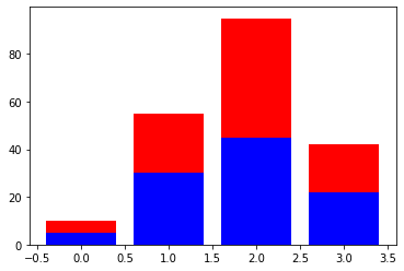
```python
import matplotlib.pyplot as plt
A = [5., 30., 45., 22.]
B = [5., 25., 50., 20.]
X = range(4)
plt.bar(X, A, color = 'b')
plt.bar(X, B, color = 'r', bottom = A)
plt.show()
OUTPUT
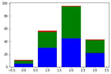
Another stacked bar chart
```python import numpy as np import matplotlib.pyplot as plt
A = np.array([5., 30., 45., 22.]) B = np.array([5., 25., 50., 20.]) C = np.array([1., 2., 1., 1.]) X = np.arange(4)
plt.bar(X, A, color = 'b') plt.bar(X, B, color = 'g', bottom = A) plt.bar(X, C, color = 'r', bottom = A + B) plt.show()
<br>
```python
import numpy as np
import matplotlib.pyplot as plt
data = np.array([[5., 30., 45., 22.],
[5., 25., 50., 20.],
[1., 2., 1., 1.]])
color_list = ['b', 'g', 'r']
X = np.arange(data.shape[1])
for i in range(data.shape[0]):
plt.bar(X, data[i],
bottom = np.sum(data[:i], axis = 0),
color = color_list[i % len(color_list)])
plt.show()

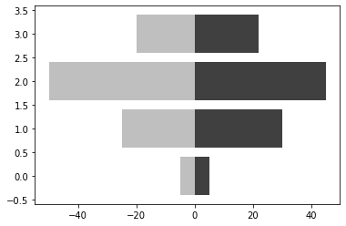
Plotting back-to-back bar charts
import numpy as np
import matplotlib.pyplot as plt

women_pop = np.array([5., 30., 45., 22.])
men_pop = np.array([5., 25., 50., 20.])
X = np.arange(4)

plt.barh(X, women_pop, color = '.25')
plt.barh(X, -men_pop, color = '.75')
plt.show()
OUTPUT
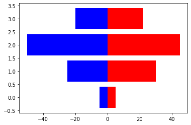
Another back-to-back bar chart
```python import numpy as np import matplotlib.pyplot as plt
women_pop = np.array([5., 30., 45., 22.]) men_pop = np.array( [5., 25., 50., 20.]) X = np.arange(4)
plt.barh(X, women_pop, color = 'r') plt.barh(X, -men_pop, color = 'b') plt.show()
<hr class='division3'>
</details>
<br><br><br>
<span class="frame3">Using custom colors for bar charts</span>
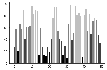
```python
import numpy as np
import matplotlib.pyplot as plt
values = np.random.random_integers(99, size = 50)
color_set = ('.00', '.25', '.50', '.75')
color_list = [color_set[(len(color_set) * val) // 100] for val in values]
plt.bar(np.arange(len(values)), values, color = color_list)
plt.show()
OUTPUT
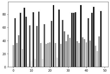
Using colormaps for bar charts
import numpy as np
import matplotlib.cm as cm
import matplotlib.colors as col
import matplotlib.pyplot as plt

values = np.random.random_integers(99, size = 50)

cmap = cm.ScalarMappable(col.Normalize(0, 99), cm.binary)

plt.bar(np.arange(len(values)), values, color = cmap.to_rgba(values))
plt.show()
OUTPUT
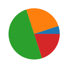
Pie chart
import matplotlib.pyplot as plt

data = [5, 25, 50, 20]

plt.pie(data)
plt.show()
OUTPUT
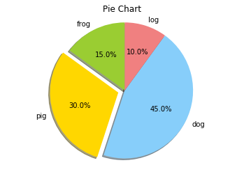
Another pie chart
```python %matplotlib inline import matplotlib.pyplot as plt import numpy as np
plt.axis('equal') # retaining the shape of a circle
labels = ['frog', 'pig', 'dog', 'log'] sizes = [15, 30, 45, 10] colors = ['yellowgreen', 'gold', 'lightskyblue', 'lightcoral'] explode = (0, 0.1, 0, 0) plt.title("Pie Chart") plt.pie(sizes, explode=explode, labels=labels, colors=colors, autopct='%1.1f%%', shadow=True, startangle=90) plt.axis('equal') plt.show()
<hr class='division3'>
</details>
<br><br><br>
<span class="frame3">Using custom colors for pie charts</span>
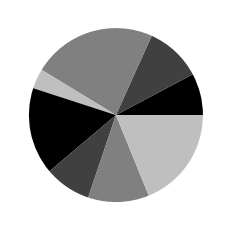
```python
import numpy as np
import matplotlib.pyplot as plt
values = np.random.rand(8)
color_set = ('.00', '.25', '.50', '.75')
plt.pie(values, colors = color_set)
plt.show()
OUTPUT
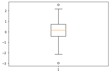
Boxplot
import numpy as np
import matplotlib.pyplot as plt

data = np.random.randn(100)

plt.boxplot(data)
plt.show()
OUTPUT
Another boxplot
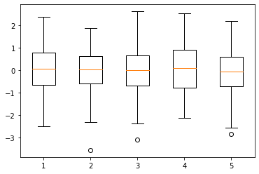
```python import numpy as np import matplotlib.pyplot as plt
data = np.random.randn(100, 5)
plt.boxplot(data) plt.show()
<hr class='division3'>
</details>
<br><br><br>
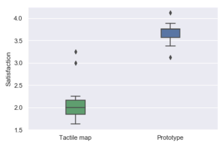
```python
import numpy as np
import matplotlib.pyplot as plt
import seaborn as sns
rv = np.array([[1.75 , 4.125],
[2. , 3.625],
[1.625, 3.625],
[2.25 , 3.125],
[1.875, 3.75 ],
[3. , 3.875],
[1.75 , 3.75 ],
[2.125, 3.75 ],
[2.125, 3.75 ],
[3.25 , 3.375],
[2. , 3.75 ],
[1.875, 3.375]])
sns.set();
my_pal = {0: "g", 1: "b"}
sns.boxplot(data=rv, width=0.2, palette=my_pal)
plt.xticks([0,1],['Tactile map','Prototype'])
plt.ylabel("Satisfaction")
OUTPUT
Some more plots
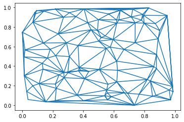
Plotting triangulations
import numpy as np
import matplotlib.pyplot as plt
import matplotlib.tri as tri

data = np.random.rand(100, 2)
triangles = tri.Triangulation(data[:,0], data[:,1])

plt.triplot(triangles)
plt.show()
OUTPUT
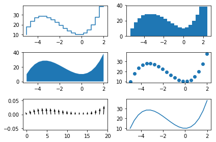
%matplotlib inline
import matplotlib.pyplot as plt

x = np.linspace(-5, 2, 20)
y =  x**3 + 5*x**2 + 10

fig, axes = plt.subplots(3,2)
axes[0, 0].step(x, y)
axes[0, 1].bar(x, y)
axes[1, 0].fill_between(x, y)
axes[1, 1].scatter(x, y)
axes[2, 0].quiver(x, y)
axes[2, 1].errorbar(x, y)

plt.tight_layout()
plt.show()
SUPPLEMENT : Refer to here about exes
OUTPUT
Working with Figures
Multiple plot, all at once
%matplotlib inline
import matplotlib.pyplot as plt
import numpy as np
# numpy plot
# multi-plot(1) : can be expressed with 1 plot
t = np.arange(0., 5., 0.2)
plt.title("Plot")
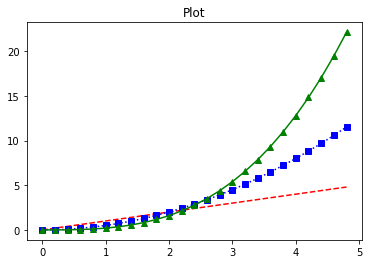
plt.plot(t, t, 'r--', t, 0.5 * t**2, 'bs:', t, 0.2 * t**3, 'g^-')
plt.show()
OUTPUT
%matplotlib inline
import matplotlib.pyplot as plt
import numpy as np
# list plot
# multi-plot(2) : using several plots
plt.title("Plot")
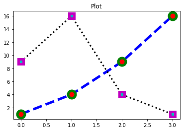
plt.plot([1, 4, 9, 16],
c="b", lw=5, ls="--", marker="o", ms=15, mec="g", mew=5, mfc="r")
plt.plot([9, 16, 4, 1],
c="k", lw=3, ls=":", marker="s", ms=10, mec="m", mew=5, mfc="c")
plt.show()
# plt.hold(True) # <- This code is required in version 1, 5
# plt.hold(False) # <- This code is required in version 1, 5
# color : c : 선 색깔
# linewidth : lw : 선 굵기
# linestyle : ls : 선 스타일
# marker : marker : 마커 종류
# markersize : ms : 마커 크기
# markeredgecolor : mec : 마커 선 색깔
# markeredgewidth : mew : 마커 선 굵기
# markerfacecolor : mfc : 마커 내부 색깔
OUTPUT
%matplotlib inline
import matplotlib.pyplot as plt
import numpy as np
# numpy plot
# setting legend
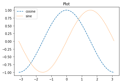
X = np.linspace(-np.pi, np.pi, 256)
C, S = np.cos(X), np.sin(X)
plt.title("Plot")
plt.plot(X, C, ls="--", label="cosine") # setting legend using label
plt.plot(X, S, ls=":", label="sine") # setting legend using label
plt.legend(loc=2) # lov value means a position of legend in figure
plt.show()
OUTPUT
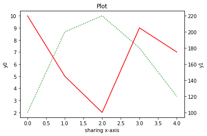
Twinx command
The twinx command creates a new Axes object that shares the x-axis.
%matplotlib inline
import matplotlib.pyplot as plt
import numpy as np

fig, ax0 = plt.subplots()
ax0.set_title("Plot")
ax0.plot([10, 5, 2, 9, 7], 'r-', label="y0")
ax0.set_xlabel("sharing x-axis")
ax0.set_ylabel("y0")
ax0.grid(False)

ax1 = ax0.twinx()
ax1.plot([100, 200, 220, 180, 120], 'g:', label="y1")
ax1.set_ylabel("y1")
ax1.grid(False)

plt.show()
OUTPUT
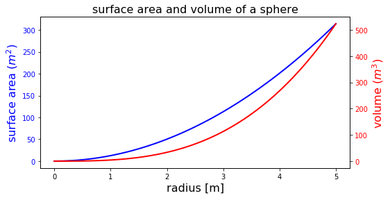
import numpy as np
import matplotlib.pyplot as plt

fig, ax1 = plt.subplots(figsize=(8, 4))

r = np.linspace(0, 5, 100)
a = 4 * np.pi * r ** 2        # area
v = (4 * np.pi / 3) * r ** 3  # volume

ax1.set_title("surface area and volume of a sphere", fontsize=16)
ax1.set_xlabel("radius [m]", fontsize=16)

ax1.plot(r, a, lw=2, color="blue")
ax1.set_ylabel(r"surface area ($m^2$)", fontsize=16, color="blue")
for label in ax1.get_yticklabels():
    label.set_color("blue")

ax2 = ax1.twinx()
ax2.plot(r, v, lw=2, color="red")
ax2.set_ylabel(r"volume ($m^3$)", fontsize=16, color="red")
for label in ax2.get_yticklabels():
    label.set_color("red")

plt.show()
OUTPUT
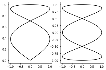
Compositing multiple figures
import numpy as np
from matplotlib import pyplot as plt

T = np.linspace(-np.pi, np.pi, 1024)
grid_size = (4, 2)
plt.subplot2grid(grid_size, (0, 0), rowspan = 3, colspan = 1)
plt.plot(np.sin(2 * T), np.cos(0.5 * T), c = 'k')
plt.subplot2grid(grid_size, (0, 1), rowspan = 3, colspan = 1)
plt.plot(np.cos(3 * T), np.sin(T), c = 'k')
plt.subplot2grid(grid_size, (3, 0), rowspan=1, colspan=3)
plt.plot(np.cos(5 * T), np.sin(7 * T), c= 'k')
plt.tight_layout()
plt.show()
OUTPUT
```python # An alternative way to composite figures import numpy as np from matplotlib import pyplot as plt
T = np.linspace(-np.pi, np.pi, 1024) fig, (ax0, ax1) = plt.subplots(ncols =2) ax0.plot(np.sin(2 * T), np.cos(0.5 * T), c = 'k') ax1.plot(np.cos(3 * T), np.sin(T), c = 'k') plt.show()
<hr class='division3'>
</details>
<br><br><br>
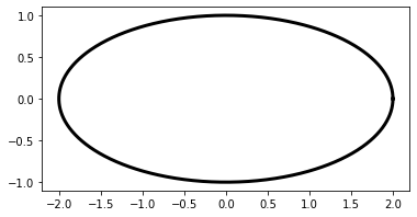
#### Scaling both the axes equally
```python
import numpy as np
import matplotlib.pyplot as plt
T = np.linspace(0, 2 * np.pi, 1024)
plt.plot(2. * np.cos(T), np.sin(T), c = 'k', lw = 3.)
plt.axes().set_aspect('equal')
plt.show()
OUTPUT
Setting an axis range
import numpy as np
import matplotlib.pyplot as plt

X = np.linspace(-6, 6, 1024)
plt.ylim(-.5, 1.5)
plt.plot(X, np.sinc(X), c = 'k')
plt.show()
OUTPUT
Setting the aspect ratio
import numpy as np
import matplotlib.pyplot as plt

X = np.linspace(-6, 6, 1024)
Y1, Y2 = np.sinc(X), np.cos(X)
plt.figure(figsize=(10.24, 2.56))
plt.plot(X, Y1, c='k', lw = 3.)
plt.plot(X, Y2, c='.75', lw = 3.)
plt.show()
OUTPUT
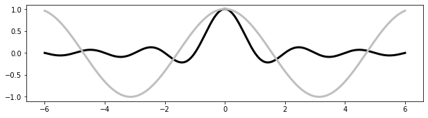
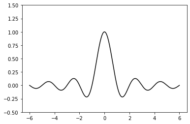
Inserting subfigures
import numpy as np
from matplotlib import pyplot as plt

X = np.linspace(-6, 6, 1024)
Y = np.sinc(X)
X_detail = np.linspace(-3, 3, 1024)
Y_detail = np.sinc(X_detail)
plt.plot(X, Y, c = 'k')
sub_axes = plt.axes([.6, .6, .25, .25])
sub_axes.plot(X_detail, Y_detail, c = 'k')
plt.setp(sub_axes)
plt.show()
OUTPUT

SUPPLEMENT
```python sub_axes = plt.axes([.6, .6, .25, .25]) ``` 
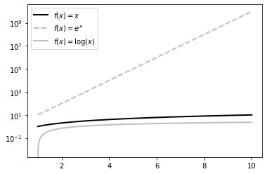
Using a logarithmic scale
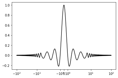
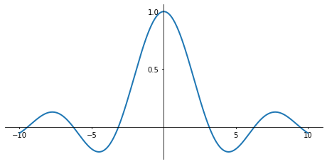
import numpy as np
import matplotlib.pyplot as plt

X = np.linspace(1, 10, 1024)
plt.yscale('log')
plt.plot(X, X, c = 'k', lw = 2., label = r'$f(x)=x$')
plt.plot(X, 10 ** X, c = '.75', ls = '--', lw = 2., label=r'$f(x)=e^x$')
plt.plot(X, np.log(X), c = '.75', lw = 2., label = r'$f(x)=\log(x)$')
plt.legend()
plt.show()
OUTPUT
SUPPLEMENT
```python plt.xscale('log') plt.yscale('log') ``` 
```python import numpy as np import matplotlib.pyplot as plt
X = np.linspace(-100, 100, 4096) plt.xscale('symlog', linthreshx=6.) plt.plot(X, np.sinc(X), c = 'k') plt.show()
<details open markdown="1">
<summary class='jb-small' style="color:blue">OUTPUT</summary>
<hr class='division3'>
<hr class='division3'>
</details>
<br><br><br>
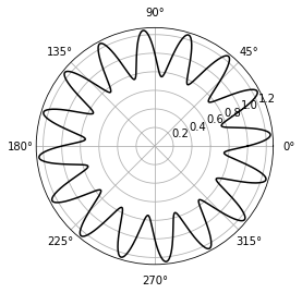
#### Using polar coordinates
```python
import numpy as np
import matplotlib.pyplot as plt
T = np.linspace(0 , 2 * np.pi, 1024)
plt.axes(polar = True)
plt.plot(T, 1. + .25 * np.sin(16 * T), c= 'k')
plt.show()
OUTPUT
```python import numpy as np import matplotlib.patches as patches import matplotlib.pyplot as plt
ax = plt.axes(polar = True) theta = np.linspace(0, 2 * np.pi, 8, endpoint = False) radius = .25 + .75 * np.random.random(size = len(theta)) points = np.vstack((theta, radius)).transpose() plt.gca().add_patch(patches.Polygon(points, color = '.75')) plt.show()
<details open markdown="1">
<summary class='jb-small' style="color:blue">OUTPUT</summary>
<hr class='division3'>
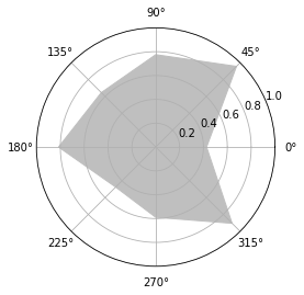
<hr class='division3'>
</details>
<br><br><br>
<hr class="division2">
## **Axes**
### ***Empty axes***
#### add_subplot
```python
%matplotlib inline
import matplotlib.pyplot as plt
fig = plt.figure()
axes = fig.add_subplot(1, 1, 1)
OUTPUT
fig = plt.figure() ax0 = fig.add_subplot(2, 2, 1) ax1 = fig.add_subplot(2, 2, 2) ax2 = fig.add_subplot(2, 2, 3) ax3 = fig.add_subplot(2, 2, 4)
<details open markdown="1">
<summary class='jb-small' style="color:blue">OUTPUT</summary>
<hr class='division3'>
<hr class='division3'>
</details>
<br><br><br>
#### Subplots
```python
%matplotlib inline
import matplotlib.pyplot as plt
fig, axes = plt.subplots(nrows=3, ncols=2)
OUTPUT
Subplot2grid
import matplotlib.pyplot as plt

ax0 = plt.subplot2grid((3, 3), (0, 0))
ax1 = plt.subplot2grid((3, 3), (0, 1))
ax2 = plt.subplot2grid((3, 3), (1, 0), colspan=2)
ax3 = plt.subplot2grid((3, 3), (2, 0), colspan=3)
ax4 = plt.subplot2grid((3, 3), (0, 2), rowspan=2)

plt.show()
OUTPUT
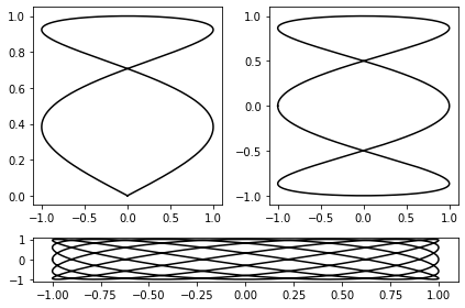
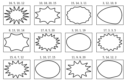
Example
```python import numpy as np from matplotlib import pyplot as plt
def get_radius(T, params): m, n_1, n_2, n_3 = params U = (m * T) / 4 return (np.fabs(np.cos(U)) ** n_2 + np.fabs(np.sin(U)) ** n_3) ** (-1. / n_1)
grid_size = (3, 4) T = np.linspace(0, 2 * np.pi, 1024)
for i in range(grid_size[0]): for j in range(grid_size[1]): params = np.random.random_integers(1, 20, size = 4) R = get_radius(T, params) axes = plt.subplot2grid(grid_size, (i, j), rowspan=1, colspan=1) axes.get_xaxis().set_visible(False) axes.get_yaxis().set_visible(False) plt.plot(R * np.cos(T), R * np.sin(T), c = 'k') plt.title('%d, %d, %d, %d' % tuple(params), fontsize = 'small')
plt.tight_layout() plt.show()
<hr class='division3'>
</details>
<br><br><br>
#### GridSpec
```python
import matplotlib.pyplot as plt
import matplotlib as mpl
fig = plt.figure(figsize=(6, 4))
gs = mpl.gridspec.GridSpec(4, 4)
ax0 = fig.add_subplot(gs[0, 0])
ax1 = fig.add_subplot(gs[1, 1])
ax2 = fig.add_subplot(gs[2, 2])
ax3 = fig.add_subplot(gs[3, 3])
ax4 = fig.add_subplot(gs[0, 1:])
ax5 = fig.add_subplot(gs[1:, 0])
ax6 = fig.add_subplot(gs[1, 2:])
ax7 = fig.add_subplot(gs[2:, 1])
ax8 = fig.add_subplot(gs[2, 3])
ax9 = fig.add_subplot(gs[3, 2])
fig = plt.figure(figsize=(4, 4))
gs = mpl.gridspec.GridSpec( 2, 2, width_ratios=[4, 1], height_ratios=[1, 4], wspace=0.05, hspace=0.05)
ax0 = fig.add_subplot(gs[1, 0])
ax1 = fig.add_subplot(gs[0, 0])
ax2 = fig.add_subplot(gs[1, 1])
plt.show()
OUTPUT
Axes object and subplot commands
Axes lines
import matplotlib.pyplot as plt

fig = plt.figure()
ax = fig.add_subplot(1, 1, 1)

ax.plot(np.random.rand(10))
ax.plot(np.random.rand(10))
ax.plot(np.random.rand(10))
OUTPUT
(,
,
)
import matplotlib.pyplot as plt

fig = plt.figure()
ax = fig.add_subplot(1, 1, 1)

ax.plot(np.random.rand(10))
ax.plot(np.random.rand(10))
ax.plot(np.random.rand(10))

ax.lines.remove(ax.lines[0])
OUTPUT
Axes object
%matplotlib inline
import matplotlib.pyplot as plt
import numpy as np

x = np.linspace(-5, 2, 100)                # 3th factor mean smoothness
y =  x**3 + 5*x**2 + 10

fig, ax = plt.subplots()                   # show a picture on screen
ax.plot(x, y, color="blue", label="y(x)")  # here, you can change type of plot,
                                           # if you want, use ax.step, ax.bar, ax.hist, ax.errorbar, ax.scatter, ax.fill_between, ax.quiver instead of ax.plot
ax.set_xlabel("x")
ax.set_ylabel("y")
ax.legend()

plt.show()
OUTPUT
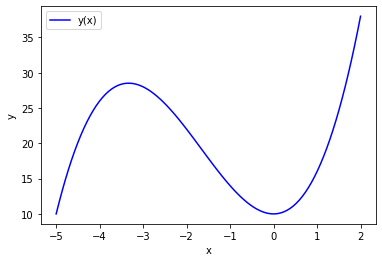
Multiple Axes objects
EXPLAINATION
In some cases, it may be necessary to display multiple plots in an array within a single window, as follows. And each plot in Figure belongs to an object called Axes.
To create Axes within the Figure, you must explicitly acquire Axes objects using the original subplot command(~like plt.subplot). However, using the plot command(~like plt.plot) automatically generates Axes.
The subplot command creates grid-type Axes objects, and you can think of Figure as a matrix and Axes as an element of the matrix. For example, if you have two plots up and down, the row is 2 and the column is 1 is 2x1. The subplot command has three arguments, two numbers for the first two elements to indicate the shape of the entire grid matrix and the third argument to indicate where the graph is. Therefore, to draw two plots up and down in one Figure, you must execute the command as follows. Note that the number pointing to the first plot is not zero but one, since numeric indexing follows Matlab practices rather than Python.
%matplotlib inline
import matplotlib.pyplot as plt
import numpy as np

x1 = np.linspace(0.0, 5.0)
x2 = np.linspace(0.0, 2.0)
y1 = np.cos(2 * np.pi * x1) * np.exp(-x1)
y2 = np.cos(2 * np.pi * x2)

ax1 = plt.subplot(2, 1, 1)
plt.plot(x1, y1, 'yo-')
plt.title('A tale of 2 subplots')
plt.ylabel('Damped oscillation')
print(ax1)          # Identification for the allocated sub-object

ax2 = plt.subplot(2, 1, 2)
plt.plot(x2, y2, 'r.-')
plt.xlabel('time (s)')
plt.ylabel('Undamped')
print(ax2)          # Identification for the allocated sub-object

plt.tight_layout()  # The command automatically adjusts the spacing between plots
plt.show()
OUTPUT
``` AxesSubplot(0.125,0.536818;0.775x0.343182) AxesSubplot(0.125,0.125;0.775x0.343182) ``` 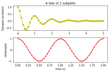
If there are four plots in 2x2, draw as follows. The argument (2,2,1) for subplot can be abbreviated a single number of 221. Axes' position counts from top to bottom, from left to right.
%matplotlib inline
import matplotlib.pyplot as plt
import numpy as np

np.random.seed(0)

plt.subplot(221)
plt.plot(np.random.rand(5))
plt.title("axes 1")

plt.subplot(222)
plt.plot(np.random.rand(5))
plt.title("axes 2")

plt.subplot(223)
plt.plot(np.random.rand(5))
plt.title("axes 3")

plt.subplot(224)
plt.plot(np.random.rand(5))
plt.title("axes 4")

plt.tight_layout()
plt.show()
OUTPUT
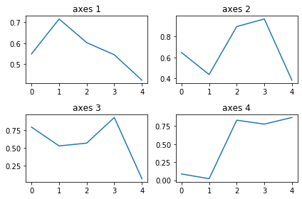
You can also create multiple Axes objects simultaneously with the subplots command. Axes objects are returned in two-dimensional ndarray form.
%matplotlib inline
import matplotlib.pyplot as plt
import numpy as np

fig, axes = plt.subplots(2, 1)

np.random.seed(0)
axes[0].plot(np.random.rand(5))
axes[0].set_title("axes 1")
axes[1].plot(np.random.rand(5))
axes[1].set_title("axes 2")

plt.tight_layout()
plt.show()
OUTPUT
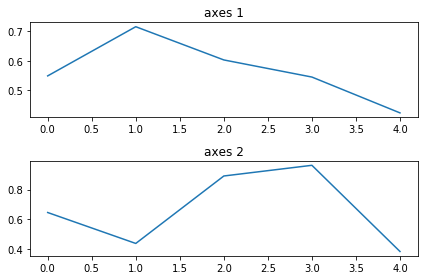
%matplotlib inline
import matplotlib.pyplot as plt
import numpy as np

fig, axes = plt.subplots(2, 2)

np.random.seed(0)
axes[0, 0].plot(np.random.rand(5))
axes[0, 0].set_title("axes 1")
axes[0, 1].plot(np.random.rand(5))
axes[0, 1].set_title("axes 2")
axes[1, 0].plot(np.random.rand(5))
axes[1, 0].set_title("axes 3")
axes[1, 1].plot(np.random.rand(5))
axes[1, 1].set_title("axes 4")

plt.tight_layout()
plt.show()
OUTPUT

import matplotlib.pyplot as plt
import numpy as np

fig, axes = plt.subplots(2, 2, figsize=(6, 6), sharex=True, sharey=True, squeeze=False)

x1 = np.random.randn(100)
x2 = np.random.randn(100)

axes[0, 0].set_title("Uncorrelated")
axes[0, 0].scatter(x1, x2)

axes[0, 1].set_title("Weakly positively correlated")
axes[0, 1].scatter(x1, x1 + x2)

axes[1, 0].set_title("Weakly negatively correlated")
axes[1, 0].scatter(x1, -x1 + x2)

axes[1, 1].set_title("Strongly correlated")
axes[1, 1].scatter(x1, x1 + 0.15 * x2)

axes[1, 1].set_xlabel("x")
axes[1, 0].set_xlabel("x")
axes[0, 0].set_ylabel("y")
axes[1, 0].set_ylabel("y")

plt.subplots_adjust(left=0.1, right=0.95, bottom=0.1, top=0.95, wspace=0.1, hspace=0.2)
plt.show()
OUTPUT
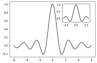
Insets
import numpy as np
import matplotlib.pyplot as plt

# main graph
X = np.linspace(-6, 6, 1024)
Y = np.sinc(X)
plt.plot(X, Y, c = 'k')

# inset
X_detail = np.linspace(-3, 3, 1024)
Y_detail = np.sinc(X_detail)
sub_axes = plt.axes([.6, .6, .25, .25])
sub_axes.plot(X_detail, Y_detail, c = 'k')
plt.setp(sub_axes)
plt.show()
OUTPUT
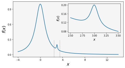
import matplotlib.pyplot as plt
import matplotlib as mpl
import numpy as np

fig = plt.figure(figsize=(8, 4))

def f(x):
    return 1 / (1 + x ** 2) + 0.1 / (1 + ((3 - x) / 0.1) ** 2)

def plot_and_format_axes(ax, x, f, fontsize):
    ax.plot(x, f(x), linewidth=2)
    ax.xaxis.set_major_locator(mpl.ticker.MaxNLocator(5))
    ax.yaxis.set_major_locator(mpl.ticker.MaxNLocator(4))
    ax.set_xlabel(r"$x$", fontsize=fontsize)
    ax.set_ylabel(r"$f(x)$", fontsize=fontsize)

# main graph
ax = fig.add_axes([0.1, 0.15, 0.8, 0.8], facecolor="#f5f5f5")
x = np.linspace(-4, 14, 1000)
plot_and_format_axes(ax, x, f, 18)

# inset
x0, x1 = 2.5, 3.5
ax.axvline(x0, ymax=0.3, color="grey", linestyle=":")
ax.axvline(x1, ymax=0.3, color="grey", linestyle=":")
ax_insert = fig.add_axes([0.5, 0.5, 0.38, 0.42], facecolor='none')
x = np.linspace(x0, x1, 1000)
plot_and_format_axes(ax_insert, x, f, 14)

plt.show()
OUTPUT
Line properties
Simple decoration
color/marker/line
Triplets: These colors can be described as a real value triplet—the red, blue, and green components of a color. The components have to be in the [0, 1] interval. Thus, the Python syntax (1.0, 0.0, 0.0) will code a pure, bright red, while (1.0, 0.0, 1.0) appears as a strong pink.
Quadruplets: These work as triplets, and the fourth component defines a transparency value. This value should also be in the [0, 1] interval. When rendering a figure to a picture file, using transparent colors allows for making figures that blend with a background. This is especially useful when making figures that will slide or end up on a web page.
Predefined names: matplotlib will interpret standard HTML color names as an actual color. For instance, the string red will be accepted as a color and will be interpreted as a bright red. A few colors have a one-letter alias, which is shown in the following table:
HTML color strings: matplotlib can interpret HTML color strings as actual colors. Such strings are defined as #RRGGBB where RR, GG, and BB are the 8-bit values for the red, green, and blue components in hexadecimal.
Gray-level strings: matplotlib will interpret a string representation of a floating point value as a shade of gray, such as 0.75 for a medium light gray.
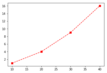
%matplotlib inline
import matplotlib.pyplot as plt

plt.plot([10, 20, 30, 40], [1, 4, 9, 16], 'rs--')
plt.show()
OUTPUT
Details decoration
Style strings are specified in the order of color, marker, and line style. If some of these are omitted, the default value is applied.
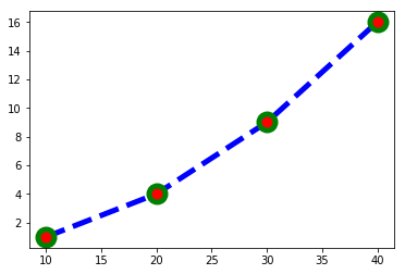
%matplotlib inline
import matplotlib.pyplot as plt

plt.plot([10, 20, 30, 40], [1, 4, 9, 16],
         c="b",
         lw=5,
         ls="--",
         marker="o",
         ms=15,
         mec="g",
         mew=5,
         mfc="r")
plt.show()
SUPPLEMENT
- color ref
- marker ref
- line style ref
|color | c| |linesidth | lw | |linestyle | ls| |marker | marker| |markersize | ms| |markeredgecolor | mec| |markeredgewidth | mew| |markerfacecolor | mfc|
EXAMPLES
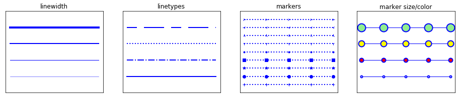
```python import numpy as np import matplotlib.pyplot as plt
x = np.linspace(-5, 5, 5) y = np.ones_like(x)
def axes_settings(fig, ax, title, ymax): ax.set_xticks([]) ax.set_yticks([]) ax.set_ylim(0, ymax + 1) ax.set_title(title)
fig, axes = plt.subplots(1, 4, figsize=(16, 3))
Line width
linewidths = [0.5, 1.0, 2.0, 4.0] for n, linewidth in enumerate(linewidths): axes[0].plot(x, y + n, color="blue", linewidth=linewidth) axes_settings(fig, axes[0], "linewidth", len(linewidths))
Line style
linestyles = ['-', '-.', ':'] for n, linestyle in enumerate(linestyles): axes[1].plot(x, y + n, color="blue", lw=2, linestyle=linestyle)
custom dash style
line, = axes[1].plot(x, y + 3, color="blue", lw=2) length1, gap1, length2, gap2 = 10, 7, 20, 7 line.set_dashes([length1, gap1, length2, gap2]) axes_settings(fig, axes[1], "linetypes", len(linestyles) + 1)
marker types
markers = ['+', 'o', '*', 's', '.', '1', '2', '3', '4'] for n, marker in enumerate(markers): # lw = shorthand for linewidth, ls = shorthand for linestyle axes[2].plot(x, y + n, color="blue", lw=2, ls=':', marker=marker) axes_settings(fig, axes[2], "markers", len(markers))
marker size and color
markersizecolors = [(4, "white"), (8, "red"), (12, "yellow"), (16, "lightgreen")] for n, (markersize, markerfacecolor) in enumerate(markersizecolors): axes[3].plot(x, y + n, color="blue", lw=1, ls='-', marker='o', markersize=markersize, markerfacecolor=markerfacecolor, markeredgewidth=2) axes_settings(fig, axes[3], "marker size/color", len(markersizecolors))
plt.show()
<hr class='division3'>
</details>
<details open markdown="1">
<summary class='jb-small' style="color:blue">OUTPUT</summary>
<hr class='division3'>
<hr class='division3'>
</details>
<br><br><br>
---
### ***Axis propertires***
#### Axis labels and titles
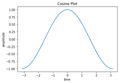
```python
%matplotlib inline
import matplotlib.pyplot as plt
import numpy as np
# numpy plot
# naming axis
X = np.linspace(-np.pi, np.pi, 256)
C, S = np.cos(X), np.sin(X)
plt.title("Cosine Plot")
plt.plot(X, C, label="cosine")
plt.xlabel("time") # naming x-axis
plt.ylabel("amplitude") # naming x-axis
plt.show()
OUTPUT
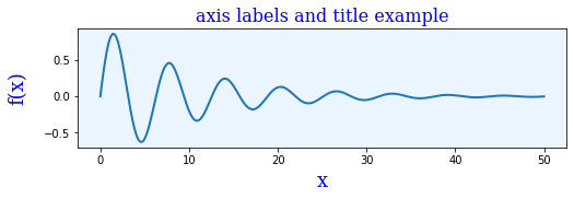
import numpy as np
import matplotlib.pyplot as plt

x = np.linspace(0, 50, 500)
y = np.sin(x) * np.exp(-x/10)

fig, ax = plt.subplots(figsize=(8, 2), subplot_kw={'facecolor': "#ebf5ff"})

ax.plot(x, y, lw=2)

ax.set_xlabel ("x", labelpad=5, fontsize=18, fontname='serif', color="blue")
ax.set_ylabel ("f(x)", labelpad=15, fontsize=18, fontname='serif', color="blue")
ax.set_title("axis labels and title example", fontsize=16, fontname='serif', color="blue")
plt.show()
OUTPUT
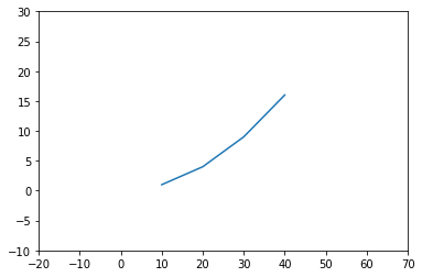
Axis range
%matplotlib inline
import matplotlib.pyplot as plt

plt.plot([10, 20, 30, 40], [1, 4, 9, 16])
plt.xlim(-20, 70)
plt.ylim(-10, 30)
plt.show()
OUTPUT
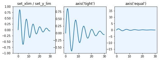
import numpy as np
import matplotlib.pyplot as plt

x = np.linspace(0, 30, 500)
y = np.sin(x) * np.exp(-x/10)

fig, axes = plt.subplots(1, 3, figsize=(9, 3), subplot_kw={'facecolor': "#ebf5ff"})

axes[0].plot(x, y, lw=2)
axes[0].set_xlim(-5, 35)
axes[0].set_ylim(-1, 1)
axes[0].set_title("set_xlim / set_y_lim")

axes[1].plot(x, y, lw=2)
axes[1].axis('tight')
axes[1].set_title("axis('tight')")

axes[2].plot(x, y, lw=2)
axes[2].axis('equal')
axes[2].set_title("axis('equal')")

plt.show()
OUTPUT
Axis ticks, tick labels, and grids
Base tick
%matplotlib inline
import matplotlib.pyplot as plt
import numpy as np

x = np.linspace(-np.pi, np.pi, 50)
y = np.cos(x)

plt.plot(x, y)
plt.xticks([-3.14, -3.14/2, 0, 3.14/2, 3.14])
plt.yticks([-1, 0, +1])
plt.show()
OUTPUT
Tick spacing
import numpy as np
import matplotlib.pyplot as plt
import matplotlib.ticker as ticker
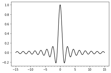
X = np.linspace(-15, 15, 1024)
Y = np.sinc(X)
ax = plt.axes()
ax.xaxis.set_major_locator(ticker.MultipleLocator(5))
ax.xaxis.set_minor_locator(ticker.MultipleLocator(1))
plt.plot(X, Y, c = 'k')
plt.show()
OUTPUT
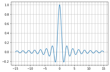
import numpy as np
import matplotlib.pyplot as plt
import matplotlib.ticker as ticker

X = np.linspace(-15, 15, 1024)
Y = np.sinc(X)

ax = plt.axes()
ax.xaxis.set_major_locator(ticker.MultipleLocator(5))
ax.xaxis.set_minor_locator(ticker.MultipleLocator(1))
plt.grid(True, which='both')
plt.plot(X, Y)
plt.show()
OUTPUT
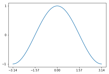
Tick labeling
%matplotlib inline
import matplotlib.pyplot as plt
import numpy as np
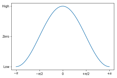
x = np.linspace(-np.pi, np.pi, 50)
y = np.cos(x)
plt.plot(x, y)
plt.xticks([-np.pi, -np.pi / 2, 0, np.pi / 2, np.pi],
[r'$-\pi$', r'$-\pi/2$', r'$0$', r'$+\pi/2$', r'$+\pi$'])
plt.yticks([-1, 0, 1], ["Low", "Zero", "High"])
plt.show()
OUTPUT
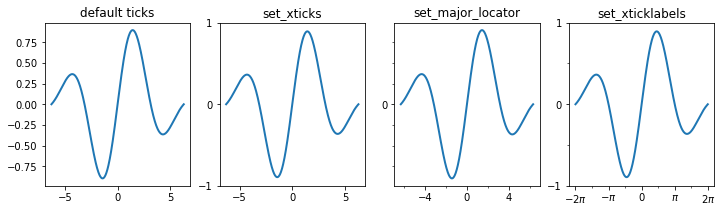
import numpy as np
import matplotlib as mpl
import matplotlib.pyplot as plt

x = np.linspace(-2 * np.pi, 2 * np.pi, 500)
y = np.sin(x) * np.exp(-x**2/20)

fig, axes = plt.subplots(1, 4, figsize=(12, 3))

axes[0].plot(x, y, lw=2)
axes[0].set_title("default ticks")

axes[1].plot(x, y, lw=2)
axes[1].set_title("set_xticks")
axes[1].set_yticks([-1, 0, 1])
axes[1].set_xticks([-5, 0, 5])

axes[2].plot(x, y, lw=2)
axes[2].set_title("set_major_locator")
axes[2].xaxis.set_major_locator(mpl.ticker.MaxNLocator(4))
axes[2].yaxis.set_major_locator(mpl.ticker.FixedLocator([-1, 0, 1]))
axes[2].xaxis.set_minor_locator(mpl.ticker.MaxNLocator(8))
axes[2].yaxis.set_minor_locator(mpl.ticker.MaxNLocator(8))

axes[3].plot(x, y, lw=2)
axes[3].set_title("set_xticklabels")
axes[3].set_yticks([-1, 0, 1])
axes[3].set_xticks([-2 * np.pi, -np.pi, 0, np.pi, 2 * np.pi])
axes[3].set_xticklabels([r'$-2\pi$', r'$-\pi$', 0, r'$\pi$',   r'$2\pi$'])
x_minor_ticker = mpl.ticker.FixedLocator([-3 * np.pi / 2,  -np.pi / 2, 0,

np.pi / 2, 3 * np.pi / 2])
axes[3].xaxis.set_minor_locator(x_minor_ticker)
axes[3].yaxis.set_minor_locator(mpl.ticker.MaxNLocator(4))

plt.show()
OUTPUT
import numpy as np
import matplotlib as mpl
import matplotlib.pyplot as plt
fig, axes = plt.subplots(1, 3, figsize=(12, 4))
x_major_ticker = mpl.ticker.MultipleLocator(4)
x_minor_ticker = mpl.ticker.MultipleLocator(1)
y_major_ticker = mpl.ticker.MultipleLocator(0.5)
y_minor_ticker = mpl.ticker.MultipleLocator(0.25)
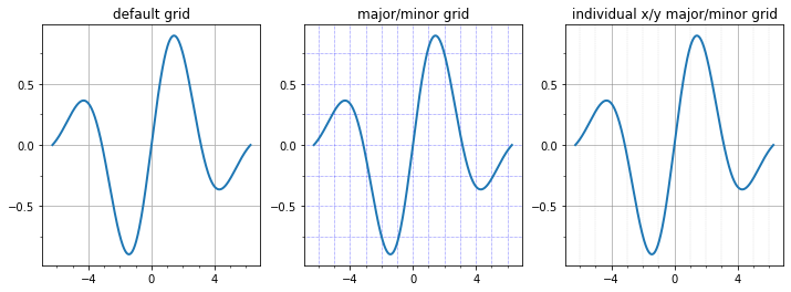
for ax in axes:
ax.plot(x, y, lw=2)
ax.xaxis.set_major_locator(x_major_ticker)
ax.yaxis.set_major_locator(y_major_ticker)
ax.xaxis.set_minor_locator(x_minor_ticker)
ax.yaxis.set_minor_locator(y_minor_ticker)
axes[0].set_title("default grid")
axes[0].grid()
axes[1].set_title("major/minor grid")
axes[1].grid(color="blue", which="both", linestyle=':', linewidth=0.5)
axes[2].set_title("individual x/y major/minor grid")
axes[2].grid(color="grey", which="major", axis='x', linestyle='-', linewidth=0.5)
axes[2].grid(color="grey", which="minor", axis='x', linestyle=':', linewidth=0.25)
axes[2].grid(color="grey", which="major", axis='y', linestyle='-', linewidth=0.5)
plt.show()
OUTPUT
import numpy as np
import matplotlib.ticker as ticker
import matplotlib.pyplot as plt
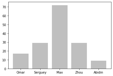
name_list = ('Omar', 'Serguey', 'Max', 'Zhou', 'Abidin')
value_list = np.random.randint(0, 99, size = len(name_list))
pos_list = np.arange(len(name_list))
ax = plt.axes()
ax.xaxis.set_major_locator(ticker.FixedLocator((pos_list)))
ax.xaxis.set_major_formatter(ticker.FixedFormatter((name_list)))
plt.bar(pos_list, value_list, color = '.75', align = 'center')
plt.show()
OUTPUT
# A simpler way to create bar charts with fixed labels
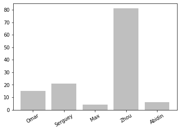
import numpy as np
import matplotlib.pyplot as plt
name_list = ('Omar', 'Serguey', 'Max', 'Zhou', 'Abidin')
value_list = np.random.randint(0, 99, size = len(name_list))
pos_list = np.arange(len(name_list))
plt.bar(pos_list, value_list, color = '.75', align = 'center')
plt.xticks(pos_list, name_list, rotation=30)
plt.show()
OUTPUT
# Advanced label generation
import numpy as np
import matplotlib.pyplot as plt
import matplotlib.ticker as ticker

X = np.linspace(0, 1, 256)

def make_label(value, pos):
     return '%0.1f%%' % (100. * value)

ax = plt.axes()
ax.xaxis.set_major_formatter(ticker.FuncFormatter(make_label))
plt.plot(X, np.exp(-10 * X), c ='k')
plt.plot(X, np.exp(-5 * X), c= 'k', ls = '--')
plt.show()
OUTPUT
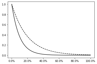
import numpy as np
import datetime
import matplotlib.pyplot as plt
import matplotlib.ticker as ticker

X = np.linspace(0, 1, 256)
start_date = datetime.datetime(1998, 1, 1)

def make_label(value, pos):
     time = start_date + datetime.timedelta(days = 365 * value)
     return time.strftime('%b %y')

ax = plt.axes()
ax.xaxis.set_major_formatter(ticker.FuncFormatter(make_label))
plt.plot(X, np.exp(-10 * X), c = 'k')
plt.plot(X, np.exp(-5 * X), c = 'k', ls = '--')
labels = ax.get_xticklabels()
plt.setp(labels, rotation = 30.)
plt.show()
OUTPUT
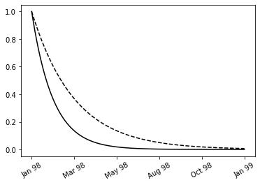
Scientific notation labels
import numpy as np
import matplotlib as mpl
import matplotlib.pyplot as plt

fig, axes = plt.subplots(1, 2, figsize=(8, 3))

x = np.linspace(0, 1e5, 100)
y = x ** 2

axes[0].plot(x, y, 'b.')
axes[0].set_title("default labels", loc='right')

axes[1].plot(x, y, 'b')
axes[1].set_title("scientific notation labels", loc='right')

formatter = mpl.ticker.ScalarFormatter(useMathText=True)
formatter.set_scientific(True)
formatter.set_powerlimits((-1,1))
axes[1].xaxis.set_major_formatter(formatter)
axes[1].yaxis.set_major_formatter(formatter)

plt.show()
OUTPUT
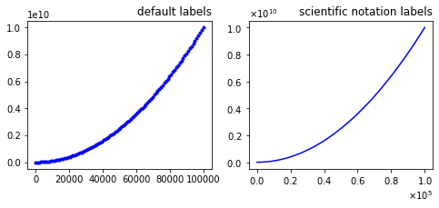
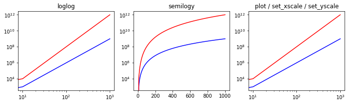
Log plots
import numpy as np
import matplotlib.pyplot as plt

fig, axes = plt.subplots(1, 3, figsize=(12, 3))

x = np.linspace(0, 1e3, 100)
y1, y2 = x**3, x**4

axes[0].set_title('loglog')
axes[0].loglog(x, y1, 'b', x, y2, 'r')

axes[1].set_title('semilogy')
axes[1].semilogy(x, y1, 'b', x, y2, 'r')

axes[2].set_title('plot / set_xscale / set_yscale')
axes[2].plot(x, y1, 'b', x, y2, 'r')
axes[2].set_xscale('log')
axes[2].set_yscale('log')

plt.show()
OUTPUT
Spines
import numpy as np
import matplotlib.pyplot as plt

x = np.linspace(-10, 10, 500)
y = np.sin(x) / x

fig, ax = plt.subplots(figsize=(8, 4))

ax.plot(x, y, linewidth=2)

# remove top and right spines

ax.spines['right'].set_color('none')
ax.spines['top'].set_color('none')

# remove top and right spine ticks
ax.xaxis.set_ticks_position('bottom')
ax.yaxis.set_ticks_position('left')

# move bottom and left spine to x = 0 and y = 0
ax.spines['bottom'].set_position(('data', 0))
ax.spines['left'].set_position(('data', 0))

ax.set_xticks([-10, -5, 5, 10])
ax.set_yticks([0.5, 1])

#  give each label a solid background of white, to not overlap with the plot line
for label in ax.get_xticklabels() + ax.get_yticklabels():
    label.set_bbox({'facecolor': 'white', 'edgecolor': 'white'})

plt.show()
OUTPUT
Colormap Plots
import numpy as np
import matplotlib.pyplot as plt
import matplotlib as mpl

x = y = np.linspace(-10, 10, 150)
X, Y = np.meshgrid(x, y)
Z = np.cos(X) * np.cos(Y) * np.exp(-(X/5)**2-(Y/5)**2)

fig, ax = plt.subplots(figsize=(6, 5))

norm = mpl.colors.Normalize(-abs(Z).max(), abs(Z).max())
p = ax.pcolor(X, Y, Z, norm=norm, cmap=mpl.cm.bwr)

ax.axis('tight')
ax.set_xlabel(r"$x$", fontsize=18)
ax.set_ylabel(r"$y$", fontsize=18)
ax.xaxis.set_major_locator(mpl.ticker.MaxNLocator(4))
ax.yaxis.set_major_locator(mpl.ticker.MaxNLocator(4))

cb = fig.colorbar(p, ax=ax)
cb.set_label(r"$z$", fontsize=18)
cb.set_ticks([-1, -.5, 0, .5, 1])

plt.show()
OUTPUT
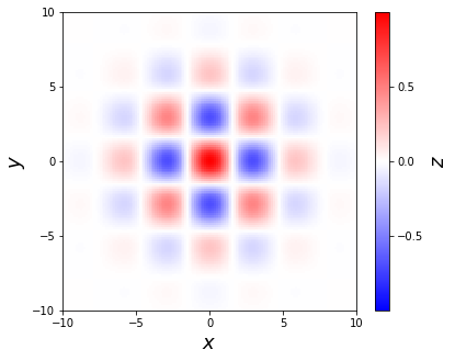
Working with Maps
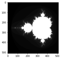
Visualizing the content of a 2D array
import numpy as np
import matplotlib.cm as cm
from matplotlib import pyplot as plt
def iter_count(C, max_iter):
    X = C
    for n in range(max_iter):
        if abs(X) > 2.:
            return n
        X = X ** 2 + C
    return max_iter
N = 512
max_iter = 64
xmin, xmax, ymin, ymax = -2.2, .8, -1.5, 1.5
X = np.linspace(xmin, xmax, N)
Y = np.linspace(ymin, ymax, N)
Z = np.empty((N, N))
for i, y in enumerate(Y):
    for j, x in enumerate(X):
        Z[i, j] = iter_count(complex(x, y), max_iter)
plt.imshow(Z, cmap = cm.gray)
plt.show()
OUTPUT
```python import matplotlib.cm as cm plt.imshow(Z, cmap = cm.binary, extent=(xmin, xmax, ymin, ymax)) ``` 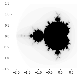
```python plt.imshow(Z, cmap = cm.binary, interpolation = 'nearest', extent=(xmin, xmax, ymin, ymax)) ``` 
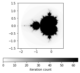
Adding a colormap legend to a figure
import numpy as np
from matplotlib import pyplot as plt
import matplotlib.cm as cm
def iter_count(C, max_iter):
    X = C
    for n in range(max_iter):
        if abs(X) > 2.:
            return n
        X = X ** 2 + C
    return max_iter
N = 512
max_iter = 64
xmin, xmax, ymin, ymax = -2.2, .8, -1.5, 1.5
X = np.linspace(xmin, xmax, N)
Y = np.linspace(ymin, ymax, N)
Z = np.empty((N, N))
for i, y in enumerate(Y):
    for j, x in enumerate(X):
        Z[i, j] = iter_count(complex(x, y), max_iter)
plt.imshow(Z,
           cmap = cm.binary,
           interpolation = 'bicubic',
           extent=(xmin, xmax, ymin, ymax))
cb = plt.colorbar(orientation='horizontal', shrink=.75)
cb.set_label('iteration count')
plt.show()
OUTPUT
Visualizing a 2D scalar field
import numpy as np
from matplotlib import pyplot as plt
import matplotlib.cm as cm

n = 256
x = np.linspace(-3., 3., n)
y = np.linspace(-3., 3., n)
X, Y = np.meshgrid(x, y)
Z = X * np.sinc(X ** 2 + Y ** 2)
plt.pcolormesh(X, Y, Z, cmap = cm.gray)
plt.show()
OUTPUT
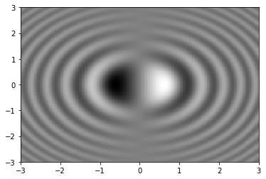
Visualizing contour lines
import numpy as np
from matplotlib import pyplot as plt
import matplotlib.cm as cm
def iter_count(C, max_iter):
     X = C
     for n in range(max_iter):
         if abs(X) > 2.:
             return n
         X = X ** 2 + C
     return max_iter
N = 512
max_iter = 64
xmin, xmax, ymin, ymax = -0.32, -0.22, 0.8, 0.9
X = np.linspace(xmin, xmax, N)
Y = np.linspace(ymin, ymax, N)
Z = np.empty((N, N))
for i, y in enumerate(Y):
     for j, x in enumerate(X):
         Z[i, j] = iter_count(complex(x, y), max_iter)
plt.imshow(Z,
           cmap = cm.binary,
           interpolation = 'bicubic',
           origin = 'lower',
           extent=(xmin, xmax, ymin, ymax))
levels = [8, 12, 16, 20]
ct = plt.contour(X, Y, Z, levels, cmap = cm.gray)
plt.clabel(ct, fmt='%d')
plt.show()
OUTPUT
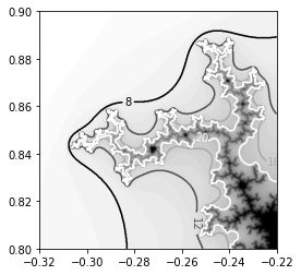
import numpy as np
from matplotlib import pyplot as plt
import matplotlib.cm as cm
def iter_count(C, max_iter):
     X = C
     for n in range(max_iter):
         if abs(X) > 2.:
             return n
         X = X ** 2 + C
     return max_iter
N = 512
max_iter = 64
xmin, xmax, ymin, ymax = -0.32, -0.22, 0.8, 0.9
X = np.linspace(xmin, xmax, N)
Y = np.linspace(ymin, ymax, N)
Z = np.empty((N, N))
for i, y in enumerate(Y):
     for j, x in enumerate(X):
         Z[i, j] = iter_count(complex(x, y), max_iter)
levels = [0, 8, 12, 16, 20, 24, 32]
plt.contourf(X, Y, Z, levels, cmap = cm.gray, antialiased = True)
plt.show()

Visualizing a 2D vector field
import numpy as np
import sympy
from sympy.abc import x, y
from matplotlib import pyplot as plt
import matplotlib.patches as patches
def cylinder_stream_function(U = 1, R = 1):
     r = sympy.sqrt(x ** 2 + y ** 2)
     theta = sympy.atan2(y, x)
     return U * (r - R ** 2 / r) * sympy.sin(theta)
def velocity_field(psi):
     u = sympy.lambdify((x, y), psi.diff(y), 'numpy')
     v = sympy.lambdify((x, y), -psi.diff(x), 'numpy')
     return u, v
U_func, V_func = velocity_field(cylinder_stream_function() )
xmin, xmax, ymin, ymax = -2.5, 2.5, -2.5, 2.5
Y, X = np.ogrid[ymin:ymax:16j, xmin:xmax:16j]
U, V = U_func(X, Y), V_func(X, Y)
M = (X ** 2 + Y ** 2) < 1.
U = np.ma.masked_array(U, mask = M)
V = np.ma.masked_array(V, mask = M)
shape = patches.Circle((0, 0), radius = 1., lw = 2., fc = 'w', ec = 'k', zorder = 0)
plt.gca().add_patch(shape)
plt.quiver(X, Y, U, V, zorder = 1)
plt.axes().set_aspect('equal')
plt.show()
OUTPUT
Visualizing the streamlines of a 2D vector field
import numpy as np
import sympy
from sympy.abc import x, y
from matplotlib import pyplot as plt
import matplotlib.patches as patches
def cylinder_stream_function(U = 1, R = 1):
     r = sympy.sqrt(x ** 2 + y ** 2)
     theta = sympy.atan2(y, x)
     return U * (r - R ** 2 / r) * sympy.sin(theta)
def velocity_field(psi):
     u = sympy.lambdify((x, y), psi.diff(y), 'numpy')
     v = sympy.lambdify((x, y), -psi.diff(x), 'numpy')
     return u, v
psi = cylinder_stream_function()
U_func, V_func = velocity_field(psi)
xmin, xmax, ymin, ymax = -3, 3, -3, 3
Y, X = np.ogrid[ymin:ymax:128j, xmin:xmax:128j]
U, V = U_func(X, Y), V_func(X, Y)
M = (X ** 2 + Y ** 2) < 1.
U = np.ma.masked_array(U, mask = M)
V = np.ma.masked_array(V, mask = M)
shape = patches.Circle((0, 0), radius = 1., lw = 2., fc = 'w', ec = 'k', zorder = 0)
plt.gca().add_patch(shape)
plt.streamplot(X, Y, U, V, color = 'k')
plt.axes().set_aspect('equal')
plt.show()
OUTPUT
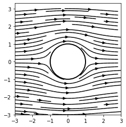
```python plt.streamplot(X, Y, U, V, color = U ** 2 + V ** 2, cmap = cm.binary) ``` 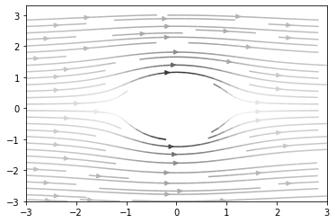
Basic 3D Plots
3D Line plot
import matplotlib as mpl
from mpl_toolkits.mplot3d import Axes3D
import numpy as np
import matplotlib.pyplot as plt

mpl.rcParams['legend.fontsize'] = 10

fig = plt.figure()
ax = fig.gca(projection='3d')
theta = np.linspace(-4 * np.pi, 4 * np.pi, 100)
z = np.linspace(-2, 2, 100)
r = z**2 + 1
x = r * np.sin(theta)
y = r * np.cos(theta)
ax.plot(x, y, z, label='parametric curve')
ax.legend()

plt.show()
OUTPUT
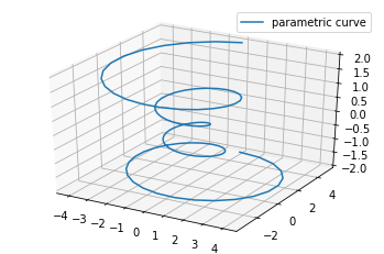
3D Scatter plots
from mpl_toolkits.mplot3d import Axes3D
import matplotlib.pyplot as plt

fig = plt.figure()
ax = fig.add_subplot(111, projection='3d')

x =[1,2,3,4,5,6,7,8,9,10]
y =[5,6,2,3,13,4,1,2,4,8]
z =[2,3,3,3,5,7,9,11,9,10]

ax.scatter(x, y, z, c='r', marker='o')
plt.show()
OUTPUT
Another scatter 3d plot
```python from mpl_toolkits.mplot3d import Axes3D import matplotlib.pyplot as plt import numpy as np
def randrange(n, vmin, vmax): ''' Helper function to make an array of random numbers having shape (n, ) with each number distributed Uniform(vmin, vmax). ''' return (vmax - vmin)*np.random.rand(n) + vmin
fig = plt.figure() ax = fig.add_subplot(111, projection='3d')
n = 100
For each set of style and range settings, plot n random points in the box
defined by x in [23, 32], y in [0, 100], z in [zlow, zhigh].
for c, m, zlow, zhigh in [('r', 'o', -50, -25), ('b', '^', -30, -5)]: xs = randrange(n, 23, 32) ys = randrange(n, 0, 100) zs = randrange(n, zlow, zhigh) ax.scatter(xs, ys, zs, c=c, marker=m)
ax.set_xlabel('X Label') ax.set_ylabel('Y Label') ax.set_zlabel('Z Label')
plt.show()
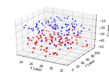
<hr class='division3'>
</details>
<br><br><br>
---
### ***3D Wireframe plots***
```python
from mpl_toolkits.mplot3d import axes3d
import matplotlib.pyplot as plt
fig = plt.figure()
ax = fig.add_subplot(111, projection='3d')
# Grab some test data.
X, Y, Z = axes3d.get_test_data(0.05)
# Plot a basic wireframe.
ax.plot_wireframe(X, Y, Z, rstride=10, cstride=10)
plt.show()
OUTPUT
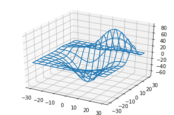
3D Surface plots
from mpl_toolkits.mplot3d import Axes3D
import matplotlib.pyplot as plt
from matplotlib import cm
from matplotlib.ticker import LinearLocator, FormatStrFormatter
import numpy as np


fig = plt.figure()
ax = fig.gca(projection='3d')

# Make data.
X = np.arange(-5, 5, 0.25)
Y = np.arange(-5, 5, 0.25)
X, Y = np.meshgrid(X, Y)
R = np.sqrt(X**2 + Y**2)
Z = np.sin(R)

# Plot the surface.
surf = ax.plot_surface(X, Y, Z, cmap=cm.coolwarm,
                       linewidth=0, antialiased=False)

# Customize the z axis.
ax.set_zlim(-1.01, 1.01)
ax.zaxis.set_major_locator(LinearLocator(10))
ax.zaxis.set_major_formatter(FormatStrFormatter('%.02f'))

# Add a color bar which maps values to colors.
fig.colorbar(surf, shrink=0.5, aspect=5)

plt.show()
OUTPUT
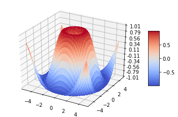
```python from mpl_toolkits.mplot3d import Axes3D import matplotlib.pyplot as plt import numpy as np
fig = plt.figure() ax = fig.add_subplot(111, projection='3d')
Make data
u = np.linspace(0, 2 * np.pi, 100) v = np.linspace(0, np.pi, 100) x = 10 * np.outer(np.cos(u), np.sin(v)) y = 10 * np.outer(np.sin(u), np.sin(v)) z = 10 * np.outer(np.ones(np.size(u)), np.cos(v))
Plot the surface
ax.plot_surface(x, y, z, color='b')
plt.show()
<details open markdown="1">
<summary class='jb-small' style="color:blue">OUTPUT</summary>
<hr class='division3'>
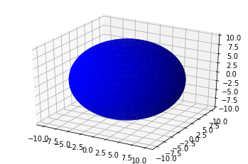
<hr class='division3'>
</details>
<br>
```python
from mpl_toolkits.mplot3d import Axes3D
import matplotlib.pyplot as plt
from matplotlib import cm
from matplotlib.ticker import LinearLocator
import numpy as np
fig = plt.figure()
ax = fig.gca(projection='3d')
# Make data.
X = np.arange(-5, 5, 0.25)
xlen = len(X)
Y = np.arange(-5, 5, 0.25)
ylen = len(Y)
X, Y = np.meshgrid(X, Y)
R = np.sqrt(X**2 + Y**2)
Z = np.sin(R)
# Create an empty array of strings with the same shape as the meshgrid, and
# populate it with two colors in a checkerboard pattern.
colortuple = ('y', 'b')
colors = np.empty(X.shape, dtype=str)
for y in range(ylen):
for x in range(xlen):
colors[x, y] = colortuple[(x + y) % len(colortuple)]
# Plot the surface with face colors taken from the array we made.
surf = ax.plot_surface(X, Y, Z, facecolors=colors, linewidth=0)
# Customize the z axis.
ax.set_zlim(-1, 1)
ax.w_zaxis.set_major_locator(LinearLocator(6))
plt.show()
OUTPUT
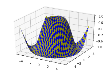
3D Tri-Surface plots
from mpl_toolkits.mplot3d import Axes3D
import matplotlib.pyplot as plt
import numpy as np


n_radii = 8
n_angles = 36

# Make radii and angles spaces (radius r=0 omitted to eliminate duplication).
radii = np.linspace(0.125, 1.0, n_radii)
angles = np.linspace(0, 2*np.pi, n_angles, endpoint=False)

# Repeat all angles for each radius.
angles = np.repeat(angles[..., np.newaxis], n_radii, axis=1)

# Convert polar (radii, angles) coords to cartesian (x, y) coords.
# (0, 0) is manually added at this stage,  so there will be no duplicate
# points in the (x, y) plane.
x = np.append(0, (radii*np.cos(angles)).flatten())
y = np.append(0, (radii*np.sin(angles)).flatten())

# Compute z to make the pringle surface.
z = np.sin(-x*y)

fig = plt.figure()
ax = fig.gca(projection='3d')

ax.plot_trisurf(x, y, z, linewidth=0.2, antialiased=True)

plt.show()
OUTPUT
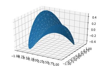
```python import numpy as np import matplotlib.pyplot as plt from mpl_toolkits.mplot3d import Axes3D import matplotlib.tri as mtri
fig = plt.figure(figsize=plt.figaspect(0.5))
#============
First plot
#============
Make a mesh in the space of parameterisation variables u and v
u = np.linspace(0, 2.0 * np.pi, endpoint=True, num=50) v = np.linspace(-0.5, 0.5, endpoint=True, num=10) u, v = np.meshgrid(u, v) u, v = u.flatten(), v.flatten()
This is the Mobius mapping, taking a u, v pair and returning an x, y, z
triple
x = (1 + 0.5 * v * np.cos(u / 2.0)) * np.cos(u) y = (1 + 0.5 * v * np.cos(u / 2.0)) * np.sin(u) z = 0.5 * v * np.sin(u / 2.0)
Triangulate parameter space to determine the triangles
tri = mtri.Triangulation(u, v)
Plot the surface. The triangles in parameter space determine which x, y, z
points are connected by an edge.
ax = fig.add_subplot(1, 2, 1, projection='3d') ax.plot_trisurf(x, y, z, triangles=tri.triangles, cmap=plt.cm.Spectral) ax.set_zlim(-1, 1)
#============
Second plot
#============
Make parameter spaces radii and angles.
n_angles = 36 n_radii = 8 min_radius = 0.25 radii = np.linspace(min_radius, 0.95, n_radii)
angles = np.linspace(0, 2*np.pi, n_angles, endpoint=False) angles = np.repeat(angles[..., np.newaxis], n_radii, axis=1) angles[:, 1::2] += np.pi/n_angles
Map radius, angle pairs to x, y, z points.
x = (radiinp.cos(angles)).flatten() y = (radiinp.sin(angles)).flatten() z = (np.cos(radii)np.cos(angles3.0)).flatten()
Create the Triangulation; no triangles so Delaunay triangulation created.
triang = mtri.Triangulation(x, y)
Mask off unwanted triangles.
xmid = x[triang.triangles].mean(axis=1) ymid = y[triang.triangles].mean(axis=1) mask = np.where(xmid2 + ymid2 < min_radius**2, 1, 0) triang.set_mask(mask)
Plot the surface.
ax = fig.add_subplot(1, 2, 2, projection='3d') ax.plot_trisurf(triang, z, cmap=plt.cm.CMRmap)
plt.show()
<details open markdown="1">
<summary class='jb-small' style="color:blue">OUTPUT</summary>
<hr class='division3'>
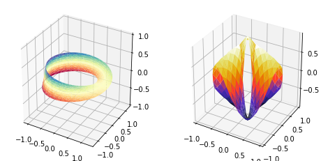
<hr class='division3'>
</details>
<br><br><br>
---
### ***3D Contour plots***
```python
from mpl_toolkits.mplot3d import axes3d
import matplotlib.pyplot as plt
from matplotlib import cm
fig = plt.figure()
ax = fig.add_subplot(111, projection='3d')
X, Y, Z = axes3d.get_test_data(0.05)
cset = ax.contour(X, Y, Z, cmap=cm.coolwarm)
ax.clabel(cset, fontsize=9, inline=1)
plt.show()
OUTPUT
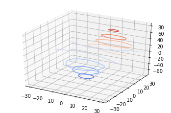
```python from mpl_toolkits.mplot3d import axes3d import matplotlib.pyplot as plt from matplotlib import cm
fig = plt.figure() ax = fig.gca(projection='3d') X, Y, Z = axes3d.get_test_data(0.05) cset = ax.contour(X, Y, Z, extend3d=True, cmap=cm.coolwarm) ax.clabel(cset, fontsize=9, inline=1)
plt.show()
<details open markdown="1">
<summary class='jb-small' style="color:blue">OUTPUT</summary>
<hr class='division3'>
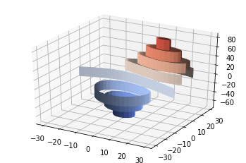
<hr class='division3'>
</details>
<br>
```python
from mpl_toolkits.mplot3d import axes3d
import matplotlib.pyplot as plt
from matplotlib import cm
fig = plt.figure()
ax = fig.gca(projection='3d')
X, Y, Z = axes3d.get_test_data(0.05)
ax.plot_surface(X, Y, Z, rstride=8, cstride=8, alpha=0.3)
cset = ax.contour(X, Y, Z, zdir='z', offset=-100, cmap=cm.coolwarm)
cset = ax.contour(X, Y, Z, zdir='x', offset=-40, cmap=cm.coolwarm)
cset = ax.contour(X, Y, Z, zdir='y', offset=40, cmap=cm.coolwarm)
ax.set_xlabel('X')
ax.set_xlim(-40, 40)
ax.set_ylabel('Y')
ax.set_ylim(-40, 40)
ax.set_zlabel('Z')
ax.set_zlim(-100, 100)
plt.show()
OUTPUT
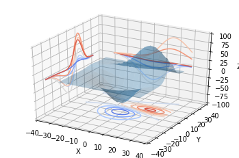
3D Filled contour plots
from mpl_toolkits.mplot3d import axes3d
import matplotlib.pyplot as plt
from matplotlib import cm

fig = plt.figure()
ax = fig.gca(projection='3d')
X, Y, Z = axes3d.get_test_data(0.05)
cset = ax.contourf(X, Y, Z, cmap=cm.coolwarm)
ax.clabel(cset, fontsize=9, inline=1)

plt.show()
OUTPUT
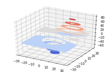
```python from mpl_toolkits.mplot3d import axes3d import matplotlib.pyplot as plt from matplotlib import cm
fig = plt.figure() ax = fig.gca(projection='3d') X, Y, Z = axes3d.get_test_data(0.05) ax.plot_surface(X, Y, Z, rstride=8, cstride=8, alpha=0.3) cset = ax.contourf(X, Y, Z, zdir='z', offset=-100, cmap=cm.coolwarm) cset = ax.contourf(X, Y, Z, zdir='x', offset=-40, cmap=cm.coolwarm) cset = ax.contourf(X, Y, Z, zdir='y', offset=40, cmap=cm.coolwarm)
ax.set_xlabel('X') ax.set_xlim(-40, 40) ax.set_ylabel('Y') ax.set_ylim(-40, 40) ax.set_zlabel('Z') ax.set_zlim(-100, 100)
plt.show()
<details open markdown="1">
<summary class='jb-small' style="color:blue">OUTPUT</summary>
<hr class='division3'>
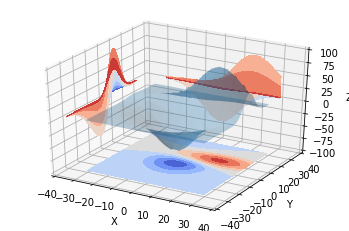
<hr class='division3'>
</details>
<br><br><br>
---
### ***3D Polygon plots***
```python
from mpl_toolkits.mplot3d import Axes3D
from matplotlib.collections import PolyCollection
import matplotlib.pyplot as plt
from matplotlib import colors as mcolors
import numpy as np
fig = plt.figure()
ax = fig.gca(projection='3d')
def cc(arg):
return mcolors.to_rgba(arg, alpha=0.6)
xs = np.arange(0, 10, 0.4)
verts = []
zs = [0.0, 1.0, 2.0, 3.0]
for z in zs:
ys = np.random.rand(len(xs))
ys[0], ys[-1] = 0, 0
verts.append(list(zip(xs, ys)))
poly = PolyCollection(verts, facecolors=[cc('r'), cc('g'), cc('b'),
cc('y')])
poly.set_alpha(0.7)
ax.add_collection3d(poly, zs=zs, zdir='y')
ax.set_xlabel('X')
ax.set_xlim3d(0, 10)
ax.set_ylabel('Y')
ax.set_ylim3d(-1, 4)
ax.set_zlabel('Z')
ax.set_zlim3d(0, 1)
plt.show()
OUTPUT
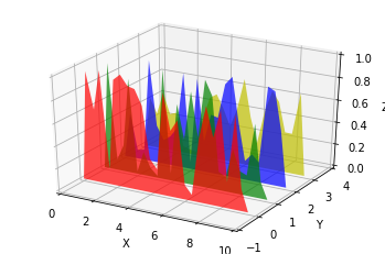
3D Bar plots
from mpl_toolkits.mplot3d import Axes3D
import matplotlib.pyplot as plt
import numpy as np

fig = plt.figure()
ax = fig.add_subplot(111, projection='3d')
for c, z in zip(['r', 'g', 'b', 'y'], [30, 20, 10, 0]):
    xs = np.arange(20)
    ys = np.random.rand(20)

    # You can provide either a single color or an array. To demonstrate this,
    # the first bar of each set will be colored cyan.
    cs = [c] * len(xs)
    cs[0] = 'c'
    ax.bar(xs, ys, zs=z, zdir='y', color=cs, alpha=0.8)

ax.set_xlabel('X')
ax.set_ylabel('Y')
ax.set_zlabel('Z')

plt.show()
OUTPUT
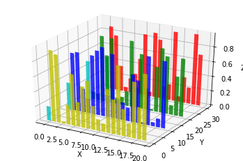
3D Quiver
from mpl_toolkits.mplot3d import axes3d
import matplotlib.pyplot as plt
import numpy as np

fig = plt.figure()
ax = fig.gca(projection='3d')

# Make the grid
x, y, z = np.meshgrid(np.arange(-0.8, 1, 0.2),
                      np.arange(-0.8, 1, 0.2),
                      np.arange(-0.8, 1, 0.8))

# Make the direction data for the arrows
u = np.sin(np.pi * x) * np.cos(np.pi * y) * np.cos(np.pi * z)
v = -np.cos(np.pi * x) * np.sin(np.pi * y) * np.cos(np.pi * z)
w = (np.sqrt(2.0 / 3.0) * np.cos(np.pi * x) * np.cos(np.pi * y) *
     np.sin(np.pi * z))

ax.quiver(x, y, z, u, v, w, length=0.1, normalize=True)

plt.show()
OUTPUT
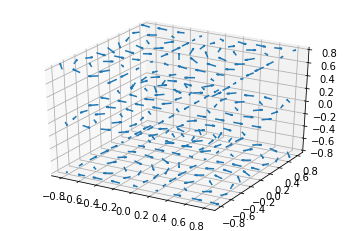
2D plots in 3D
OUTPUT
3D Text
from mpl_toolkits.mplot3d import Axes3D
import matplotlib.pyplot as plt


fig = plt.figure()
ax = fig.gca(projection='3d')

# Demo 1: zdir
zdirs = (None, 'x', 'y', 'z', (1, 1, 0), (1, 1, 1))
xs = (1, 4, 4, 9, 4, 1)
ys = (2, 5, 8, 10, 1, 2)
zs = (10, 3, 8, 9, 1, 8)

for zdir, x, y, z in zip(zdirs, xs, ys, zs):
    label = '(%d, %d, %d), dir=%s' % (x, y, z, zdir)
    ax.text(x, y, z, label, zdir)

# Demo 2: color
ax.text(9, 0, 0, "red", color='red')

# Demo 3: text2D
# Placement 0, 0 would be the bottom left, 1, 1 would be the top right.
ax.text2D(0.05, 0.95, "2D Text", transform=ax.transAxes)

# Tweaking display region and labels
ax.set_xlim(0, 10)
ax.set_ylim(0, 10)
ax.set_zlim(0, 10)
ax.set_xlabel('X axis')
ax.set_ylabel('Y axis')
ax.set_zlabel('Z axis')

plt.show()
OUTPUT
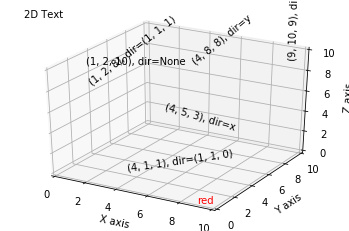
3D Subplotting
import matplotlib.pyplot as plt
from mpl_toolkits.mplot3d.axes3d import Axes3D, get_test_data
from matplotlib import cm
import numpy as np


# set up a figure twice as wide as it is tall
fig = plt.figure(figsize=plt.figaspect(0.5))

#===============
#  First subplot
#===============
# set up the axes for the first plot
ax = fig.add_subplot(1, 2, 1, projection='3d')

# plot a 3D surface like in the example mplot3d/surface3d_demo
X = np.arange(-5, 5, 0.25)
Y = np.arange(-5, 5, 0.25)
X, Y = np.meshgrid(X, Y)
R = np.sqrt(X**2 + Y**2)
Z = np.sin(R)
surf = ax.plot_surface(X, Y, Z, rstride=1, cstride=1, cmap=cm.coolwarm,
                       linewidth=0, antialiased=False)
ax.set_zlim(-1.01, 1.01)
fig.colorbar(surf, shrink=0.5, aspect=10)

#===============
# Second subplot
#===============
# set up the axes for the second plot
ax = fig.add_subplot(1, 2, 2, projection='3d')

# plot a 3D wireframe like in the example mplot3d/wire3d_demo
X, Y, Z = get_test_data(0.05)
ax.plot_wireframe(X, Y, Z, rstride=10, cstride=10)

plt.show()
OUTPUT
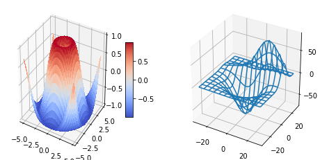
```python from mpl_toolkits.mplot3d import Axes3D import matplotlib.pyplot as plt import numpy as np
def f(t): s1 = np.cos(2np.pit) e1 = np.exp(-t) return np.multiply(s1, e1)
################
First subplot
################ t1 = np.arange(0.0, 5.0, 0.1) t2 = np.arange(0.0, 5.0, 0.02) t3 = np.arange(0.0, 2.0, 0.01)
Twice as tall as it is wide.
fig = plt.figure(figsize=plt.figaspect(2.)) fig.suptitle('A tale of 2 subplots') ax = fig.add_subplot(2, 1, 1) l = ax.plot(t1, f(t1), 'bo', t2, f(t2), 'k--', markerfacecolor='green') ax.grid(True) ax.set_ylabel('Damped oscillation')
#################
Second subplot
################# ax = fig.add_subplot(2, 1, 2, projection='3d') X = np.arange(-5, 5, 0.25) xlen = len(X) Y = np.arange(-5, 5, 0.25) ylen = len(Y) X, Y = np.meshgrid(X, Y) R = np.sqrt(X2 + Y2) Z = np.sin(R)
surf = ax.plot_surface(X, Y, Z, rstride=1, cstride=1, linewidth=0, antialiased=False)
ax.set_zlim3d(-1, 1)
plt.show()
<details open markdown="1">
<summary class='jb-small' style="color:blue">OUTPUT</summary>
<hr class='division3'>
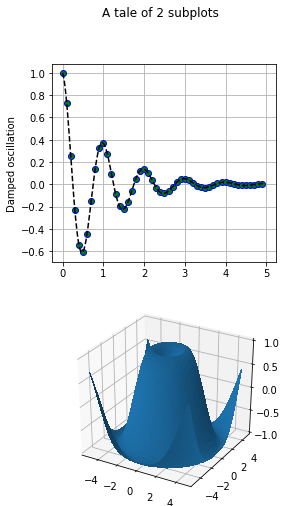
<hr class='division3'>
</details>
<br><br><br>
<hr class="division2">
## **Actual 3D Plots**
```python
%matplotlib inline
import matplotlib as mpl
import matplotlib.pyplot as plt
from mpl_toolkits.mplot3d.axes3d import Axes3D
import numpy as np
import sympy
fig, axes = plt.subplots(1, 3, figsize=(14, 4), subplot_kw={'projection': '3d'})
def title_and_labels(ax, title):
ax.set_title(title)
ax.set_xlabel("$x$", fontsize=16)
ax.set_ylabel("$y$", fontsize=16)
ax.set_zlabel("$z$", fontsize=16)
x = y = np.linspace(-3, 3, 74)
X, Y = np.meshgrid(x, y)
R = np.sqrt(X**2 + Y**2)
Z = np.sin(4 * R) / R
norm = mpl.colors.Normalize(-abs(Z).max(), abs(Z).max())
p = axes[0].plot_surface(X, Y, Z, rstride=1, cstride=1, linewidth=0, antialiased=False, norm=norm, cmap=mpl.cm.Blues)
cb = fig.colorbar(p, ax=axes[0], shrink=0.6)
title_and_labels(axes[0], "plot_surface")
p = axes[1].plot_wireframe(X, Y, Z, rstride=2, cstride=2, color="darkgrey")
title_and_labels(axes[1], "plot_wireframe")
cset = axes[2].contour(X, Y, Z, zdir='z', offset=0, norm=norm, cmap=mpl.cm.Blues)
cset = axes[2].contour(X, Y, Z, zdir='y', offset=3, norm=norm, cmap=mpl.cm.Blues)
title_and_labels(axes[2], "contour")
OUTPUT
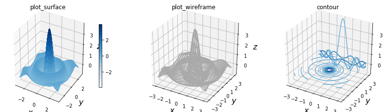
Creating 3D scatter plots
import numpy as np
from mpl_toolkits.mplot3d import Axes3D
import matplotlib.pyplot as plt
%matplotlib inline

# Dataset generation
a, b, c = 10., 28., 8. / 3.
def lorenz_map(X, dt = 1e-2):
     X_dt = np.array([a * (X[1] - X[0]),
     X[0] * (b - X[2]) - X[1],
     X[0] * X[1] - c * X[2]])
     return X + dt * X_dt
points = np.zeros((2000, 3))
X = np.array([.1, .0, .0])
for i in range(points.shape[0]):
     points[i], X = X, lorenz_map(X)
# Plotting
fig = plt.figure()
ax = fig.gca(projection = '3d')
ax.set_xlabel('X axis')
ax.set_ylabel('Y axis')
ax.set_zlabel('Z axis')
ax.set_title('Lorenz Attractor a=%0.2f b=%0.2f c=%0.2f' % (a, b, c))
ax.scatter(points[:, 0], points[:, 1], points[:, 2], zdir = 'y', c = 'k')
plt.show()
OUTPUT
Creating 3D curve plots
import numpy as np
from mpl_toolkits.mplot3d import Axes3D
import matplotlib.pyplot as plt
a, b, c = 10., 28., 8. / 3.
def lorenz_map(X, dt = 1e-2):
     X_dt = np.array([a * (X[1] - X[0]),
     X[0] * (b - X[2]) - X[1],
     X[0] * X[1] - c * X[2]])
     return X + dt * X_dt
points = np.zeros((10000, 3))
X = np.array([.1, .0, .0])
for i in range(points.shape[0]):
     points[i], X = X, lorenz_map(X)
fig = plt.figure()
ax = fig.gca(projection = '3d')
ax.plot(points[:, 0], points[:, 1], points[:, 2], c = 'k')
plt.show()
OUTPUT
Plotting a scalar field in 3D
import numpy as np
from matplotlib import cm
from mpl_toolkits.mplot3d import Axes3D
import matplotlib.pyplot as plt
x = np.linspace(-3, 3, 256)
y = np.linspace(-3, 3, 256)
X, Y = np.meshgrid(x, y)
Z = np.sinc(np.sqrt(X ** 2 + Y ** 2))
fig = plt.figure()
ax = fig.gca(projection = '3d')
ax.plot_surface(X, Y, Z, cmap=cm.gray)
plt.show()
OUTPUT
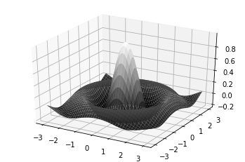
Plotting a parametric 3D surface
import numpy as np
from mpl_toolkits.mplot3d import Axes3D
import matplotlib.pyplot as plt
# Generate torus mesh
angle = np.linspace(0, 2 * np.pi, 32)
theta, phi = np.meshgrid(angle, angle)
r, R = .25, 1.
X = (R + r * np.cos(phi)) * np.cos(theta)
Y = (R + r * np.cos(phi)) * np.sin(theta)
Z = r * np.sin(phi)
# Display the mesh
fig = plt.figure()
ax = fig.gca(projection = '3d')
ax.set_xlim3d(-1, 1)
ax.set_ylim3d(-1, 1)
ax.set_zlim3d(-1, 1)
ax.plot_surface(X, Y, Z, color = 'w', rstride = 1, cstride = 1)
plt.show()
OUTPUT
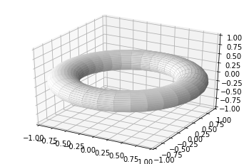
Embedding 2D figures in a 3D figure
import numpy as np
from mpl_toolkits.mplot3d import Axes3D
import matplotlib.pyplot as plt
x = np.linspace(-3, 3, 256)
y = np.linspace(-3, 3, 256)
X, Y = np.meshgrid(x, y)
Z = np.exp(-(X ** 2 + Y ** 2))
u = np.exp(-(x ** 2))
fig = plt.figure()
ax = fig.gca(projection = '3d')
ax.set_zlim3d(0, 3)
ax.plot(x, u, zs=3, zdir='y', lw = 2, color = '.75')
ax.plot(x, u, zs=-3, zdir='x', lw = 2., color = 'k')
ax.plot_surface(X, Y, Z, color = 'w')
plt.show()
OUTPUT
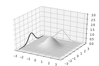
import numpy as np
from matplotlib import cm
import matplotlib.colors as col
from mpl_toolkits.mplot3d import Axes3D
import matplotlib.pyplot as plt
# Data generation
alpha = 1. / np.linspace(1, 8, 5)
t = np.linspace(0, 5, 16)
T, A = np.meshgrid(t, alpha)
data = np.exp(-T * A)
# Plotting
fig = plt.figure()
ax = fig.gca(projection = '3d')
cmap = cm.ScalarMappable(col.Normalize(0, len(alpha)), cm.gray)
for i, row in enumerate(data):
     ax.bar(4 * t, row, zs=i, zdir='y', alpha=0.8, color=cmap.to_rgba(i))
plt.show()
OUTPUT
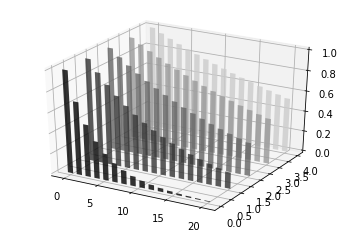
Creating a 3D bar plot
import numpy as np
from mpl_toolkits.mplot3d import Axes3D
import matplotlib.pyplot as plt
# Data generation
alpha = np.linspace(1, 8, 5)
t = np.linspace(0, 5, 16)
T, A = np.meshgrid(t, alpha)
data = np.exp(-T * (1. / A))
# Plotting
fig = plt.figure()
ax = fig.gca(projection = '3d')
Xi = T.flatten()
Yi = A.flatten()
Zi = np.zeros(data.size)
dx = .25 * np.ones(data.size)
dy = .25 * np.ones(data.size)
dz = data.flatten()
ax.set_xlabel('T')
ax.set_ylabel('Alpha')
ax.bar3d(Xi, Yi, Zi, dx, dy, dz, color = 'w')
plt.show()
OUTPUT
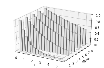
Animation
on Console
import numpy as np
import matplotlib.pyplot as plt
from matplotlib.animation import FuncAnimation

fig, axes = plt.subplots()
line, = axes.plot([],[])

def init():
    line.set_data([],[])
    return line,

def y(t):
    x = np.linspace(0,2,1000)
    y = np.sin(2*np.pi*(x-0.01*t))
    line.set_data(x,y)
    return line,

ani = FuncAnimation(fig=fig, func=y, init_func=init, frames=100, interval=20, blit=True)
ani.save('exAnimation.gif', writer='imagemagick', fps=30, dpi=100)

axes.set_xlim((0,2))
axes.set_ylim((-2,2))
axes.grid(True)
plt.show()
on HTML
First of all, you should download FFmpeg on Windows, MAX OS. After installation, set your environment variable, refer to here. If you are user on Ubuntu, follow below reference.
```python import numpy as np import matplotlib.pyplot as plt from matplotlib.animation import FuncAnimation from IPython.display import HTMLfig, axes = plt.subplots() line, = axes.plot([],[])
def init(): line.set_data([],[]) return line,
def y(t): x = np.linspace(0,2,1000) y = np.sin(2np.pi(x-0.01*t)) line.set_data(x,y) return line,
axes.set_xlim((0,2)) axes.set_ylim((-2,2)) axes.grid(True)
ani = FuncAnimation(fig=fig, func=y, init_func=init, frames=100, interval=20, blit=True) HTML(ani.to_html5_video())
<details open markdown="1">
<summary class='jb-small' style="color:blue">OUTPUT</summary>
<hr class='division3'>
<hr class='division3'>
</details>
<br>
```python
import numpy as np
import matplotlib.pyplot as plt
from matplotlib.animation import FuncAnimation
from IPython.display import HTML
fig, axes = plt.subplots(1,2)
line1, = axes[0].plot([],[])
line2, = axes[1].plot([],[])
def init():
line1.set_data([],[])
line2.set_data([],[])
return line1, line2,
def y(t):
x1 = np.linspace(0,2,1000)
x2 = np.linspace(0,2,1000)
y1 = np.sin(2*np.pi*(x1-0.01*t))
y2 = np.sin(4*np.pi*(x2-0.01*t))
line1.set_data(x1,y1)
line2.set_data(x2,y2)
return line1, line2,
axes[0].set_xlim((0,2))
axes[0].set_ylim((-2,2))
axes[0].grid(True)
axes[1].set_xlim((0,2))
axes[1].set_ylim((-2,2))
axes[1].grid(True)
ani = FuncAnimation(fig=fig, func=y, init_func=init, frames=100, interval=20, blit=True)
HTML(ani.to_html5_video())
OUTPUT
Interactive plot
import numpy as np
import matplotlib.pyplot as plt

for i in range(3):
    plt.plot(np.random.rand(10))
OUTPUT
for i in range(3): plt.plot(np.random.rand(10)) plt.show()
<details markdown="1">
<summary class='jb-small' style="color:blue">OUTPUT</summary>
<hr class='division3'>
<hr class='division3'>
</details>
<br><br><br>
`one figure`
```python
%matplotlib inline
import time
import numpy as np
import matplotlib.pyplot as plt
from IPython import display
for i in range(10):
plt.clf()
plt.plot(np.random.randn(100))
display.display(plt.gcf())
display.clear_output(wait=True)
#time.sleep(1.0)
OUTPUT
several figures
import numpy as np
import matplotlib.pyplot as plt
from IPython import display

_, axes = plt.subplots(2,1)
for _ in range(10):
    axes[0].clear()
    axes[1].clear()
    axes[0].plot(np.random.normal(0,1, size=100))
    axes[1].plot(np.random.normal(0,1, size=100))
    display.display(plt.gcf())
    display.clear_output(wait=True)
One figure
%matplotlib qt5

import numpy as np
import matplotlib.pyplot as plt

x = np.linspace(-10,10,100)

fig = plt.figure()
ax = fig.add_subplot(1, 1, 1)

for i in range(10):
    err = np.random.normal(loc=0.0, scale=3.0)
    y = lambda x:x
    if ax.lines:
        ax.lines.remove(ax.lines[0])
    ax.plot(x, y(x)+np.sin(i)*err, lw=0, marker="o")
    plt.xlim(-20,20)
    plt.ylim(-20,20)
    plt.ion()
    plt.show()
    plt.pause(0.1)
figures
%matplotlib qt5

import numpy as np
import matplotlib.pyplot as plt

fig, axes = plt.subplots(2,2)

for i in range(20):
    for j in range(axes.shape[0]):
        for k in range(axes.shape[1]):
            if axes[j,k].lines:
                axes[j,k].lines.remove(axes[j,k].lines[0])

    axes[0,0].plot(np.random.normal(0,5,(100,)))
    axes[0,1].plot(np.random.normal(0,5,(100,)))
    axes[1,0].plot(np.random.normal(0,5,(100,)))
    axes[1,1].plot(np.random.normal(0,5,(100,)))

    plt.ion()
    plt.show()
    plt.pause(0.5)
OUTPUT
ipywidgets
official guide, Examples
Installation on windows
pip install ipywidgets
jupyter nbextension enable --py widgetsnbextension
Installation on Linux
$ pip3 install ipywidgets
$ jupyter nbextension enable --py widgetsnbextension
interact
import numpy as np
import matplotlib.pyplot as plt
from ipywidgets import interact

def f(x):
    plt.plot(np.arange(0,10), x*np.arange(0,10))
    plt.ylim(-30,30)
interact(f,x=(-3,3,0.5))
OUTPUT
import numpy as np
import matplotlib.pyplot as plt
from ipywidgets import interact

def f(x):
    if x:
        plt.plot(np.random.rand(100), 'b')
    else:
        plt.plot(np.random.rand(100), 'r')
interact(f,x=True)
OUTPUT
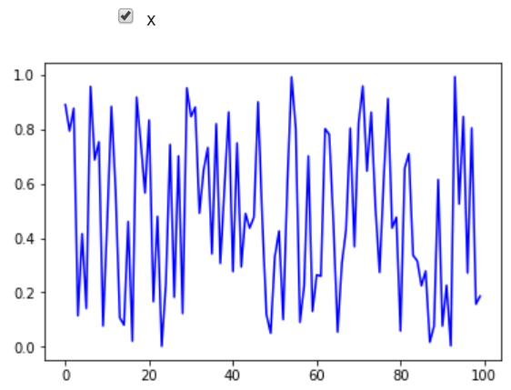
import numpy as np
import matplotlib.pyplot as plt
from ipywidgets import interact

@interact(x='Title of plot')
def f(x):
    plt.title(x)
OUTPUT
import numpy as np
import matplotlib.pyplot as plt
from ipywidgets import interact

def f(a,b):
    plt.plot(np.arange(0,10), a*np.power(np.arange(0,10),b))
    plt.title("Power Law : $x=ay^b$")
interact(f, a=1, b=3)
OUTPUT
import numpy as np
import matplotlib.pyplot as plt
from ipywidgets import interact, fixed

def f(a,b):
    plt.plot(np.arange(0,10), a*np.power(np.arange(0,10),b))
    plt.title("Power Law : $x=ay^b$")
interact(f, a=1, b=fixed(2))
OUTPUT
import numpy as np
import matplotlib.pyplot as plt
from ipywidgets import interact

def f(colour):
    plt.plot(np.arange(0,10), np.power(np.arange(0,10), 5), c=colour)
    plt.title("Power Law : $x=ay^b$")
colours=['red','green','blue']
interact(f, colour=colours)
OUTPUT
import numpy as np
import matplotlib.pyplot as plt
from ipywidgets import interact

@interact(x=(-10,10,1))
def f(x):
    _, axes = plt.subplots(2,1, figsize=(10,8))
    axes[0].plot(np.arange(0,10), x*np.arange(0,10))
    axes[1].plot(np.arange(0,10), np.arange(0,10)**abs(x))
    axes[0].set_ylim([-20,20])
    axes[1].set_ylim([-20,20])
OUTPUT
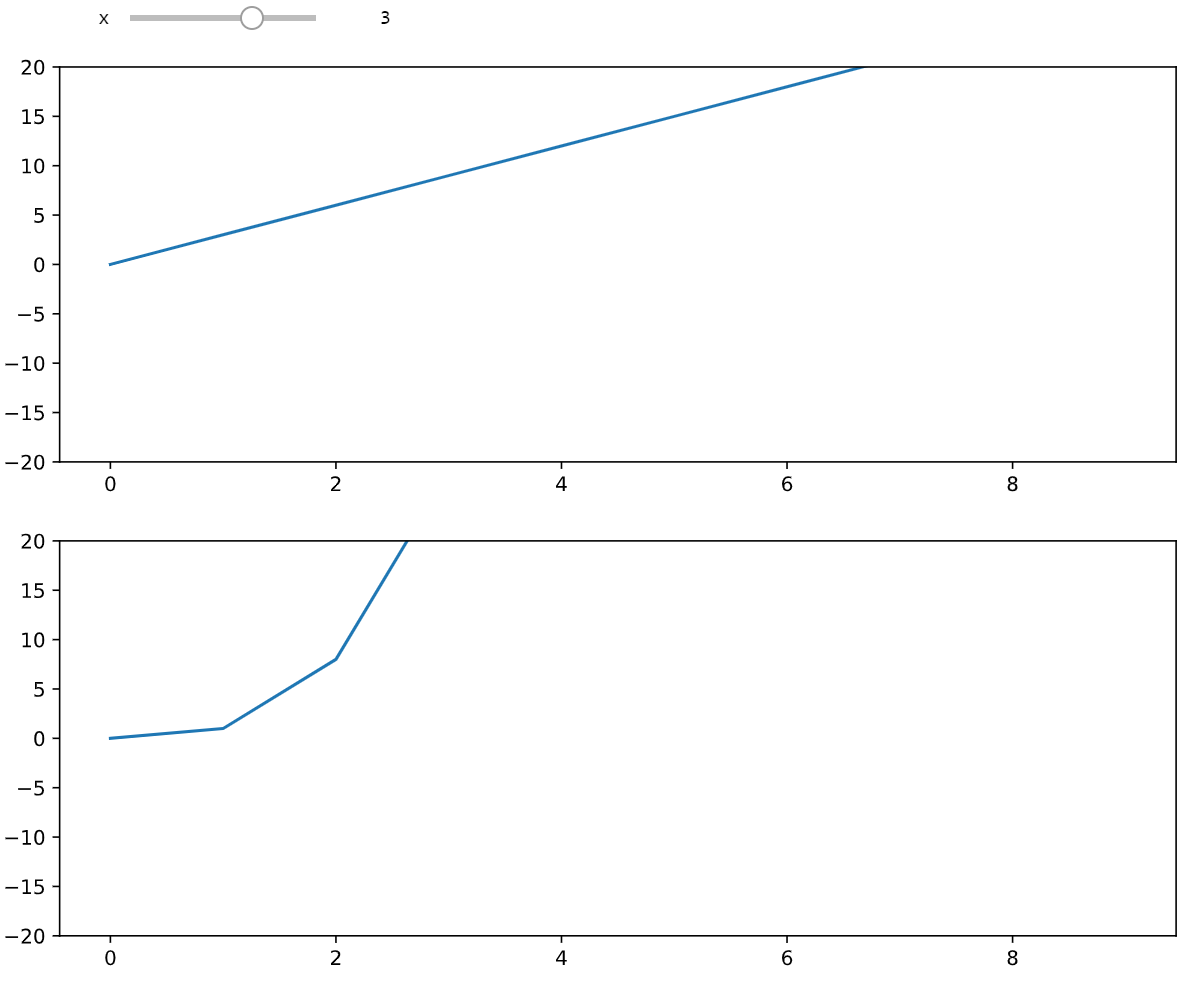
User Interface
Third partys
basemap
readthedocs, official user guide
Installation
$ conda install basemap
$ conda install basemap-data-hires
Source
Installation : download url, download guide
site-packages
$ wget https://github.com/matplotlib/basemap/archive/v1.2.2rel.tar.gz
$ tar -zxvf v1.2.2rel.tar.gz
$ cd basemap-1.2.2rel/geos-3.3.3
site-packages/basemap-1.2.2rel/geos-3.3.3
$ export GEOS_DIR=/usr/local
$ ./configure --prefix=$GEOS_DIR
$ make; make install
$ cd ../
site-packages/basemap-1.2.2rel
$ python setup.py install
List of posts followed by this article
Reference
[1]:{{ site.url }}/download/PL03/my_data.txt [2]:{{ site.url }}/download/PL03/my_data2.txt