Design Spec
- Navigation and Transitions
- Map
- List
- Campus Select
- Filter
- Favorites list
- Space Details view
- Report Problem view
- Top right is the Filter button, represented by a funnel icon. Always displayed except when on favorites list or space details page.
- Top left is the application Up icon. The Up icon is a button used to navigate within an app based on the hierarchical relationships between screens. (details)
- Immediately right of the Up icon is the Campus Select Spinner. The spinner shows the current campus and appears on List and Map view.
Top -
On initial load, the map displays with initial basic search (near me, open now, any type, no other filters set) results showing.
- The map and list views are a toggle; the transition should be a fade in/out (see Yelp's map/list toggle)
- In map mode, the "recenter the map on me" button is in the upper right; in list mode, the button disappears.
Top -
- The favorites list is accessed in the bottom right. The transition should be a slide in/fade from right.
Top -
- The filter screen is accessed in the top right. It should slide in/fade from the right.
Top -
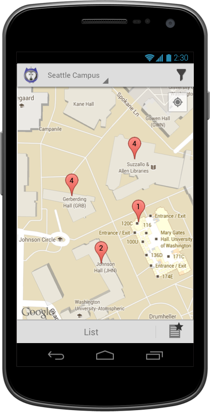
- The map initially displays with a "Move and zoom the map to find spaces" message at the top. This message disappears as soon as the user moves or zooms the map.
- Top Right button recenters the map on the user's location (unless unauthorized)
Top -
Initial zoom level
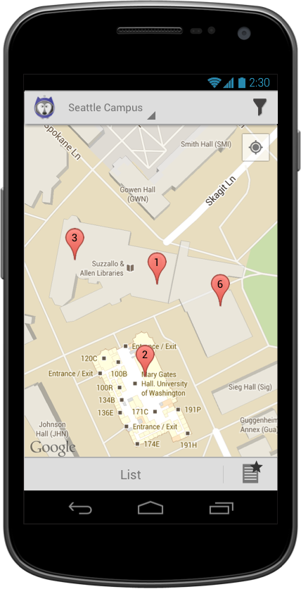
Zooming in one step -- note that the 4 in Suzzallo has broken out to be a 3 and a 1.
Zooming in two steps -- note that the 6 in Allen has broken out to be a 4 and two 1s.
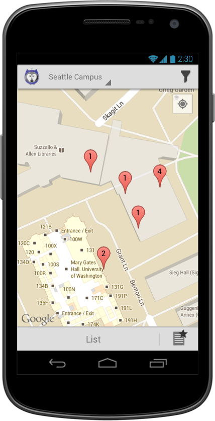
- Spaces are clustered when they are too close together. When zoomed out, all spaces are too close together, so all spaces in a building are clustered; as you zoom in, they break apart. But ones that are immediately adjacent or on top of each other (rooms 101, 201, and 301) are always too close together, so they never break apart; they always stay clustered.
- A clustered pin takes you to a list.
- A single pin goes directly to the space details.
Top -
- The map will load centered on the pointed set as the center of the current campus, with no blue pointer.
- The "recenter the map on me" button will recenter the map on the center of the current campus, as above.
- Distances to space in space details and list view should not be shown.
Top -
Top -
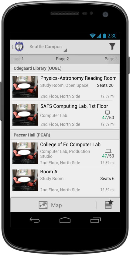
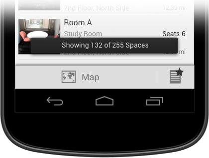
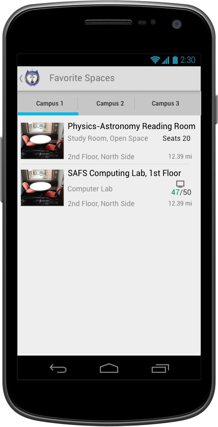
- Each list item contains the following:
- Image of space
- Space name, truncated to fit on one line
- Space type(s) -- comma-delimited if there is more than one
- Number of seats, if known
- Location, in a format TBD (may be different on different types of spaces, or may be determined by us on a case-by-case basis) -- this may wrap onto two lines, but should truncate if it is going to wrap to 3 lines.
- Distance between user's current location and the center of the building, rounded and displayed as follows:
- 0.01 - 0.99 miles away: rounded to and displayed in hundredths
- 1.0+ miles away: rounded to and displayed in tenths
- Each cell should be tall enough to accommodate a two-line location (four lines of text total). If there are only three lines, the text should center vertically but the cell should stay the same height as a four-line cell. This is to ensure that images are all the same height.
Top -
Search results should be ordered according to the following:
- Proximity to current location (when no location authorized, do not show the distance in the list view and sort alpha by building instead) -- based on the distance rounded to hundredths of a mile
- Alpha by building name
- Floor number (basement, 1, 2, etc. -- OR, lower level, main floor, upper level)
- Room number
- Alpha by space name
- By room type (according to the order we listed in the search screen)
- By number of seats (ascending)
Top -
- List should be paginated using Scrollable tabs
- Each tab should contain 15 list items
- The next tab (current tab + 1) should preload.
- Tabs are labeld as "Page #".
Top -
## Campus Select The campus select spinner is located to the right Up icon. It displays the current campus. When clicked, it shows a spinner dropdown with other campus options.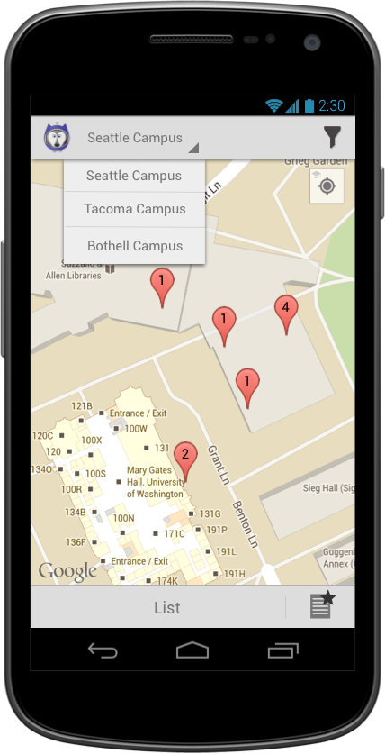
- Only a single campus may be selected at one time.
- If the campus selection is changed, the user is returned to the view they were previously on with all filters reset to default.
- If map view, show default zoom level at center of campus.
Top -
This filter screen is accessed from the "filter" button, available in the top right action bar from the map and list views.

- The default set of search criteria on initial load is: all types of spaces, open now, near me.

- On returning to this view after having made selections:
- The selected options (or abbreviated versions) are now displayed in this view instead of "No preference."
- The circular icon for the filter is now filled in (blue)
- A clear button with "x" icon is added to the selection. Clicking clears that specific filter.
- A reset button appears in the top action bar. When clicked this removes ALL filters
- We may need to have an upper limit beyond which we say "4 selected" or similar instead of trying to fit abbreviated versions of all of them in there.
Top -
- When filter is applied, the filter icon on the Map view and List view indicates the filter with a blue circle added to the icon.
- After filter is applied a toast is displayed (on both Map and Listview) showing the number of spaces appearing within the filter and the total:
Top -
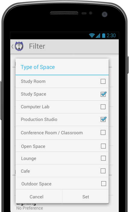
- Multi-select
- "Set" button saves selection, closes the dialog and applies the select criteria.
- "Cancel" button exits the dialog and discards any changes in selection made.
- Tapping outside of the dialog dismisses the dialog and is equivalent to cancel.
- None selected is the same as all selected.
- On returning to the main search screen, the values selected are shown in abbreviated form. The goal of this is to provide feedback that the values have been changed so that the user has confidence that the search will run correctly, and to remind the user what has been selected. They don't have to be completely intelligible as standalone words.
Abbreviated values -- first stab
- Study room --> Rm
- Study area --> Area
- Computer lab --> Lab
- Production studio --> Stdo (???)
- Conference/classroom --> clsrm
- Open space --> Open sp
- Lounge --> Lng
- Café --> Café
- Outdoor area --> Outdr
Top -
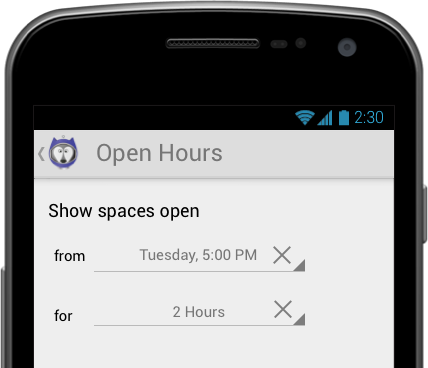
Clicking Hours slides in a modal:

- On tapping "now," the picker should pop up with reflecting the current date/time (rounded up to the nearest quarter-hour). The picker for this setting is a 4 option picker: Day of the week, Hour, Minute (15 minute incremenets), AM/PM.
- On tapping the "for" field, the picker should be set to 1 hour. The picker for this setting should range from 0 to 48 hours in 1 hour increments.
- When "from" or "for" is set, an "x" icon appears in the field. Tapping this "x" clears the field:
Top -
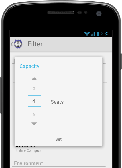
- Default value is 1.
- Clicking in the list item pulls up a picker.
- The picker contains the following values: 1, 2, 3, 4, 5, 6, 7, 8, 9, 10, 15, 20, 25+
- Some spaces, particularly the larger spaces like open space, outdoor, café, and lounge, may not have capacity listed. If the space's data doesn't include a capacity, the space should return for all searches regardless of capacity set. The space details should not list capacity (i.e. it should never say "seats 0," "seats < null >," etc.)
- The picker only has one button, Set, which engages the current selection.
- Clicking outside of the modal closes the picker without applying the selection.
Top -
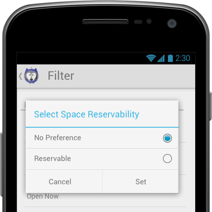
- On the back end, spaces are either not reservable, reservable, or reservations required.
- When searching, users can select either "reservable" or "no preference"
- Selecting "reservable" will return spaces where users either CAN or MUST make reservations.
- Default is no preference
- Single-select
- "Set" button saves selection, closes the dialog and applies the select criteria.
- "Cancel" button exits the dialog and discards any changes in selection made.
- Tapping outside of the dialog dismisses the dialog and is equivalent to cancel.
Top -
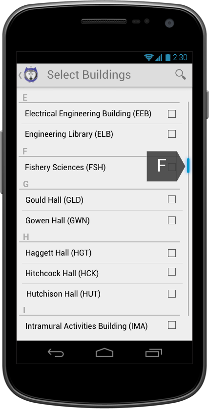
- Default setting is "entire campus"
- Only buildings that have space in our database are displayed.
- On selecting building(s) and returning to main search screen, the short values of the buildings are displayed, as many as there is room for.
- When out of room, it should say "and ## more" or similar.
- Building selector page
- Multi-select
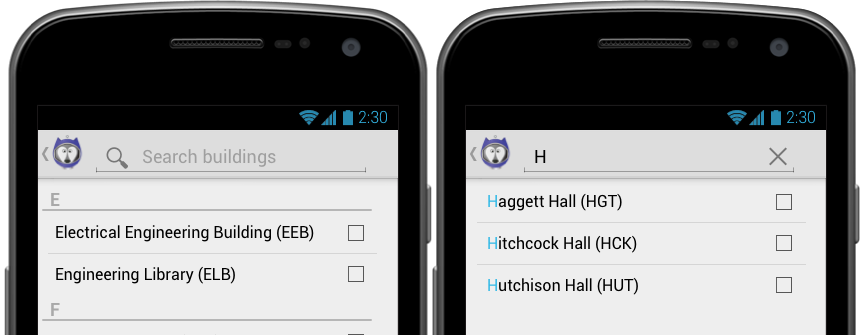
- Search icon expands to search bar
- Alphabetical order
- Uses indexed scrolling
- Search
- Searching should auto-filter the list to show only results that match the string typed
- "x" button in search field will clear search query, shows normal alphabetical list.
Top -
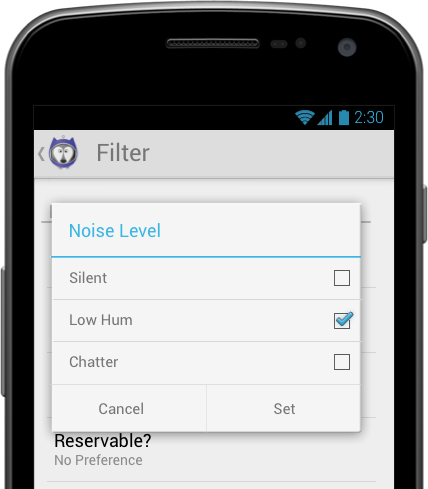
- Multi-select
- Values:
- Silent
- Low hum
- Chatter
- On returning to the main search screen, the values selected are shown in full if there's space, or if not, in abbreviated form.
- Silent: S
- Low Hum: LH
- Chatter: Ch
- Study rooms and production studios will not have a noise level listed in the data or displayed in the interface.
- Study spaces with a noise level listed will behave like a normal search -- searching for "low hum" gets all study spaces marked with "low hum," etc.
- When spaces are marked "variable," they return for any search and "variable" displays in the space details.
- When spaces do not have a noise level listed, they return for any search and nothing -- no icon, label, or value -- displays in the space details.
- This is most likely to be study rooms or production studios, as those are spaces where the current occupant controls the noise level, more or less.
- If you find other types of spaces that do not have a noise level listed, check with someone if you can before filing a bug.
Top -
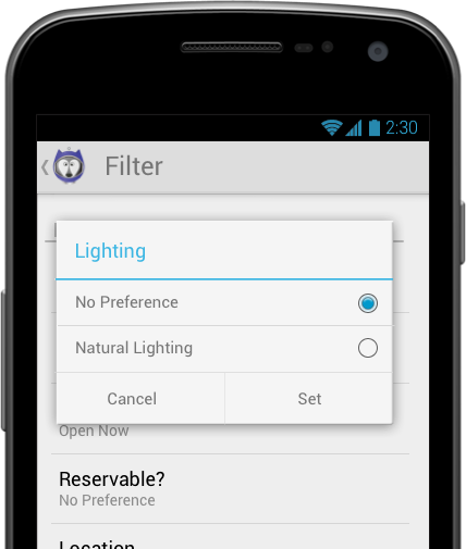
- Single-select
- Values:
- Natural lighting
- No preference
- On returning to the main search screen, the value selected displays.
Top -

- Multi-select
- Values:
- No preference
- In space
- In building
- In neighboring building
- On returning to the main search screen, values selected are displayed if there's room, or if not, abbreviated values are displayed (DRAFT! Help me with these!!):
- In space: In Sp.
- In building: In Bldg.
- In neighboring building: Neighb.
Top -

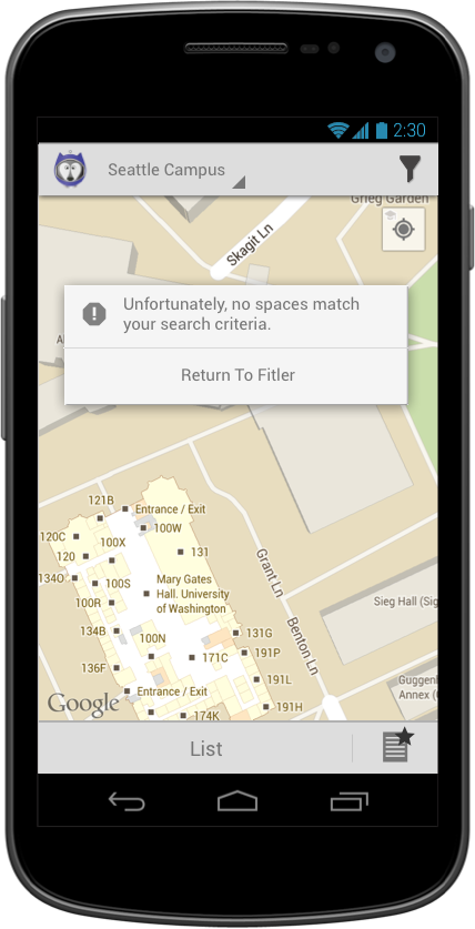
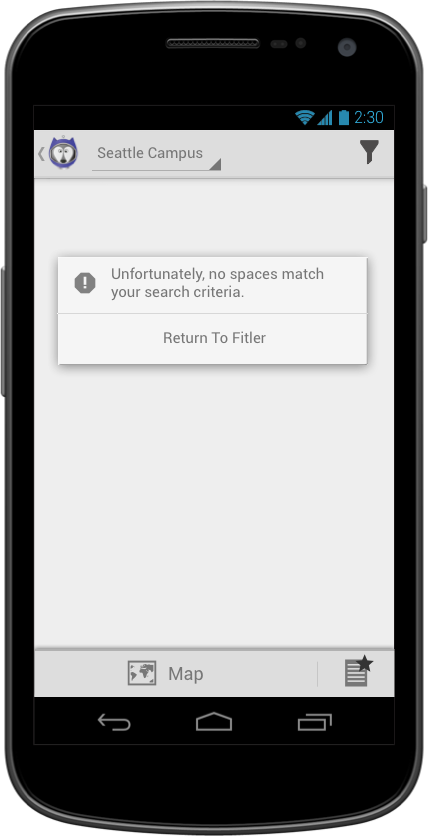
- Multi-select
- When no results are found, a message pops up on returning to the map/list view.
- The "try again" button takes users back to the filter screen, preserving all the criteria they had input, so that they can remove some and try again.
Top -
- The "Reset" button at the bottom of the filter screen returns the search criteria to the default (entire campus, open now, no other preferences).
Top -
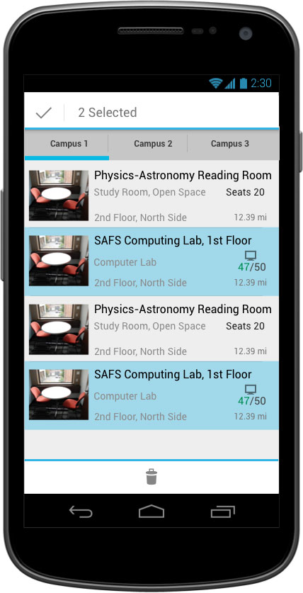
- The favorites list is accessed via the button in the bottom right of list & map screens.
- The list slides in from the right as a modal.
- The list contains all spaces that the user has "Starred".
- If user has favorites from 2 or more campuses, tabs are used to display campus specific lists
- List items are formatted just like on the regular list
- Favorites can be deleted through press and hold gesture. Multiple selection is possible once one item is selected for delete:

Top -

Top -
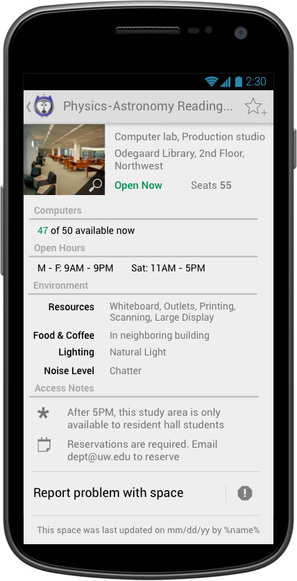
- The space name, type, capacity and current status (open/closed) are displayed to the right of the image
- If space is a computer lab with Lab Stats enabled, number of computers is shown.
- When a space is open and computers are available, the total amount free is displayed in green text.
- The amount free should never be greater than three less than the lab total. For example, a 50 seat computer lab should never show greater than 47 of 50 free.
- When a space has zero computers free, the zero is displayed in red.
- When a spot is closed OR if no information is available (Labstats not working) "--" is used to display amount available.
- The open hours are displayed below the image
- Content scrolls behind bottom action bar.
- Bottom action bar contains 2 buttons:
- Directions: opens native navigation app to building
- Map: Switches to map view with only this space pinned. No other spaces are shown.
- The location is displayed below the hours. The format of the location is not consistent, as it depends on what the space name is; we have generated each location manually on a case-by-case basis. However, the following guidelines should be more or less applicable:
- Locations should avoid, as much as possible, duplicating the space name. That is, if the space name is "Paccar 3rd floor East Study Room" (a made-up example), the location should NOT say "Paccar Hall, 3rd floor, East." But it should also not be blank. It should just say "Paccar Hall" or so. That is, it can duplicate the name a little, so as to make sense, but it shouldn't be identical.
- The location should start with the owner ("Research Commons," "Math Library") if there is one, then list the building, wing and/or floor, and room number. Basically it should go large to small.
- Floors should be in the format "1st floor," or "Main floor"/"Lower level"/etc.
- Proper nouns ("Research Commons," "Paccar Hall") should all have initial caps but others like "1st floor" or "Main floor" should have the first word capitalized and not the others.
- Cardinal directions (South, North, etc) should be capitalized.
- For testing purposes, in general, if you see locations (or combinations of locations and names) that don't make sense, let us know.
Top -

- The favorite button (star) will toggle between empty and full when the user taps it.
- Full represents "this space is favorited"
- Favorited space should appear on the favorites list
- Empty with "+" sign represents "this space is not favorited"
- Full represents "this space is favorited"
Top -
- The space detail page displays an open/closed flag.
- OPEN will be green text
- CLOSED will be red text
Top -

- The image displays with a semi-transparent corner overlay with magnifying glass icon.
- tapping anywhere on the image pulls up the image modal (below).
Top -
- Tapping anywhere on the image on the space details screen brings up the image modal.
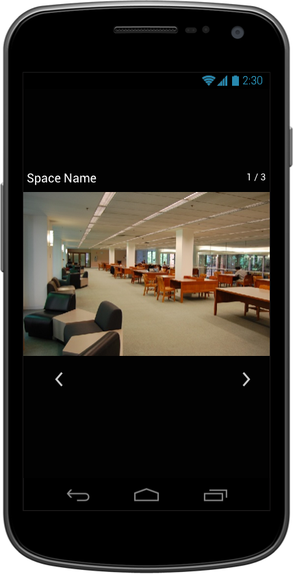
- The arrow buttons at the bottom of the screen let users move between multiple images.
- Users can also swipe left and right to move between multiple images.
- The current position ("1 of 4," "2 of 4" etc.) is represented at the bottom of the screen, between arrows.
- If there is only one image, do not display arrow icons or image #.
- Rotating the device should rotate the image.
- Swiping to the right from the first image, or to the left from the second image, should not allow swipe. That is, it's linear; you don't move back around from end back to the beginning.
- Users exit the modal via the Android built in back button
Top -
- Access alerts and Reservability alerts are represented with icons (icons depicted are NOT final -- devs, use placeholders)
- The Access alerts and Reservability alerts only appear if there are notes to call attention to.
- Reservability alerts will say either "Reservations required" OR "Can be reserved."
- The icons are repeated below in the Notes section so that users can see which alert corresponds to which note.
Top -
- Environment notes are displayed in their own block with the header "Environment."
- This block displays ONLY if there is something in it. If all four are empty, the entire block, and its header, will not be present.
- Each thing has its own icon (still being developed)
- "Equipment" lists the available equipment in the space, and is in its own table cell or otherwise offset from the other attributes
- If a space has NO equipment, this field does not display.
- Noise level will display only if there is a value. That is, if we don't have a noise level listed for a space, the icon and text for noise level will not display.
- Noise level text options:
- Silent
- Low Hum
- Chatter
- Lighting icon and text will display only if natural light = true. That is, the space details screen will never say "No natural light."
- Food/coffee icon and text will display only if there is some. It will never say "No food/coffee."
- Food/coffee text options:
- In space
- In building
- In neighboring building
Top -
- The "Getting here" block is displayed with its own header.
- Things related to physically accessing this space are included in this block -- directions to the space, instructions on how to reserve the space, how to get into the room (get a key or key code, etc.), anything pertaining to access restrictions by groups or by date/time, etc.
Top -
- If access alerts or reserveability alerts are present above, the icons are repeated here with more information on what users need to do.
Top -
- "View this space on the map >" slides the map view (in SpaceScout app) in from the right. The map is centered on the pin for this space. No other pins are present on the map.
- "Get directions to building in Maps" takes users out of SpaceScout and into the Maps app, with directions from the user's current location to the space's building.
Top -
- The date stamp records and displays the last time the record's data was updated. At this time, since all spaces are offical UW-submitted spaces, the "by the University of Washington" does not need to be dynamic.
- When/if we move to crowd-sourcing, this will need to be revisited.
Top -
- A button at the very bottom of each record says "Report a problem with this space." This takes user to the report problem view.
Top -

- Space list info is displayed below action bar in same manner as search results.
- "What's the problem?" spinner with following options:
- Hours incorrect
- Space location info incorrect
- Space resource info incorrect
- Space image incorrect
- Other issue
- Drop down is required to submit
- Below dropdown, open entry text field (not required).
- Report is sent through send button. Upon successful report submission, a Toast should appear on the following screen:

Top -