React-sidemenubar allows you to create a responsive sidebar with easy to customize.
$ npm install --save react-sidemenubar
$ yarn add react-sidemenubar

import { Menu, Toggle } from "react-sidemenubar";
import "react-sidemenubar/dist/react-sidemenubar.css";
- Easy to set up for real, you can make it work in less than 1minute!
- Super easy to customize
- Has
onClickhooks. Can pass onclick event when user interact. Togglefunction allows you to toggle the sidemenu from open to close and close to open.- And much more !
import React from "react";

import { Menu, Toggle } from "react-sidemenubar";
import "react-sidemenubar/dist/react-sidemenubar.css";

function App() {
  const data = [
    {
      title: "Home",
      section: true,
    },
    {
      icon: <img src="home.png" alt="home" />,
      title: "Home",
      submenus: [
        {
          title: "Dashboard 1",
          onClick: (e) => {
            alert("home1");
          },
        },
        {
          title: "Dashboard 2",
          onClick: (e) => {
            alert("home2");
          },
        },
        {
          title: "Dashboard 3",
          onClick: (e) => {
            alert("home3");
          },
        },
      ],
    },
    {
      title: "Auth",
      section: true,
    },
    {
      icon: <img src="login.png" alt="home" />,
      title: "Login",
    },
    {
      icon: <img src="register.png" alt="home" />,
      title: "Register",
    },
    {
      icon: <img src="logout.png" alt="home" />,
      title: "Logout",
    },
  ];

  return (
    <div>
      <button
        onClick={() => {
          Toggle();
        }}
      >
        Toggle
      </button>
      <Menu
        menus={data}
        bg="transparent"
        activeBg="linear-gradient(45deg, #204520, #74b474)"
        color="black"
        activeColor="white"
        menubg="#efefef"
        menuborder={5}
      />
    </div>
  );
}
Properties used to customise the rendering:
| Name | Type | Description |
|---|---|---|
| color | String | Text color of a menu |
| data | Array | Menu items |
| bg | String | Background color of menu item |
| activeBg | String | Background color of menu item when user interacts |
| activeColor | String | Text color of menu item when user interacts |
| menubg | String | Background color of menu |
| menuborder | Number | Border-radius of a menu item |
| Name | Type | Description |
|---|---|---|
| title | String | Menu title |
| icon | String or HTMLElement | 'optional' Menu icon |
| submenus | Array | 'optional' Submenu items |
| onClick | func | 'optional' Calls the given function when user clicks on title and pass two parameters, first one is click event and second is the object of tree prop |
| section | boolean | 'optional' true if menu item is a section, default is false. |
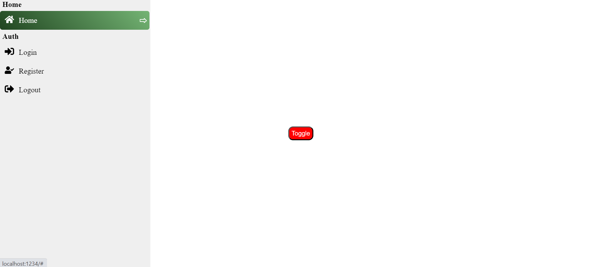
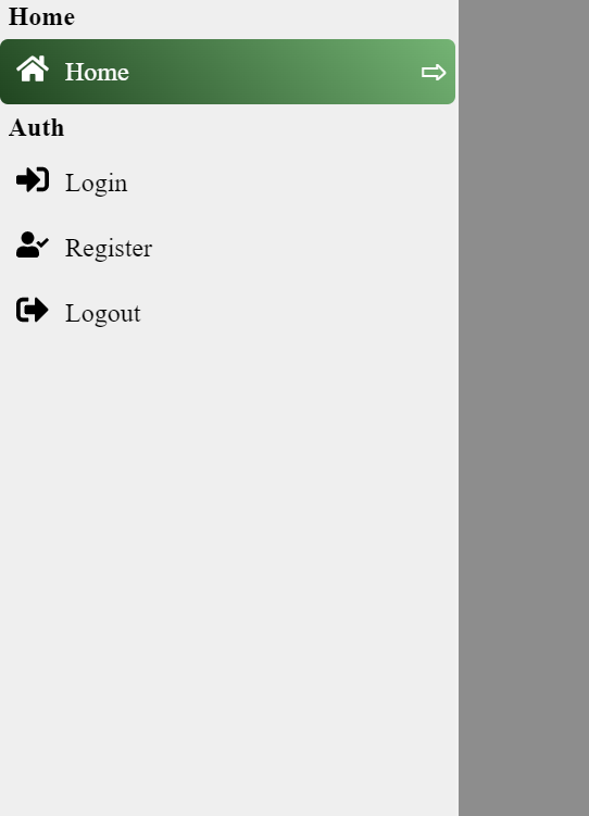
A demo is worth a thousand words
Show your ❤️ and support by giving a ⭐. Any suggestions are welcome! venkatmcajj@gmail.com
Become a financial contributor and help us sustain our community. Contribute
Licensed under MIT