Flair Visualizations
- Introduction
- Installation
- Getting Started
- Global Configuration in Flair Visualizations
-
Charts
- Clustered Vertical Bar Chart
- Clustered Horizontal Bar Chart
- Stacked Vertical Bar Chart
- Stacked Horizontal Bar Chart
- Line Chart
- Combo Chart
- Scatter Plot Chart
- Pie Chart
- Doughnut Chart
- Gauge Chart
- Table
- PivotTable
- KPI Chart
- InfoGraphics Chart
- Map
- TreeMap
- HeatMap
- BoxPlot Chart
- Text Object
- Bullet Chart
- Chord Diagram
- Word Cloud
- Sankey Chart
- Pie Grid Chart
- Number Grid Chart
Data Visualization can be understood as a graphical presentation of data to uncover the underlying information that it holds and allow the users to identify the patterns present in it. By delivering information in a vibrant and interactive structure it facilitates users to make quick decisions based upon their roles. What makes a data visualization even more powerful is its ability to process data in real-time allowing immediacy in making a decision. On contrary to batch or event-driven visualization real-time analytics is the state of the art tool for any individual or organisation who must take tactical or operational decisions on the fly.
With support for more than 20 different basic and advanced visualizations, the users can view the data from various dimensions whether it be for distribution analytics, relationship analytics or comparison analytics. The Flair BI visualization library is completely open-source, allowing any data enthusiasts to use it to create their own custom Business Intelligence tool or simply use the visualizations in their personal projects.
Flair-Visualizations can be installed via npm or bower. It is recommended to get Flair-Visualizations this way.
npm install flair-visualizations
bower install flair-visualizations
| Property Name | Config Property Name | Description | Default Value | Possible Values |
|---|---|---|---|---|
| Show X Axis | showXaxis | Boolean that says if x-axis should be shown | TRUE | True |
| Show Y Axis | showYaxis | Boolean that says if y-axis should be shown | TRUE | True |
| X Axis Colour | xAxisColor | Colour of X-axis | #676a6c | |
| Y Axis Colour | yAxisColor | Colour of Y-axis | #676a6c | |
| Show X Axis Label | showXaxisLabel | Boolean that says if x-axis label should be shown | TRUE | True |
| Show Y Axis Label | showYaxisLabel | Boolean that says if y-axis label should be shown | TRUE | True |
| Show Legend | showLegend | Boolean that says if legend should be shown | TRUE | True |
| Legend position | legendPosition | Legend position with sides | Top | Top |
| Show Grid | showGrid | Boolean to Show Grid or not | TRUE | True |
| Stacked | stacked | Boolean that says if the chart is stacked | TRUE | True |
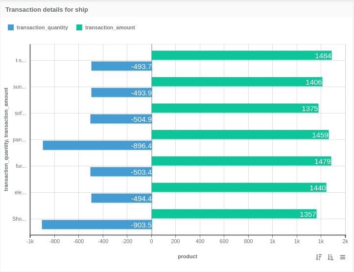
In Flair-BI, Clustered Vertical Bar Chart one type of visualization that displays the data from the same category into a cluster.
Open Flair BI application and create one data-set after that using that data-set create dashboard and view. see how to create dashboard and view
-
Click on the toggle to enable EDIT mode.

-
You can see all the available visualizations by clicking on the visualization icon.

-
Click on Clustered Vertical Bar Chart.

-
when you click on Clustered Vertical bar charts its open one empty container.

-
Clustered Vertical Bar Chart container has some options like tools, live, refresh etc... click on tools option.

Two ways to create Visualizations :
- using the setting option
- using drag-drop option
-
Click on settings option.

-
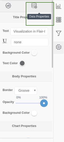
when you click on settings option its open settings right side setting penal that allow to select dimension and measure for charts and set the property of charts.
-
Click on viz-properties tab to set visualization properties.

-
Click on data-properties tab to select visualization dimension and measure for charts.
-
Clustered Vertical Bar Chart allows only one dimension so select dimension from the drop-down.

-
Clustered Vertical Bar Chart allows selecting one or more measure, select measures from drop-down and property for that.

-
Click on save button so you can see the visualization render.
-
Click on Flip option. when you click on Flip option visualization container flip and allow to drag-drop measures and dimension

-
Click on dimension tab to drag-drop dimension for charts.

-
Click on measures tab to drag-drop measures for charts.

-
Click on Build option to build the visualization. When you click on build visualization will render.


| Type | Required | Optional |
|---|---|---|
| Dimensions | 1 | 0 |
| Measures | 1 | 4 |
-
-
Property Name Config Property Name Description Default Value Possible Values Display name displayName A Display name Displayname -
Property Name Config Property Name Description Default Value Possible Values Value on Points showValues Show value on points false true/false Display name displayNameForMeasure A Display name for Measure Displayname Font style fontStyle Style of fonts Normal Normal/Italique/Oblique Font weight fontWeight Weight of fonts Normal Normal/Bold/100-900 Number format numberFormat Possible number formats Actual K,M,B,Actual Text colour textColor The text colour #617c8c Display colour displayColor An display colour null Border colour borderColor An border colour null Font size fontSize Size of fonts 9
-
In Flair-BI, Clustered horizontal Bar Chart one type of visualization that displays the data from the same category into a cluster.
Open Flair BI application and create one data-set after that using that data-set create dashboard and view. see how to create dashboard and view
-
Click on the toggle to enable EDIT mode.
-
You can see all the available visualizations by clicking on the visualization icon.
-
Click on Clustered horizontal Bar Chart.

-
when you click on Clustered horizontal bar charts its open one empty container.
-
Clustered horizontal Bar Chart container has some options like tools, live, refresh etc... click on tools option.
Two ways to create Visualizations :
- using the setting option
- using drag-drop option
-
Click on settings option.
-
when you click on settings option its open settings right side setting penal that allow to select dimension and measure for charts and set the property of charts.
-
Click on viz-properties tab to set visualization properties.
-
Click on data-properties tab to select visualization dimension and measure for charts.
-
Clustered horizontal Bar Chart allows only one dimension so select dimension from the drop-down.
-
Clustered horizontal Bar Chart allows selecting one or more measure, select measures from drop-down and property for that.
-
Click on save button so you can see the visualization render.
-
Click on Flip option. when you click on Flip option visualization container flip and allow to drag-drop measures and dimension
-
Click on dimension tab to drag-drop dimension for charts.
-
Click on measures tab to drag-drop measures for charts.
-
Click on Build option to build visualization. when you click on build visualization is render.

| Type | Required | Optional |
|---|---|---|
| Dimensions | 1 | 0 |
| Measures | 1 | 4 |
-
-
Property Name Config Property Name Description Default Value Possible Values Display name displayName A Display name Displayname -
Property Name Config Property Name Description Default Value Possible Values Value on Points showValues Show value on points false true/false Display name displayNameForMeasure A Display name for Measure Displayname Font style fontStyle Style of fonts Normal Normal/Italique/Oblique Font weight fontWeight Weight of fonts Normal Normal/Bold/100-900 Number format numberFormat Possible number formats Actual K,M,B,Actual Text colour textColor The text colour #617c8c Display colour displayColor An display colour null Border colour borderColor An border colour null Font size fontSize Size of fonts 9
-
In Flair-BI, Stacked horizontal Bar Chart one type of visualization that displays the data from the same category into a cluster.
Open Flair BI application and create one data-set after that using that data-set create dashboard and view. see how to create dashboard and view
-
Click on the toggle to enable EDIT mode.
-
You can see all the available visualizations by clicking on the visualization icon.
-
Click on Stacked horizontal Bar Chart.

-
when you click on Stacked horizontal bar charts its open one empty container.
-
Stacked horizontal Bar Chart container has some options like tools, live, refresh etc... click on tools option.
Two ways to create Visualizations :
- using the setting option
- using drag-drop option
-
Click on settings option.
-
when you click on settings option its open settings right side setting penal that allow to select dimension and measure for charts and set the property of charts.
-
Click on viz-properties tab to set visualization properties.
-
Click on data-properties tab to select visualization dimension and measure for charts.
-
Stacked horizontal Bar Chart allows only one dimension so select dimension from the drop-down.
-
Stacked horizontal Bar Chart allows selecting one or more measure, select measures from drop-down and property for that.
-
Click on save button so you can see the visualization render.
-
Click on Flip option. when you click on Flip option visualization container flip and allow to drag-drop measures and dimension
-
Click on dimension tab to drag-drop dimension for charts.
-
Click on measures tab to drag-drop measures for charts.
-
Click on Build option to build visualization. when you click on build visualization is render.

| Type | Required | Optional |
|---|---|---|
| Dimensions | 1 | 0 |
| Measures | 1 | 4 |
-
-
Property Name Config Property Name Description Default Value Possible Values Display name displayName A Display name Displayname -
Property Name Config Property Name Description Default Value Possible Values Value on Points showValues Show value on points false true/false Display name displayNameForMeasure A Display name for Measure Displayname Font style fontStyle Style of fonts Normal Normal/Italique/Oblique Font weight fontWeight Weight of fonts Normal Normal/Bold/100-900 Number format numberFormat Possible number formats Actual K,M,B,Actual Text colour textColor The text colour #617c8c Display colour displayColor An display colour null Border colour borderColor An border colour null Font size fontSize Size of fonts 9 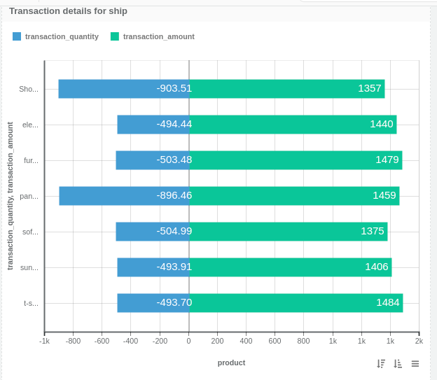
-
In Flair-BI, Stacked Vertical Bar Chart one type of visualization that displays the data from the same category into a cluster.
Open Flair BI application and create one data-set after that using that data-set create dashboard and view. see how to create dashboard and view
-
Click on the toggle to enable EDIT mode.
-
You can see all the available visualizations by clicking on the visualization icon.
-
Click on Stacked Vertical Bar Chart.

-
when you click on Stacked Vertical bar charts its open one empty container.
-
Stacked Vertical Bar Chart container has some options like tools, live, refresh etc... click on tools option.
Two ways to create Visualizations :
- using the setting option
- using drag-drop option
-
Click on settings option.
-
when you click on settings option its open settings right side setting penal that allow to select dimension and measure for charts and set the property of charts.
-
Click on viz-properties tab to set visualization properties.
-
Click on data-properties tab to select visualization dimension and measure for charts.
-
Stacked Vertical Bar Chart allows only one dimension so select dimension from the drop-down.
-
Stacked Vertical Bar Chart allows selecting one or more measure, select measures from drop-down and property for that.
-
Click on save button so you can see the visualization render.
-
Click on Flip option. when you click on Flip option visualization container flip and allow to drag-drop measures and dimension
-
Click on dimension tab to drag-drop dimension for charts.
-
Click on measures tab to drag-drop measures for charts.
-
Click on Build option to build visualization. when you click on build visualization is render.

| Type | Required | Optional |
|---|---|---|
| Dimensions | 1 | 0 |
| Measures | 1 | 4 |
-
-
Property Name Config Property Name Description Default Value Possible Values Display name displayName A Display name Displayname -
Property Name Config Property Name Description Default Value Possible Values Value on Points showValues Show value on points false true/false Display name displayNameForMeasure A Display name for Measure Displayname Font style fontStyle Style of fonts Normal Normal/Italique/Oblique Font weight fontWeight Weight of fonts Normal Normal/Bold/100-900 Number format numberFormat Possible number formats Actual K,M,B,Actual Text colour textColor The text colour #617c8c Display colour displayColor An display colour null Border colour borderColor An border colour null Font size fontSize Size of fonts 9 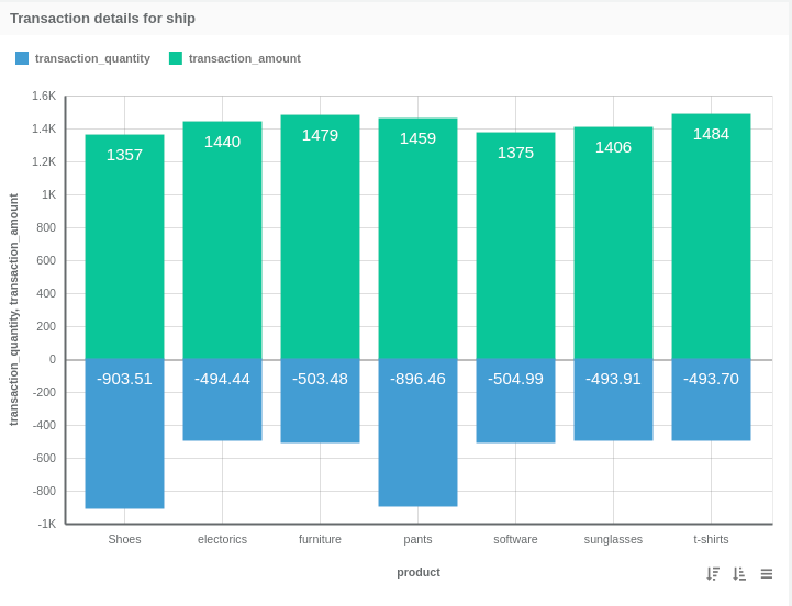
-
In Flair-BI, Line Chart is one type of visualization that used to compare changes over the same period of time for more than one category.
When to use Line Chart
- Line chart is used when you want to compare data for short and long time duration.
- If your data change over time than the line chart is the best option to show your data.
- Line chart is also used to compare changes over the same period of time for more than one category.
-
Click on the toggle to enable EDIT mode.
-
You can see all the available visualizations by clicking on the visualization icon.
-
Click on Line Chart.

-
when you click on Line charts its open one empty container.
-
Line Chart container has some options like tools, live, refresh etc... click on tools option.
Two ways to create Visualizations :
- using the setting option
- using drag-drop option
-
Click on settings option.
-
when you click on settings option its open settings right side setting penal that allow to select dimension and measure for charts and set the property of charts.
-
Click on viz-properties tab to set visualization properties.
-
Click on data-properties tab to select visualization dimension and measure for charts.
-
Line Chart allows only one dimension so select dimension from the drop-down.
-
Line Chart allows one or more measure, select measures from drop-down and property for that.
-
Click on save button so you can see the visualization render.
-
Click on Flip option. when you click on Flip option visualization container flip and allow to drag-drop measures and dimension
-
Click on dimension tab to drag-drop dimension for charts.
-
Click on measures tab to drag-drop measures for charts.
-
Click on Build option to build visualization. when you click on build visualization is render.

| Type | Required | Optional |
|---|---|---|
| Dimensions | 1 | 0 |
| Measures | 1 | 4 |
-
-
Property Name Config Property Name Description Default Value Possible Values Display name displayName A Display name Displayname -
Property Name Config Property Name Description Default Value Possible Values Value on Points showValues Show value on points false true/false Display name displayNameForMeasure A Display name for Measure Displayname Font style fontStyle Style of fonts Normal Normal/Italique/Oblique Font weight fontWeight Weight of fonts Normal Normal/Bold/100-900 Number format numberFormat Possible number formats Actual K,M,B,Actual Text colour textColor The text colour #617c8c Display colour displayColor An display colour null Border colour borderColor An border colour null Font size fontSize Size of fonts 9 Line Chart Point type pointType Type of points Circle Circle,Cross,CrossRot,Dash,Line,Rect,RectRounded,RectRot,Star,Triangle Line Type lineType Types of line charts Line Area/Line 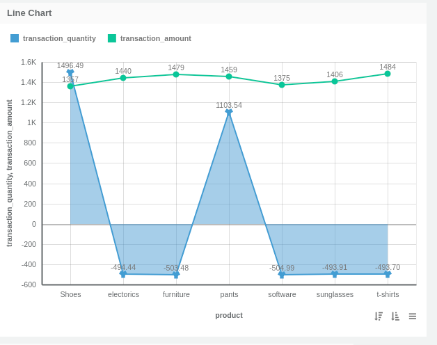
-
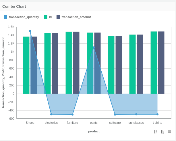
In Flair-BI, Combo Chart is one type of visualization that use to display different types of data in one chart. combo chart is a combination of bar chart, line chart and area chart.
When to use Combo Chart
- Combo chart is used when you want to comparing different types of data in one chart.
- Combo chart is best if you want to show how one category is effected by another category.
-
Click on the toggle to enable EDIT mode.
-
You can see all the available visualizations by clicking on the visualization icon.
-
Click on Combo Chart.

-
when you click on Combo charts its open one empty container.
-
Combo Chart container has some options like tools, live, refresh etc... click on tools option.
Two ways to create Visualizations :
- using the setting option
- using drag-drop option
-
Click on settings option.
-
when you click on settings option its open settings right side setting penal that allow to select dimension and measure for charts and set the property of charts.
-
Click on viz-properties tab to set visualization properties.
-
Click on data-properties tab to select visualization dimension and measure for charts.
-
Combo Chart allows only one dimension so select dimension from the drop-down.
-
Combo Chart allows one or more measure, select measures from drop-down and property for that.
-
Click on save button so you can see the visualization render.
-
Click on Flip option. when you click on Flip option visualization container flip and allow to drag-drop measures and dimension
-
Click on dimension tab to drag-drop dimension for charts.
-
Click on measures tab to drag-drop measures for charts.
-
Click on Build option to build visualization. when you click on build visualization is render.

| Type | Required | Optional |
|---|---|---|
| Dimensions | 1 | 0 |
| Measures | 1 | 4 |
-
-
Property Name Config Property Name Description Default Value Possible Values Display name displayName A Display name Displayname -
Property Name Config Property Name Description Default Value Possible Values Value on Points showValues Show value on points false true/false Display name displayNameForMeasure A Display name for Measure Displayname Font style fontStyle Style of fonts Normal Normal/Italique/Oblique Font weight fontWeight Weight of fonts Normal Normal/Bold/100-900 Number format numberFormat Possible number formats Actual K,M,B,Actual Text colour textColor The text colour #617c8c Display colour displayColor An display colour null Border colour borderColor An border colour null Font size fontSize Size of fonts 9 Line Chart Point type pointType Type of points Circle Circle,Cross,CrossRot,Dash,Line,Rect,RectRounded,RectRot,Star,Triangle Line Type lineType Types of line charts Line Area/Line Combo chart type comboChartType line or bar Bar Bar/Line
-
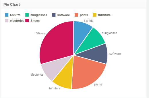
In Flair-BI, Pie Chart one type of visualization that shows data comparison.
- Pie charts are best to use when you are trying to compare parts of a whole. They do not show changes over time.
- If you have a small number of categories to compare then the pie chart is the best option to show your data.
- Pie charts used to display data in percentage and that percentage indicate each category that provided next to the corresponding slice of pie.
-
Click on the toggle to enable EDIT mode.
-
You can see all the available visualizations by clicking on the visualization icon.
-
Click on Pie Chart.

-
when you click on Pie charts its open one empty container.
-
Pie Chart container has some options like tools, live, refresh etc... click on tools option.
Two ways to create Visualizations :
- using the setting option
- using drag-drop option
-
Click on settings option.
-
when you click on settings option its open settings right side setting penal that allow to select dimension and measure for charts and set the property of charts.
-
Click on viz-properties tab to set visualization properties.
-
Click on data-properties tab to select visualization dimension and measure for charts.
-
Pie Chart allows only one dimension so select dimension from the drop-down.
-
Pie Chart allows only one measure, select measures from drop-down and property for that.
-
Click on save button so you can see the visualization render.
-
Click on Flip option. when you click on Flip option visualization container flip and allow to drag-drop measures and dimension
-
Click on dimension tab to drag-drop dimension for charts.
-
Click on measures tab to drag-drop measures for charts.
-
Click on Build option to build visualization. when you click on build visualization is render.

| Type | Required | Optional |
|---|---|---|
| Dimensions | 1 | 0 |
| Measures | 1 | 0 |
-
-
Property Name Config Property Name Description Default Value Possible Values Show value as valueAs show labels as option in piece lable Label Label/Percentage/Value Value as Arc valueAsArc Boolean that says value on the segment should be in arc or not TRUE true/false Value position valuePosition Position of value outside or inside pie segment Border Border/Outside
-
In Flair-BI, Doughnut Chart one type of visualization that use to show data comparison. doughnut chart is a variant of the pie chart.
- Doughnut charts are best to use when you are trying to compare parts of a whole. They do not show changes over time.
- If you have a small number of categories to compare then the pie chart is the best option to show your data. If you want to display additional information like the total of all data values in the center of the doughnut chart then you can use Doughnut chart.
-
Click on the toggle to enable EDIT mode.
-
You can see all the available visualizations by clicking on the visualization icon.
-
Click on Doughnut Chart.

-
when you click on Doughnut charts its open one empty container.
-
Doughnut Chart container has some options like tools, live, refresh etc... click on tools option.
Two ways to create Visualizations :
- using the setting option
- using drag-drop option
-
Click on settings option.
-
when you click on settings option its open settings right side setting penal that allow to select dimension and measure for charts and set the property of charts.
-
Click on viz-properties tab to set visualization properties.
-
Click on data-properties tab to select visualization dimension and measure for charts.
-
Doughnut Chart allows only one dimension so select dimension from the drop-down.
-
Doughnut Chart allows only one measure, select measures from drop-down and property for that.
-
Click on save button so you can see the visualization render.
-
Click on Flip option. when you click on Flip option visualization container flip and allow to drag-drop measures and dimension
-
Click on dimension tab to drag-drop dimension for charts.
-
Click on measures tab to drag-drop measures for charts.
-
Click on Build option to build visualization. when you click on build visualization is render.

| Type | Required | Optional |
|---|---|---|
| Dimensions | 1 | 0 |
| Measures | 1 | 0 |
-
-
Property Name Config Property Name Description Default Value Possible Values Show value as valueAs show labels as option in piece lable Label Label/Percentage/Value Value as Arc valueAsArc Boolean that says value on the segment should be in arc or not TRUE true/false Value position valuePosition Position of value outside or inside pie segment Border Border/Outside -
Property Name Config Property Name Description Default Value Possible Values Display name dimensionDisplayName A Display name for Dimension Displayname Display name measureDisplayName A Display name for Measure Displayname Font style fontStyle Style of fonts Normal Normal/Italique/Oblique Font weight fontWeight Weight of fonts Normal Normal/Bold/100-900 Text colour fontColor The text colour #617c8c Font size fontSize Size of fonts 9 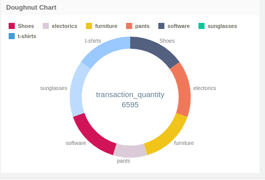
-
In Flair-BI, Gauge chart is one type of visualization used to compare source and target data.
- If you want to compare one measure with another measure.
- Highlight the gain for a goal.
-
Click on the toggle to enable EDIT mode.
-
You can see all the available visualizations by clicking on the visualization icon.
-
Click on Gauge Chart.

-
when you click on Gauge charts its open one empty container.
-
Gauge Chart container has some options like tools, live, refresh etc... click on tools option.
Two ways to create Visualizations :
- using the setting option
- using drag-drop option
-
Click on settings option.
-
when you click on settings option its open settings right side setting penal that allow to select dimension and measure for charts and set the property of charts.
-
Click on viz-properties tab to set visualization properties.
-
Click on data-properties tab to select visualization dimension and measure for charts.
-
Gauge Chart allows two measure, select measures from drop-down and property for that.
-
Click on save button so you can see the visualization render.
-
Click on Flip option. when you click on Flip option visualization container flip and allow to drag-drop measures and dimension
-
Click on measures tab to drag-drop measures for charts.
-
Click on Build option to build visualization. when you click on build visualization is render.

| Type | Required | Optional |
|---|---|---|
| Dimensions | 0 | 0 |
| Measures | 2 | 0 |
-
-
Property Name Config Property Name Description Default Value Possible Values Gauge Type gaugeType Type of gauges Half Circle Half Circle/Radial -
Property Name Config Property Name Description Default Value Possible Values Value on Points targetShowValues Show value on points for Target Measure FALSE True Display name targetDisplayName A Display name for Target Measure Displayname Font style targetFontStyle Style of fonts for Target Measure Normal Normal/Italique/Oblique Font weight targetFontWeight Weight of fonts for Target Measure Normal Normal/Bold/100-900 Number format targetNumberFormat Possible number formats for Target Measure Actual K,M,B,Actual Text colour targetTextColor The text colour for Target Measure #617c8c Display colour targetDisplayColor An display colour for Target Measure null Value on Points showValues Show value on points FALSE True Display name displayName A Display name for Measure Displayname Font style fontStyle Style of fonts Normal Normal/Italique/Oblique Font weight fontWeight Weight of fonts Normal Normal/Bold/100-900 Number format numberFormat Possible number formats Actual K,M,B,Actual Text colour textColor The text colour #617c8c Display colour displayColor An display colour null Enable Gradient Color isGradient Enable Gradient Color for Source Measure FALSE True 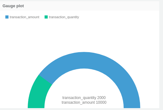
-
In Flair-BI, Table Chart is one type of visualization that used display data in table format.
When to use Table Chart
- Display a large amount of data.
- Compare multiple dimension with one or more measured values.
-
Click on the toggle to enable EDIT mode.
-
You can see all the available visualizations by clicking on the visualization icon.
-
Click on Table Chart.

-
when you click on Table charts its open one empty container.
-
Table Chart container has some options like tools, live, refresh etc... click on tools option.
Two ways to create Visualizations :
- using the setting option
- using drag-drop option
-
Click on settings option.
-
when you click on settings option its open settings right side setting penal that allow to select dimension and measure for charts and set the property of charts.
-
Click on viz-properties tab to set visualization properties.
-
Click on data-properties tab to select visualization dimension and measure for charts.
-
Table Chart allows one or more dimension so select dimension from the drop-down.
-
Table Chart allows one or more measure, select measures from drop-down and property for that.
-
Click on save button so you can see the visualization render.
-
Click on Flip option. when you click on Flip option visualization container flip and allow to drag-drop measures and dimension
-
Click on dimension tab to drag-drop dimension for charts.
-
Click on measures tab to drag-drop measures for charts.
-
Click on Build option to build visualization. when you click on build visualization is render.

| Type | Required | Optional |
|---|---|---|
| Dimensions | 1 | 9 |
| Measures | 1 | 9 |
-
-
Property Name Config Property Name Description Default Value Possible Values Display name displayNameForDimension A Display name for Dimension Displayname Font style fontStyleForDimension Style of fonts for Dimension Normal Normal/Italique/Oblique Font weight fontWeightForDimension Weight of fonts for Dimension Normal Normal/Bold/100-900 Text colour textColorForDimension The text colour for Dimension #617c8c Font size fontSizeForDimension Size of fonts for Dimension 9 Cell colour cellColorForDimension Cell colour for table cells for Dimension rgba(255, 255, 255, 1) Text colour expression textColorExpressionForDimension The text colour expression for Dimension null Text alignment textAlignmentForDimension Alignment of text for Dimension Center Center/Left/Right -
Property Name Config Property Name Description Default Value Possible Values Display name displayNameForMeasure A Display name for Measure Displayname Font style fontStyleForMeasure Style of fonts for Measure Normal Normal/Italique/Oblique Font weight fontWeightForMeasure Weight of fonts for Measure Normal Normal/Bold/100-900 Text colour textColorForMeasure The text colour for Measure #617c8c Font size fontSizeForMeasure Size of fonts for Measure 9 Cell colour cellColorForMeasure Cell colour for table cells for Measure rgba(255, 255, 255, 1) Text colour expression textColorExpressionForMeasure The text colour expression for Measure null Cell colour expression cellColorExpressionForMeasure Expression to customize cell colour of table cells null Icon name iconNameForMeasure An icon name for Measure null Icon Expression iconExpressionForMeasure An icon expression for Measure null Text alignment textAlignmentForMeasure Alignment of text for Measure Center Center/Left/Right Icon position iconPositionForMeasure An icon position for Measure Center Center/Left/Right Number format numberFormatForMeasure Possible number formats for Measure Actual K,M,B,Actual 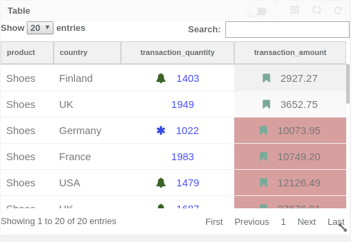
-
In Flair-BI, Pivot Table Chart is one type of visualization that used display data in table format and gets summarized information.
When to use Table Chart
- Display a large amount of data.
- If you want summarizes statistics date for dataset then pivot table is the best choice.
-
Click on the toggle to enable EDIT mode.
-
You can see all the available visualizations by clicking on the visualization icon.
-
Click on Pivot Table Chart.

-
when you click on Pivot Table its open one empty container.
-
Pivot Table container has some options like tools, live, refresh etc... click on tools option.
Two ways to create Visualizations :
- using the setting option
- using drag-drop option
-
Click on settings option.
-
when you click on settings option its open settings right side setting penal that allow to select dimension and measure for charts and set the property of charts.
-
Click on viz-properties tab to set visualization properties.
-
Click on data-properties tab to select visualization dimension and measure for charts.
-
Pivot Table Chart allows one or more dimension so select dimension from the drop-down.
-
Pivot Table Chart allows one or more measure, select measures from drop-down and property for that.
-
Click on save button so you can see the visualization render.
-
Click on Flip option. when you click on Flip option visualization container flip and allow to drag-drop measures and dimension
-
Click on dimension tab to drag-drop dimension for charts.
-
Click on measures tab to drag-drop measures for charts.
-
Click on Build option to build visualization. when you click on build visualization is render.

| Type | Required | Optional |
|---|---|---|
| Dimensions | 1 | 4 |
| Measures | 1 | 9 |
-
-
Property Name Config Property Name Description Default Value Possible Values Display name displayNameForDimension A Display name for Dimension Displayname Font style fontStyleForDimension Style of fonts for Dimension Normal Normal/Italique/Oblique Font weight fontWeightForDimension Weight of fonts for Dimension Normal Normal/Bold/100-900 Text colour textColorForDimension The text colour for Dimension #617c8c Font size fontSizeForDimension Size of fonts for Dimension 9 Cell colour cellColorForDimension Cell colour for table cells for Dimension rgba(255, 255, 255, 1) Text colour expression textColorExpressionForDimension The text colour expression for Dimension null Text alignment textAlignmentForDimension Alignment of text for Dimension Center Center/Left/Right Pivot isPivoted Pivot the dimension FALSE true/false -
Property Name Config Property Name Description Default Value Possible Values Display name displayNameForMeasure A Display name for Measure Displayname Font style fontStyleForMeasure Style of fonts for Measure Normal Normal/Italique/Oblique Font weight fontWeightForMeasure Weight of fonts for Measure Normal Normal/Bold/100-900 Text colour textColorForMeasure The text colour for Measure #617c8c Font size fontSizeForMeasure Size of fonts for Measure 9 Cell colour cellColorForMeasure Cell colour for table cells for Measure rgba(255, 255, 255, 1) Text colour expression textColorExpressionForMeasure The text colour expression for Measure null Cell colour expression cellColorExpressionForMeasure Expression to customize cell colour of table cells null Icon name iconNameForMeasure An icon name for Measure null Icon Expression iconExpressionForMeasure An icon expression for Measure null Text alignment textAlignmentForMeasure Alignment of text for Measure Center Center/Left/Right Icon position iconPositionForMeasure An icon position for Measure Center Center/Left/Right Number format numberFormatForMeasure Possible number formats for Measure Actual K,M,B,Actual Icon Font weight iconFontWeight Weight of icon fonts Normal Normal/Bold/100-900 Icon colour iconColor An Icon colour null 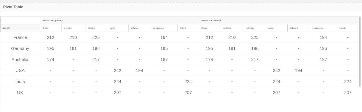
-
In Flair-BI, Map Chart one type of visualization that shows data comparison.
- Map chart is used to compare data and show in geographical regions.
- Map chart is used when you have geographical regions in your data for example countries
-
Click on the toggle to enable EDIT mode.
-
You can see all the available visualizations by clicking on the visualization icon.
-
Click on Map Chart.

-
when you click on Map charts its open one empty container.
-
Map Chart container has some options like tools, live, refresh etc... click on tools option.
Two ways to create Visualizations :
- using the setting option
- using drag-drop option
-
Click on settings option.
-
when you click on settings option its open settings right side setting penal that allow to select dimension and measure for charts and set the property of charts.
-
Click on viz-properties tab to set visualization properties.
-
Click on data-properties tab to select visualization dimension and measure for charts.
-
Map Chart allows only one dimension so select dimension from the drop-down.
-
Map Chart allows only one measure, select measures from drop-down and property for that.
-
Click on save button so you can see the visualization render.
-
Click on Flip option. when you click on Flip option visualization container flip and allow to drag-drop measures and dimension
-
Click on dimension tab to drag-drop dimension for charts.
-
Click on measures tab to drag-drop measures for charts.
-
Click on Build option to build visualization. when you click on build visualization is render.

| Type | Required | Optional |
|---|---|---|
| Dimensions | 1 | 1 |
| Measures | 1 | 1 |
-
-
Config Property Name Description Default Value Possible Values numberFormat Possible number formats Actual K,M,B,Actual displayColor An display colour null -
Property Name Config Property Name Description Default Value Possible Values Border colour borderColor An border colour null 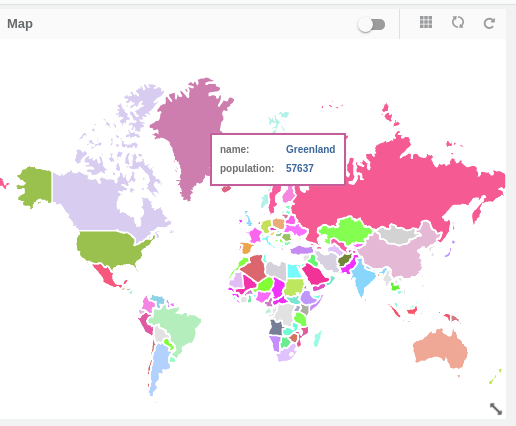
-
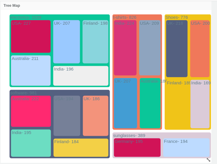
In Flair-BI, Treemap Chart one type of visualization representing hierarchical data in a tree-like structure.
- If you have a display large amount of hierarchical data then treemap is best option to show your data.
-
Click on the toggle to enable EDIT mode.
-
You can see all the available visualizations by clicking on the visualization icon.
-
Click on Tree map.

-
when you click on Treemap its open one empty container.
-
Treemap container has some options like tools, live, refresh etc... click on tools option.
Two ways to create Visualizations :
- using the setting option
- using drag-drop option
-
Click on settings option.
-
when you click on settings option its open settings right side setting penal that allow to select dimension and measure for charts and set the property of charts.
-
Click on viz-properties tab to set visualization properties.
-
Click on data-properties tab to select visualization dimension and measure for charts.
-
Treemap allows one or two dimension so select dimension from the drop-down.
-
Treemap allow only one measure, select measures from drop-down and property for that.
-
Click on save button so you can see the visualization render.
-
Click on Flip option. when you click on Flip option visualization container flip and allow to drag-drop measures and dimension
-
Click on dimension tab to drag-drop dimension for charts.
-
Click on measures tab to drag-drop measures for charts.
-
Click on Build option to build visualization. when you click on build visualization is render.

| Type | Required | Optional |
|---|---|---|
| Dimensions | 1 | 1 |
| Measures | 1 | 0 |
-
-
Property Name Config Property Name Description Default Value Possible Values Show Labels showLabelForDimension Boolean to show labels TRUE true/false Colour of labels labelColorForDimension Label colours null null Display colour displayColor An display colour null null Font style fontStyleForDimension Style of fonts for Dimension Normal Normal/Italique/Oblique Font weight fontWeightForDimension Weight of fonts for Dimension Normal Normal/Bold/100-900 Font size fontSizeForDimension Size of fonts for Dimension 9 -
Property Name Config Property Name Description Default Value Possible Values Value on Points showValues Show value on points FALSE true/false Font size fontSizeForMes Size of fonts 9 Font style fontStyleForMes Style of fonts Normal Normal/Italique/Oblique Font weight fontWeightForMes Weight of fonts Normal Normal/Bold/100-900 Number format numberFormat Possible number formats Actual K,M,B,Actual Text colour valueTextColour The text colour #617c8c Color Pattern colorPattern Color pattern to vizualizations null Single/Gradient/Unique
-
In Flair-BI, Heatmap Chart one type of visualization that use to display graphical representations of data that utilize colour-coded systems
- If you want to highlight the database on the volume of data then heatmap chart is used.
-
Click on the toggle to enable EDIT mode.
-
You can see all the available visualizations by clicking on the visualization icon.
-
Click on Heatmap.

-
when you click on Treemap its open one empty container.
-
Heatmap container has some options like tools, live, refresh etc... click on tools option.
Two ways to create Visualizations :
- using the setting option
- using drag-drop option
-
Click on settings option.
-
when you click on settings option its open settings right side setting penal that allow to select dimension and measure for charts and set the property of charts.
-
Click on viz-properties tab to set visualization properties.
-
Click on data-properties tab to select visualization dimension and measure for charts.
-
Heatmap allow one or two dimension so select dimension from the drop-down.
-
Heatmap allow one or more measure, select measures from drop-down and property for that.
-
Click on save button so you can see the visualization render.
-
Click on Flip option. when you click on Flip option visualization container flip and allow to drag-drop measures and dimension
-
Click on dimension tab to drag-drop dimension for charts.
-
Click on measures tab to drag-drop measures for charts.
-
Click on Build option to build visualization. when you click on build visualization is render.

| Type | Required | Optional |
|---|---|---|
| Dimensions | 1 | 1 |
| Measures | 1 | 0 |
-
-
Property Name Config Property Name Description Default Value Possible Values Colour of labels dimLabelColor Label colours null null Display name displayName A Display name Displayname Font style fontStyleForDimension Style of fonts for Dimension Normal Normal/Italique/Oblique Font weight fontWeightForDimension Weight of fonts for Dimension Normal Normal/Bold/100-900 Font size fontSizeForDimension Size of fonts for Dimension 9 -
Property Name Config Property Name Description Default Value Possible Values Value on Points showValues Show value on points FALSE True/False Number format numberFormat Possible number formats Actual K,M,B,Actual Show Icon showIcon Boolean to show icons TRUE true/false Color Coding colourCoding Conditional coloring null Display name displayNameForMeasure A Display name for Dimension Displayname Font style fontStyleForMeasure Style of fonts for Dimension Normal Normal/Italique/Oblique Font weight fontWeightForMeasure Weight of fonts for Dimension Normal Normal/Bold/100-900 Text colour valueTextColour The text colour for Dimension #617c8c Font size fontSizeForMeasure Size of fonts for Dimension 9 Alignment valuePosition an alignment Left Center/Left/Right Icon name iconNameForMeasure An icon name for Measure null Icon position iconPositionForMeasure An icon position for Measure Center Center/Left/Right Icon Font weight iconFontWeight Weight of icon fonts Normal Normal/Bold/100-900 Icon colour iconColor An Icon colour null 
-
-
Click on the toggle to enable EDIT mode.
-
You can see all the available visualizations by clicking on the visualization icon.
-
Click on Box plot Chart.

-
when you click on Box plot charts its open one empty container.
-
Box plot Chart container has some options like tools, live, refresh etc... click on tools option.
Two ways to create Visualizations :
- using setting option
- using drag-drop option
-
Click on settings option.
-
when you click on settings option its open settings right side setting penal that allow to select dimension and measure for charts and set the property of charts.
-
Click on viz-properties tab to set visualization properties.
-
Click on data-properties tab to select visualization dimension and measure for charts.
-
Box plot Chart allows only one dimension so select dimension from the drop-down.
-
Box plot Chart allows selecting Five measure, select measures from drop-down and property for that.
-
Click on save button so you can see the visualization render.
-
Click on Flip option. when you click on Flip option visualization container flip and allow to drag-drop measures and dimension
-
Click on dimension tab to drag-drop dimension for charts.
-
Click on measures tab to drag-drop measures for charts.
-
Click on Build option to build visualization. when you click on build visualization is render.

| Type | Required | Optional |
|---|---|---|
| Dimensions | 1 | 0 |
| Measures | 5 | 0 |
-
-
Property Name Config Property Name Description Default Value Possible Values Number format numberFormat Possible number formats Actual K,M,B,Actual Show Labels showLabel Boolean to show labels TRUE true/false Colour of labels labelColor Label colours null null -
Property Name Config Property Name Description Default Value Possible Values Display colour displayColor An display colour null

-
In Flair-BI, the Text object is one type of visualization that use to display text information with formatting.
-
Click on the toggle to enable EDIT mode.
-
You can see all the available visualizations by clicking on the visualization icon.
-
Click on Text object.

-
when you click on the text object its open one empty container.
-
Text object container has some options like tools, live, refresh etc... click on tools option.
Two ways to create Visualizations :
- using the setting option
- using drag-drop option
-
Click on settings option.
-
when you click on settings option its open settings right side setting penal that allow to select measure for charts and set the property of charts.
-
Click on viz-properties tab to set visualization properties.
-
Click on data-properties tab to select visualization dimension and measure for charts.
-
Text object allow one or more measures so select dimension from the drop-down.
-
Click on save button so you can see the visualization render.
-
Click on Flip option. when you click on Flip option visualization container flip and allow to drag-drop measures and dimension
-
Click on measures tab to drag-drop measures for charts.
-
Click on Build option to build visualization. when you click on build visualization is render.

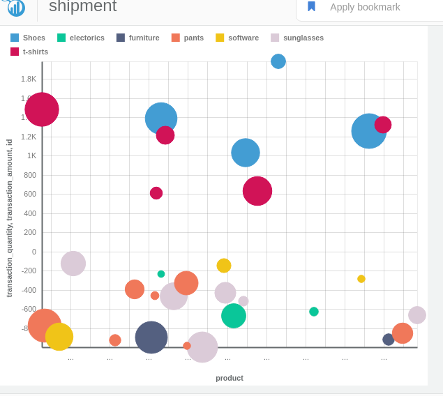
In Flair-BI, Scatter plot Chart one type of visualization that displays the relationship between two measures.
Open Flair BI application and create one data-set after that using that data-set create dashboard and view. see how to create dashboard and view
- Display relationships between two measures.
- Display large number of data-set without regard to time
-
Click on the toggle to enable EDIT mode.
-
You can see all the available visualizations by clicking on the visualization icon.
-
Click on Scatter plot Chart.

-
when you click on Scatter plot charts its open one empty container.
-
Scatter plot Chart container has some options like tools, live, refresh etc... click on tools option.
Two ways to create Visualizations :
- using the setting option
- using drag-drop option
-
Click on settings option.
-
when you click on settings option its open settings right side setting penal that allow to select dimension and measure for charts and set the property of charts.
-
Click on viz-properties tab to set visualization properties.
-
Click on data-properties tab to select visualization dimension and measure for charts.
-
Scatter plot Chart allows two dimension so select dimension from the drop-down.
-
Scatter plot Chart allows selecting three, select measures from drop-down and property for that.
-
Click on save button so you can see the visualization render.
-
Click on Flip option. when you click on Flip option visualization container flip and allow to drag-drop measures and dimension
-
Click on dimension tab to drag-drop dimension for charts.
-
Click on measures tab to drag-drop measures for charts.
-
Click on Build option to build visualization. when you click on build visualization is render.

| Type | Required | Optional |
|---|---|---|
| Dimensions | 1 | 0 |
| Measures | 2 | 1 |
-
-
Property Name Config Property Name Description Default Value Possible Values Display name displayName A Display name Displayname -
Property Name Config Property Name Description Default Value Possible Values Value on Points showValues Show value on points false true/false Display name displayNameForMeasure A Display name for Measure Displayname Font style fontStyle Style of fonts Normal Normal/Italique/Oblique Font weight fontWeight Weight of fonts Normal Normal/Bold/100-900 Number format numberFormat Possible number formats Actual K,M,B,Actual Text colour textColor The text colour #617c8c Display colour displayColor An display colour null Border colour borderColor An border colour null Font size fontSize Size of fonts 9
-
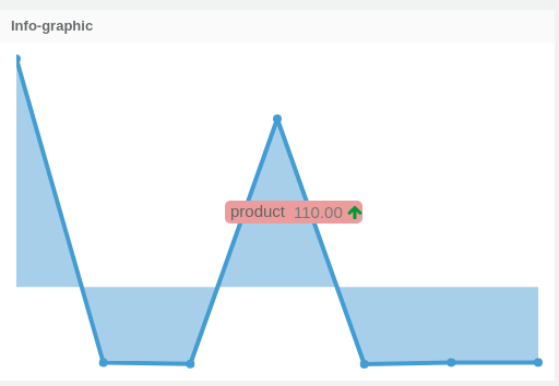
In Flair-BI, the Infographic chart is one type of visualization used highlight the KPI information.
- When you want to monitor the performance of KPI.
- Measure the gap between source and target.
-
Click on the toggle to enable EDIT mode.
-
You can see all the available visualizations by clicking on the visualization icon.
-
Click on Infographic Chart.

-
when you Click on Infographic charts its open one empty container.
-
Gauge Chart container has some options like tools, live, refresh etc... click on tools option.
Two ways to create Visualizations :
- using the setting option
- using drag-drop option
-
Click on settings option.
-
when you click on settings option its open settings right side setting penal that allow to select dimension and measure for charts and set the property of charts.
-
Click on viz-properties tab to set visualization properties.
-
Click on data-properties tab to select visualization dimension and measure for charts.
-
Infographic Chart allows only one dimension so select dimension from the drop-down.
-
Infographic Chart allows only one measure, select measures from drop-down and property for that.
-
Click on save button so you can see the visualization render.
-
Click on Flip option. when you click on Flip option visualization container flip and allow to drag-drop measures and dimension
-
Click on measures tab to drag-drop measures for charts.
-
Click on Build option to build visualization. when you click on build visualization is render.

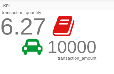
In Flair-BI, KPI charts are one type of visualization used to highlight the KPI information.
- When you want to monitor the performance of KPI.
- Measure the gap between source and target.
-
Click on the toggle to enable EDIT mode.
-
You can see all the available visualizations by clicking on the visualization icon.
-
Click on KPI Chart.

-
when you Click on KPI charts its open one empty container.
-
KPI Chart container has some options like tools, live, refresh etc... click on tools option.
Two ways to create Visualizations :
- using the setting option
- using drag-drop option
-
Click on settings option.
-
when you click on settings option its open settings right side setting penal that allow to select dimension and measure for charts and set the property of charts.
-
Click on viz-properties tab to set visualization properties.
-
Click on data-properties tab to select visualization dimension and measure for charts.
-
KPI Chart allows one or two measure, select measures from drop-down and property for that.
-
Click on save button so you can see the visualization render.
-
Click on Flip option. when you click on Flip option visualization container flip and allow to drag-drop measures and dimension
-
Click on measures tab to drag-drop measures for charts.
-
Click on Build option to build visualization. when you click on build visualization is render.

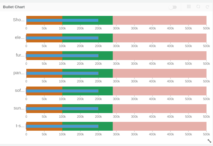
In Flair-BI, Bullet Chart is one type of visualization that used to compare you source value with the target value for multiple entries in a single category.
When to use Bullet Chart
- When you want to monitor the progress towards the target.
- If you want to check performance of data then also bullet chart is used.
-
Click on the toggle to enable EDIT mode.
-
You can see all the available visualizations by clicking on the visualization icon.
-
Click on Bullet Chart.

-
when you click on Bullet charts its open one empty container.
-
Bullet Chart container has some options like tools, live, refresh etc... click on tools option.
Two ways to create Visualizations :
- using the setting option
- using drag-drop option
-
Click on settings option.
-
when you click on settings option its open settings right side setting penal that allow to select dimension and measure for charts and set the property of charts.
-
Click on viz-properties tab to set visualization properties.
-
Click on data-properties tab to select visualization dimension and measure for charts.
-
Bullet Chart allows only one dimension so select dimension from the drop-down.
-
Bullet Chart allows two measure, select measures from drop-down and property for that.
-
Click on save button so you can see the visualization render.
-
Click on Flip option. when you click on Flip option visualization container flip and allow to drag-drop measures and dimension
-
Click on dimension tab to drag-drop dimension for charts.
-
Click on measures tab to drag-drop measures for charts.
-
Click on Build option to build visualization. when you click on build visualization is render.
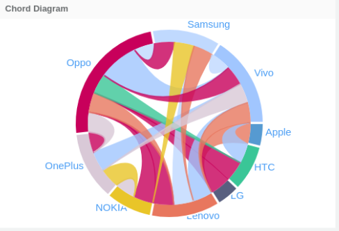
In Flair-BI, chord diagram is one type of visualization that used to display interrelationships between entities.
When to use Chord diagram
- Chord Diagrams is best when you want to compare similarities within a data.
-
Click on the toggle to enable EDIT mode.
-
You can see all the available visualizations by clicking on the visualization icon.
-
Click on Chord Diagrams.

-
when you click on Chord Diagrams its open one empty container.
-
Chord Diagrams container has some options like tools, live, refresh etc... click on tools option.
Two ways to create Visualizations :
- using the setting option
- using drag-drop option
-
Click on settings option.
-
when you click on settings option its open settings right side setting penal that allow to select dimension and measure for charts and set the property of charts.
-
Click on viz-properties tab to set visualization properties.
-
Click on data-properties tab to select visualization dimension and measure for charts.
-
Chord Diagrams allow two dimension so select dimension from the drop-down.
-
Chord Diagrams allow one measure, select measures from drop-down and property for that.
-
Click on save button so you can see the visualization render.
-
Click on Flip option. when you click on Flip option visualization container flip and allow to drag-drop measures and dimension
-
Click on dimension tab to drag-drop dimension for charts.
-
Click on measures tab to drag-drop measures for charts.
-
Click on Build option to build visualization. when you click on build visualization is render.

In Flair-BI, Sankey Chart is one type of visualization that used to display flows and their quantities. Arrows of various thickness are used to visualise the quantity in each flow as well as the direction or path in which they flow.
When to use Sankey Chart
- Show relations between two-dimension. how one category is related to another category.
-
Click on the toggle to enable EDIT mode.
-
You can see all the available visualizations by clicking on the visualization icon.
-
Click on Sankey Chart.

-
when you click on Sankey charts its open one empty container.
-
Sankey Chart container has some options like tools, live, refresh etc... click on tools option.
Two ways to create Visualizations :
- using the setting option
- using drag-drop option
-
Click on settings option.
-
when you click on settings option its open settings right side setting penal that allow to select dimension and measure for charts and set the property of charts.
-
Click on viz-properties tab to set visualization properties.
-
Click on data-properties tab to select visualization dimension and measure for charts.
-
Sankey Chart allows two dimension so select dimension from the drop-down.
-
Sankey Chart allows one measure, select measures from drop-down and property for that.
-
Click on save button so you can see the visualization render.
-
Click on Flip option. when you click on Flip option visualization container flip and allow to drag-drop measures and dimension
-
Click on dimension tab to drag-drop dimension for charts.
-
Click on measures tab to drag-drop measures for charts.
-
Click on Build option to build visualization. when you click on build visualization is render.

| Type | Required | Optional |
|---|---|---|
| Dimensions | 2 | 3 |
| Measures | 1 | 0 |
-
-
Property Name Config Property Name Description Default Value Possible Values Font style fontStyle Style of fonts for Dimension Normal Normal/Italique/Oblique Font weight fontWeight Weight of fonts for Dimension Normal Normal/Bold/100-900 Font size fontSize Size of fonts for Dimension 9 Text colour textColor The text colour for Target Measure #617c8c Value on Points showValues Show value on points FALSE True/False -
Property Name Config Property Name Description Default Value Possible Values Number format numberFormat Possible number formats Actual K,M,B,Actual Color Pattern colorPattern Color pattern to vizualizations null Single/Gradient/Unique Display colour displayColor An display colour null Border colour borderColor An border colour null

-
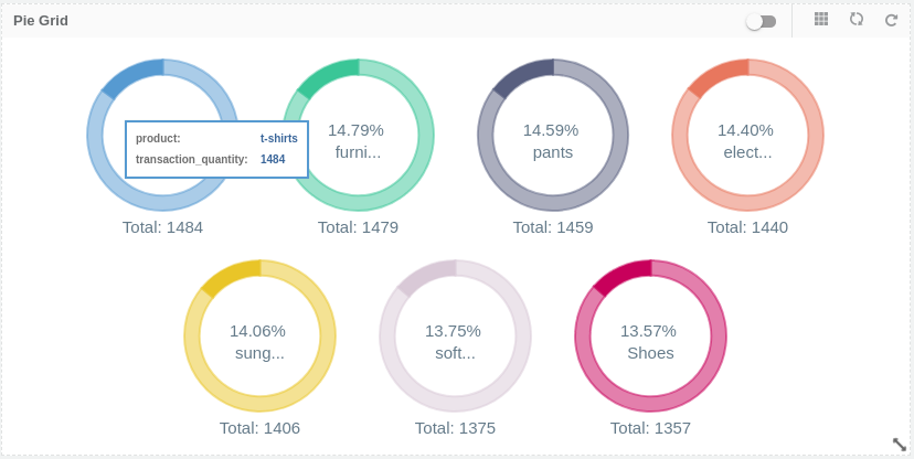
In Flair-BI, Pie Grid Chart one type of visualization that shows data comparison in percentage.
- Pie Grid charts are best to use when you are trying to compare data in percentage
-
Click on the toggle to enable EDIT mode.
-
You can see all the available visualizations by clicking on the visualization icon.
-
Click on Pie Grid Chart.

-
when you click on Pie Grid charts its open one empty container.
-
Pie Grid Chart container has some options like tools, live, refresh etc... click on tools option.
Two ways to create Visualizations :
- using the setting option
- using drag-drop option
-
Click on settings option.
-
when you click on settings option its open settings right side setting penal that allow to select dimension and measure for charts and set the property of charts.
-
Click on viz-properties tab to set visualization properties.
-
Click on data-properties tab to select visualization dimension and measure for charts.
-
Pie Grid Chart allows only one dimension so select dimension from the drop-down.
-
Pie Grid Chart allows only one measure, select measures from drop-down and property for that.
-
Click on save button so you can see the visualization render.
-
Click on Flip option. when you click on Flip option visualization container flip and allow to drag-drop measures and dimension
-
Click on dimension tab to drag-drop dimension for charts.
-
Click on measures tab to drag-drop measures for charts.
-
Click on Build option to build visualization. when you click on build visualization is render.

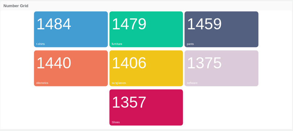
In Flair-BI, Number Grid Chart one type of visualization that shows data comparison in percentage.
- Number Grid charts are best to use when you are trying to compare data in percentage
-
Click on the toggle to enable EDIT mode.
-
You can see all the available visualizations by clicking on the visualization icon.
-
Click on Number Grid Chart.

-
when you click on Number Grid charts its open one empty container.
-
Number Grid Chart container has some options like tools, live, refresh etc... click on tools option.
Two ways to create Visualizations :
- using the setting option
- using drag-drop option
-
Click on settings option.
-
when you click on settings option its open settings right side setting penal that allow to select dimension and measure for charts and set the property of charts.
-
Click on viz-properties tab to set visualization properties.
-
Click on data-properties tab to select visualization dimension and measure for charts.
-
Number Grid Chart allows only one dimension so select dimension from the drop-down.
-
Number Grid Chart allows only one measure, select measures from drop-down and property for that.
-
Click on save button so you can see the visualization render.
-
Click on Flip option. when you click on Flip option visualization container flip and allow to drag-drop measures and dimension
-
Click on dimension tab to drag-drop dimension for charts.
-
Click on measures tab to drag-drop measures for charts.
-
Click on Build option to build visualization. when you click on build visualization is render.