[css-writing-modes] Support rtl Chinese #2754
Comments
|
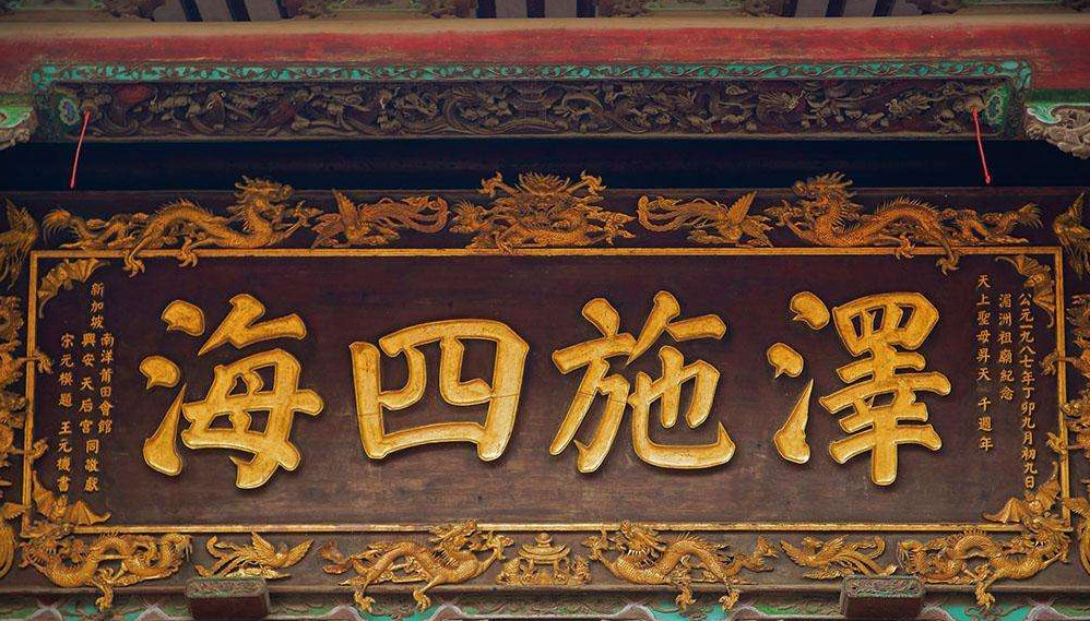
Here is one example. This is the plaque of a traditional Chinese temple. Look at the slogan part of the plaque, the slogan is written from right to left, So actually they reads 澤施四海 in the Latin habit, not 海四施澤 |
|
I think this should be considered as a special case for |
|
@upsuper I think they are different in that the whitespace gaps between characters for |
|
Does this mode of writing use the vertical alternates? My experience of it is insufficient to answer, as I cannot recall seeing any content like this that used characters that are different in horizontal vs vertical writing modes. If it is using horizontal alternates, I wonder if this is a case where we should actually use the Another other interesting questions to help figure out whether this is indeed horizontal right to left or vertical-rl with very short columns: What happens when numbers in the latin script's numerals are embedded in it? I believe that happens for example in newspaper titles with dates, and that the dates are displayed in their usual ltr. This would confirm that this is a horizontal mode, and that the direction property can handle it. |
|
@frivoal Thanks for the point. I finally managed to achieve the effect with the following code: The Having said that, as to the topic whether it's in horizontal mode or short-columned vertical mode: As a Chinese, I have never experienced in my life any senario where traditionally horizontal CJK characters are mixed with non-CJK characters. But I believe usages like this are meant in horizontal mode instead of short-columned vertical mode. Characters are placed to the next line typically ONLY when there's no room in the inline direction so they have to have a new line. But I have seen RTL horizontal usages in senarios where there's still much room in the vertical direction. So you can just imagine how incredible it is to put each English word in one line when there's still much room in the horizontal direction. So for this reason, I believe usages like this are meant in horizontal mode. Although they can be used to address insufficient room issues in the vertical direction, that doesn't necessarily mean they're in vertical mode. |
|
This Taiwanese newspaper contains various items in RTL Chinese, and not only headings – see the caption under the photo. Note also that it's actually bidirectional text: eg. the 8.6% flows LTR within the RTL flow, just as in Arabic/Hebrew/etc. The normally recommended approach for this is indeed to use an override. However, take the case of 8.6%受訪者没頭路: since the text should be always stored in logical order (so that a machine knows this is 8.6%, not 6.8%, and can read the word 'respondents' 受訪者), it's important to not reorder the digits or the text in memory. For that reason, you need to apply directionality separately to the number and the text. In HTML the best way to do this is probably via markup such as the following: Note also that the one-character per column approach is really not at all helpful when dealing with the caption. One might try to argue that there is some column related semantics in the case of simple headings, since they span vertical-rl text, but actually there are plenty of examples of RTL chinese and (pre-1945) japanese in contexts that have nothing to do with vertical text. If we were to develop some new property/value for this, i'm thinking it would be better to have something that resets the default direction at the character level to RTL for han, kana, and other defined sets of characters. Then we'd have a situation where |

|
I just submitted an improved proposal for this issue. #3608 |
|
@Zhang-Junzhi Issues should be primarily tagged to problems, not solutions. |
horizontal-tb-rl to writing-mode|
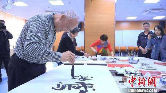
Here are my two cents on favouring adding support of RTL Chinese: As a Chinese, I can confirm there are reasonably common use cases in horizontal RTL Chinese. First, in present-time use, plenty of traditional-style title-line things, such as park names, shop names, temple names, are read still horizontally RTL, like I said in the original post. Second, like @macnmm said horizontal RTL Japanese can also be seen in vehicles, the horizontal RTL Chinese scripts also often appear in vehicles in China as well. Third, although horizontal RTL Chinese titles are hardly seen in newspaper in mainland China nowadays, they are still often seen in Taiwan Chinese newspaper and books, and as do Japanese newspaper and books. Fourth, horizontal RTL Chinese scripts are also common practices in Chinese Calligraphy field in present-time China, Japan and Korean, where majority people are in favour of RTL scripts, or usually encouraged to write RTL instead of LTR.
(Photos showing people practicing Chinese Calligraphy with RTL scripts) Fifth, the original horizontal Chinese scripts are almost always RTL, the LTR Chinese is primarily due to infulence of western scripts. Since CSS even supports ancient scripts(like vertical-lr Mongolian), it makes senses to me to also support RTL CJK. |


|
I'm not opposed to the idea of supporting horizontal RTL for Chinese and Japanese, but:
Vertical writing is commonly seen in those in Japan, but horizontal RTL is not. Maybe it happens occasionally, but it isn't common, and I don't recall seeing it.
These generally are names / single words / short phrases (without embedded numbers, mixed scripts, punctuation, etc), which seem to be adequately covered by That should cover it for truck-side signs as well, and probably also for calligraphic exercises. With all that said, I think the Taiwanese newspaper use case is perfectly reasonable and justified, and for that, So, I'm not saying we don't need to do this, just that we need to be sure what we're doing it for, so that we can figure out:
PS:
Mongolian script is in current use, so describing it as an ancient script is inaccurate. |
|
I believe that no-one is disagreeing with the suggestion that some texts in Chinese and Japanese run, or used to run, RTL in horizontal text. I want to move on to discuss the proposal that was made in the opening comment of this issue for handling that. The proposal was to create a new For the use cases described above the writing-mode direction is still horizontal-tb. What's needed is a way to change the arrangment of characters within a line during display. The way that's normally done is to use the I made a counter-proposal that says use overrides (with nesting where necessary to change direction). I'm not yet convinced that anything else is needed. Note also that this is very similar to the advice we give authors using Arabic, Hebrew, etc - ie. tightly wrap every opposite-direction phrase in markup, and use the dir attribute on that markup. Be sure to nest markup to show the structure. It's true that override markup or styling doesn't inherit well (i never understood why that was always treated differently from normal direction - or for that matter, why we need an inline bdo element rather than an rlo/lro attribute on an element, but i digress...), but i think that an override approach should probably suffice for the amount of text that needs this special treatment. In modern use it seems to be mostly short runs of text alongside vertically aligned content (eg. for titles or captions shown above). For archaic uses, it is probably only needed for short expository texts too, i suspect. By the way... Also, let's bear in mind that this is not only about Chinese and Japanese. Many archaic scripts could be written RTL in horizontal lines. And also let's bear in mind that RTL directionality is often not all that's need. Often scripts that ran RTL but who's modern Unicode properties are LTR also tended to mirror the characters at the same time, eg, Egyptian hieroglyphs, Tifinagh berber script, and Old Norse runes. (You can do this using CSS. See an example here https://r12a.github.io/scripts/tifinagh/index#dir. Or go to my pickers for any of those scripts, click on the + top left of the text area, then click on the ⭅︎ at the bottom right of the text area to see the effect.) So, in summary, a new |
|
Thanks for the reply. @r12a Applying additional markups doesn't seem pretty, although people usually can live with it, if no other better solution is available. But something can even not be achieved by applying additional markups. Please see #3608 (comment) about punctuations. FYI, I just tested the conjecture and it unfortunately turned out to be true. Parentheses mirror their shapes, but periods and commas unfortunately "remain in LTR shape". And commas seem reasonable use cases in RTL CJ. So that's an unsolved issue. |
|
TBC, by talking about punctuation issue, I am not necessarily saying this issue is to be fixed in CSS level. The issue seems to me could be that punctuations like commas, periods lack native Unicode LTR/RTL property in Unicode level(or/and maybe in font level). But I am not an expert, I just talk about the issue I just saw, not specific solution. |
|
If you look at the caption in the picture of the Taiwanese newspaper above you'll see that commas look the same in that (printed) RTL text as in LTR text. (Also note that all commas in Hebrew look the same as English commas - no mirroring.) Do you have evidence to suggest that this is not the normal approach, or are you just guessing? |
I have no evidence, and that doesn't bother me at all for Chinese, because the punctuation marks are centered. For Hebrew, the space next to the comma gets bidi-reordered as well, to there's no problem either. But Japanese commas and period include a blank right half, and that blank feels very weird to me if writing in RTL. When switching to a vertical text, the blank upper half is removed and replaced by a blank lower half to keep the comma / period next to the preceeding phrase and away from the following phrase. Independently of the shape of the punctuation mark, I'd expect something similar to happen to the spacing in RTL mode. That said, that's just my expectation, and I have no material to look at to judge whether that is correct. Or maybe it's irrelevant, because it just never happens, and RTL Japanese is either old (before punctuation was a thing), or short phrases on signs, where punctuation isn't used. |
|
Yep, i was wondering those things too. It could also be that the tendency to leave the gap to the right in Japanese punctuation is a new thing, too. The idea that RTL text in Japanese is and always was only for short pieces of text is supported by the article at https://www.sljfaq.org/afaq/right-to-left.html. According to that article, more serious use of RTL text was a short-lived, failed experiment.
|
|
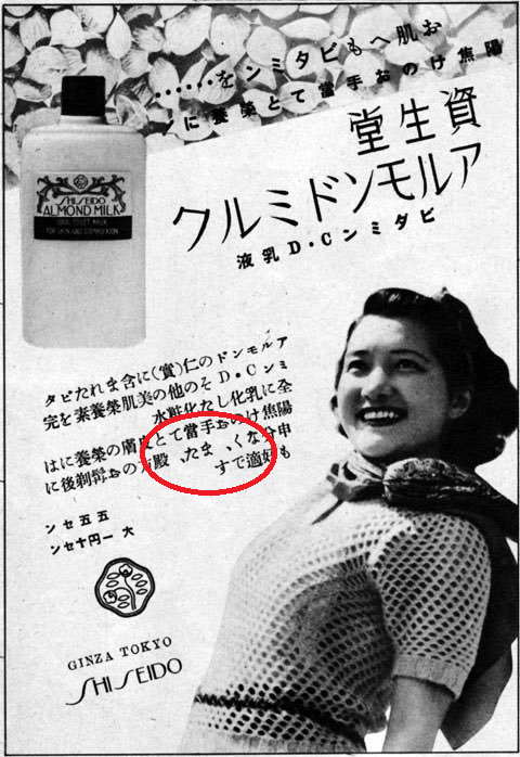
[again, with link] Is that a period on the very top line, or just a centre dot? The only punctuation in the multline block, bottom right, is an interestingly tilted exclamation mark. I wonder whether the Latin text is AD or DA when pronounced. I notice that 'vitamin' is written LTR on the actual bottle. |
I'd guess a center dot, that makes more sense as a separator of two phrases which aren't sentences. Also, if it was a period, there ought to be one at the end of the second phrase, but there isn't. Interestingly, this one is right aligned within the space it is given, while today the center dot would be centered horizontally and vertically.
Right. That doesn't tell us anything about spacing, except maybe that they're avoiding needing to cope with spacing, but that's too little data to even conclude that.
But as far as I know, neither Vitamin AD nor Vitamin DA is a thing, so they probably mean A & D. Since the Vitamin A is what they're supposed to have started the company with (https://www.rike-vita.jp/int/com/history.html) and their flagship product, I suspect they mean for the A to come first, and the word to be read "Vitamin AD". Meaning that they're not doing bidi, but are bdoing latin text into rtl as well. |
|
At the risk of stating the obvious, the problem with relying on advertising and packaging copy is that it often employs custom detailing for the sake of better graphic effect at the expense of established orthographic rules. |
|
Seeking various (yes, various....) old Japanese newspapers and magazines, I think I found two samples which has Japanese comma in horizontal RTL. Both seems to use opposite spacing for comma (red circled in images).
As in article @r12a pointed (one at sljfaq.org), originally Japanese horizontal text was
(so every vertical line are line-breaked by one character) and normally used only for signboards or headings (of e.g. newspaper), so I suppose usually no comma nor period is included... |

|
In a meeting of Japanese typography experts today at the APL, I raised this topic. People were aware that RTL horizontal Japanese for text other than names on signs used to exist, but all agreed that it has completely disappeared in modern use, and no-one could actually recall seeing any instance of it in person (other than the samples in this thread). Even back when it was used, the practice was short lived. As far as I can tell, modern practice is limited to Taiwan, and so the design of the feature should be driven by Taiwanese needs. For example, the question of the spacing around Japanese punctuation marks I raised earlier, and for which @himorin has found nice examples, while interesting in theory, is not relevant to modern practitioners. Since it is not relevant for Taiwan, we probably shouldn't let concerns about it get in the way of solving the actual problem. |
|
As @frivoal wrote, horizontal RTL in Japanese is historical and almost totally not used in Japan (car body sample should be considered as design/display matter - just placing character from the front of car on both side, one should be RTL and another is LTR as normal), of course we need them when we reproduct old documents as E-PUB or something but could be rare. |
|
FYI. I have a long-standing action from the i18n WG to write an article about how to make LTR scripts run RTL. I have just started work on that. |
|
Thanks. It will be a nice work. |
|
@frivoal I wonder if it would be nice for the CSS writing mode to also give an example of use of bidi-override for horizontal RTL CJ. Right now, the spec just simply discourages use of bidi-override. |
|
Possibly relevant: I stumbled across an English book from 1801 that has inline RtL Chinese https://books.google.de/books?id=sDRMAAAAcAAJ&pg=PR25#v=onepage&q&f=false For example: The name of the person mentioned is 乾隆 but written 隆乾 in the book. And 琉球 is written as 球琉 (and the Latinisations are left-to-right in word order) |

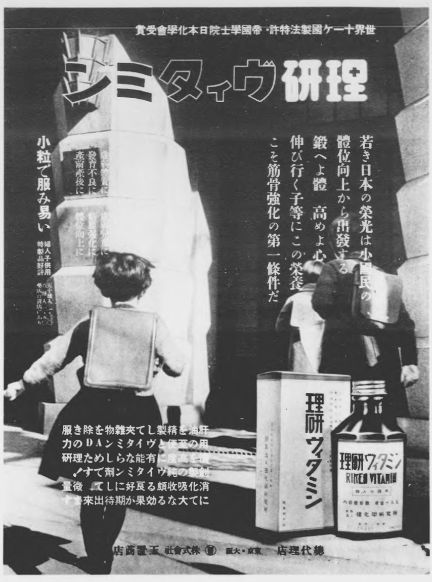
The conversation has long since moved on from this topic, but just for the sake of completeness, no one seems to have noticed that there is actually a full stop in the Riken Vitamin image as well – not in the line at the top (or the address line at the very bottom), but in the longer bit of text over the girl’s skirt. The second-to-last line contains “良好にして。” with a full stop spaced towards the preceding kana (て). |
Traditionally, CJK text writes and reads vertically, but sometimes it is preferred to write horizontally. Especially when the text is used for some title-line kind things, such as a park name, a shop name, etc.
But traditional horizontal CJK text is different from horizontal-tb, it reads from right to left.
So I suggest adding a new value
horizontal-tb-rltowriting-mode.Note that it doesn't mean that
horizontal-tbwill only be used for LTR text from now on.horizontal-tbcan still be both LTR and RTL. Those languages which can ONLY be written right to left (such as Arabic, Hebrew) will always be written from right to left no matter whether it's inhorizontal-tborhorizontal-tb-rl.The text was updated successfully, but these errors were encountered: