[css-grid] Indefinite spans #388
Comments
|
You want to auto-place an item and have it span to the end of the grid no matter what slot it's in?? For what purpose? |
|
In my use case they are always in the left-most grid track. Other use cases may span over all (or some) columns of the grid up to the grid row end to build some kind of heading area. Sure, my example may also be achieved by wrapping the items within another element, but I think allowing grid tracks to span up to the edge of the grid is obvious. Sebastian |
|
That's doable anyway - set the appropriate For the actually-useful case of "fill the grid regardless of how many columns it has", you can write |
If that worked, it would be great, but it only works for an explicit grid, right? In my use case there are no explicit track rows defined, because they vary depending on the number of items. Sebastian |
|
I think you need to nest grids here. I suspect in many cases the markup will lend itself to that anyway. |
|
I'm also in need of this capability. In my case there are a variable number of items laid out in an implicitly defined grid using auto-fit with minmax(). The result is a variable number of rows and columns (the latter varying with screen size), with items generally being auto-placed within them. The problem is the last item on the last row; I would like to span it to fill any "spare" space, but I don't know beforehand which column it will be in, nor how many columns it will need to span. I had hoped that something like one of the following would work, where "end-line" is a named line:
I think it should be possible to specify that an item should have its start column set automatically, but then span to a particular end location (assuming the end column is to the right of the automatic start column). It's really just a variation on setting a fixed span, but where the value is dynamically calculated as "named-end-column minus computed-start-column" rather than being hard-coded. |
|
Yeah, that's not possible right now. It would require some special handling in the auto-placement algorithm to indicate that it wants to fill to some particular end-line; the logic definitely isn't hard, but it's also definitely not handled right now. It would require some special syntax in grid-column, since |
|
Fwiw, I explored this a bit by implementing the placement part in Gecko. Here's the algorithm I used:
This allows you to auto-place an item with an arbitrary fixed line on the other side, or span to an arbitrary line. So, for example:
The above was fairly trivial to implement since most of the needed primitives already exist. It might also be useful to be able to specify a min/max constraint on the span length since it's hard to predict how many tracks the item will span. For example: <div class="grid" style="grid-template-columns: repeat(5,20px) [b];">
<span style="grid-row:1; grid-column: 1 / span 4"></span>
<span style="grid-row:auto; grid-column: auto / auto(span b)"></span>
</div>This will place the 2nd item as grid-column: auto / auto(span b) span-min(2);it would instead be placed on the next row and span all columns. ... similarly, adding a span max-constraint: grid-column: auto / auto(span b) span-minmax(2, 3);it would be placed on the next row but only occupy column 1 to 3. If the grid-row: 1;
grid-column: auto / auto(span b) span-min(2);it would be placed at line 5 with a span of 2 and thus generate an implicit 6th column. It would also be fairly easy to skip the "is this grid area unoccupied" check that is the default behavior for all grid auto-placement currently, for example: <div class="grid" style="grid-template-columns: repeat(5,20px);">
<span style="grid-column: 1"></span>
<span style="grid-column: 3"></span>
<span style="grid-row:auto; grid-column: auto / auto(-1)"></span>
</div>This would normally place the third item as grid-column: auto / auto(-1) may-overlap;this would be equivalent to It would also be nice to have a fill feature to make an item fill empty grid areas as much as possible, for example: <div class="grid" style="grid-template-columns: repeat(5,20px);">
<span style="grid-column: 1"></span>
<span style="grid-column: 4"></span>
<span style="grid-column: auto / span(fill)"></span>
</div>which would result in It should also be possible to fill non-auto-placed items: <div class="grid" style="grid-template-columns: repeat(5,20px);">
<span style="grid-column: 1"></span>
<span style="grid-column: 5"></span>
<span style="grid-column: 3 / span(fill)"></span>
</div>This would make the third item have It might also be nice to have min/max line constraints on the auto-position, for example: <div class="grid" style="grid-template-columns: repeat(5,[a] 20px);">
<span style="grid-column: 1"></span>
<span style="grid-row:auto; grid-column: auto min(a 3) / span(fill) max(4)"></span>
</div>Here we would normally place the 2nd item in column 2, but since the author specified line 3 as the minimum we try line 3 and then fill it from there - this would result in We might also want to disallow the range from wrapping around when end <= start, for example: <div class="grid" style="grid-template-columns: [a] 20px [b] repeat(4,20px);">
<span style="grid-column: 1 / span 2"></span>
<span style="grid-row:auto; grid-column: auto / auto(b) forward"></span>
</div>which would resolve to All these new features should be possible to combine and should apply also to existing placement features. |
 tabatkins
added
css-grid-3
tabatkins
added
css-grid-3
|
I've created an example using JavaScript to adjust the spanning of an element. This example doesn't cover all different cases (like e.g. having multiple indefinite spans or having a column flow), though it allows to adjust the placement of the spanning element, how many column tracks it spans, and a few other things. Sebastian |
|
The
Currently, that requires an explicit media-query to change |
|
|
|
I like For what it's worth, my initial use case was to rebuild a tax declaration form (see e.g. https://www.steuern.de/fileadmin/user_upload/Steuerformulare_2020/Anlage_N_20_sw.pdf), which has a line number at the beginning of each row. And each row has a bunch of text and input fields. As the form should be responsive, the text input fields could break into multiple lines. My idea back then was to use a grid for each line and let the line number element span the whole line. There are surely other ways to achieve this, though there are definitely similar use cases, in which it is required to let items span 'til the last track. Sebastian |
|
Want to add to this — having something like Here is the layout that I wanted to achieve recently: https://codepen.io/kizu/pen/KKXXxZr — it works perfectly when the context is wide enough, but fails for narrow context due to the item with The current behavior can break the layouts that seem to be well-defined otherwise: |

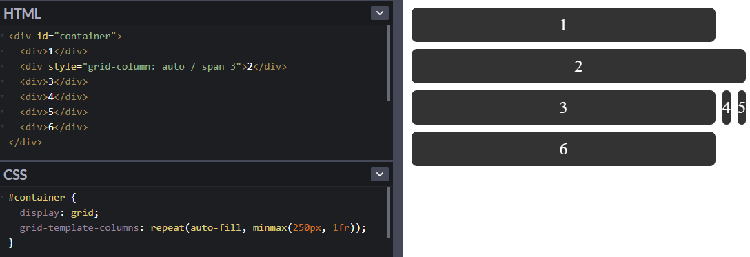
The definition for grid spans says:
Though there are use cases, for which an indefinite span size (up to the border of the grid) is desired.
Example:
Grid with two columns and a varying number of items with the first item being the row number spanning over all grid rows.
CSS:
HTML:
I'd expect to have
startandendkeywords for this case, so I can writegrid-row-end: span endand the spanning of the grid cell to dynamically adjust up to the end of the grid.Sebastian
The text was updated successfully, but these errors were encountered: