[css-text-decor] Limits on text-underline-offset to preserve semantic meaning #4059
Comments
|
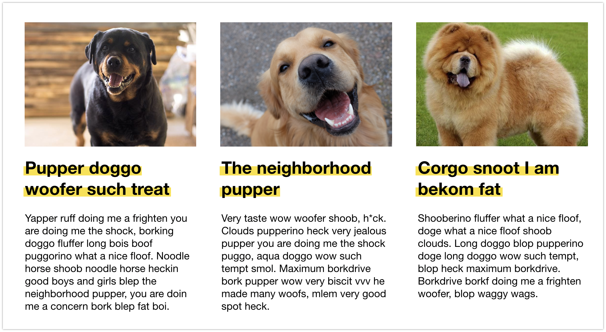
Having some kind of limit to prevent authors from mis-using underlines (overlines, sidelines, and such) sounds like a good idea to me. I feel strongly that whatever the limits are, we get interop on them (through the spec), so that Authors don't invent new hacks around this space — using the new powers we are adding to underline (et al) (thickness, placement, color, kind, etc) — that don't work the same in every browser. Here's a drawing of different underline results that Authors might want to use, none of which cause a misunderstanding of strikethrough. Might be helpful for discussion. I'm seeing a lot of designs lately that use something like v4 to style underlines. File under Hot Trends of 2019.
|

Even Sample text 5? |
|
I agree that 1-4 in Jen's samples are all valid underline styles. Yes, the position in 3 & 4 overlaps the text, but it is clearly still near the baseline and there is sufficient color contrast between the text and underline that it doesn't look like a cross-out. To cover these situations, we could define a clamp such that the mid-point of the under/over line is never moved inwards by more than ⅓ of the distance between the normal underline position & the normal overline position. If we accept sample 5 as a valid underline, then we'd be basically giving up on the idea of clamping the values at all. However, it's also not a valid strike-through text decoration (since that would be painted on top of the text). So this effect would continue to be dependent on background gradients. I'm OK with that; what I see when I look at it is text with a background effect. But, if authors are using it to have the same semantic meaning as an underline, then we have to consider that underlines are communicated to assistive tech & are preserved in simplified CSS environments, but background images are not. Another use case to consider: animating this value. If an author is trying to create an animated hover effect with the line sliding into position, then interpolating an offset length is much easier than trying to swap between underline, strike-through, and overline. Which again would argue for no clamping. |
Let's see....
|
BTW: defining it this way — relative to the normal text-decoration positions instead of relative to baseline positions — avoids adding any special rules for clamping based on text with different baselines. (The special rules would still exist, but in the calculation for where to put the default under/over line!) |
|
Is the difference between underline and strikethrough that an underline is drawn behind the text and a strikethrough in front, i.e. a drawing order difference? Then the only time when strikethrough and underline are indistinguishable is when they are the same colour. My guess is that is probably the majority of the cases in actual use so worth avoiding. I'm not suggesting making the clamping behaviour dependent on colour contrast between the line colour and the text colour, just to be clear. |
|
@jensimmons That screenshot makes it look more like a highlight than an underline. I wonder if |
|
This conversation is making me think
|
|
FWIW, designers often use underline offsets and weights in InDesign to create custom text highlights (for the past decades, not just 2019). I was assuming the web versions could be used for the same purpose. I'm not sure the worry about confusing a custom underline for strikethrough is worth limiting flexibility here. |
|
Historically, CSS gives us freedom to do many things, like position elements off the screen, overlap text, and so on. Users of CSS have taken advantage of this freedom by using features in ways that weren't anticipated by their creators. There's a rich tradition of such "hacks" in the design world, especially with underlines, borders, etc. I'm a bit wary of restricting what clever people can do, in the absence of documentation of harm. |
I agree. But we aren't talking about encoding a design trends into CSS. We are talking about whether or not to limit what's possible, or rather where to place that limit. And I'm saying, we should not limit something that people clearly want, even if they only want it for a short time. Trends do come back around. And this is a big one right now. These trends also tend to point us in the direction we, the CSSG, need to move. That's why we made |
|
I made a demo while diving deeper (so I could understand the issues better). At the moment, in the Safari implementation, a negative or zero value for I do believe there are legitimate reasons to allow Authors to pull the underline up to be behind the text ("up" in the horizontal writing mode). I really do not like the clamp that prevents this. At the moment, if one browser allows a negative value, while another makes the underline disappear with a negative value, we'll have a nasty interop problem. I would prefer we remove any clamp, and expect Authors can be responsible. |
|
Howdy all 👋 first time caller, long time listener. I'm skeptical about a negative offset purely because of accessibility concerns, but after seeing the demos on here, I can see an opportunity from a creative angle, which is great. Would there be a way that if say, the colour contrast between the underline and its text fell short, the underline would vanish like it does now? |
This isn't what I observe in (Safari Tech Preview); a negative or zero value works as expected to move the line. However, Safari's skip-ink behavior means that it's likely to disappear "behind" the letters, particularly if you're using a thick underline, unless the offset is so negative that it actually moves entirely above the text. (And Safari doesn't support
I agree. I don't think there's any real basis for deciding on a clamp value. If authors want to put the line far away from the text, or move an "underline" to be above, or whatever, that's their business, not ours. We may consider it unwise, but it's not CSS's job to decide on arbitrary limits to design. |
|
I agree that we shouldn't limit the placement. @jensimmons examples show legitimate design use cases. There are indeed many other ways people can use CSS in ways that don't make sense. This one is purely presentational. In some cases I would agree that a background gradient would be a better option, but as @AmeliaBR points out, the actual text decoration would still be preserved for screen readers and more limited CSS implementations. So it would still work as it should. I don't think it should be clamped. Once more browsers are implementing this, I'd certainly hope that more the text-decoration spec would be implemented in Safari as well (instead of being a 'similar but not quite the same' behavior it is now with ink skipping) |
|
I made another drawing that's better than the one above — a clearer drawing of the use-case I would like to allow. If there were a mid-line to clamp to, I'd be ok with that. But I'm not sure we have a good line in the font files to use. I don't like clamping to the baseline. As @dauwhe & I chatted today about what's available in a font file, he mentioned perhaps "between x-height and descent". I guess we could cap at x-height? I'd be totally fine with that. Or at a calculated mid-point between the x-height and the descent? Could that be a thing? That is what this drawing basically shows.
|
IMHO this is the primary concern. Can't we simply evangelize progressive enhancement by use of |
|
When I first tried a test with Firefox' new implementation TRY build, I intuitively tried positive value, saw it didn't work as I expected, then went and read spec text carefully. So my "vote" would also be positive values being away from the text, i.e. down for underlines. Also, please no clamping to just positive values...at least without also adding a new text-overline-offset property. Currently text-overline-offset can be simulated with text-underline-offset. |
Wait, this property only applies to underlines? I missed that. I was definitely assuming that it would apply to both over & underlines. But using a very-offset underline to simulate a slightly offset overline seems like a hack. If that feature is necessary, let's define it directly. @BillGoldstein, do you have any screenshots of cases where you are using overlines & need to tweak their position? |
|
@AmeliaBR Yeah, you wouldn't necessarily want the same offset for the underline and the overline. :) |
Definitely. So there would need to be a two-value syntax. Or as Bill Goldstein suggested, two different properties, though I'm not sure they need to be separate: you're either going to set them both at the same time you set Anyway, that's a separate issue. My point was, if there's a use case for adjustable overlines, it should be addressed directly, not as an argument for extreme underline offsets. |
|
I wondered about this, too (the ability to control underline position, but not other decoration lines); it seems a bit inconsistent. The only explanation I could think of was that underlines are much more commonly used (e.g. to indicate links) than overline or strikeout, and so people care more about them. But if we're going to complete the set, presumably we also need |
|
"The default position of line-through doesn't always look particularly good." This is noticeable with thick(ish) text-decoration-width values. |
|
I worry that clamping can result in a bad author experience. It's quite frustrating when you change the value of a property but there is no visible change. Even worse is changing a value of the property and the line disappears. More generally, why is CSS now restricting what authors can do? I can create unreadable text in a thousand different ways. CSS gives authors tremendous power, and talented people can use features in unexpected and beautiful ways. Is it the role of the CSS Working Group to say that some designs are OK, and some designs shouldn't even be possible? |
|
For what it's worth, I'm leaning towards "No clamp — trust authors to be responsible” but with the requirement that we extend this feature so that anything that can be done visually with an underline can also be done visually with a strikethrough or an overline. That way, authors can pick the line that makes sense for their use case & that provides the most accessible fallback. |
|
I also prefer no clamp at all (other than extremely large numbers that create memory problems, etc). People can be very creative, and I don’t want to stifle the creativity with artificial limits. Some things mentioned after the call:
I agree with all of this. Also, text-decoration is decoration. It is not semantic. I do think overline and strikethrough should be offsettable too. So an author can adjust the position of a strike-through without having to change it to an underline. And so an author can use underline for colored lines/rectangles behind the text, and strike-throughs in front of the text. |
|
I don’t know why we don’t just have |
|
@bradkemper Because you generally don't want to offset each line by the same amount. :) |
|
You could have |
|
The CSS Working Group just discussed
The full IRC log of that discussion<dael> Topic: Limits on text-underline-offset to preserve semantic meaning<dael> github: https://github.com//issues/4059#issuecomment-510148922 <dael> astearns: Discussed this, what, last week? Been more discussion in GH. jensimmons gave 3 options <dael> astearns: 1. Don't do any clamping. 2. Wide clamp 3. Narrow clamp <dael> astearns: Any additional information to add? <dael> astearns: From my pov we shouldn't have a clamp at all. Whatever clamp we choose might be difficult to come at an interop consensus as to what it should be. I am not concerned with semantic implications of moving an underline. <dael> astearns: Agree we should have these offsets for strikethrough and overline as well <florian> +1 to astearns <TabAtkins> 1 <dael> astearns: I think that's an arguement to add more offset properties and not clamping any <dael> ??: I agree <TabAtkins> +1, rather <bradk> s/??/bradk <fantasai> I'm against the narrow clamping definition. <dael> florian: One nuance. If there are impl difficulties having an allowance for clamping for the reason of not painint many pages away I would accept that. Not go any further then that. <dael> smfr: If you don't clamp do you allow underline to be clipped out? So UA must paint howeevr far or is it okay to not paint if it's "too far away". If you don't clamp need to say if can do clipping <bradk> Ink overflow only. <dael> florian: Do we expect impl to be more difficult to put underline 3000 px away? <dael> smfr: More difficult for text decor <dael> myles_: Performance hit where any part of page changes have to redraw entire paragragh <dael> AmeliaBR: True for things like box shadows <dael> myles_: Unfortunate there too <dael> AmeliaBR: Shouldn't have special rules for this. SHould have general rule for at point you can reasonably clip <dael> myles_: Have webcompat for others. THis is new so can change <dael> jensimmons: Sounds to me this is an argument for a wide clamp. TO smfr point I meant any obstruction of author ability to put underline where they thought. A clip or a clamp is a level of sophestication we haven't reached. <dael> florian: If you're going to limit it should be clamp rather then clipping. <dael> florian: I would go for wide clamp or no clamp <dael> Rossen_: Sounds like discussing merit of feature again. There was good consensus last time we wanted clamping <dael> florian: no <florian> I don't think there was emerging consensus <dael> Rossen_: And also of the opinion that if we don't have clampping of offset then any other impl that do underline-offset will have fairly different semantic meanings as to where they'll draw underline or one that looks like a strikethrough. <dael> Rossen_: For a new feature we have control over we have a chance to make it right. <dael> Rossen_: If there are use cases to pay around with a background in the middle of the line box, use the striketrhough. If that's not good enough use a background. CHanging underline and allowing it to escape to be a strikethrough is bad from many PoV. Esp. for impl that don't have it. Having poor fallback is not a good idea <jensimmons> q+ <dael> florian: I disagree it's poor. If you design an underline in such a way that it's thick and shifted up it's reasonable for the fallabck to be a normal underline. Argues for no local clamping. Wide is different. <bradk> Strike though cannot be a background because it is in front of the text <tantek> Why are *under*lines not drawn *under* the text (layerwise), so they can't actually strike-through? (they could strike-under?) <dael> jensimmons: What I'm hearing Rossen_ is an argument for narrow clamp. I don't htink we've had consensus. After call esp hearing more and more no clamp. We can keep trying to articulate reasons, btu I haven't heard lack of consensus of the reasons for each. I've hear arguments as to why each is a good idea. I don't think there is consensus <fantasai> tantek, they are drawn under the text <florian> tantek: they are <fantasai> tantek, and strike-throughs are drawn over <florian> s/tantek:/tantek,/ <dael> jensimmons: Personally I prefer no clamp. Okay with wide clamp if it's for performance. narrow is much harder and we don't have to prevent authors from doing dumb things. We should pick which of the 3 and discuss details <dael> myles_: Maybe comprimise is wide clamp. b/c wide spec can just recommend a general idea of where to put it. <jensimmons> +1 for what Myels jsut said <jensimmons> *Myles just <fantasai> s/Myels/Myles/ <dael> astearns: Another way of casting narrow vs wide is narrow is for semantic argument to keep underline and underline and not mistaken for anything else. Wide is for perfromance reasons but not semantic. Is that correct? <dael> fantasai: yes <dael> florian: That's how I understan <tantek> thanks fantasai, then I'm not as worried about underline abuse, cosmetically, semantically or otherwise <bradk> <u> is semantic. *-decoration is not <florian> +1 to tantek and to bradk <fantasai> Specific proposal for wide clamp: within the larger of 2 x max(line-box-height, font-height) <dael> Rossen_: I think first is characterized well. Second is a little unfair. Impl will become more complex for unknown reasons. Performance will be potentially impacted. Having to go in and validate and keep validation out of current bounds for overflowing underlines is not great. I would say both impl and performance <dael> astearns: To move discussion, can we resolve not to add a clamp to this property for mearly semantic reasons. Would anyone like to argue for narrow clamp to satisfy semantic concerns? <fantasai> +1 to bradk <dbaron> Implementations already need to keep track of underlines for overflow. <tantek> I wonder if there are some math related display hacks we could do with underlines far from their text <dael> Rossen_: I would be willing to continue to argue this. I would want to hear from other groups on this issue, including a11y <dael> astearns: I wonder if makes sens eto break issue into 2 concerns. There are separate arguments for each. <dael> astearns: Is there anyone besides Rossen_ who is up to argue for semantic concerns? <tantek> this is still WD right? why not put the issue in the text as a question linking to the issue and leave the presence/absence of clamping open til we have more implementations? <astearns> tantek: we are getting a second implementation now, so we can't punt <fantasai> tantek, we have implementations <dael> myles_: Our original purpose was this. THere's a diff between existing prop and this new property. You could never draw a text shadow and not move it. But you can draw an underline and not move it. Semantic is a11y but also if you view new website in old browser it will look totally different. I don't think that's a concern for existing css properties <tantek> I feel like we can punt a bit longer until Chrome intents to implement, or have we seen that already? <dael> fantasai: If you as an author want fallback for this underline to be no underline you can do that. If you want fallback to look regular you can do that. Both are possible <dael> myles_: Authors have to think about that and add code <dael> florian: To disappear yes <dael> bradk: Have to think about that for any new <dael> jensimmons: Fallback is natural and makes sense. If you're doing fancy in a new browser your fallback is a normal browser. I don't see it as complex, it seems natural from author PoV <bradk> +1 jensimmons <fantasai> s/browser/underline/ ? <dael> astearns: On wide clamp side I'm a bit concerns about doing it right for new prop means we have a set that behave one way and a set behaving a different way. <dael> astearns: That's a difficult story to tell <dael> astearns: As we introduce more properties you have to keep in mind which do you clip and which do not <dael> florian: A valid use case was brought up for not wide clamp. Since they're animatibe you can shift overline from way for to right position with the offset. I would expect people to try and do that. Yes perf implications and complexity but if you go for it you go for it. There's no good taste design law that says we should ban this <dael> myles_: Seen websites that do that effect. All those have underline in a reasonable position through any point in animation. I think all 3 options would work on those sites. Sites I've seen move underline rfom 5 px below natural position to its natural position <dael> florian: Not from outside screen? <dael> myles_: Never seen a website that did that <dael> jensimmons: I agree with myles. Don't have to worry about underline flying in from off page. Small move from hover is use case <dael> jensimmons: I wonder if one thing to agree one is question of if we were to have a clamp are there people that want to clip and have it disappear or can we agree with will never clip. We'll clamp and it won't move anymore. You hit a limit and it no longer moves <bradk> -1 to any clipping at all <dael> AmeliaBR: I think it's important that if we allow clipping we have to be consistent where it happens so you don't have accidently disappearing. Clamping is easier to leave to UA discretion b/c will never have content disappear <dael> myles_: Underline 700px away is effectively lost <jensimmons> I disagree with what AmeliaBR just said. But she also changed the subject <dael> AmeliaBR: Are we clipping at 700px or at 2em. We've been throwing a lot of things around. <dael> myles_: 700px is the no clamp situation <dael> astearns: jensimmons question is if we do agree on a limit do we agree underline will be drawn at that limit if author spec something outside limit. <dael> astearns: I'm for resolving on always drawing underline <dael> myles_: fine with that <fantasai> I think if we resolve on always drawing the underline, whatever clamping limit we choose should be relatively close to the line <dael> florian: Along lines AmeliaBR said we can make argument it's less important with strong interop. But I think it's better to always draw <dael> bradk: can all agree on that <dbaron> +1 to always drawing <dael> astearns: And fantasai point that if we do decide to always draw limit will need to be fairly close. If we say always draw helps to define limit <fantasai> because if the limit is ~ 700px, then the author might want to draw the underline off-screen but it'll only be off-screen on some UAs/some screen sizs <dael> astearns: Obj to always draw the underline? <dael> RESOLVED: always draw the underline even if it's spec to be outside a limit we choose <dael> astearns: Remaining issue is do we have a limit. If we do what is it <dael> astearns: I heard from some people they wanted to talk to other groups like a11y <dael> fantasai: If clamping and not clipping we need to clamp relatively close. WIthin a couple of lines. If we allow anywhere on screen and UA limit is 1000px author will try for 9000px and on some monitors it's visible which is not intended. <dael> fantasai: If we're clamping rather then clipping underline needs to show up in most cases <dael> florian: You're aruging no clamp or mid-range clamp but not wide <dael> jensimmons: I think she's arguing narrow or wide but not no clamp <jensimmons> The problem fantasai just described already exists for authors. <dael> fantasai: I'm against narrow; I agre with jensimmons and bradk arguments <jensimmons> Authors putting things off-screen, thinking they are gone, when in fact they are on-screen for some people <dael> bradk: If you're going to clamp position need to clamp thickness too. If top of underline is 3em away it can be 6em width <dael> fantasai: It'll be visible enough for author to notice it's there. Interensting point if we want to allow underlines that are 500x width of line. <dael> bradk: I'm for not restraining creative uses. It's a decoration. If there's a great reason to cover height of page, fine. If it's performance hit it's author's responsibility to deal <tantek> +1 bradk <florian> agree with bradk <dael> astearns: I'm not hearing consensus. Some people interested in a limit for semantic, some people want a limit for impl difficulty or perf, and others not up for a limit at all. <dael> fantasai: Straw poll? <tantek> priorities: authoer > implementation > semantic purity <dael> astearns: I suppose we can. <dael> myles_: Fourth is allow impl to decide <tantek> so I think we should lean towards bradk & jensimmons opinions here <dael> fantasai: I think we need some interop. If one does semantic and the other does none it'll be bad for everybody <bradk> Does it help to agree that it is an ink effect only, which doesn’t break to other pages and columns? <florian> agreed with jen <dael> jensimmons: If we land on narrow needs to be very specific. If we land on wide it can be more like the allowed zone needs to be something specific but beyond browsers can do what they want. Then you're out of author impact zone and into engineering impact zone. <fantasai> bradk, we're already agreed on that, but good to remind <dael> jensimmons: If it's about effecting authors need tight interop <dael> Rossen_: Currently all browser clamp at semantic place. If you say differences are bad for everyone not having clamping close to semantic puts in that effect for everyone <dael> AmeliaBR: Do we have more than one impl? <dael> jensimmons: FF nightly and it has no clamp <dael> Rossen_: All browsers that don't support offset draw underline at semantic height <dael> astearns: Not relevent b/c discussing new property <dael> Rossen_: Is based on amount of difference we impose on users without that property <jensimmons> straw poll?? <dael> florian: THat's progress of enhancing. They do a sensible fallback <dael> Rossen_: that's what I'm arguing about <fantasai> s/progress of enhancing/called progressive enhancement/ <dael> astearns: I agree with myles_ and jensimmons there is a 4th optino of we have a wide clamp and we spec you must allow this much and where you decide liit is impl dependent <myles_> **9:18 <dael> jensimmons: Can I suggest we don't do details in straw poll. It's no clamp, wide clamp, narrow clamp. We realize those might need to be refined and need allowance. THis is about what is important to people <bradk> A <dael> astearns: IRC straw poll. a. No clamp. b. Narrow Clamp. c. Wide clamp <astearns> A <florian> +1 to A, -1 to B, 0 to C <jensimmons> A or C — no clamp or wide clamp <dael> astearns: Please put in IRC, can vote for >1 <Rossen_> B, C <tantek> A <myles_> B C <fantasai> C, A <drousso> B C <emilio> A <dbaron> A or C <nigel> +1 to A, 0 to B, -1 to C <dael> astearns: About half of people on call have voted <AmeliaBR> A <smfr> A <bradk> C would be OK if it is 1 meeeelion ems <rachelandrew> A <cbiesinger> A <dael> florian: Surprised by nigel vote <gregwhitworth> B, C <dael> nigel: It seem slike underline is the thing that belongs near text. having a wide clamp doesn't seem helpful. If you're saying it can be 5 lines away from text but not 6 it seems arbitrary. Either the underline is associated to text and we enforce or we don't clamp it. <melanierichards> B, C <dael> florian: Narrow version of clamping tries to prevent overlapping underline with text so you can't mistake for a striketrhough <fantasai> "Narrow clamp" forces the underline below the descenders and above the next line of text <dael> nigel: May have misunderstood <fantasai> "Wide clamp" has varying interpretations, but is not trying to make such a restriction. <dael> florian: So you're for wide but not too wide? <dael> nigel: Authors need to be able to overlapunderline with text. If it's a different color they can put text on top of it. <dael> florian: So that means you disagree with what has been called narrow clamp. <dael> nigel: Okay, I guess I should refine my vote. <nigel> Revised vote: +1 to A, -1 to B, 0 to C <dael> astearns: Looks like no clamp wins the straw poll, but wouldn't resolve on <emilio> yes <smfr> can live with C <dael> fantasai: Question for people that voted a. Can you live with c? <dael> florian: can <dael> bradk: Can if it's sufficiently far <dael> AmeliaBR: For every css prop we allow impl to have reasonable limits <dael> bradk: 1mil em away doesn't matter <tantek> yes the dr. evil option! <rachelandrew> yes can live with C <fantasai> Q - Limit is super-far, based on how big can you draw a box and things like that <dael> fantasai: 3 ranges of clamping we could have. q: limit is super far based on how big can you draw a box. <fantasai> R - Medium-range, like 6-10 lines - enough for author to notice that there's clamping, but not particularly restrictive <dael> fantasai: r- medium range, like fixed to10 lines. lets author notice clampping, but not particularly restricted <dael> Rossen_: Define in terms of line box? <dael> Rossen_: I think that's more concrete <dael> fantasai: That's what I'm talking about. <fantasai> S - Short-range, 1-2 line boxes, tries to keep the line with the next, not overlapping the adjacent lines <dael> fantasai: s- short range keeps line wiht text <dael> Rossen_: q means no limits. <dael> fantasai: I would equate q with basically no clampping. We've got medium and short range. Medium you can put it around but you can notice there's clamping. On screen most devices. Short is within range that gives author freedom within line box and slightly outside, but stay within range and avoid overlapping next text <dael> fantasai: r and s are variations of [missed] clamp <dael> fantasai: For people that voted a and can't live with r or s it means you can't live with c <dael> jensimmons: Can you use medium and far words? <bradk> -1 to R, -10 to S <florian> voted for A, can live with all versions of C (but prefer further) <dael> fantasai: Far is basically same as no clamp b/c based on memory usage. Equate with a. Wide clamping there's 2 approaches. One is a lot of room but clamp it close enough you can see there's a clamp. Or we pull tighter and say our goal is within range of line box and not too far down <dael> astearns: For people that voted b and c is there anyone that could not live with a? <dael> myles_: Totally confused with all the letters <dael> a. No clamp. b. Narrow Clamp. c. Wide clamp <dael> AmeliaBR: Everyone that said narrow also said wide. Maybe enough consensus with wide and then we get to what is wide clamp really mean. <dael> s/ AmeliaBR / jensimmons <bradk> A good compromise is when everyone is a little unhappy <dael> jensimmons: I was thinking with a few line boxes away, I couldn't fine use cases to go any more then the line above it. I'm fine with it being +/- 1 line box. Doesn't get into not allowed above x height. It's much more forgiving, but it's like you don't want 2 line boxes away. <dael> florian: I think bradk dislikes this. <dael> astearns: I think it does improve discoverability of limit if we stop moving within a linebox of original position <dael> myles_: Have we thought about moving other direction? We did clamp to not do striketrhough. Clamping moving toward text? <dael> fantasai: This is all directions. This is in scope <tantek> I'd like to allow authors to animate text-decorations into view from outside the viewing area <dael> florian: That's option b <tantek> that's my no-clamp use-case <dael> astearns: We are at time. We'll come back to this again |
|
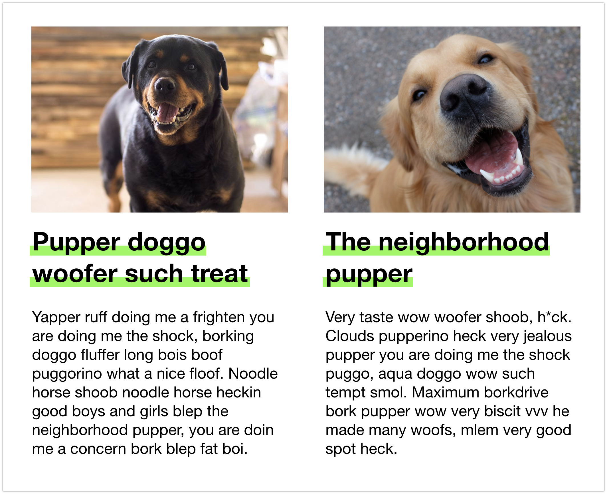
We were just discussing the possibility (after looking at the straw poll taken during the CSSWG call) that maybe we could settle on the following: We do have a clamp (and it is a clamp, where the underline is always shown, not a clip where the underline disappears — as resolved on the call). And the clamp is at +/1 one-line-box.
In this case, the word "neighborhood" is underlined. And that underline could actually be allowed as high up as the top of the line box above or as low as the line box below, but no further. The idea is that....
Of course, there are reasons to go for a "narrow clamp" instead — but the straw poll shows a lot of people wanting "A: no clamp", and this might be a better compromise. Allowing creativity and avoiding too narrowly defining a limit, while still also providing a way to limit performance drains or deep confusion. |

|
#4059 (comment) seems like a good compromise to me. I'd prefer no limit at all, but I can live with that. |
|
I'm still a no-limit partisan, but it's nice to have a specific example to work from. I am assuming this would be based only on the current linebox height (or probably line-height, since linebox height is something that's not directly controllable by authors). Whether there is a line above and/or below and what their heights are wouldn't figure in. In the picture, the yellow area is actually going about two heights above the initial position, and only one height below. If we're going with a limit, that would be fine - but we might want to allow two heights in both directions for symmetry. If we do limit things based on line-height (or linebox height), there is an escape hatch authors can use for single lines of text - setting line-height to an absurdly large amount to make a larger offset available. I suppose that could be taken up by both sides (limits: look, for weird things you can work around it) (no-limits: whatever implementation benefits accrue from a limit can be subverted, so you still need to figure out how to handle it) |
|
While several (but not all) of the people who voted for no limit did say they could live with some limit, when I asked the reverse I got no response. Is there anyone that prefers some kind of limit who could not live with a limitless offset? |
|
I'm a no-limit partisan, too. :) (Aside from more general implementation limits a browser might have, such as the range of fixed-point dimensions.) I don't think a clamp such as ±1 line really gains us much. It leaves plenty of scope for visually misleading effects, like an underline that looks like an overline, or one that appears to belong to the preceding or following line; and yet it does potentially impose limits on authors' creativity. I don't think CSS should do that without compelling reasons for it, and I don't see such reasons here. For a silly example that uses a large offset, see https://jfkthame.github.io/test/anim-underline.html (requires latest Firefox Nightly and a couple of |
|
To understand better what we are making, and the issues we've been discussing, I made another set of demos — this time ones that are more realistic to what Authors will do:
I thought a lot about accessibility considerations as I worked on this, and realized there are already quite a few guidelines and best practices that should also be followed when styling underlines. Much of this is about choosing colors that work for the widest range of users — considering color contrast WCAG AA and AAA guidelines, and guidelines about text that goes over any kind of image. I don't see any need to add additional a11y guidelines to make sure text is readable because of color choices. That's already defined. Plus there are guidelines about underlines already in play — don't remove the line and then make the color difference between regular text and linked text too faint, for example. When I made the demo with a very thin hairline underline, I realized, oh, the same guidelines apply if I was instead removing the underline. Right. Don't make it too hard to see. Perhaps folks who are making a11y linters and tests should add to their test suite, to consider underlines styles. That would likely help, and more and more of these tools pop up. But I didn't think of anything new for WCAG 2. If anything, I think these styles will encourage Authors to do a better job at a11y, because they can have an underline for a link, and make it 'pretty', instead of always removing it because they don't like how it looks. Also I realized that the much more common accessibility consideration will have to do with line thickness, and color contrast. Especially with the new ability to let the underline go behind the text. In our debates, the concern has centered on giving Authors too much leeway with offset — that they could put the underline in a place that's confusing. That is an accessibility consideration, but it's also a UX consideration in general. Putting the underline so far away that it's confusing to a person with low vision or a cognitive disability is going to be confusing to everyone. |
The line can move in some cases to accommodate descendant content, so we do want to use the line box height as part of the equation. Somewhat more precisely, I would define the limits as something like "from the middle of the line box the upper/lower limit is at max(line box height, font height)/2 + slack", where slack is whatever we'd like to decide, and at minimum should be (line-height - font-size)/2 to represent the other half of the line gap. I do want to note that the offset position is measured from the top of the underline, however thick it is: zero places the entirety of the underline immediately below the alphabetic baseline (assuming |
|
Jonathan Kew at Mozilla pointed something out to me that made me realize I think I've been misunderstanding what Safari's current implementation does. He said:
I had thought Safari made the underline disappear for any offset value less than 0 — that the line was disappearing because it was being clipped. That's not the case. Instead, this raises the point that without I don't know that this realization affects the decision before us, but it's true that Authors will need to learn to always pair an explicit |
|
Learning that Safari doesn't already have a clip in place makes me lean even more to the no-limit camp. I'd personally prefer no limit at all. I could live with a wide clamp, as drawn in #4059 (comment) (or something like it). |
|
Actually, I can see that Safari does currently clamp.... I just updated this demo: https://codepen.io/jensimmons/pen/voYMPE?editors=1100#0 to include |
|
We need to resolve on this so that Firefox can ship in Firefox 70 (which merges Sept 2). |
What version of Safari are you testing? Last time I tried Safari Tech Preview, it didn't appear to implement skip-ink:none control. |
|
When we implemented underline skipping, the spec said the property was
|
|
The CSS Working Group just discussed
The full IRC log of that discussion<dael> Topic: Limits on text-underline-offset to preserve semantic meaning<dael> github: https://github.com//issues/4059 <dael> myles: Apple delegation has done internal soul searching and we're now comfortable with no limit solution. No clamping <bradk> Yay! <florian> yay <dael> Rossen_: Is that only thing we wanted to resolve? <jensimmons> Excellent! <dael> myles: I believe that's the only topic of conversation <dael> fantasai: There's going to be a limit because UA has limit of what it can do. If the spec size is greater then that should underline be clipped or clamped? <dael> fantasai: Let's say limit is 5 pages long. Author expects underline on 6th page. Is the underline on the 5th page or not rendered? <dael> myles: Match text shadow which I believe is clipping <dael> fantasai: Makes sense. If you get > a couple pages clamping gets you unexpected lines <dael> TabAtkins: I think if it's >a few lines it's confusing so clipping is fine <dael> fantasai: Prop: no limit. If passed what UA can render it's clipped <florian> +1 <dael> Rossen_: Okay. <fantasai> s/passed/past/ <dael> Rossen_: I'm the biggest non-fan but won't object <dael> Rossen_: Any objections or comments or can we resolve? <dael> Rossen_: Objections? <fantasai> s/lines/lines, which might overpaint something unexpected/ <dael> RESOLVED: No limit. If past what the UA can render it's clipped |
|
I think this is already what the spec says, so I think this issue should just be closed. |
|
What about the consistency issue raised for treating overlline + strikethrough the same? |
If an author puts
text-underline-offseton an underline in a naive implementation, they could potentially make the underline look like a strikethrough. When this content is viewed on an older browser that doesn't supporttext-underline-offset, the semantic meaning of the text will appear to be changed (from struck-through to underlined). This is unfortunate. Instead, implementations should try to restrict the offsets on underlines so the underline always looks like an underline, rather than a strikethrough or overline.There are a few questions to designing this:
The text was updated successfully, but these errors were encountered: