Allow specifying the "accent color" of a form control element #5187
Comments
|
Is there a reason this can't be done via |
Two reasons:
|
|
Accent color isn't indicating what's being colored, either. I'd say if there isn't a compat restriction, @AmeliaBR's suggestion to re-use FWIW, the CSS UI spec used to say
That seems to have gotten lost along the way... //CC @tantek |
I think it is. It's more specific than
I see. We need to find out which commit removed it. |
I think the biggest downside to re-using <input type=date style="color: red">which has a text display of the date, and (on some platforms) a picker icon or arrow. If we tie everything to <input type=date style="color: black; accent-color: red;">This would also be compatible with the existing Mac concept of an "Accent color", which affects control elements but not text colors. It would also be safe for web compat, since |
|
I agree that tying this to A few questions that come to mind that I haven't given much thought to yet:
|
|
An alternative would be to use pseudo elements to target the classic This is not a mutually exclusive alternative, but interaction between the two would need to be clarified. |
Focus rings can already be styled with CSS like
For some sites, yes, but I can also see them also wanting to choose a different color.
I think we should add the language you suggested.
We could perhaps define a pseudo element on custom form controls that accent-color automatically applies to? That's kind of what the |
|
"A" pseudo element. As in One. That has one name, suitable for any form control? X to doubt. If form controls get pseudo elements, there should be as many as that form element needs. Not some generic one size fits all one. One pseudo class that applies to the correct pseudo elements could work tho. |
|
What's the intended scope of |
Yes, something like that (or similar accents in other form elements). |
|
"Something like that" and "or similar accents" are not phrases that belong in a standard. We need a clear definition of what "accent" means here, not vague hand waving. |
|
How does this idea fit into the work of the Open UI project? @gregwhitworth ? |
|
Windows also has the concept of an accent color on Windows 10. I'd recommend that this be a system color so that it can be leveraged in numerous places. As @chrishtr noted it's used in focus, but also can be used in the glyphs or other areas for form controls. I haven't looked at other use cases for this but the fact that Windows changes the title bars and other backgrounds to the accent color makes me think that it may be something that is allowed to be broad while allowing UAs to leverage it in our stylesheets for the specific scenario denoted by @chrishtr. TLDR; I propose
While this was discovered due to form controls it doesn't have to do with defining behavior, anatomy, states and interactions between states so I think staying in the CSSWG makes the most sense. Shoutout to @heycam for pinging the Open UI discourse channel though :) and thanks @jensimmons for thinking of us :) |
|
@gregwhitworth I think the proposal here is to provide a way to set the accent color for a particular form control, not to use the system accent color (that may also separately be useful, but it also creates fingerprinting surface, which this proposal does not). |
Ideally, the
All of the above seem to make sense as a usage of the accent-color. In Chrome, I could also see adding to the above list:
Again, the idea is to control the currently-uncontrollable colors of form elements just a bit better. Our hope is that the more broad Open UI type improvements in stylability will give even better control over all pieces of these controls. But in the meantime, this |
On macOS Safari, this is rendered using the Highlight Color rather than the Accent Color. (By default the Highlight Color is a lighter or darker version of the Accent Color, but you can set it to a completely different color.) |
Yes, I'm aware of that. No need to talk down. However, each user agent has their own default form control styling, so the specification of this property will need to be higher level than specific DOM elements. |
Going over how this might apply to rendering of a wider range of controls as in this comment might help us understand if all of this coming through one property makes sense. For example, Cameron noticed the highlight color vs accent color issue. It might help to be even more exhaustive in considering the full range of form controls. For example, one thing to consider is the There are also colored pieces of form controls that do not normally follow the OS accent color. We probably want to avoid including those. Rationale: since accent color is likely to be desirable set across a whole site, that is the common use of similar functionality in apps. So it would be tempting to set it as a rule on |
|
@othermaciej ahhh my bad - completely mis-read the issue :/ I'll avoid the fingerprinting discussion given this is about a different proposal altogether.
LOL, I was just writing something similar. I agree that we should scope this in if it's solely focusing on form controls. Also, regarding the stepper buttons on |
|
The CSS Working Group just discussed The full IRC log of that discussion<dael> TOpic: Allow specifying the "accent color" of a form control element<dael> github: https://github.com//issues/5187 <dael> chrishtr: Form controls are styled and painted in UA specific way in all browsers <dael> chrishtr: There tends to be a concept of an accent color used to indiacte checked or marked state of form controls. <dael> chrishtr: UAs pick a default color for that that's consistent in page. There are also OS settings on some OSs to change accepnt color which is respected by some browsers. <dael> chrishtr: COlor might conflict with brand of site, like site with orange theme but checkboxes are blue <dael> chrishtr: Proposal is to ahve css property which says form controls should use this color as basis of accent color when painting form control <dael> Rossen_: Opinions on this? <tantek> the other big use-case is for sites that want to make "darker" versions of form controls that match their site styling, similar to scrollbar colors <hober> q? <dael> fantasai: Main concern is it's not clear what accent color is used for. B/c that it's nto clear what's expected contrast between that, text, and background. <tantek> +1 agree with fantasai, needs to be predictably specified so it makes sense across OSs and devices <dael> fantasai: Concern people will choose colors that are good on some OS but won't contrast with background enough in other rows. For example a select multiple it needs to contrast with text. But on a selected checkmark it's background <dael> fantasai: Understand what you're trying to do but concerned we won't get something robust across browsers <tantek> needs to be sufficiently predictable across browsers <dael> florian: Can we split into foreground and background or does that not generalize well <dael> myles: We had internal discussion and general feeling is good for web in general. Not sure mech to expose. We have a general idea good to style lots of form control aspects. Good to do in general not just one piece. In general feel this has value for web. <tantek> +1 myles that's a good summary <fantasai> tantek, that use case is handled by the 'color-scheme' property fwiw <fantasai> tantek, https://www.w3.org/TR/css-color-adjust-1/#preferred <dael> chrishtr: Re: general styling point. Agree that there are other things devs wish to style and hopefully can. This one seems to be simple and common and immediately solves a specific conern. THat's why I think do it as a one-off for the moment and general in future <Rossen_> q? <jensimmons> q+ <tantek> fantasai, not talking about not dark mode. hence I said darker deliberately <hober> q? <dael> florian: General will take time. Seems most of time accent color is related to backgrou,d but not always. If it's background or foreground matters. Having the pair would be a step which could make sense. There can be many aspects of form control we can do later. Knowing if your'e in foreground or background matters. <dael> heycam: Ignoring select multiple issue which might nto be accent color all other colros are contrasting separately. For checkbox and radio you'd got icon inside which authors can't control. I think for most cases where accent color can be changed any contrasting color can be painted by UA. <dael> jensimmons: Has anyone working on open UI on the call? I know a lot of work has gone into form controls and what it means to style them <dael> myles: On iOS there's no concept of the accent colors. Whatever is in spec needs affordences for OS where it doesn't apply <Rossen_> q? <Rossen_> ack jensimmons <dael> florian: If we look at range of historical OS to get diversity the buttons were a shade of blue. If that was still the fashion accent color wold be there and it's very background-y <florian> https://66.media.tumblr.com/e0c02215356306ee52298451ac25685e/tumblr_o5a0h4UIDN1v0jfsto2_1280.png <florian> http://pcdesktops.emuunlim.com/pictures/skins/wb/macosx-aqua-bjb.gif <dael> chirsh: Answering jensimmons, I'm working with gregwhitworth and others on longer term project for form controls. I don't know if enought o discuss here. In general I think compat. I don't think enough to say about OpenUI to clarify <dael> Rossen_: Is there a resolution you're looking for? <dael> chrishtr: I'm hoping to get to agreement on name and set of text what's it's supposed to be for UA and says UA should make sure sufficent contrast and only where it makes sense <dael> fantasai: Fine to try and draft language. Requires more release to make so it works on a variety of OSs. I'm a little skeptical this will work but understand we want it. I'm concerned about having it work for all OSs. <dael> fantasai: If we can show that would be the case across current and past OSs and there's a reasonable interpretation for all the OS/browser combos I would feel more comfortable moving forward <jensimmons> +1 to what fantasai said <dael> chrishtr: Hearing general support but need mroe research to understand compat as well as foreground/background comments <dael> fantasai: I think we should do that evaluation in GH. Might be right design, but might be diversity of form controls requires something different. <tantek> we're also looking preliminarily at a more longer term project for form controls as well, if existing work is happening in the open, please share that in CSSWG! Thanks! <dael> chrishtr: We'll come back with more concrete proposal <dael> florian: What I'd liekt os ee in research is wide variety of form control and show form controls is always background or neither. If it's in foreground sometimes we need to split it up. |
|
Per the action items from the CSSWG meeting, I have worked through these two action items:
Additionally, I gave some thought to the foreground/background color issue brought up by @frivoal. I've collected the results in this shared doc: https://docs.google.com/document/d/1yHQUshdC3hKrDRG-xDtUPYVIcc_JNUglK0KMVoqRyCo I disabled comments on the doc, but I would love to hear feedback, so please add your comments back here in this issue thread. |
a clarification question for @mfreed7: Is there an assumption that there would be granularity options to apply the colors from all UA-chosen form controls to a single element chosen by the developer? Or would the granularity need to be just all UA-chosen controls? |
Thanks for the question. This is a proposed new CSS property, which can be applied with full CSS granularity, down to individual elements. So: input[type=text].group1 {
accent-color-foreground: blue;
}
#myelement {
accent-color-background: red;
} |
|
Agenda+ to discuss a resolution regarding the general shape of the spec approach Mason listed in his doc. |
|
Regarding separate accent foreground and background colors, are there existing form control designs where the two colors can be independently chosen? Or is it just that the accent foreground color is chosen automatically based on the background? For example, on macOS you can select the accent background color from a specified set of colors, but the foreground color is chosen automatically (it's white, unless the highlight color is "Graphite" then it's black). I'm not convinced we really need the two separate properties, as opposed to having requirements that, if they do honor accent-color, implementations must do so in a way that does not cause contrast issues. |
|
Ok, at the last teleconference, there was significant discussion about encouraging interoperability while not constraining innovation, and the inherent conflict therein. I also heard a suggestion from @astearns that it might help to include more prose explaining the motivation and intent for the spec, because it will aid in interpreting the specification. So I've gone ahead and done that - please see the new section of the proposal. I also copied it inline below. Separately, I heard a recommendation that separate issues be opened for the sub-questions being debated here:
While there are additional issues, I think #3 is a key question. A decision there will guide the rest of the process. Here is a copy/paste from the new proposal section: Motivation and IntentThis section is non-normative. In implementing
The goal of interoperability pushes this solution towards a more strict specification of exactly how to use each The general methodology for achieving the above compromise is to examine the set of existing form control elements (as of 2020), and agree on the basics of the way This will require judgement when applying the recommendations to new or existing form controls. The goal would be to adhere to the spirit of this spec as much as possible. For example, if the guidance states that an Further, this spec is careful to not require exact conformance of each form control with the To assist in characterizing "close enough" as it relates to the accent parts of form control elements, the Existing Control Examples section of this document includes many examples of several control types, pulled from different browsers, operating systems, and time periods. Except where noted, each of the control examples within each group should be considered "close enough" to the group that the guidance for that group should apply. |
|
I've just closed the "interoperability" issue that I opened, as it didn't help move the conversation forward as I had hoped. It actually seems to have somewhat derailed it, and that's likely my fault. The big conclusion I took from that discussion was that my proposal bites off too much, and most people seem to agree that As such, I think we should consider other proposals for the |
|
Agenda+ to discuss the specific proposals mentioned in Mason's second paragraph, or the version Brad suggested here. Those approaches sound workable to me, and likely compatible with a wide range of form control UX designs. |
|
The CSS Working Group just discussed
The full IRC log of that discussion<astearns> topic: accent-color<TabAtkins> masonfreed: Summary is I closed the "interopability thread" - question I was trying to ask was whether we wanted precise control over where accent colors should go on a control <TabAtkins> masonfreed: Think I got the answer I needed - we dont' want to do so. <astearns> github: https://github.com//issues/5187 <TabAtkins> masonfreed: Majority opinion seems to be that we want this to be more of a hint to the UA - "accent-color: purple" means "use purple on this control if you can if it makes sense". <TabAtkins> masonfreed: Not "put this purple on the checkbox background", more of a hint instead <Rossen_> q <TabAtkins> masonfreed: So I'd like to get a reoslution from the grou pon this direction <TabAtkins> q+ <jensimmons> q+ <fantasai> sgtm <florian> q+ <Rossen_> ack TabAtkins <fantasai> TabAtkins: I'm not sure this is exactly the right direction, fine with it as long as we adopt something like what fantasai said, where we require the UA's chosen colors contrast appropriately with the accent-color <fantasai> TabAtkins: UA can't put black on black ifyou specify accent-color:black <fantasai> TabAtkins: With that, sounds fine <fantasai> Rossen_: you can't ignore the accent color? <fantasai> fantasai: can always ignore it... <TabAtkins> jensimmons: I think how Mason described it is good and realistic <Rossen_> ack jensimmons <fantasai> jensimmons: I think the way Mason described is really good, more realistic to where we are <fantasai> jensimmons: more time to solve the problem of robus styling <TabAtkins> jensimmons: Allows us to give authors something useful and gives us time to solve the problems more robustly <TabAtkins> florian: Roughly in line with all that. As long as the hint involves the requirement that contrast must work. <TabAtkins> florian: Don't think we have a resolution on one vs many colors, but we can decide that later <Rossen_> acj florian <TabAtkins> florian: I think there is an appetite for precise control, but that requires a more robust solution. Should od that too, but shouldn't conflate with this. <Rossen_> ack florian <TabAtkins> Rossen_: Taking the lack of queue as meaning we've said everything we need. Objections? <TabAtkins> proposed resolution: adopt accent-color as a hint to the UA, with requirements on contrast <tantek> I think we're ok with that too <TabAtkins> RESOLVED: adopt accent-color as a hint to the UA, with requirements on contrast <TabAtkins> masonfreed: We probably need to discuss the 1 vs many colors question later <TabAtkins> Rossen_: yes <TabAtkins> fantasai: I think we should put this into UI 4, should we let the editors put that in, and discuss 1 vs many colors separately? <TabAtkins> astearns: Would Mason like to become an editor? <TabAtkins> masonfreed: "want" is strong, but I'm willing to do it <TabAtkins> florian: Happy to have help <TabAtkins> fantasai: There is proposed text already <TabAtkins> Rossen_: Objections to adding Mason as UI 4 editor? <TabAtkins> RESOLVED: Mason Freed added as UI 4 editor |
CSS 'accent-color' Proposed TextDrafted by Mason Freed, 11 September 2020 As discussed on CSSWG Issue 5187, and at the July 1, 2020, July 22, 2020, August 19, 2020, and August 26, 2020 CSSWG meetings, This proposal is a result of those discussions. Motivation and IntentIn implementing
The goal of interoperability pushes this solution The general methodology for achieving the above compromise This will require judgement when applying the recommendations Proposed Spec TextExamplesThis section is non-normative.
|
| Browser | Platform | Sample | Notes |
|---|---|---|---|
| Firefox 79 | Win |   |
No use of accent color |
| Chrome 81 | Win |   |
No use of accent color |
| Chrome 83 | Win/Light |   |
Accent color as checked item “background” |
| Chrome 86 | Win/Dark |   |
Accent color as checked item “background” |
| Safari 13 | Mac/Light |   |
Accent color as checked item “background” |
| Safari 13 | Mac/Dark |   |
Accent as checked item “background”, and also used to generate highlight and shadow colors around the edges |
| Snow Leopard | Mac |   |
Accent color used to generate checked “background” gradient |
Depending on the specified 'accent-color',
in order to preserve sufficient contrast
between the square and the checkmark
the UA might need to make some adjustments.
For example,
when applying 'accent-color' as the square’s “background”,
the UA could either adjust the accent color’s luminosity or brightness enough
to contrast with the color used to draw the “checkmark”
or change the color used for the “checkmark” to conrast better with the 'accent-color',
for example by switching from using the scheme’s foreground color to its background color
or vice versa.
If using 'accent-color' for the “checkmark” instead,
a different adjustment might be needed
since the relevant contrast would be between the 'accent-color'
and the square’s fill color.
<input type=radio>
A radio button is typically composed of a circle,
potentially overlaid by a “dot” representing the checked state.
As with checkboxes,
certain visual styles use an accent color for the checked state:
some of these use it for the background of the circle,
others for its foreground.
In both cases, 'accent-color' would be used to style
the affected parts of the control.
For visual styles that do not use an [=accent color=],
'accent-color' will have no effect.
The following are all examples of radio buttons rendered with a blue 'accent-color':
| Browser | Platform | Sample | Notes |
|---|---|---|---|
| Firefox 79 | Win |   |
No use of accent color |
| Chrome 81 | Win |   |
No use of accent color |
| Chrome 83 | Win/Light |   |
Accent color as checked “foreground” |
| Chrome 86 | Win/Dark |   |
Lightness-adjusted accent color as checked “foreground” |
| Safari 13 | Mac/Light |   |
Accent color as checked “foreground” |
| Safari 13 | Mac/Dark |   |
Accent color as checked “foreground” |
| Snow Leopard | Mac |   |
Accent color used to generate checked “background” gradient |
Depending on the specified 'accent-color',
in order to preserve sufficient contrast
between the circle and the dot
the UA might need to make some adjustments.
For example,
when applying 'accent-color' as the “background”,
the UA could either adjust the accent color’s luminosity or brightness enough
to contrast with the color used to draw the “dot”
or change the color used for the “dot” to contrast better with the 'accent-color',
for example by switching from using the scheme’s foreground color to its background color
or vice versa.
If using 'accent-color' for the “dot” instead,
a different adjustment might be needed
since the relevant contrast would be between the 'accent-color'
and the circle’s fill color.
<select> / <input type=text list=datalist>
Drop-down and combo-box controls are typically displayed as
a text area containing the currently-selected value,
and an activation “widget” (such as an arrow button)
which is used to pop up the list of options.
Some visual styles use an accent color for the activation widget.
In these styles, 'accent-color' would be used to style the widget.
The following are all examples of drop-down controls rendered with a blue 'accent-color':
| Browser | Platform | Sample | Notes |
|---|---|---|---|
| Firefox 79 | Win |  |
No use of accent color |
| Chrome 81 | Win |  |
No use of accent color |
| Chrome 83 | Win/Light |  |
No use of accent color |
| Chrome 86 | Win/Dark |  |
No use of accent color |
| Safari 13 | Mac/Light |  |
Accent color lightened and used to generate drop-down widget “background” gradient |
| Safari 13 | Mac/Dark |  |
Accent color used to generate drop-down widget “background” gradient |
| Snow Leopard | Mac |  |
Accent color used to generate drop-down widget “background” gradient |
Depending on the specified 'accent-color',
in order to preserve sufficient contrast
within the activation widget
the UA might need to make some adjustments.
For example,
when applying 'accent-color' as a background,
the UA could either adjust the accent color’s luminosity or brightness enough
to contrast with the color used to draw the arrows
or change the color used for the arrows,
for example by switching from using the foreground color to the background color
or vice versa.
If using 'accent-color' for the arrows instead,
a different adjustment might be needed
since the relevant contrast would be between the 'accent-color'
and the widget’s background.
<select multiple>
A multi-select is typically composed of
a rectangular area containing several lines of text,
each corresponding to an option.
Depending on the visual style,
selected options might be identified as highlighted items
or identified by some adjacent icon such as a checkmark.
In visual styles where the highlight is intended to match the [=accent color=],
the UA would use specified 'accent-color'.
<button> / <input type=submit|reset|button>
A button does not typically have any [=accent colored=] pieces.
<input type=range>
A range input many parts, and thus many potential accent parts.
One is the thumb, which is the part of the <range>
that the user can drag along the track.
Another is the track that the thumb slides along,
which is sometimes shaded differently on the “filled” side of the thumb,
the portion of the range, between 0 and range.value.
Whichever portion of the range input is typically colored by the [=accent color=]
would be likewise affected by 'accent-color'.

<progress>
A progress bar is typically composed of a shaded track,
within which a portion of the track is shaded in a different color
to indicate the value of the control.
Whichever portion of the progress bar is typically colored by the [=accent color=]
would be likewise affected by 'accent-color'.

<input type=text|search|password|email|tel|url|...>
Text-input controls are typically rendered as an empty box
containing the value of the input as text,
and do not have any parts highlighted by the [=accent color=].
However, sometimes additional controls are embedded,
such as a “clear value” button,
or a “show/hide password” button.
If the visual style uses its [=accent color=] to render any of these,
then they would be likewise affected by 'accent-color'.

<input type=number|date|time|datetime-local|week|month>
A number of more complex input controls are typically rendered as
a text field that displays the currently-selected value,
and an activation widget/button which is used to bring up a pop-up “picker”.
As with text-input controls,
if the visual style uses its [=accent color=] to render any part of the activation widget,
then they are likewise affected by 'accent-color'.
Additionally, if the visual style uses its [=accent color=] within the pop-up “picker”,
then those affected parts, too, can be affected by 'accent-color'.

This comment has been minimized.
This comment has been minimized.
This comment has been minimized.
This comment has been minimized.
I don't think we should return the OS color scheme here due to fingerprinting, like you said. We don't even use the OS color scheme for form control accent colors yet in chrome, we only use it for focus rings and selection color right now. |
|
My concern there is that javascript may need the value in order to load appropriate assets or for other customizations too complex for css to handle. |
|
@josepharhar Could we make sure that the spec mentions that the OS color scheme shouldn't be returned? |
|
Spec has been published on /TR at https://www.w3.org/TR/css-ui-4/#widget-accent Note: The computed value is explicitly defined as “the keyword auto or a computed color”. |
|
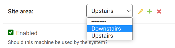
Well done guys this makes code much simpler (chopped out masses of pseduo ::before svg elements to simulate checkboxes, that had all sort of issues with validation), big thank you! I have a suggestion. What if (Please note the very nice green check box, because the color theme is green, but can't change the blue in the select box): |
|
|
|
The spec for EDIT: Unless the implementors for the browser are considering that to be a "text selection" color, rather than part of the element itself? See #5657 |
 and others
(not sure which spec this might apply to - css-color-adjust? css-color? css-pseudo?)
Form controls often have a themed highlight color that indicates a "selected" state. For example, in Chromium, we recently changed the look and feel to have a blue highlight color:
(Edge on Mac has similar styling to Chrome but does not use blue). This demo enumerates all of the form controls and can be tested on various browsers.
In addition, some operating systems, such as Mac OS X, allow changing the accent color via a user setting. Safari uses this setting to change the blue color in the screenshots above to a different color.
A number of developers have indicated that they would prefer to be able to change the color. See e.g. this issue. I propose a way to do this via CSS:
accent-colorthat would take on the usual color values. We would specify that a user agent should use this color to change the accent color of a UA-rendered form control, if there is such a well-defined concept for that form control; and otherwise this property has no effect. In the various accessibility and forced color modes, this property is ignored.In general, form control styling and rendering is not specified, but this particular part of it seems like it can be.
The text was updated successfully, but these errors were encountered: