2.4.12 Focus not Obscured (Minimum) and user opened / controlled content #2751
Comments
|
For keyboard users, opening additional content would typically involve moving the keyboard focus to the trigger that then opens content (and either set kb focus to the newly opened content (modal dialogs) or leave it on the trigger where a repeat activation would then close content (custom tooltips or popup menus). To me, this seems to mitigate the risk that any focus points would become obscured by actively opened content. That's why I don't think the behaviour would generally cause problems for keyboard users as long as focus management works as it should. In situations where the focus is not trapped by the additinonal content (say, with non-modal dialogs), I think users can be expected to actively close content that they have actively opened before. It may be good to add a clarification to the 2.4.12 understanding text. |
|
@melaniephilipp is the explanation @detlevhfischer provided sufficient? If so, please close this issue. Else, please expand on what your are looking for. |
|
Hi @bruce-usab When I asked for "Clarification along the lines of the one given for movable content would be very welcomed." I could have added "in the Understanding document, to be more clear. Based on @detlevhfischer apparent support for the idea of adding a clarification to the understanding text: My suggestion would be to divide the second paragraph of the Intent section into two paragraphs with an additional sentence added to the end of the second paragraph.
Also, I think the instance of “dialogues” should be “dialogs”? Thank you |
|
Excellent, thank you. I am going to mark this issue as Ready for Survey because I think we have clarity as to the changes you are looking for in Understanding. |
 alastc
changed the title
alastc
changed the title
|
Picking up the conversation from the last meeting, how about something like this, (updated 27th Jan): Where other content can overlap with a focused item, the focused element should not be hidden. Typical types of content that can overlap focused items are sticky footers, sticky headers, or non-modal dialogues. As a user tabs through the page, these layers of content can obscure the focused item, including the focus indicator. If the interface is configurable so that the user can manually open, close, and/or move components such as toolbars and non-modal dialogues, then only the default positions of user-movable content would be considered for testing and conformance of this success criterion. If a component automatically opens and obscures focused elements, that would fail this criterion. For example, a navigation drop-down which opens when focused, but does not close when focus moves to other elements would not pass if it covered focusable elements. |
|
@mbgower we've tweaked the suggested text in the comment above, does that work for you? |
|
I am noting that this edit to Understanding is consistent with exceptions in other SC and general principle It is essentially a bug (and a failure against this SC) if something (like a hamburger menu) stays open on keyboard focus after keyboard focus is removed — when mouse-over behavior (appear/disappear) works as expected. Selecting (click or return key) is not in scope for this SC, since that is a very different scenario. |
|
I put comments into the PR. The challenge we have is that there is a gap between a menu (which I'm hoping everyone agrees should close on loss of focus) and an expandable side bar. In a different implementation of the latter, the side bar never collapses until the user actually collapses it by clicking on the collapse button. I need hardly say that this poses more potential problems for keyboard users, and there doesn't seem to be any GOOD reason to do it. IMO, this should fail this new criterion, and some interactions would have to be updated (including some of the behaviour of the side bar on https://www.w3.org/TR/WCAG21/). |
|
For things like the LInkedIn example pointed out on Tuesday's call, I think there are some relatively easy ways this could be implemented without obscuring focus. I'd like to take those on a case by case basis, but I have so far not seen an interaction that could not be done in such a way that focus was not obscured. |
|
Apologies, as I think if I had been more on the ball with the backlog call today (2/3) we might have been able to close this one out.
I agree with not giving anti-patterns too much attention, but it seems worth it to keep chewing on to me. It seems common enough that keyboard focus behavior is poor as compared to on-hover behavior. Yes, we all agree that menus should close on loss of focus. Also I agree that if an expandable sidebar menu 'pushes' the main content over (main content section reduces in width), then focus will never be obscured.
Okay, I am with you here so far...
@mbgower please clarify. In your opinion, does such an implication fail 2.4.12? (Because IMHO it is poor UI, but not a fail necessarily.)
Please describe the problematic WCAG sidebar behavior in more detail, so I might better understand your reference. |
Here's the current SC wording:
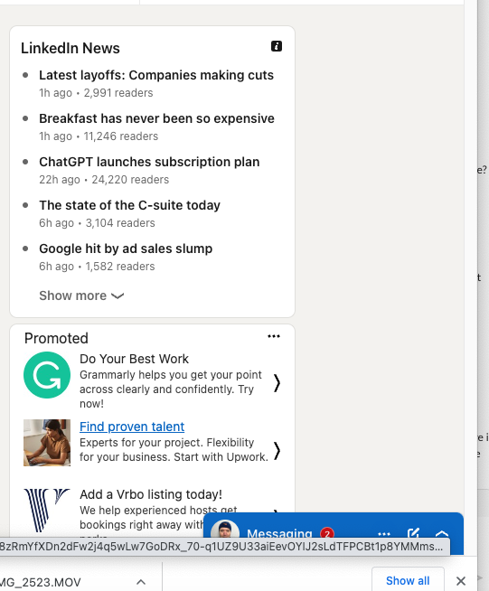
The way the SC wording is now, if the LinkedIn messaging region, which opens from the bottom of the page, at any time completely obscures a link or control behind it that gets focus, it will fail this SC. I've posted two images of that interaction below. I'm going to put my descriptions for each in text below them.
In the first, the Messaging 'popup' (for lack of a better term) is collapsed in the bottom right corner (yet already ALMOST obscures the last 'chevron button' > in the Promotion/Ad area). Two thirds of the area above this collapsed popup is 'empty space'.
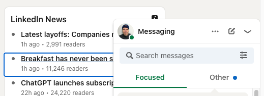
In the second, the Messaging pane is expanded (I have obscured personal data with a big black rectangle; ignore that). It's mainly taking up that empty space, but it does covers all the chevrons in the Promotion area and partially covers the i icon in the LinkedIn News section. Now, bulleted items in the LinkedIn News -- at least at the magnification, etc I have -- will never entirely be obscured, since the entire news item takes focus. I'm adding in a screen detail to show how one of these is not fully obscured behind the messaging. The blue focus indicator is clearly visible for a good chunk of the news item.
But the right facing 'chevron' buttons in the Promoted section are fully obscured (which I obviously can't take a screen shot of!) The only wiggle room I think there is for this not to fail is what exactly is scoped by the following note (which IMO should be immediately under the normative text and not at the bottom of the Intent).
I would like some content in the Understanding document that clarifies that something that can only be expanded/opened is not "user-movable" and does not fall into this exception. In other words, the LinkedIn example SHOULD fail this criteria. BTW, note that the only ones that are fully obscured in my view of the LinkedIN site are those 'chevrons'. There are other items that take focus without being fully obscured, even within that Promoted section. I've put in a screen snippet showing how a good portion of the item and its blue focus indicator are clearly visible. So this is not a very hard to redesign to comply. Final note on this: |


|
Here's the current SC wording:
@mbgower writes:
Uh oh. That was not my understanding of this SC. If that were the case, the SC would be more like:
I think this is much stricter than the phrasing we arrived at! Or is that the LinkedIn messaging region (which opens from the bottom of the page) completely obscures the keyboard focus indicator of the keyboard trigger (which caused the messaging region to open)? |
|
@bruce-usab yeah, I should have worded that more carefully (and I have edited my original comment to match):
|
|
Okay, again we are in rabid agreement. |
|
Two concerns:
Can we think in terms of differentiating scenarios along the lines of 1) content that is not meant to be open while the rest of the page is being viewed (for example hamburger menus or mega menu submenus) and 2) content that may be open or closed (user discretion) while the rest of the page is viewed (for example chat bots and messaging panels and form field level tooltips)? |
|
And as I was just messaging in LinkedIn, I realized that the message panel has yet another panel that can open to the left of the main message panel to respond to a message in the panel, further complicating the scenario of covering other focusable content. But also... if you don't want the panels open, you have the choice of collapsing them and opening the whole messaging activity in a dedicated messaging page. It's really in the user's control to decide if the open panels are a problem or a convenience. |
|
My 2 cents. I'm pretty concerned that if we're too strict about things like opened chat boxes that devs are going to simply trap the keyboard focus in the chat, while leaving the page interactive for mouse users. Anything else may very well require a complete overhaul of the layout of the page. If we're too strict, the path of least resistance here would be to make the keyboard experience worse. I think the way to do this is to say that "author-created content" means; content rendered 1. not by the user agent, and 2. not activated by the user. I.e. If the user clicked a button to open something, they are responsible for closing it. But if that thing opened on a load, on focus / hover, on a timeout / on some other external event outside the user's control then the author is responsible. So a page that pops up a chat automatically after 30 seconds on the page could fail this SC. A chat that opens when the user clicks the chat button could not fail the SC. |
|
@mbgower regarding your popup emoji example from github, and related to my comment on this PR - #3083 (review). Would the popup content persisting after focus left it be a problem if it could be dismissed by the Esc key? The problem with light dismissing (closing when focus leaves the popup) stuff like that is for a sighted keyboard user, they can see that it's gone. but for someone using a screen reader, they may not be immediately aware that they've tabbed out of the component and in trying to find it again, it's been closed and they have to redo the process of opening the popup. Granted, there are certain popups like listboxes and menus where there is long standing behavior that they will light dismiss when they are left via tab key. But more generic types of popups - a list of links, a disclosure widget whose content overlays others (a toggle tip, which doesn't necessarily have a "tooltip" containing element role), or even a non-modal dialog (keyboard focus is not natively trapped in these by default). It can be awkward and unexpected for these sorts of components to auto-dismiss, or even in some cases have keyboard focus trapped within. While I agree we don't want to have people jump through hoops to figure out how to dismiss an element that is obscuring other content, if there are common mechanisms in place that allow parity for users to dismiss or minimize content so that it is no longer obscuring other focusable elements (e.g., esc key, click/tap outside to dismiss), I think those should be considered as a way to unobscure content and help pass this SC. Otherwise, all popups will need to keyboard trap or light dismiss when tab key exits, and I think this SC would be problematic if it was essentially requiring that, without stating it - which after reading these discussions, is what I'm understanding this rule as requiring now. |
|
@patrickhlauke @scottaohara Thank you for your perspectives. It seems that this is one of those scenarios where in some cases it would be strongly preferable to have content "light dismiss" and others where it would be strongly preferable to leave control with the user and others somewhere in between and could go either direction depending on the use case and the user. When I find myself wrestling with "it depends" scenarios, I (almost) always go in favor of leaving the control with the user (in this case to dismiss, or not, the thing THEY opened). I would really like to see user opened / controlled content treated the same as user movable content in the understanding document. |
Added additional note to address comments by Scott Ohara in the PR #3083 (comment) and recent comments in the issue starting at #2751 (comment)
|
@melaniephilipp I believe the wording committed as a note should address much of this problem space -- without perpetuating what I hope folks agree tends to be a 'second class' keyboard experience.
The result of this would be that someone would for example be able to pass Focus Not Obscured by allowing the user to do any of the following where they'd opened content that obscured focus:
The two key qualifiers are that 1) it is allowed where it is an action of the user that obscures the item with focus 2) the item with focus needs to be brought into view without the user needing to adjust focus. May need a bit of tweaking, but it feels pretty close. @patrickhlauke, I think this covers both true and faux non-modal interactions. Providing a keyboard shortcut for overlay interaction would resolve. For instance, in gmail, the Shift+Esc/Esc shortcuts allow me to put focus in the main inbox (when my compose overlay is in the way). |
|
@melaniephilipp and @WilcoFiers and @patrickhlauke Have you had a chance to look at the additional information I've added to the understanding document, including the notes? Does this clarify things enough? #3083 |
|
@mbgower It's a bit difficult to follow what the resulting full page content is intended to look like with all the comments. But, the proposed note for the SC text looks reasonable for desktop: "Where content disclosed by the user can obscure other content, if the user can reveal the item with focus without moving keyboard focus (for example, by dismissing with Esc), such disclosed content is not considered to fully obscure the item receiving focus." Are there implications for mobile interfaces with a screen reader turned on and where a keyboard isn't being used - so ESC or arrows keys can't be used? In other words, is mobile screen reader focus in scope for this SC? I think not, but want to be sure. |
@melaniephilipp I will try to generate a preview.
Remember that this entire SC is about keyboard focus for user interface components. So if a scenario exists in a modality where such keyboard focus is not achieved (i.e., focus put on something that is not a UIC, or nothing whatever has keyboard focus) then the SC is not going to apply. In the scenario of a gesture-based screen reader navigation, depending on the context, we may not even be talking about interaction; just content review analogous to scrolling down a page without navigating it. Conversely, it is possible for a mobile interface to be operated by keyboard. There are already requirements in Keyboard, Focus Visible and Non-Text Contrast to be met.
To those three, this SC would add on the requirement that when a UIC has visible focus, it not be entirely obscured --or that the user be able to unobscure it with ease, in the case where the user has obscured it. |
|
@melaniephilipp I'm attaching a preview from my own system for you. I couldn't quickly figure out to generate a rawgit preview, so hope this will help! If this direction makes sense, I'll incorporate more of the above comments in the issue into the doc, and start getting some visuals and examples to help make it more understandable. |
|
@alastc It took me a LONG time to find it, but I finally located the article I was talking about -- from Knowbility -- which tackles some considerations relevant to this space https://knowbility.org/blog/2020/accessible-slide-menus |
|
@mbgower Thank you for the PDF! I think you have struck a good balance. The only thing that comes to mind is under the heading "User openable, persistent disclosures" it should mention as one of the approaches the ability to dismiss the opened content with something like the ESC key as is mentioned in the Note under the SC itself. |
|
Thanks, @melaniephilipp. Not all the persistent disclosures would be dismissible/collapsible with
I'll see if there's another place to work it in appropriately. Now that I have a direction that seems to be working, I'll also attempt to get some complementary illustrations added. |
|
@mbgower I think I wasn’t clear enough. What I am suggesting is an additional bullet in this section: User openable, persistent disclosures Some disclosure patterns provide a mechanism for the user to open additional content that remains open until intentionally closed by the user. Accordions are a simple example of such a pattern.Chatbots and expandable side navigation are more complex examples. All of these patterns can be implemented so they are not at risk of failing this SC. Some possible approaches are:
|
|
Okay, I'll incorporate. Thanks! |
|
A small note on your edits @mbgower - I've been piloting this guideline with testing teams as an internal standard, and we get asked about whether using the arrow to scroll the page and bring the focused element into view passes this a lot (e.g. with sticky banners/footers). I got asked about this again today. Because it's so common, if that could be explicitly in the example, i.e. "(for example, by scrolling the page or dismissing with Esc)" it would helpful. |
|
Thanks, @DanHolbrookQA I will work to incorporate that. HOWEVER, to make sure we're on the same page, I need to address your "e.g." text. Since the sticky banner/footer is not content the user opened/disclosed, it would not meet the wording of the second note. I hope the distinction is obvious. If I as a user starting tabbing through a new page only to find that through no action of my own I can't see where the focus is, that responsibility is the author's. Contrast that with a user who while interacting with a page opens a chat window (or say a compose window in an online email application). There are still obvious ways the author can ensure focus is never obscured. But there are also possible situations where the user is given the power to switch modalities or views. I'll work on making this crystal clear in the wording -- and may revise the note to make it clearer, since it's obviously still |
|
@mbgower That's good to know, as I was concerned we were taking the teeth out this guideline with this second note, and we've been testing the situation I described as failures going back to when we just had Focus Visible. I would ignore my (e.g.) suggestion then entirely, but (and this may be a separate issue) given the questions I've heard, I don't think that it's clear in the Understanding text that author-caused but user-solvable Focus Not Obscured issues are covered by the guideline, and this note might add to that confusion without clarification elsewhere. |
|
@DanHolbrookQA thanks for that feedback. |
|
@rachaelbradley This issue is not resolved until #3083 is surveyed, adjusted, and merged |
|
@DanHolbrookQA After doing a LOT of drafts, I've ended up with the slightest change to the current wording, and that's just adding emphasis on one word:
|
|
@rachaelbradley and @alastc The Understanding document will certainly benefit from some illustrations and future tweaks, but I believe this is something that should be put in front of the working group. I'm particularly concerned that while these are not normative changes, there may be perceptions that the notes need to be finalized as part of this last round of prep for the round of CR. Apologies for not getting it into survey this week. |
|
Closed by #3083, approved here: https://www.w3.org/2023/04/25-ag-minutes#item06 |
While implementing WCAG 2.2’s 2.4.12 Focus not Obscured (Minimum), we encountered a scenario we’d like the Understanding document to provide clarification on: The applicability of 2.4.12 where content that can be opened / closed by the user impacts the visibility of other focusable content.
Regarding movable content, the Understanding document clarifies: “If the interface is configurable so that the user can move toolbars and non-modal dialogs around, then only the initial positions of user-movable content would be considered for testing and conformance of this success criterion.”
That doesn’t seem to directly address content where opening / closing of overlay content can be controlled by the user, that is: where there is no failure of 2.4.12 in the default state of the page, but when the user opens overlay content, focusable elements could end up entirely behind the content while the content is open.
More detailed examples follow.
One impactful and wide-spread example is a chat interface that is collapsed into a button in its default state. In that state, there isn’t a 2.4.12 failure. However, when the user opens the chat interface, it entirely covers some focusable content. For this scenario let’s also say that any content behind the chat can be accessed by collapsing the chat to access it again - without losing any of the chat activity.
Closely related are the messaging popup panels in the lower right corner of sites like Facebook and LinkedIn.
Another example is popup content that is actively opened / closed by the user on mouse click or Enter (as opposed to opening on hover or focus), sometimes referred to as a “toggle tip”. Content behind the “toggle tip” could contain focusable elements that are entirely covered. Toggle tips aren’t (usually) modal, so the user could tab to elements entirely behind the toggle tip overlay if they don’t choose to close it.
Those are just a few examples that come to mind.
Clarification along the lines of the one given for movable content would be very welcomed.
Thank you.
The text was updated successfully, but these errors were encountered: