SC 1.4.11 contrast on hover included or not #400
Comments
|
From @goetsu on May 11, 2018 17:22 Also in case like this one https://www.lvmh.fr/ (click on the search icon in the header) or https://knowbility.org/ where search input has no border and transparent background having a hover effect with suffisant contrast will definitly be helpfull for everyone specially low vision user to understand those are interactive area |
|
From @detlevhfischer on May 11, 2018 18:24 As to mouse operation, while it is desirable to have good hover focus, the fact that the user places the visible cursor over the interactive element is IMHO a sufficient indication in terms of minimal SC requirements (for mouse operation). |
|
From @mraccess77 on May 14, 2018 14:8 I believe the hover state needs to have sufficient contrast as well. Just because a point is over something doesn't mean it's the item we want to activate. If we have to move the mouse away to then get sufficient contrast that might mean panning the magnified view. |
|
From @goetsu on May 14, 2018 18:43 Also as I already said in some cases (button element for example) cursor isn’t changing. So if user don’t see the change of state because contrast isn’t sufficient he will may consider the element as not interactive |
|
From @detlevhfischer on May 15, 2018 5:10 I would support the requirement, I just think the current SC text and understanding text do not make it unambiguously clear that a hover state is required. The current master understanding text has:
I find this hard to parse, perhaps also because of the echo of "Regardless of whether or not". I would wish some explicit distinction between focus (as in keyboard focus) and hover (as in cursor operation) and a clearer statement what this means for the applicability of 1.4.11. 2.4.7 explicitly calls out keyboard focus. My current reading is that 1.4.11 does not require a change of state for controls when hovered over (including a change of cursor). Such a requirement may be a good thing and some readers may think its is implied, but this is not my reading of (minimal) requirements right now. I am happy to be proven wrong, though. |
|
From @goetsu on May 15, 2018 5:32 I don’t ask to have a mandatory hover state but like focus if there is one it must be contrasted enough specially if it used to let user know boundaries of the component / hit area |
|
From @alastc on May 22, 2018 13:18 That section is currently under discussion (email and conf call later today), I don't think we can ask for both:
You end up needing three (or more) directions of contrast, which even at 3:1 it is difficult or impossible depending on your colour schreme. My current reading of the SC would be that: If you have a hover state involving the boundaries of the control, it should have sufficient contrast with the surrounding colour(s). |
|
From @jnurthen on May 23, 2018 5:10 If hover is included at least one of the reference sites fails. https://www.w3.org/WAI/WCAG21/implementation-report/implementation?implementation_id=178 references https://www.funka.com/ |
|
From @goetsu on May 23, 2018 5:47 @jnurthen even without taking care of contrast of hover state most of current reference sites fails with existing criteria as it is right know see w3c/wcag21#914 Using designer consideration isn’t an option here I think. Otherwise you must remove even the current criteria on text contrast because Vast majority of them still not respect it. I think we must either :
|
|
From @DavidMacDonald on May 24, 2018 19:1 SC 1.4.3 understanding says:
I think that means WCAG requires contrast on hover or focus, even in WCAG 2.0, on Text that is. |
|
From @alastc on May 24, 2018 22:33 Let me string the SC text and understanding together and try to get a logical outcome:
In the understanding as:
Therefore:
This does not answer @goetsu's original point:
However, that is a (potentially) conflicting requirement with:
At least for 'flat' links/buttons, if the hover state is a noticeable (contrasting) change with it's default state, that makes it very difficult to do whilst also maintaining contrast with the surroundings. I think seeing a thing is more important than seeing a change in the thing (is that right @allanj-uaag, @WayneEDick?), it does seem to be indicated here. The states aspect is in the normative text, but I wonder if there's a way we can indicate that if something starts with no boundary, adding a boundary on hover that does not have 3:1 contrast is not an issue. |
|
From @mraccess77 on May 25, 2018 0:11 While we are updating this text we should be sure to be clear regarding our understanding of the following: that for boundaries we only need the inside or outside of the boundary -- not both in order to distinguish it as a boundary. The same would go for the focus indicator. I assume the focus indicator would be the same as well -- contrast with the pixels outside or inside of it but not both. If people interpret it differently then we should discuss. I'd prefer contrast on both sides but I don't think that may be practical given borders, backgrounds, and focus indicators all next to each other. |
|
From @goetsu on May 25, 2018 10:24
have you some example ? I confirm this part isn't clear at all. This will be part of lot of confusion and interpretation I think
Sorry but I disagree with that it's not more difficult than maintaining contrast with the surroundings when indicator isn't on hover. If you choose to do an indicator using border/background it must be contrasted enough on all cases not only for keyboard users |
|
From @alastc on May 25, 2018 23:10 For an example, imagine you have a graphic of something that is wrapped in a link. If the content is an image (JPG of a person) that would probably come under the 'essential' part of graphical objects. However, it fills the hit-area, so it does come to the boundary, but is not the boundary indicator as such (in the same way that text isn't a boundary indicator).
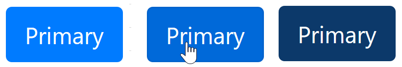
Take a bootstrap button, the left is default, middle is the hover state. In order to get 3:1 with both itself and the background, you'd need to use the version on the right, which is almost black, and not within the desirable range for branding colours. (This is a demo of James' point above.) |
|
From @alastc on May 26, 2018 16:1 Kinda missing the point. If the middle one was the default, the right one would have to be even darker. The point being that differentiating hover from the default state with contrast is not feasible if design / branding is a factor. |
|
From @goetsu on May 26, 2018 16:49 sorry but I still don't get your point if middle one is default and right is on hover you have nothing to change as both are passing SC 1.4.11 I'm not asking for a contrast ratio between background color of standard state and hover state but to apply the 3:0 ratio between the background of the page and boundaries of the hover state as the SC currently require for focus state. |
|
From @alastc on May 26, 2018 21:56 Going back to the opening comments, I thought you were asking for the default and hover states to have contrast between each other, but re-reading perhaps I was mistaken. There are many possible variations and examples in this area, I believe it will be the focus on discussion over the next few days, keep an eye on the list for more. |
|
From @awkawk on June 1, 2018 18:46 [Proposed response]: Thank you for the comment. The Working Group discussed this issue and the primary concerns for the hover state are a bit different than the focus state. For the hover state, user has the benefit of additional information when viewing the hover state in that the user is in control of the pointer position so between following the pointer position as the user moves it and the change in the pointer shape there is additional information that is available to clarify the hover state. The focus state is different because there isn't a positional relationship between the keyboard presses and the location of the focus on screen, so the focus contrast is more critical to help users find their place on screen. For both keyboard focus and hover, it is important for the content to continue to have sufficient contrast, although it will depend on whether that content is text (relates to 1.4.3) or graphical (1.4.11) in nature. Contrast of the content being hovered or keyboard focused is particularly important for screen magnifier users. When using a magnifier at a high zoom level the focus or hover determine the position of the magnifier viewport, so there users may not view content that isn't focused or hovered. |
|
From @goetsu on June 2, 2018 7:41
not always the case specially for button element, label or fake interactive element done with aria and tabindex |
|
Hi @goetsu, This is a proposed-response to your question for the working group to agree with (or not). It seems strange to address you in this comment, but hey, we're working in the open! The working group has been going over various aspects of the non-text contrast understanding doc and I think this is clearer now. From the pre-live version, key snippets are:
So to answer the original question: No, it does not require that hover as a state is differentiated from the default (and presumably all other) states. There are a few reasons:
I hope that resolves this issue, it will go in front of the working group soon. |
|
The working group agreed with the proposed response, so the above comment is the response. Closing now, please re-open if there is something new for the working group to consider. To note, there is some work going on for focus indicators, to bolster that requirement. |
|
@alastc thanks for this answer but I'am a but confuse as the last understanding version as you quote state So do it mean that working group don't consider hover as one of state covered by this ? For example if on a button there is a background color or border that change on hover it's not considered as "visual information necessary to indicate state" by the working group ? |
|
The key is "the information used to identify the control in that state", i.e. there must be separate information dedicated to that state. Such as the check in a checkbox, or an arrow on a drop-down. A background / border change does not provide more/separate information, and also has no (different) adjacent color to test against. I thought this bit was clear on that:
|
|
I'm trying to interpret this piece of the SC (emphasis mine):
Suppose I have a menu dropdown with adjacent menuitems. The menuitems have white backgrounds by default, and gain a subtle gray background on hover. Does this menuitem hover state (i.e. the gray background) need to meet 1.4.11 contrast requirements with the normal states of adjacent menuitems (i.e. the white backgrounds)? |
|
Menu items that are not hovered would not need to contrast with hovered items. The hovered item itself still must have contrast per SC 1.4.3 and 1.4.11. If color is used to indicate current menu item then SC 1.4.1 might come into play if color used to communicate active menu is not >= 3:1. |
|
I have a question I'd like to come back to related to this @alastc
Can you please clarify how is a halo or border change not conveying information about the component state? If it is the only visual change that indicates the state is a border shift, then is that not information needed to identify the state? I fully understand that the state does not need to be compared to itself, but information that indicates the state is supposed to be contrastive. |
From @goetsu on May 11, 2018 17:0
Hi,
current text inside understanding state :
"Regardless of the whether or not there is a visible indication of the hit area for the button, the focus indicator for the component must have sufficient contrast when the component is focused."
I think hover indicator must also have a sufficient contrast otherwise people using mouse only may not see the change of state specially on button element where cursor isn't changing to pointer by default
Copied from original issue: w3c/wcag21#913
The text was updated successfully, but these errors were encountered: