Non-text contrast updates #550
Conversation
Will create a survey for this change, Dec 7th ish.
|
In the first section, second bullet you say |
|
Hi @allanj-uaag, In the understanding doc that became the second paragraph:
We need another way of saying 'state', without using 'state', as then it gets mixed up with hover, visited etc. I wasn't totally happy with 'value', but couldn't think of a better term. |
|
Below are several recommended edits on the first few sections...
|
|
Thanks for the updates Jared and Alastair. I have two additional things we should attempt to address.
|
|
Thank you @jared-w-smith, Re: color / colour, Doh! that's my muscle memory kicking in, color is the correct spelling here. I've integrated almost all of that, a couple of notes on the the things not integrated:
SCs use title-case, and I realised I was trying to convey the related SCs, so I've updated that to "Focus Visible and Use of Color", matching the order of the content.
I would like to phrase it in a way that says: Whatever the visual indicator is, that's what should have contrast, so I've updated that to: "Where a text-input has a visual indicator that it is an input, such as a bottom border, that indicator must meet 3:1 contrast ratio."
Now: "Text inputs that have no border and are differentiated only by a background color must have a 3:1 contrast ratio to the adjacent background."
Now: "Where an author-created focus style is applied to a control on a dark background, it must have 3:1 contrast with the adjacent dark background."
Yes, and I agree, but it is kind of an FAQ, we keep getting asked about that. I'd like to find somewhere else to put it before removing it. (I'll respond to Jon's later, my train is pulling in.) |
|
Hi Jon, I've added an 'adjacent colors' section that I think addresses those points, see what you think. (Diff of just those changes.) |
|
Nice work on this! Here are a few thoughts: A couple "colours" made their way in again. :-)
This example isn't always accurate. This suggests that Text box 1 at https://webaim.org/temp/1-4-11examples.htm would fail in its default state. Because it has sufficient contrast to its border, this is sufficient. Also consider Text box 2. In this case the border has insufficient contrast to the text box, but sufficient contrast to the background. So this would also pass. Additionally, this statement would not be true for an input without a border at all, but on a different colored background. In this case the color within the input and the background color must sufficiently contrast. So, sometimes we measure internal to border, sometimes we measure border to external, and sometimes we measure internal to external. As such, I think we need to be careful about defining this as "internal" vs. "external", but should instead focus on what is needed to identify the component. Perhaps the following:
You wrote:
As above, I don't believe this is always accurate. Consider button 12 at https://webaim.org/temp/1-4-11examples.htm The focus indicator in this case only has >3:1 contrast with the internal button color (and also >3:1 from its default state), but not the background. Perhaps change to simply:
The SC requires that it be visible - considered to be 3:1 to adjacent colors (which isn't necessarily background/external) - so I think this is more accurate. Wow, this is tough stuff to document! |
|
Ach, I consciously tried to avoid colour, but my muscle memory is strong... despite years of CSS.
There is a concept that is easy to say but hard to convey: If you couldn't see the non-contrasting bit, would it still look like the thing it is intended to be? Text box 1 is a good example, if you ignore the border (which doesn't contrast with the white background) it has still got plenty of contrast for the input. I'll start with your suggested text, but I don't think it clearly covers the textbox 1 example either, we need to include something about ignoring a border if that isn't required to discern the control due to the background.
I consider that another example of 'changing the shape', it is conceptually the reverse of the 2nd button in the set of 4 just above "Use of Color and Focus Visible". Adding the grey border inside the boundary of the button means the button changes shape as the grey doesn't contrast with the white background. It effectively reduces the size of the dark internal background so changes shape. If we use simply:
I think that opens up more questions: adjacent to internal and external? External to the component? I'll keep thinking... |
|
Hi @jared-w-smith, I added a couple of updates to try and make things clearer from your last comments, diff of just those, and the preview should have updated. |
|
I think the suggestion from @jared-w-smith is helpful -- that it's not so much about calling out internal or external adjacent colors but any adjacent colors that provide the indication of what is being communicated, e.g. focus ring, etc. |
|
Hi @mraccess77, I'm not sure how that would be clearer? If you look at the examples it matters whether you are trying to contrast with the internal and/or external colors. Otherwise adding a light grey outline around a dark control won't help. |
Right. What we're suggesting is that it will be very difficult to define the conditions where one or the other is used. It would be better, I think, to allow the author to determine what is needed to discern the control (or its state), then ensure 3:1 contrast to is adjacent colors - whatever that may be (internal color, border, or external color)
Sure it will - if it has >3:1 contrast. |
With what though? It won't (in reasonable cases) be able to contrast with both. Sorry if I'm missing something, I'm just confused about 'any adjacent color' making it clearer. Compare examples 4 & 5, and 12 & 13 from: https://alastairc.ac/tests/wcag21-examples/ntc-focus-styles.html How do you word that to pass 4 & 12, but fail 5 & 13? My suggestion is that sufficient techniques include:
|
Please note that the border is present in the default state, but is the same as the internal color. It changes color on focus. I don't believe a border color change alone is 'changing the shape' - unless there is also a 3:1 contrast (as is the case with your examples). Otherwise, this is problematic... Consider my new Button 13 at https://webaim.org/temp/1-4-11examples.htm It is nearly identical to Button 12, except that the border style is a bit thinner and the color on focus does not provide >3:1 to either the button color OR to the background OR to the default border color. If you consider the border color change alone to be "changing the shape", then this would pass, despite it being nearly impossible to determine the focus state. I think that exceptions will always exist any time you try to dictate the specific the conditions for contrast between internal vs border vs external. As above, the key is to simply identify what is needed to differentiate the control or state (in this case the border change on focus) and ensure >3:1 to the adjacent colors (internal OR external would work), and, if it's color-reliant indicator of state, a >3:1 change from the default state. |
That's very similar to the example 13 on my page. No, I'm not saying that passes. For it to be a change of shape, it must contrast with either the component or the background. If you look at the sub-bullets from my last comment:
I don't think internal or external does work, otherwise examples 5 & 13 would pass. -Alastair |
These would both pass if they had >3:1 contrast to the default state, as I've indicated is necessary. In #5, the #ccc border is <3:1 to the white that was at this location before focus. In #13, the dark grey on focus is <3:1 to the default black. You've already indicated that color-reliant focus indicators (such as a button changing color) must have >3:1 from the default. Why would this be required of a button color change on focus, but not a button border color change on focus? Yes, this can be constraining in certain designs, but this is a constraint the author has invoked by not having a standard focus outline (which, if customized, must also have >3:1 contrast to the background). Or maybe we're still misunderstanding each other here. |
Ah, ok, I see what you mean now, that’s another way of describing this aspect of contrast. What colour was replaced, and whether that has contrast with what was there before. I had started with a similar explanation when talking it through with a developer at gov.uk (check out their focus styles, there are some interesting examples). They had struggled with that explanation, at least when considering their examples, and found the ‘change of shape’ concept easier to understand. I don’t have a preference, the effect is the same, I’ll see what impact that change would have on the doc tomorrow and try and get some other perspectives. |
|
Alternative explanation created in #557. |
|
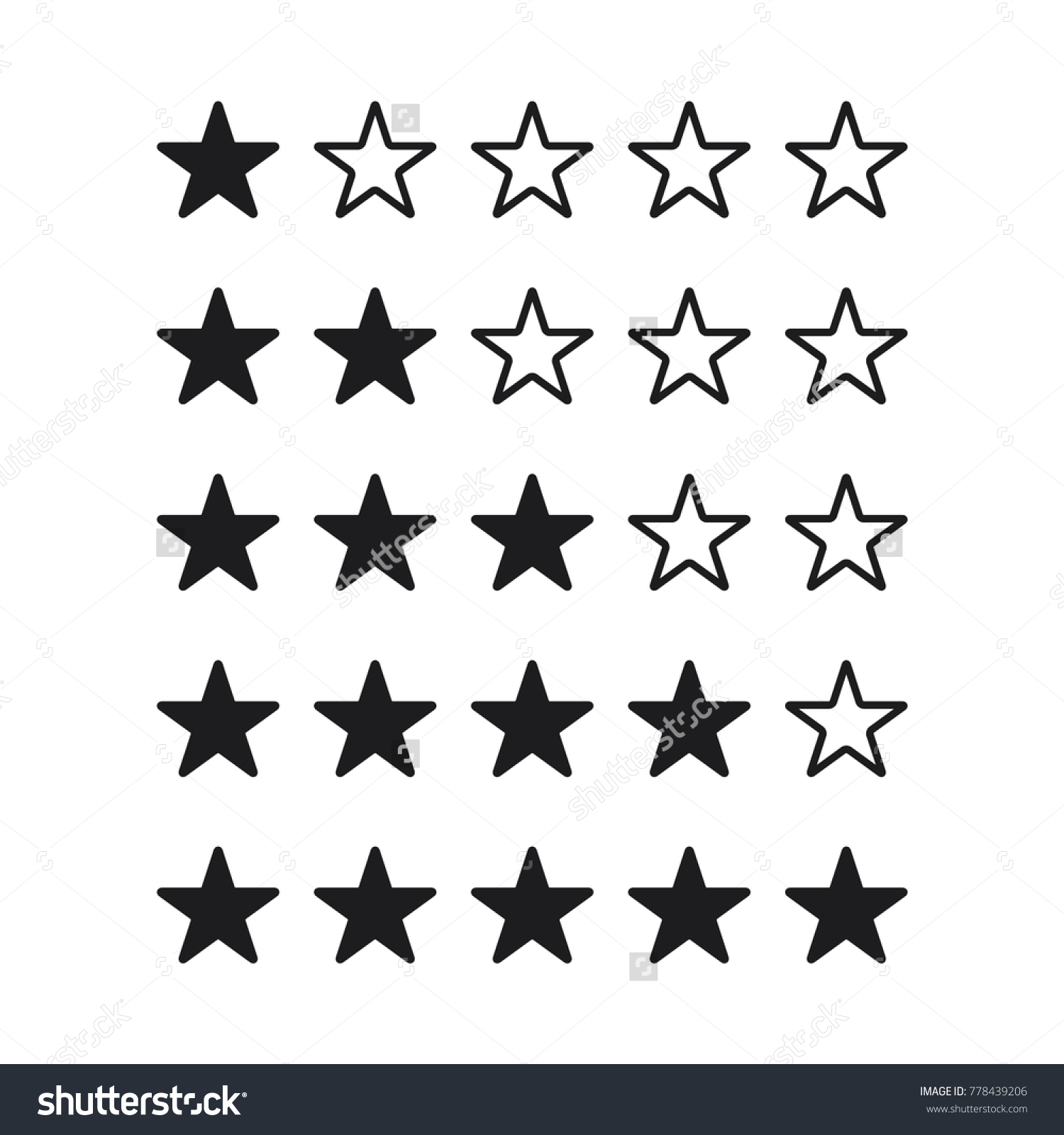
I think that my link example isn't great since that actually probably falls under 1.4.1 Use of Color. I'm not sure that people have failed links/visited links on that basis. For a checkbox, the non-text elements would be the border and the check, and 1.4.11 requires that the visual information required to identify the component and required to identify the state has a 3:1 contrast ratio against adjacent colors. I think that we are agreed that adjacent means "next to" in space rather than in time, so if the check and the border are needed to identify the component and the state, then the check and the border need to have a 3:1 ratio against the background. If the checkbox is done like the Material style (https://material.io/design/components/selection-controls.html) then in the unchecked state the dark gray border needs to meet 3:1 against the background, and in the checked state the edge of the fill defines the component and the lack of fill defines the check, so it is the purple:white contrast comparison. If you have a star rating widget you might have one where the stars are the same color if filled or not filled (https://image.shutterstock.com/z/stock-vector--star-rating-vector-icon-flat-design-best-vector-star-rating-illustration-778439206.jpg) or with different colors (https://cdn2.vectorstock.com/i/1000x1000/38/16/5-star-rating-symbol-design-vector-21353816.jpg) - in this case I think that the all black one would pass but the other wouldn't because the not selected stars don't have good contrast against the navy colored background. |
|
Here's a different version of my added paragraph that doesn't use text links: This Success Criterion does not require that changes in color that differentiate between states of an individual component meet the 3:1 contrast ratio. For example, a rating component with five stars may have 3 blue and 2 gray filled stars to indicate a rating of three. The blue and gray colors each need to meet the 3:1 contrast ratio against the star's background, but the blue and gray colors are not required to meet the 3:1 against each other. The Working Group intends to investigate ways to address the contrast between states in a future revision of the guidelines. |
|
I agree with @awkawk's examples and summary, and his updated paragraph. To take Andrew's star example (https://image.shutterstock.com/z/stock-vector--star-rating-vector-icon-flat-design-best-vector-star-rating-illustration-778439206.jpg) a step further, if the stars changed appearance (say to grey) on hover, the grey would not have to contrast with any other color of star, but only with the background white while in that hover state. It may thus be difficult to know it is hovered, but the star is still perceivable. Another example would be a menu button that looks like a link, but presents a blue drop-down carat on hover to indicate that it's a drop-down menu button. The blue carat only appears in the hover state, but would still be covered by this SC and must be 3:1 to the background because it is necessary to discern the component in that particular state. If the carat changes color to red when the menu is in the open state, the red does not have to contrast with the blue, but the red does still have to contrast to the background. This does leave out some use cases that could be impactful, such as differences between pressed and non-pressed states of toggle buttons. Or color changes for a round dot that changes from green to yellow to red to indicate number of remaining characters available in a tweet, for example. Each of the colors of these components must be 3:1 to their surrounding colors, but not between each other, which could cause usability issues. These issues could perhaps be addressed by the new proposed SC. |
If that is the case, how do we square that with not applying to hover/visited etc? Do you mean the change creates a 'change of form'? E.g. a text link changing color doesn't change it's form, but a check being added does change it's form/shape?
Ok, I'm agreeing that components should maintain contrast through different states (e.g. visited link needs contrast, although that would be under text in most cases), but struggling to see how that works with the checkbox example.
But the component (the whole checkbox) does maintain it's contrast to the surrounding color, even with a pink on white check. Also, by that logic this 'Modern' radio button example would fail then, as the check doesn't contrast to 'adjacent' colours? You are assuming that there are adjacent colours, and that isn't always the case. How do we square that with the SC text?
I agree that the solid color ones are good, but how do you measure the 'adjacent colour' for the state? However this is an interesting example: The component (dark blue) has good contrast with it's surroundings, and it is conveying the same information as the other one, but it has 3 colours being used. If you assume the dark-grey / blue doesn't contrast (2.8:1) and can't be differentiated, it is still conveying the same information as the solid example. I.e. empty or full (yellow). If the grey and blue and yellow have to contrast with each other we are making it unfeasible, as it is a three-way contrast situation. From the proposed paragraph:
That would be relying on color then, probably not a good example? I also think that would lead to a worse situation as we'd be encouraging people not to use contrast to differentiate states. I understand (and like) the aim of saying: If something switches colour (like text links) then the change isn't covered except to maintain contrast. But if the form changes (e.g. checked, or the menu indicator Jared outlined) then that is covered. However, I'm struggling to square that with the SC text (& definition of states), and adjacent color aspect. |


I think that this is the same as the thinking around gradients. The evaluator needs to ask what adjacencies are relevant to understand the graphic enough to identify the state. For a checkbox the contrasts inside the bounding box are relevant and need to be taken into account. For this: The stars have sufficient contrast in both states, so they pass. If either of these were used as icons for some function (e.g. on a button to open some sort of rating function dialog) we would pass either, right? For this: This one is interesting because I could try to make an argument that the grey/green is relevant or irrelevant depending on the page background that they are placed on. The yellow is always compared to the green, and passes. The grey effectively disappears into the green, but since it is supposed to show and empty star or no star that can be ok as long as the user is able to determine that there is a set of rating stars to work with - and that is the problem, because the star shape that provides the clue as to the type of control lacks sufficient contrast. The way that this control might need to be adjusted to conform is to include a yellow outline around the grey (empty) stars. |


Of those options yes I agree, but if there is a (arguably superfluous) hover effect that added a mid grey (non-contrasting) state, would that cause a fail? I'm struggling with the scope, .
Indeed, the white background helps here. I generally see these graphics as as layers of light/dark contrast, so the dark border 'houses' the light yellow stars, and the grey is essentially irreverent. Of these variations, it's the white one (3rd) I would fail based on lack of differentiation from the others: But that isn't 'adjacent'. |

But the differentiation with the others is what we are saying isn't covered, aren't we? |
|
So on the call we got to a point where we agreed (I think) that components maintain contrast, and we can require that graphical indicators (but not changes in color) within components need to contrast. How about this as the content of the "Active user interface components" bit, 1st paragraph unchanged but included for context:
I'm going to update the 'notes' page of examples to double-check we're all happy with the outcome of that text for various examples, I'll add the ones above. |
|
I've added examples 21-23 based on the discussions, and updated the pass/fail 'decision tree'. |
|
Here's the version to be published soon, any other comments/updates will go into the next version. To note, the updates provide a stronger differentiation between non-text contrast and focus visible, and there are techniques to add under focus visible to do with contrast. |
There was a problem hiding this comment.
I pushed a HTML validation commit.
The use of examples that use brand names with fake data might be problematic. I think it will be better to have completely imaginary labels for the examples, avoid avoid use of corporate icons (such as the social media ones). That said, I don't want to hold up merge over that, but something we should be aware could come back to us at some point if somebody misunderstands or takes exception.
|
Understood. Those examples have been there for a while by the way, not new in this update! |
This update to the understanding doc for Non-Text Contrast addresses several issues raised.
Preview the rendered understanding doc, or review the diff.
The substantive updates are in the Intent section, from the second paragraph down to the table. They are based on the following assumptions:
From 1.4.11:
In combination with Focus Visible (2.4.7) & Use of Color (1.4.1)
Not in scope:
This update should address these issues: