Updating an example for buttons. #813
Conversation
|
feint blue > faint blue? |
|
Good point! Updated. |
|
I apologize for being on sabbatical during this conversation. This change is very disturbing to me. I agree with @mraccess77 that this neuters the original intent of this SC. |
|
A similar question came up for a table -- do the lines have to have sufficient contrast? One could say the space between cells is enough for you to visually distinguish that it's a table. We really need guidance on how this applies to each component like tables, buttons, links, page tabs, etc. because we are talking about the expensive brand redesign of sites depending on how you interpret this. |
|
If we give an exemption to buttons, there may not be a great justification for this SC as one of the main intent was to let low vision users identify the touch target area.. if boundaries fail color contrast of 3:1 then how can we ensure that they would be aware of where to touch to activate the button or link? |
|
The decision around buttons was (just) prior to publication for 2.1, see this comment in 800 for the history. This update is in accordance with that decision over a year ago, just making it clearer. (There haven't been any new decisions on NTC since Jan 2019.)
For buttons & links we have some in the understanding doc, although any updates would be gratefully received. For tables / table rows, I'm not sure how that would be covered by the SC? It isn't a UI component (unless also interactive), and it isn't a graphic. We haven't defined graphics as such, but I've been assuming something in an For tabs, that's probably a good example to add, maybe something based on a11yportal's approach? |
|
@alastc I'm in complete disagreement. The visible edge of button is information about that interface control I never agreed at any point that there was an exemption for buttons just because they have text or icons. As always, if a designer choses to not have any visual border on a button...then that is their design choice. BUT...if a visual border exists for people who have sharp vision, it must also exist for people who have low vision. That is one of the main points of this SC coming into existence. And, I find it ironic that this change was made...because someone did't want to encourage designers to leave off the low contrast borders of interface controls. Which actually proves the point of these borders needing contrast. Sharp sighted folks value that low contrast border because it is information. Designers are not going to remove it completely if it kills usability. And it is not hard to make a visible edge of an interface control meet this 3 to 1 contrast. This conversation about buttons with text and/or icons somehow magically being exempt from this SC has only occurred in the past few weeks (while I was out on sabbatical). This is a significant change in interpretation that I do not think is supported by the normative text of the SC. Out of scope
|
|
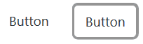
Digging back, here's the meeting where this aspect was decided in the May 2018 conf call, see also the survey. Which triggered this understanding update the same day. The first example on the current understanding page is this image: That was added in May 2018, and I think the input without a full boundary was added in June 2018.
The change was triggered by the comment from Funka, and it was pretty clear indication that the SC would have a negative impact as proposed.
That interpretation would lead to a lot of fails for navigation links, e.g. both Deque's and Nomensa's main navigation links do not have boundary indicators and shouldn't have passed as implementations if that were the case. These aspects were decided a year ago, the updates at the beginning of 2019 were around states & focus styles, nothing significant has changed in the understanding doc since January. |
|
It might be helpful understand where it is required -- checkbox, radio buttons, feedback stars, input (without placeholders), focus checked, and selected states. Not required for buttons, links, hamburger menus, page tabs, or anything that has text or icons inside of it. |
|
@alastc thank you for helping me see the decision I missed back in 2018. I had not seen the Funka feedback and realize I was on vacation the week that decision was made (and mea culpa for not reading the minutes that week). If I would have seen that decision (in time)...I would have explained that 1.4.11 never required a boundary on navigation. It only required that IF there is a visible boundary, it must be visible to everyone. (Deque.com would pass) But...I missed the moment in time to speak up. I could have helped Funka with their design challenge. Spilt milk. Time to move on. Apologies for bringing this up. Thanks again for helping me understand it truly was something that was decided by the whole group using the proper process. I owe you a beverage of your choice for any angst I caused. |
Closes #800.