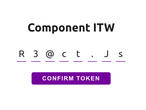
The Input-token-web, is a easy and beautiful component reactjs for web applications, allowing to obtain the token information entered by the user.
npm i input-token-webThis is overview of Input-Token-Web implementation. The next step, see each props separatly.
import InputTokenWeb from 'input-token-web';
...
<InputTokenWeb
    fontColor="#232129"
    borderColor="#663399"
    shadowColor="#6b07e6"
    size={4}
    onValidate={(code) => code.replace(/[^A-Za-z0-9]+/ig, '')}
    onComplete={(code) => setCodeAccess(code)}
onChange={(code) => setDisableButton(code.length < 8)} />This is used for change font color of string component
fontColor="#232129"This is used for change border color of caracteres box
borderColor="#663399"This is used for change border color of caracteres box active
shadowColor="#6b07e6"This is used for change number of the character box. Default value is 8
size={8}This is function used for validation of token received, this function callback required return token validated
onValidate={(code) => yourValidate(code)}This is function used for send token when completed
onComplete={(code) => yourFunction(code))}This is the function used to receive the token, when the user updates the input
onChange={(code) => yourOnChange(code)}MIT Licence. See the file LICENSE for more details.
Developed by Walesson Silva 👋 See my Linkedin!


