-
-
Notifications
You must be signed in to change notification settings - Fork 538
New issue
Have a question about this project? Sign up for a free GitHub account to open an issue and contact its maintainers and the community.
By clicking “Sign up for GitHub”, you agree to our terms of service and privacy statement. We’ll occasionally send you account related emails.
Already on GitHub? Sign in to your account
New extension icon #2430
Comments
|
Yeah - the original one comes from audioscrobbler days :) While I love the current one, you're right - it's not a true representation of the scope of the extension now. I added help wanted since neither of us are designers... I used to dabble a bit with it back in the day but It's been far too long. |
I had the same idea and played around a bit a while ago but couldn't come up with anything I really like. Modifying an existing icon was easier (and in hindsight probably shouldn't have been done), but creating a new one is beyond me. I'll attach what I came up with. I'm again without Adobe Illustrator and using Inkscape is just too painful, so I won't be able to do a pull request. But anyone can use the attached files. https://drive.google.com/file/d/1pI5A4vpYuPEAWsVwWmBobhKueOncSjsa/view?usp=sharing |
|
@Paszt Thanks for the suggestion! The blue one looks nicer IMO. :) I have Adobe Illustrator... well, that's all I have. If someone have an idea, they could share a sketch scan, and I will try to make an icon/logo from it. Also, I don't mind if we use a some abstract symbol instead of "WS" letters. |
|
I like the top one more - it feels more in-line with the current one which reflects the good old audioscrobbler days :D |
|
The one that looks like a sound wave is really good. |
|
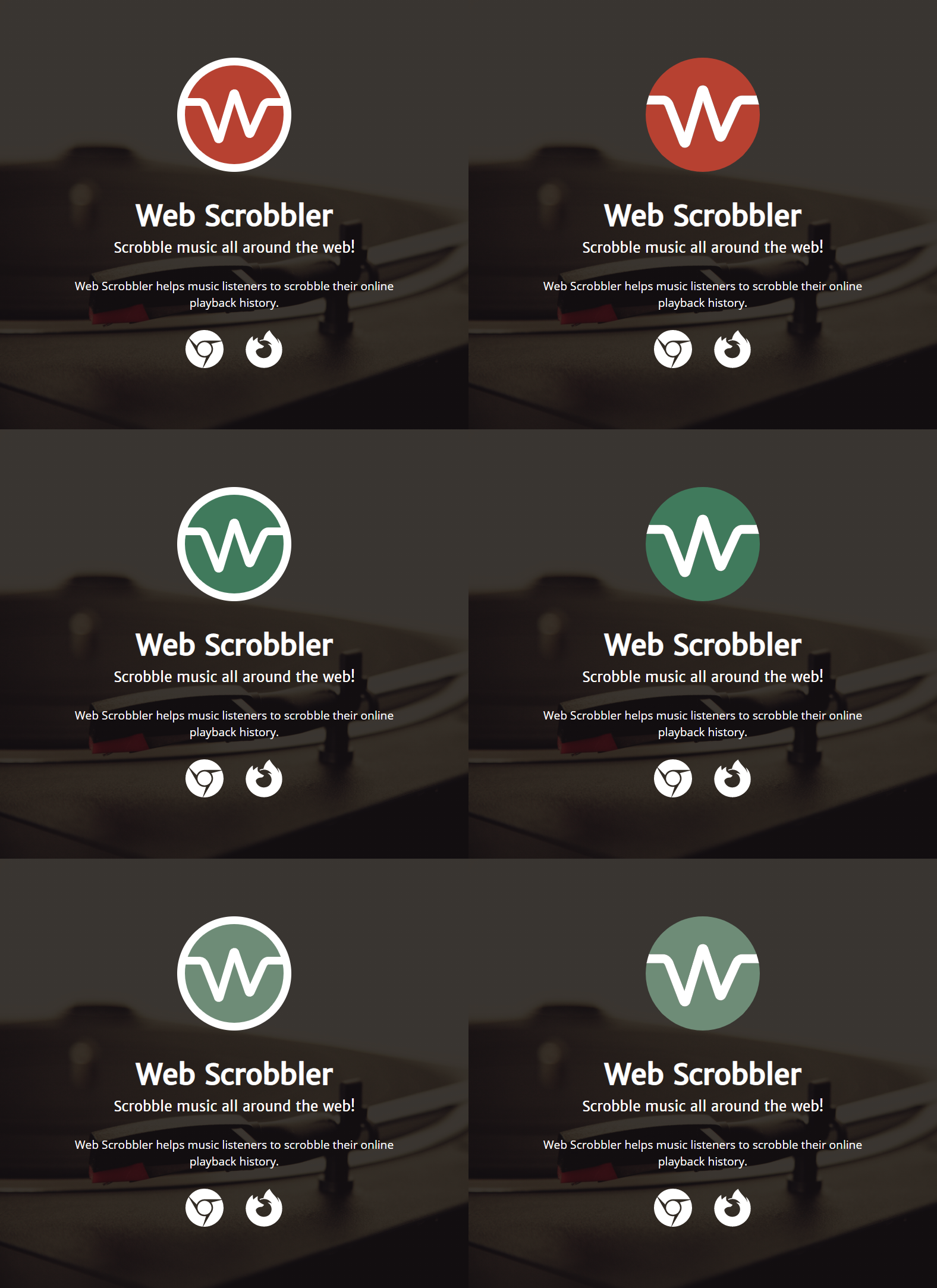
Thanks for the feedback, guys. I played with the first icon more, added a circle version, and added outline for circle icon. To get the icon color I used https://mycolor.space/. So I was need to get the initial color to generate a color palette to choose the icon color from the palette. Since I plan on using the icon on the new WS website, I generated colors from the website header background, and picked one of them ( https://mycolor.space/?hex=%239C7F6B&sub=1 From that palettes I used some colors I liked. Initially I wanted to get rid of the red color, but Also I want to keep both default and outline version, but I can't choose between inner and outer border. |
|
All three look nice - yeah it's a tough one to choose |
|
I like the red, no outer circle. The red is similar to the previous version. |
|
Looks interesting! |
|
This looks way better than the square icon, which looks a little outdated with all the circle icons nowadays |
|
@arkhi it's the same as an accessibility extension I use |
|
Any flirtation with letter "W" and "S" always sucked into WC idiom... 🚾🚽
The device is scrobbler. For scrobbling music, lol. |
|
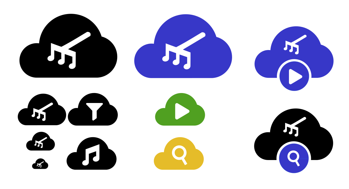
It has become necessary to change logo quickly due to apple review (they do not allow usage of the audioscrobbler as). Circular icons are quite rare on app store, and the previous icon doesn't feel like it has much of a connection to scrobbling, so I tried my hand at yet another variant by sbubbying the lastfm logo. It does remain somewhat closer to lastfm though, but is not flat out using the lastfm logo anymore. I feel like it more clearly represents what the application does, but I've been wrong before. This currently has the different colored edges of v2, so that issue is not really solved. The decision will have to be relatively quick since v3 cannot go out before it has been decided, but there is one other issue that needs resolution first anyway that probably takes a couple days at best. |


Although the current icon is pretty nice, it has some issues:
The extension supports Libre.fm, and ListenBrainz as well.
The extension support Firefox, and every browser based on Chromium.
This point was partially fixed by adding a Firefox-stylized icon for Firefox, but the main icon (Chrome version) is used elsewhere (other browsers, a extension website, a social media preview, etc), and it's still an issue.
Again, the current icon is great, but it became outdated a little since the extension is being actively developed.
I'm a bad designer, and I have no idea how the new icon should be look like. Perhaps, we can play with "W" and "S" letters somehow. Suggestions are very welcome!
I know designing is pretty hard, and there're no chances to resolve the issue, but there was a suggestion some time ago (#650, thanks @Paszt!), so I'm giving a try and submitting this one.
The current icons for reference:


The text was updated successfully, but these errors were encountered: