www.wetteronline.de - Desktop page instead of mobile on "Feedback" page #8581
Comments
 softvision-oana-arbuzov
changed the title
softvision-oana-arbuzov
changed the title
|
Thanks for the report @softvision-oana-arbuzov. It appears we are getting the same content as Chrome, spoofing the user agent doesn't fix our problem here. I believe the difference is how Chrome is handling the viewport tag. Let's ping @karlcow for this. <meta name="viewport" content="width=device-width">If we change that to: It looks more like Chrome in Firefox. It may make more sense to make the site more responsive. Let's see what Karl has to say. Firefox w/updated viewport: |

 adamopenweb
added
browser-firefox-mobile
status-needsdiagnosis
and removed
status-needstriage
labels
adamopenweb
added
browser-firefox-mobile
status-needsdiagnosis
and removed
status-needstriage
labels
|
https://bugzilla.mozilla.org/show_bug.cgi?id=1123938 html/body are set to the width of the viewport #contentcontainer, #leftcontainer, #totalcontainer, body, html {
height: 100%;
-webkit-text-size-adjust: none;
font-size: 100%;
min-height: 673px;
width: 100%;
}so for example for me, it will be 360px. but #contentcontainer, #leftcontainer, #totalcontainer {
max-width: 675px !important;
min-width: 675px;
}Duplicate of https://bugzilla.mozilla.org/show_bug.cgi?id=1123938 |
|
Just a note for webcompat historians and archivists, the site has been fixed. Let's see how: <meta name="viewport" content="width=device-width, initial-scale=1, user-scalable=no">html {
font-size: 100%;
width: 100%;
height: 100%;
overflow-x: hidden;
-webkit-text-size-adjust: 100%;
}
body {
margin: 0;
-webkit-backface-visibility: hidden;
min-width: 320px;
max-width: 700px;
width: 100%;
min-height: 100%;
display: -webkit-box;
display: -webkit-flex;
display: -ms-flexbox;
display: flex;
-webkit-box-orient: vertical;
-webkit-box-direction: normal;
-webkit-flex-direction: column;
-ms-flex-direction: column;
flex-direction: column;
overflow-x: hidden;
-webkit-tap-highlight-color: transparent;
background: #fff;
color: #3c3c3c;
}
main {
	width: 100%;
	-webkit-box-flex: 1;
	-webkit-flex: 1;
	-ms-flex: 1;
	flex: 1;
	margin-top: 60px;
}
I will change the status from duplicate to worksforme as we did not contact them. |
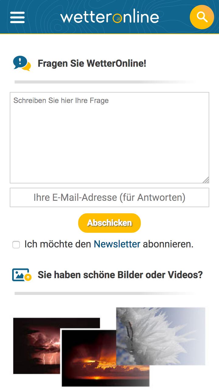
URL: https://www.wetteronline.de/kontakt
Browser / Version: Firefox Mobile Nightly 56.0a1 (2017-07-31)
Operating System: LG G5 (Android 7.0) - Resolution 1440 x 2560 pixels (~554 ppi pixel density)
Tested Another Browser: Yes
Problem type: Desktop site instead of mobile site
Description: Desktop page instead of mobile on "Feedback" page
Steps to Reproduce:
Expected Behavior:
Mobile page is displayed.
Actual Behavior:
Partial desktop page is displayed (page can be scrolled left/right).
Note:
Watchers:
@softvision-sergiulogigan
@softvision-oana-arbuzov
sv; country: de
From webcompat.com with ❤️
The text was updated successfully, but these errors were encountered: