Block: Button #9
Comments
|
@jwold Where do you enter the link? |
|
@dugajean I forgot to include that, just updated the GIF prototype. Thanks! It's now as a setting in the sidebar at the bottom. |
|
AC and prototype have both been updated. |
|
@jwold Could you add individual screenshots for the larger components (icon picker, color picker)? I'm having a hard time seeing the icon picker design while it's moving so much 😄. |
|
@dugajean I updated two of the subtasks, and saw that Ravi did the other! :) |
|
@dugajean can you write the implementation brief for this? Thanks! |
|
@jwold Done. Let me know if that is what you expected. |
|
@dugajean this looks really great! Thanks :) |
|
@dugajean @ravichdev based on the Demo last week, we have some feedback. I put this on the parent issue for now, but can move to the child issues if we want to re-open them. Rounded Corners:
New SVG styles: Color Picker:
|

This comment has been minimized.
This comment has been minimized.
|
Discussion to add icon button to this. Thinking through how that would work. |
|
Based on feedback in Slack we've been discussing extending this block to include I realize it's a bit of a departure from what we had, so I'm guessing we'll need to add this to an issue for a future Sprint.
cc @dugajean and @ravichdev |

|
Found a few issues in QA when reviewing the block on staging:
cc @ravichdev |
|
@jwold - should we have an "x"/"close" for the Color Palette and Custom Color popups? |


|
Great question @csossi! This may be something to consider in the future. However, for now we're ok to go without the close indicators, since this is a pattern that already exists in WordPress. |
|
@jwold - fyi, the following remain outstanding on staging site (per your comments above)
|
@csossi Great catch. I've verified that the
Oh interesting, you're right. I see that the corner ACTUALLY maxes at 20, but the slider lets you go further. That's a bug, but not necessarily a blocker. Will check with the team on that. Thanks! |
|
I've opened a bug report for the two QA issues: #184 |
Feature description
Do not alter or remove anything below. The following sections will be managed by moderators only.
Acceptance criteria
Adding the button
Styles: Text,Container: Contained,Icon: NoneButtonEditing the button
Changing button settings
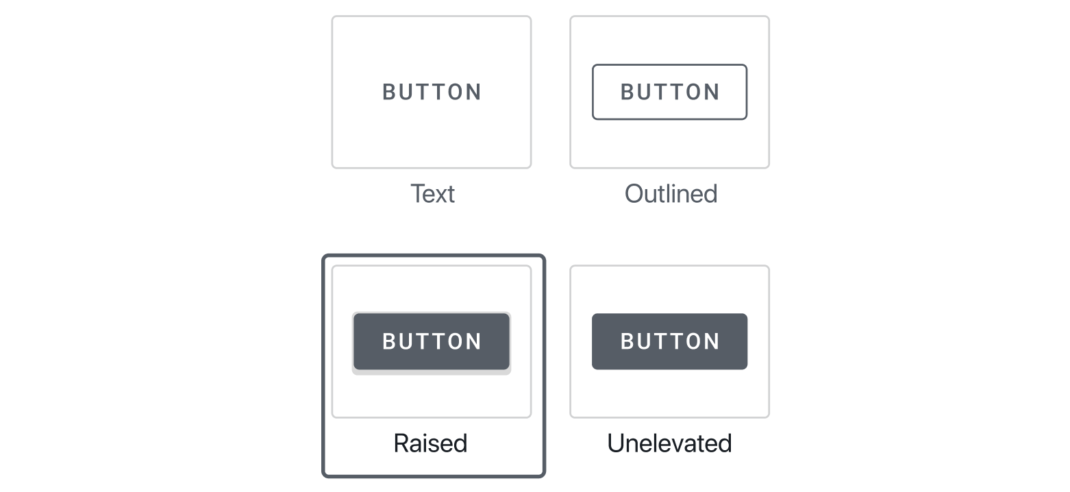
Text,Outlined,Raised,Unelevatedas the options. Here's a demo to check against from the actual web component: https://material-components.github.io/material-components-web-catalog/#/component/buttonIcons
Text, you can add an icon at the beginning or end of the button by selectingLeadingorTrailing. If you select one of those the button block should add thefavoriteicon immediately as an example, allowing you to then change it.Icon: None. But if you turn it back on it defaults to the last icon you used, or if you didn't use one, defaults to theFavoriteicon.Colors
Color palette.Custom Color, which shows a color wheel and allows entering a hex.ClearColor palette borders correspond to darker variation of color(don't believe this is necessary)Rounded Corners
Container: Outlined,Container: Raised,Container: Unelevated, then you should be able to change the corner style from 0 to 20 (screenshot from shape scheme tool: https://d.pr/i/Mkg1qN)Prototype:
Figma link
Styles
Styles.zip
Icon
crop_7_5-24px.svg.zip
Implementation brief
.activeclass appropriately.contentEditableto make the label of the button editableTextControlcomponent to allow for user to change target URL. Switch to advanced URL picker soon.ContrastCheckercomponent, checking the contrast between background and text, displaying a warning appropriately.RangeControlcomponent, which adjusts the inline styles of the outest button container to apply aborder-radiusToggleControlwhich when checked, stores_blankas the attribute value. We then apply this directly on the anchor element.TextControlcomponent.QA testing instructions
Note 1: With most of these changes you'll also want to see if the frontend is working, and not just the Gutenberg preview. It's possible there are discrepancies.
Note 2: For now we're just testing with the theme set in the staging env, we'll need to come back later and test with the top five themes that we approve.
Add a new button block and see if the suggested defaults all work as expected
See if description and icon match AC
Change the label
Add a link, validate that it works when previewing block on frontend
Change button styles and see if they match the web component: https://material-components.github.io/material-components-web-catalog/#/component/button
See if opening link in new tab works
Change the font in the Customizer, publish it, and see if the button font updates.
Before you change the button color: Change the color in the Customizer, publish it, and see if the button color changes in the block to match Customizer (it should)
After you change the button color in the block, goes to the Customizer and change it, then come back to the block and see if it matches the Customizer (it shouldn't)
The colors shown as available should be the primary and secondary colors from the Customizer, but the primary should always be set by default. Ensure that these two colors match what's set in the Customizer.
See if accessibility notices appear when colors aren't accessible, and verify those notices match with the color tool https://material.io/resources/color/#!/?view.left=0&view.right=0 (screenshot: https://d.pr/i/75qBjI)
Change color from color palette, see if works as expected
Change color by selecting custom color, see if works as expected.
Try clearing color, when you clear it should revert to what is set in Customizer
Try adding leading and trailing icons and see if that matches the material web component
Ensure that the icon collection matches the style set in Customizer, try changing Customizer a few times to ensure that the icon collection updates in Gutenberg
Rounded corners should be changeable and match the shape scheme tool in terms of constraints. Screenshot: https://d.pr/i/Rz76Gc, link: https://material.io/design/shape/about-shape.html#shape-customization-tool
Demo
Video: https://d.pr/v/EJWiyN
Changelog entry
The text was updated successfully, but these errors were encountered: