

A lightweight plugin to render a simple, animated progress bar.
- highly customizable
- very easy to implement
$ npm i ngx-i24-progress-bar@latest
import { NgxI24ProgressBarModule } from 'ngx-i24-progress-bar';
@NgModule({
  declarations: [ AppComponent ],
  imports: [BrowserModule, NgxI24ProgressBarModule  ],
  bootstrap: [AppComponent]
})
export class AppModule { }import { Component } from '@angular/core';
@Component({
selector: 'app-root',
templateUrl: './app.component.html',
styleUrls: ['./app.component.scss']
})
export class AppComponent {
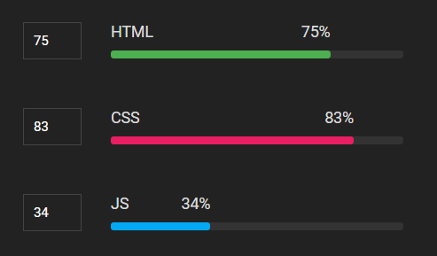
percentage = 89;
text = 'HTML';
}<ngx-i24-progress-bar [percentage]="percentage" [text]="text" ></ngx-i24-progress-bar>| Property (Type) | Default | Description |
|---|---|---|
| percentage | 0 | The percent value 0 - 100 |
| text | HTML | The text value |
| textColor | '#222' | The text color |
| percentageRadius | '3px' | The border radius |
| percentageHeight | '8px' | The height of percentage |
| percentageColor | '#222' | The color of percentage text |
| progressBackColor | '#eee' | The border radius |
| progressColor | '#e91e63' | The border radius |
| spaceBetween | '10px' | The space between the text and the progress |
| Name | Link | Description |
|---|---|---|
| ngx-i24-circular-progress | Link | A lightweight plugin to render a simple, animated circular progress bar. |
| ngx-i24-progress-bar | Link | A lightweight plugin to render a simple, animated progress bar. |
| ngx-weekday-picker | Link | Lightweight plugin to a pick weekday. |
| ngx-i24-color-picker | Link | A lightweight plugin to pick a color. |
| ngx-i24-checkbox | Link | A lightweight plugin to display a modern checkbox. |

Copyright (c) 2022 Yaseen Alrefaee, contributors. Released under the MIT