1、克隆项目到本地
git clone https://github.com/zengjielin/vue-component-library.git
2、安装依赖
npm install
3、运行项目
npm run dev

备注:组件都处于封装状态,可以直接复制用到自己的项目中。
#安装sass的依赖包
npm install --save-dev sass-loader
//sass-loader依赖于node-sass
npm install --save-dev node-sass

#在build文件夹下的webpack.base.conf.js的rules里面添加配置
{
  test: /\.sass$/,
  loaders: ['style', 'css', 'sass']
}
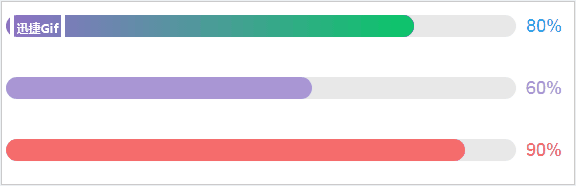
Name: config
Type: Object
Default:  {
            background: "#0cc769",
            color: "#0cc769",
            startGradient: "#adfc77",
            endGradient: "#09c669"
          }
Describe: 配置进度条样式,其中background进度条的样式,color右边数字的颜色,
          startGradient渐变色开始颜色,endGradient渐变色结束颜色 ,
Remark:若使用了该配置,上面的属性属性一定要全,否则样式会错乱。

Name: percent
Type: Number
Default: 0
Describe: 进度条已完成进度

Name: height
Type: Number
Default: 22
Describe: 进度条的高度

Name: gradient
Type: Boolean
Default: false
Describe: 是否开启进度条背景色,如果为true,config中的startGradient和endGradient务必要填,否则不生效
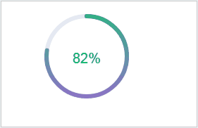
Name: progressConfig
Type: Object
Default:  {
            ringWidth: 24,
            ringBackground: "#E5E9F2",
            ringColor: "#5EE270",
            startGradient: "#adfc77",
            endGradient:"#09c669"
          }
Describe: 配置进度条样式,其中ringWidth圆环的宽度,ringBackground进度条的背景色,
          ringColor进度条的颜色,startGradient开始渐变色,当progressGradient为true时生效,
          endGradient结束渐变色,当progressGradient为true时生效
Remark:若使用了该配置,上面的属性属性一定要全,否则样式会错乱。

Name: circleRadius
Type: Number
Default: 190
Describe: 进度条的半径

Name: percent
Type: Number
Default: 0
Describe: 进度条已完成进度

Name: progressGradient
Type: Boolean
Default: false
Describe: 进度条是否使用渐变

Name: percentConfig
Type: Object
Default:  {
            size: 30,
            txtColor: "#E5E9F2",
            startGradient: "#adfc77",
            endGradient:"#09c669"
          }
Describe: 配置进度条样式,其中size文字大小,txtColor文字颜色,startGradient开始渐变色,
          当progressGradient为true时生效,endGradient结束渐变色,当progressGradient为true时生效
Remark:若使用了该配置,上面的属性属性一定要全,否则样式会错乱。

Name: percentGradient
Type: Boolean
Default: false
Describe: 进度条是否使用文字渐变
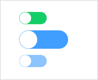
Name: v-model
Type: Boolean
Default: true
Describe: v-model的值,默认是true

Name: width
Type: Number
Default: 60
Describe: switch的宽度

Name: height
Type: Number
Default: 30
Describe: switch的高度

Name: background
Type: String
Default: '#ff4949'
Describe: switch背景色

Name: disabled
Type: Boolean
Default: false
Describe: 是否禁止使用,只能传true或false,否则报错
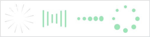
ComponentName: Loading1
Name: width
Type: Number
Default: 100
Describe: 组件的宽度,默认高度等于宽度
Remark: 第一种loading

注意:另外三种loading的props一样
ComponentName: Loading2,Loading3,Loading4
Name: width
Type
Default: 100: Number
Describe: 组件的宽度,组件会根据传过来的宽度进行伸缩

ComponentName: Loading2,Loading3,Loading4
Name: color
Type: String
Default: '#acd8e4
Describe: 组件的颜色,背景色默认为透明