Implement welcome guide modal #18041
Conversation
 noisysocks
added
[Type] Enhancement
noisysocks
force-pushed
the
add/welcome-guide
branch
from
noisysocks
added
[Type] Enhancement
noisysocks
force-pushed
the
add/welcome-guide
branch
from
9aed3a9
to
bab8f7b
Compare
|
There's still lots to do here, but it would be good to get some early design feedback 🙂 |
|
Hey @noisysocks! 👋 Happy to help with design feedback. How can I get this to show up on my local install? |
|
Thanks @enriquesanchez! You can check out the branch and then open the Welcome Guide from the More menu:
|
 noisysocks
force-pushed
the
add/welcome-guide
branch
3 times, most recently
from
noisysocks
force-pushed
the
add/welcome-guide
branch
3 times, most recently
from
4dfdc1c
to
bc79748
Compare
| return ( | ||
| <Modal | ||
| className="edit-post-welcome-guide-modal" | ||
| shouldCloseOnClickOutside={ false } |
There was a problem hiding this comment.
I've disabled this to work around an issue where the modal is immediately dismissed on page load because the post's title field receives focus. Let me know if you can think of a better alternative!
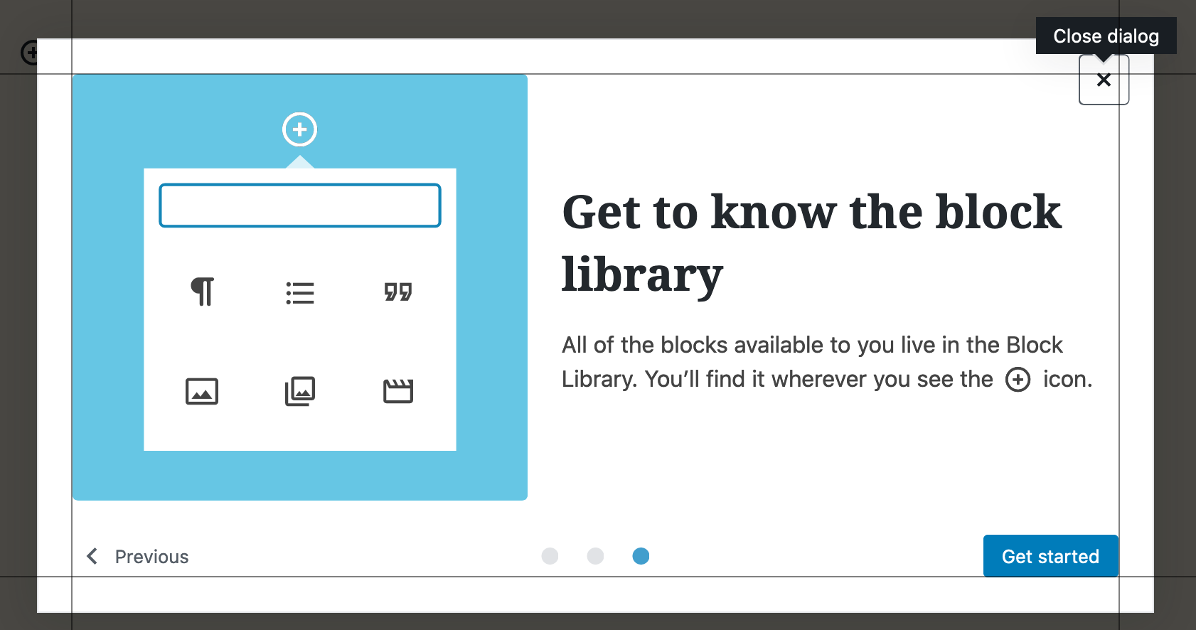
| { __experimentalCreateInterpolateElement( | ||
| __( 'All of the blocks available to you live in the Block Library. You’ll find it wherever you see the <InserterIconImage /> icon.' ), | ||
| { | ||
| InserterIconImage: ( |
There was a problem hiding this comment.
I like how you chose to name the property to align with the component name, but in-so-doing it occurs to me whether we ought to have any coding guidelines around the names we choose for these interpolated keys? cc @nerrad
There was a problem hiding this comment.
I think this is a question best answered by those working more closely with translators.
One of the intents behind the interface is to provide additional guidance to translators on what a tag represents and signal that it shouldn't be translated. With WordPress core in particular, I think generally translators know to leave tags alone (although that has been a smaller subset of tags I think).
I think others might be better equipped to detail what standards we should have. cc @ocean90 , @swissspidy or @akirk , do you have any guidance here?
There was a problem hiding this comment.
I am huge proponent of "speaking" component placeholders. It's a very easy way to convey to translators what is being substituted here. InserterIconImage sounds good to me.
How and where would be put coding guidelines for this?
There was a problem hiding this comment.
I like this proposal. Assuming that it's copied to all translations it would work great 👍
For the full picture, there are some drawbacks discussed in the PR which test this new API. The discussion triggered by @johnbillion starts with this comment: #18623 (comment).
There was a problem hiding this comment.
@akirk do you suggest that the following:
{ __experimentalCreateInterpolateElement(
	__( 'While writing, you can press <kbd>/</kbd> to quickly insert new blocks.' ),
	{ kbd: <kbd /> }
) }
could be easier refactored to:
{ __experimentalCreateInterpolateElement(
	__( 'While writing, you can press <Shortcut /> to quickly insert new blocks.' ),
	{ Shortcut: <kbd>/</kbd> }
) }
|
Would it be possible for the Separately, it looks like #12632 would still be effected by this tips redesign. AFAICT, the close button here is dismissing all guides instead of just the current "guide". |
Good suggestion! I'll look into this. @mapk: Do you think a guide component would be useful outside of WP Admin? If so, then I think we should consider putting
Thanks for pointing me to #12632. I'll look into moving away from |
YES! Adding this to |
|
I really like how this is shaping up! Great work. Here's some design feedback: 1. First image needs to be centered better.The webpage in the graphic feels like it's not quite centered. Even the blocks in the webpage don't look centered.
2. First two graphics should be equal width.I think this may help visually if both graphics in the first two images are equal width within the blue container.
3. Should we capitalize certain things?"Block Editor" or "Block Library" seem like proper nouns. For example, we capitalize Block Library in the sentence, but not in the heading of the third screen. 4. Second screen text additionShould we mention that you can move the block toolbar to be fixed at the top of the screen for less visual distractions? 5. This icon can probably use some visual cleanup.Also lets make the triangle white to match the popover graphic too. Right now it's grey.
I think these last few changes will dial it in beautifully. |


|
Hey @noisysocks! This is looking great! 🎉 VisualsWould it be possible to align the close button so it has the same space around like the previous and next/get-started buttons?
I also noticed that the hover state of the page control buttons looks a bit off. It looks like the right border is missing half a pixel (I'm on a retina display).
AccessibilityI was able to interact with the welcome guide using only my keyboard 👍 I also did a quick test with Voice Over and had a couple of issues: The page control buttons could use an I'm thinking these could be grouped on a I don't think the images need an Overall, this is looking great! Let me know what you think of my comments and suggestions. |

|
@noisysocks where are you getting the images from? Let me know if you need help with Mark's suggestions on alignment and size. |
|
Thanks @mapk and @enriquesanchez! I'll work through your suggestions.
I would absolutely love it if you could update the images for me! I got the SVGs from @jasmussen, who I think exported them from the 'Tips Iteration' project in the WordPress.org Figma team. |
|
Hey @noisysocks! (I never get tired of your username 😃) Here are the new SVGs with Mark's suggested changes: |
|
Wait, I noticed the add block icon on 'illustration 3.svg` was still showing some weird artifacts. Here's a cleaner version: |
noisysocks
force-pushed
the
add/welcome-guide
branch
from
bc79748
to
92e1773
Compare
👍 I updated the images in d8cee821dc14c4c4dbb9494534f2b0411e97422e. Thanks for fixing those up @enriquesanchez!
👍 I capitalised 'Block Editor' and 'Block Library' in 745fdd44ceb3821af508a90ebbd35411a9107f8c.
I'll defer to you all on this one. Let me know what you'd like the copy to be and I can update it.
I updated the alignment in 47c2879888c27ee743c1b7189197977c210b20fc, though I wonder if doing this makes the X button look too much like 'content' instead of 'chrome'? Let me know what you think.
👍 I updated the page controls to use the markup you suggested in 92e1773ddd73af1851c480ece84af2f8c709d565.
The images already have an empty |
 noisysocks
force-pushed
the
add/welcome-guide
branch
from
noisysocks
force-pushed
the
add/welcome-guide
branch
from
92e1773
to
99c80cc
Compare
Let's look at making the welcome guide use something other than
I've left |
|
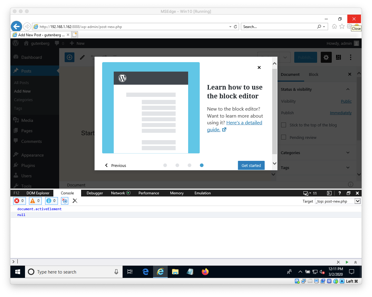
The modal is not labelled. This is in part a problem with this modal, but should probably be corrected in the component: the Modal component allows the component to be misused. We should enforce a label for the modal element with role=dialog within the e2e tests, because all modals must be labelled. Additionally, the modal component should enforce 'role="document"' on the content of all modal dialogs. This isn't strictly required on all modals, but the component can't know what type of content a modal will contain, this will give the best overall experience. There are usability problems with having this modal open automatically on page load.
One possible way that this could be made available is to add a prominent button for users to launch the Welcome Modal if they are detected as new Gutenberg users. The modal, in that case, should have two cancel actions: one that simply closes the modal, and one that dismisses it persistently. As a second issue, the method for assessing whether a user is "new" to Gutenberg is significantly flawed: the usage of local storage for this means that a user will be new on every device they use, on every browser they use, and on every new site they launch. Secondarily, because the detection appears to be based on the positive presence of 'modal dismissed' setting in local storage, it will essentially be impossible to permanently disable it; anytime the local storage is flushed it will come back. (See #15105) |
| } | ||
| } | ||
|
|
||
| &__container { |
There was a problem hiding this comment.
While I think this convention certainly makes things more concise, in practice I find it adds difficulty to a very common use-case of searching for a class name in the codebase. To try to search for "components-guide__container" would not yield this as a result.
While it requires a couple more characters to type, I would personally advocate to use the fully expanded form in source:
.components-guide__container {
 jorgefilipecosta
added
the
Needs Dev Note
jorgefilipecosta
added
the
Needs Dev Note
| // Focus the button on mount if nothing else is focused. This prevents a | ||
| // focus loss when the 'Next' button is swapped out. | ||
| useLayoutEffect( () => { | ||
| if ( document.activeElement === document.body ) { |
There was a problem hiding this comment.
In #20594, I am encountering an issue where we make certain assumptions about what it means for "no focus" to exist. It appears that the value of activeElement may differ depending on browser:
When there is no selection, the active element is the page's
<body>ornull.
https://developer.mozilla.org/en-US/docs/Web/API/DocumentOrShadowRoot/activeElement
I mention it here, since this may not cover all focus losses, notably those in Internet Explorer. Specifically, this condition is only checking for the first of these two possible "no active element" scenarios.
It might be something where we want to provide some utility, e.g. wp.dom.hasActiveElement, since it seems to be an easy issue to overlook.
Edit: I confirmed that there is a focus loss which occurs when reaching the last page of the guide in Internet Explorer:
 youknowriad
removed
the
Needs Dev Note
youknowriad
removed
the
Needs Dev Note
Closes #16315.
Implements the welcome guide modal described in #16315 (comment).
What's changed
Guidecomponent in@wordpress/nuxwhich implements the guide modal in a reusable way. This is marked experimental so that we can potentially move this to@wordpress/componentsin a follow-up PR.WelcomeGuidein@wordpress/edit-postwill useGuideto display a welcome guide for the block editor if the user has not previously disabled tips. This replaces all of our instances of theDotTipcomponent. We can potentially move away from usinghasDisabledTipsin a follow-up PR.How to test
Unit and E2E tests are included. To manually test the upgrade process, follow these steps:
master, open the block editor and ensure that you have dismissed tips.localStorageto simulate being a new user.