Contribution points
This document covers the various contribution points that are defined in the package.json extension manifest. These are in addition to the ones inherited by VS Code.
Defines a connection provider, which is added the list of connections a user can create a connection profile from. The extension defining this must also register a connection provider using azdata.dataprotocol.registerConnectionProvider to handle actually making the connections.
type: string
The connection provider id, e.g. MSSQL, LOGANALYTICS
type: string
The display name of the connection provider, e.g. Microsoft SQL Server, Azure Monitor Logs
type: string or object
Path to the connection provider's icon
type: string
type: object
type: string
type: string
type: boolean
type: boolean
Whether or not to use all non-default advanced options to create connection URI that uniquely identifies a connection. This configuration is set to 'false' by default. By default, only options specified with a 'specialValueType' are considered for creating connection URI.
type: string
Azure resource endpoint to be used by the connection provider. Defaults to Sql if not specified.
type: string
Alias to be used for the kernel in notebooks
type: object
Connection string options for the connection provider
type: boolean
Whether the connection provider supports connection string as an input option. The default value is false.
type: boolean
Whether the connection provider uses connection string as the default option to connect. The default value is false.
type: boolean
Boolean indicating whether the connection provider supports queries. The default value is true.
type: boolean
Boolean indicating whether the connection provider supports execution plan.
type: array
List of file extensions supported by the execution plan provider, if execution plan is supported.
type: boolean
Boolean indicating whether the provider support copy results to clipboard. Default value is false. If true, the copy results to clipboard will be delegated to the provider to avoid passing large amount of data using the RPC channel, otherwise ADS will handle the copy request on the UI side.
type: string
The server defined name of the ID assigned to all connections (such as editors or object explorer nodes) if it is supported by the provider, such as PID used by SQL Server, this is used for display in areas such as Query Editor where knowing the process ID is needed.
type: array
An array of objects with the following properties that define the connection options to display in the Connection Dialog.
type: string
type: string
type: string
type: string
type: enum
Either string, multistring, password, number, category, boolean or object
type: enum
Either connectionName, serverName, databaseName, authType, userName, password or appName
type: string, number, boolean, object, integer, null or array
type: array
type: enum
Either Windows, Macintosh or Linux
type: string, number, boolean, object, integer, null or array
type: string
type: array
type: string
type: string
type: boolean
When set to true, the respective connection option will be rendered on the main connection dialog and not the Advanced Options window.
type: string
The placeholder text to show in option control when it's value is empty.
type: array
Used to define list of values based on which another option is rendered visible/hidden.
type: array
Values that affect actions defined in this event.
type: array
Action to be taken on another option when selected value matches to the list of values provided.
type: string
Name of option affected by defined action.
type: enum
Action to be taken. Either show or hide.
type: boolean
Whether or not the option should be set to required when visible. Defaults to false.
type: boolean
type: boolean
type: boolean
This is an array of dataExplorer contributions, each with the following properties. This is used to add views to the Connections view container in the panel - it currently doesn't support having views adding through the normal contributes.views extension point from VS Code.
The ID of the view - used when registering the associated vscode.TreeDataProvider
The human-readable name of the view shown in the title bar
The when-clause condition for when the view will be shown
These are custom menu contributions for Azure Data Studio, in addition to the built-in ones inherited from VS Code.
Menu items for Data Explorer contributed views.
Menu items for the Object Explorer (Server) tree view
To set an item as the default menu item when a node is double-clicked, you can set the isDefault property to true. An error will be logged to the console if multiple menu items are set as the default action for a node and none of them will be executed.
Example:
        {
          "command": "mssql.objectProperties",
          "when": "connectionProvider == MSSQL && nodeType =~ /^(ServerLevelLogin|User)$/ && config.workbench.enablePreviewFeatures",
          "group": "0_query@1",
          "isDefault": true
        }
Contribute tab, container, insight widget to the dashboard.
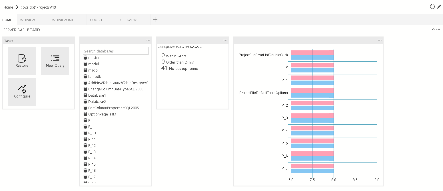
dashboard.tabs will create the tab sections inside the dashboard page. It expects an object or an array of objects.
"dashboard.tabs": [
	{
		"id": "test-tab1",
		"title": "Test 1",
		"description": "The test 1 displays a list of widgets.",
		"when": "connectionProvider == 'MSSQL' && !mssql:iscloud",
		"alwaysShow": true,
		"container": {
			…
		}
	}
]
Instead of specifying dashboard container inline (inside the dashboard.tab). You can register containers using dashboard.containers. It accepts an object or an array of the object.
"dashboard.containers": [
	{
		"id": "innerTab1",
		"container": {
			…
		}
	},
	{
		"id": "innerTab2",
		"container": {
			…
		}
	}
]
To refer to registered container, you can simply specify the id of the container
"dashboard.tabs": [
	{
		...
		"container": {
			"innerTab1": {
			}
		}
	}
]
You can register insights using dashboard.insights. This is similiar to Tutorial: Build a custom insight widget
"dashboard.insights": {
	"id": "my-widget"
	"type": {
		"count": {
			"dataDirection": "vertical",
			"dataType": "number",
			"legendPosition": "none",
            "labelFirstColumn": false,
			"columnsAsLabels": false
        }
    },
    "queryFile": "{your file folder}/activeSession.sql"
}
There are 4 different container types that we currently support:
-
widgets-container The list of widgets that will be displayed in the container. It’s a flow layout. It accepts the list of widgets.
"container": { "widgets-container": [ { "widget": { "query-data-store-db-insight": { } } }, { "widget": { "explorer-widget": { } } } ] } -
webview-container The webview will be displayed in the entire container. It expects webview id to be the same is tab ID
"container": { "webview-container": null } -
grid-container The list of widgets or webviews that will be displayed in the grid layout
"container": { "grid-container": [ { "name": "widget 1", "widget": { "explorer-widget": { } }, "row":0, "col":0 }, { "name": "widget 2", "widget": { "tasks-widget": { "backup", "restore", "configureDashboard", "newQuery" } }, "row":0, "col":1 }, { "name": "Webview 1", "webview": { "id": "google" }, "row":1, "col":0, "colspan":2 }, { "name": "widget 3", "widget": { "explorer-widget": {} }, "row":0, "col":3, "rowspan":2 }, ] -
nav-section The navigation section will be displayed in the container
"container": {
	"nav-section": [
		{
			"id": "innerTab1",
			"title": "inner-tab1",
			"icon": {
				"light": "./icons/tab1Icon.svg",
				"dark": "./icons/tab1Icon_dark.svg"
			}
			"container": {
				…
			}
		},
		{
			"id": "innerTab2",
			"title": "inner-tab2",
			"icon": {
				"light": "./icons/tab2Icon.svg",
				"dark": "./icons/tab2Icon_dark.svg"
			}
			"container": {
				…
			}
		}
	]
}