\mainpage
Welcome to the FTXUI documentation!
This is a brief tutorial. You are also encouraged to self-learn by reading the examples.
@tableofcontents
Short example
To build a single frame, you need create an ftxui::Element, and display it on
a ftxui::Screen.
main.cpp
#include <ftxui/dom/elements.hpp>
#include <ftxui/screen/screen.hpp>
#include <iostream>

int main(void) {
  using namespace ftxui;

  // Define the document
  Element document =
    hbox({
      text("left")   | border,
      text("middle") | border | flex,
      text("right")  | border,
    });

  auto screen = Screen::Create(
    Dimension::Full(),       // Width
    Dimension::Fit(document) // Height
  );
  Render(screen, document);
  screen.Print();

  return EXIT_SUCCESS;
}
output
┌────┐┌────────────────────────────────────┐┌─────┐
│left││middle                              ││right│
└────┘└────────────────────────────────────┘└─────┘Assuming FTXUI is available or installed on the system.
CMakeLists.txt
cmake_minimum_required (VERSION 3.11)
find_package(ftxui 5 REQUIRED)
project(ftxui-starter LANGUAGES CXX VERSION 1.0.0)
add_executable(ftxui-starter src/main.cpp)
target_link_libraries(ftxui-starter
  PRIVATE ftxui::screen
  PRIVATE ftxui::dom
  PRIVATE ftxui::component # Not needed for this example.
)
If you want to fetch FTXUI using cmake:
CMakeLists.txt
cmake_minimum_required (VERSION 3.11)

include(FetchContent)
set(FETCHCONTENT_UPDATES_DISCONNECTED TRUE)
FetchContent_Declare(ftxui
  GIT_REPOSITORY https://github.com/ArthurSonzogni/ftxui
  GIT_TAG main # Important: Specify a version or a commit hash here.
)
FetchContent_MakeAvailable(ftxui)

project(ftxui-starter LANGUAGES CXX VERSION 1.0.0)
add_executable(ftxui-starter src/main.cpp)
target_link_libraries(ftxui-starter
  PRIVATE ftxui::screen
  PRIVATE ftxui::dom
  PRIVATE ftxui::component # Not needed for this example.
)mkdir build && cd build
cmake ..
make
./mainThe project is comprised of 3 modules:
-
ftxui/screen defines a
ftxui::Screen, a grid offtxui::Pixel. -
ftxui/dom is the main module. It defines a hierarchical set of
ftxui::Element. An element draws something on theftxui::Screen. It is responsive to the size of its container. -
ftxui/component The module is required if your program needs to respond to user input. It defines a set of
ftxui::Component. These components can be utilized to navigate using the arrow keys and/or cursor. There are several builtin widgets like checkbox/inputbox/etc to interact with. You can combine them, or even define your own custom components.
This is the visual element of the program. It defines a ftxui::Screen, which
is a grid of ftxui::Pixel. A Pixel represents a Unicode character and its
associated style (bold, colors, etc.). The screen can be printed as a string
using ftxui::Screen::ToString(). The following example highlights this
process:
  #include <ftxui/screen/screen.hpp>
  #include <iostream>

  int main(void) {
    using namespace ftxui;
    auto screen = Screen::Create(Dimension::Fixed(32), Dimension::Fixed(10));

    auto& pixel = screen.PixelAt(9,9);
    pixel.character = U'A';
    pixel.bold = true;
    pixel.foreground_color = Color::Blue;

    std::cout << screen.ToString();
    return EXIT_SUCCESS;
}This module defines a hierarchical set of ftxui::Element. An element manages
the layout and can be responsive to the terminal dimension changes. Note the
following example where this module is used to create a simple layout with a
number of operators:
Example:
// Define the document
Element document = vbox({
  text("The window") | bold | color(Color::Blue),
  gauge(0.5)
  text("The footer")
});

// Add a border, by calling the `ftxui::border` decorator function.
document = border(document);

// Add another border, using the pipe operator.
document = document | border.

// Add another border, using the |= operator.
document |= border
List of elements
The list of all elements are included and can be accessed by including the corresponding header file:
#include <ftxui/dom/elements.hpp>\include ftxui/dom/elements.hpp
The most simple widget. It displays a text.
text("I am a piece of text");I am a piece of text.Identical to ftxui::text, but displayed vertically.
Code:
vtext("HELLO");Terminal output:
H
E
L
L
OSimilar to ftxui::text, but the individual word are wrapped along multiple
lines, depending on the width of its container.
Sample Code:
paragraph("A very long text")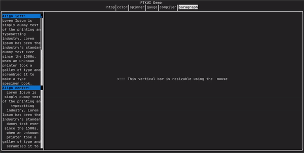
For a more detailed example refer to detailed example. Paragraph also includes a number of other variants as shown below:
Element paragraph(std::string text);
Element paragraphAlignLeft(std::string text);
Element paragraphAlignRight(std::string text);
Element paragraphAlignCenter(std::string text);
Element paragraphAlignJustify(std::string text);Adds a border around an element.
Code:
border(text("The element"))Terminal output:
┌───────────┐
│The element│
└───────────┘
You can achieve the same behavior by using the pipe operator.
Code:
text("The element") | borderBorder also comes in a variety of styles as shown below:
Element border(Element);
Element borderLight(Element);
Element borderHeavy(Element);
Element borderDouble(Element);
Element borderRounded(Element);
Element borderEmpty(Element);
Decorator borderStyled(BorderStyle);
Decorator borderWith(Pixel);A ftxui::window is a ftxui::border, but with an additional header. To add a
window around an element, wrap it and specify a string as the header.
Code:
window("The window", text("The element"))Terminal output:
┌The window─┐
│The element│
└───────────┘Displays a vertical/horizontal line to visually split the content of a container in two.
Code:
border(
  hbox({
    text("Left"),
    separator(),
    text("Right")
  })
)
Terminal output:
┌────┬─────┐
│left│right│
└────┴─────┘
Separators come in a variety of flavors as shown below:
Element separator(void);
Element separatorLight();
Element separatorHeavy();
Element separatorDouble();
Element separatorEmpty();
Element separatorStyled(BorderStyle);
Element separator(Pixel);
Element separatorCharacter(std::string);
Element separatorHSelector(float left,
                           float right,
                           Color background,
                           Color foreground);
Element separatorVSelector(float up,
                           float down,
                           Color background,
Color foreground);It constitutes a gauge. It can be used to represent a progress bar.
Code:
border(gauge(0.5))Teminal output:
┌────────────────────────────────────────────────────────────────────────────┐
│██████████████████████████████████████                                      │
└────────────────────────────────────────────────────────────────────────────┘
Gauges can be displayed in many orientations as shown below:
Element gauge(float ratio);
Element gaugeLeft(float ratio);
Element gaugeRight(float ratio);
Element gaugeUp(float ratio);
Element gaugeDown(float ratio);
Element gaugeDirection(float ratio, GaugeDirection);@htmlonly
<script id="asciicast-223726" src="https://asciinema.org/a/223726.js" async></script>@endhtmlonly
See:
Element graph(GraphFunction);Most terminal consoles can display colored text and colored backgrounds. FTXUI supports every color palette:
Decorator color(Color);
Decorator bgcolor(Color);
Color gallery:
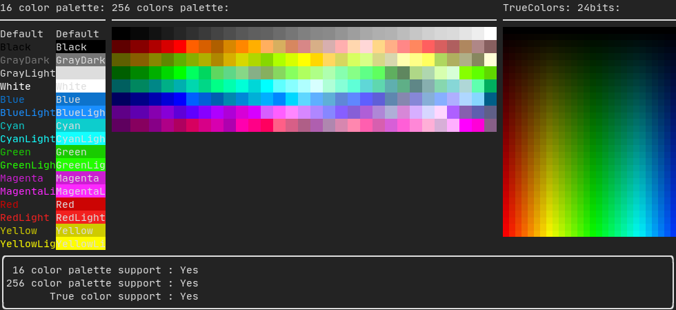
On most terminals the following colors are supported:
-
Default
-
Black
-
GrayDark
-
GrayLight
-
White
-
Blue
-
BlueLight
-
Cyan
-
CyanLight
-
Green
-
GreenLight
-
Magenta
-
MagentaLight
-
Red
-
RedLight
-
Yellow
-
YellowLight
Example use of the above colors using the pipe operator:
text("Blue foreground") | color(Color::Blue);
text("Blue background") | bgcolor(Color::Blue);
text("Black on white") | color(Color::Black) | bgcolor(Color::White);On terminal supporting 256 colors. @htmlonly
<script id="asciicast-OAUc3n6QrkmrLt7XEEb8AzbLt" src="https://asciinema.org/a/OAUc3n6QrkmrLt7XEEb8AzbLt.js" async></script>@endhtmlonly
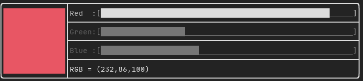
text("HotPink") | color(Color::HotPink);On terminal supporting trueColor, you can directly use the 24bit RGB color space:
Use the constructors below to specify the RGB or HSV values for your color:
There are two constructors:
ftxui::Color::RGB(uint8_t red, uint8_t green, uint8_t blue);
ftxui::Color::HSV(uint8_t hue, uint8_t saturation, uint8_t value);
@htmlonly
<script id="asciicast-dk5r8IcCH0aFIIgWG0keSEHMG" src="https://asciinema.org/a/dk5r8IcCH0aFIIgWG0keSEHMG.js" async></script> <script id="asciicast-xwzzghmqcqzIuyLwCpQFEqbEu" src="https://asciinema.org/a/xwzzghmqcqzIuyLwCpQFEqbEu.js" async></script>@endhtmlonly
FTXUI supports linear gradient. Either on the foreground or the background.
Decorator color(const LinearGradient&);
Decorator bgcolor(const LinearGradient&);
A ftxui::LinearGradient is defined by an angle in degree, and a list of color
stops.
auto gradient = LinearGradient()
  .Angle(45)
  .AddStop(0.0, Color::Red)
  .AddStop(0.5, Color::Green)
  .AddStop(1.0, Color::Blue);
You can also use simplified constructors:
LinearGradient(Color::Red, Color::Blue);LinearGradient(45, Color::Red, Color::Blue);See demo.
In addition to colored text and colored backgrounds. Many terminals support text
effects such as: bold, dim, underlined, inverted, blink.
Element bold(Element);
Element dim(Element);
Element inverted(Element);
Element underlined(Element);
Element underlinedDouble(Element);
Element strikethrough(Element);
Element blink(Element);
Decorator color(Color);
Decorator bgcolor(Color);
Decorator colorgrad(LinearGradient);
Decorator bgcolorgrad(LinearGradient);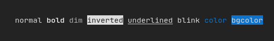
To use these effects, simply wrap your elements with your desired effect:
underlined(bold(text("This text is bold and underlined")))Alternatively, use the pipe operator to chain it on your element:
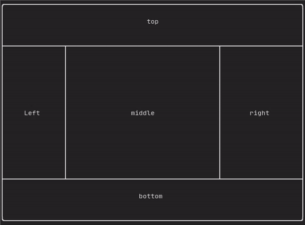
text("This text is bold") | bold | underlinedEnables elements to be arranged in the following ways:
- Horizontally with
ftxui::hbox - Vertically with
ftxui::vbox - Inside a grid with
ftxui::gridbox - Wrapped along one direction using the
ftxui::flexbox.
Example using ftxui::hbox, ftxui::vbox and ftxui::filler.
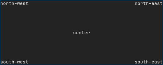
Example
using ftxui::gridbox:
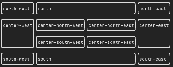
Example using flexbox:
Checkout this example and the associated demo.
Element can also become flexible using the the ftxui::flex decorator.
Code:
  hbox({
    text("left") | border ,
    text("middle") | border | flex,
    text("right") | border,
  });
Terminal output:
┌────┐┌─────────────────────────────────────────────────────┐┌─────┐
│left││middle                                               ││right│
└────┘└─────────────────────────────────────────────────────┘└─────┘
Code:
  hbox({
    text("left") | border ,
    text("middle") | border | flex,
    text("right") | border | flex,
  });
Terminal output:
┌────┐┌───────────────────────────────┐┌───────────────────────────────┐
│left││middle                         ││right                          │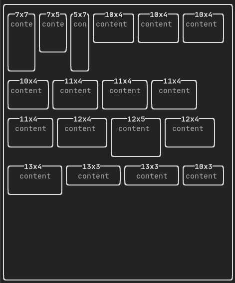
└────┘└───────────────────────────────┘└───────────────────────────────┘Enables easy formatting of data into a neat table like visual form.
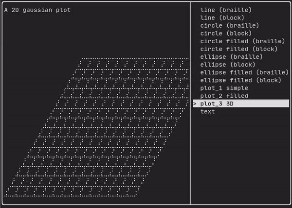
See the API <ftxui/dom/canvas.hpp>
  auto c = Canvas(100, 100);
  c.DrawPointLine(10, 10, 80, 10, Color::Red);
  auto element = canvas(c);
Drawing can be performed on a ftxui::Canvas, using braille, block, or simple
characters:
Simple example:
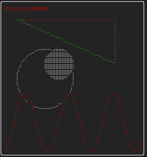
Complex example:
The ftxui::component module defines the logic that produces interactive
components that respond to user events (keyboard, mouse, etc.).
A ftxui::ScreenInteractive defines a main loop that renders a component.
A ftxui::Component is a shared pointer to a ftxui::ComponentBase. The latter defines:
ftxui::ComponentBase::Render(): How to render the interface.ftxui::ComponentBase::OnEvent(): How to react to events.ftxui::ComponentBase::Add(): Construct a parent/child relationship between two components. The tree of component is used to define how to navigate using the keyboard.
ftxui::Element are used to render a single frame.
ftxui::Component are used to render dynamic user interface, producing multiple
frame, and updating its state on events.
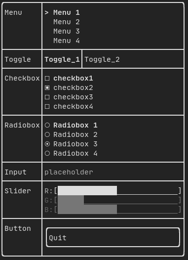
Gallery of multiple components. (demo)
All predefined components are available in "ftxui/dom/component.hpp"
\include ftxui/component/component.hpp
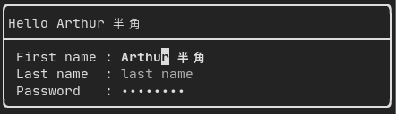
Produced by: ftxui::Input() from "ftxui/component/component.hpp"
@htmlonly
<script id="asciicast-223719" src="https://asciinema.org/a/223719.js" async></script>@endhtmlonly
On can filter out the characters received by the input component, using
ftxui::CatchEvent.
std::string phone_number;
Component input = Input(&phone_number, "phone number");

// Filter out non-digit characters.
input |= CatchEvent([&](Event event) {
  return event.is_character() && !std::isdigit(event.character()[0]);
});

// Filter out characters past the 10th one.
input |= CatchEvent([&](Event event) {
  return event.is_character() && phone_number.size() >= 10;
});Defines a menu object. It contains a list of entries, one of them is selected.
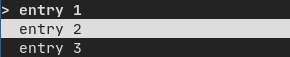
Produced by: ftxui::Menu() from "ftxui/component/component.hpp"
@htmlonly
<script id="asciicast-223720" src="https://asciinema.org/a/223720.js" async></script>@endhtmlonly
A special kind of menu. The entries are displayed horizontally.
Produced by: ftxui::Toggle() from "ftxui/component/component.hpp"
@htmlonly
<script id="asciicast-223722" src="https://asciinema.org/a/223722.js" async></script>@endhtmlonly
This component defines a checkbox. It is a single entry that can be turned on/off.
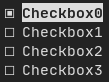
Produced by: ftxui::Checkbox() from "ftxui/component/component.hpp"
@htmlonly
<script id="asciicast-223724" src="https://asciinema.org/a/223724.js" async></script>@endhtmlonly
A radiobutton component. This is a list of entries, where one can be turned on.
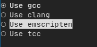
Produced by: ftxui::Radiobox() from "ftxui/component/component.hpp"
@htmlonly
<script id="asciicast-223725" src="https://asciinema.org/a/223725.js" async></script>@endhtmlonly
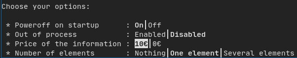
A drop down menu is a component that when checked display a list of element for the user to select one.

Produced by: ftxui::Dropdown() from "ftxui/component/component.hpp"
Represents a slider object that consists of a range with binned intermediate
intervals. It can be created by ftxui::Slider().
Produced by: ftxui::Slider() from "ftxui/component/component.hpp"
Produced by: ftxui::Renderer() from \ref ftxui/component/component.hpp. This
component decorate another one by using a different function to render an
interface.
Example:
auto inner = [...]

auto renderer = Renderer(inner, [&] {
  return inner->Render() | border
});
ftxui::Renderer also supports the component decorator pattern:
auto component = [...]
component = component
  | Renderer([](Element e) { return e | border))
  | Renderer(bold)
As a short hand, you can also compose a component with an element decorator:
auto component = [...]
component = component | border | bold;Produced by: ftxui::CatchEvent() from \ref ftxui/component/component.hpp.
This component decorate others, catching events before the underlying component.
Examples:
auto screen = ScreenInteractive::TerminalOutput();
auto renderer = Renderer([] {
  return text("My interface");
});
auto component = CatchEvent(renderer, [&](Event event) {
  if (event == Event::Character('q')) {
    screen.ExitLoopClosure()();
    return true;
  }
  return false;
});
screen.Loop(component);
The ftxui::CatchEvent can also be used as a decorator:
component = component
  | CatchEvent(handler_1)
  | CatchEvent(handler_2)
  | CatchEvent(handler_3)
;Useful for visual elements whose visibility can be toggle on/off by the user.
Essentially, this the combination of the ftxui::Checkbox() and
ftxui::Maybe() components.
auto collabsible = Collapsible("Show more", inner_element);Produced by: ftxui::Maybe() from \ref ftxui/component/component.hpp.
This component can be utilized to show/hide any other component via a boolean or
a predicate.
Example with a boolean:
bool show = true;
auto component = Renderer([]{ return "Hello World!"; });
auto maybe_component = Maybe(component, &show)
Example with a predicate:
auto component = Renderer([]{ return "Hello World!"; });
auto maybe_component = Maybe(component, [&] { return time > 10; })
As usual, ftxui::Maybe can also be used as a decorator:
component = component
  | Maybe(&a_boolean)
  | Maybe([&] { return time > 10; })
;Produced by: ftxui::Container::Horizontal() from
"ftxui/component/component.hpp". It displays a list of components horizontally
and handle keyboard/mouse navigation.
Produced by: ftxui::Container::Vertical() from
"ftxui/component/component.hpp". It displays a list of components vertically
and handles keyboard/mouse navigation.
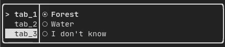
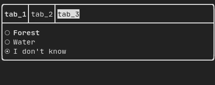
Produced by: ftxui::Container::Tab() from
"ftxui/component/component.hpp". It take a list of component and display only
one of them. This is useful for implementing a tab bar.
It defines a horizontal or vertical separation between two children components. The position of the split is variable and controllable using the mouse. There are four possible splits:
ftxui::ResizableSplitLeft()ftxui::ResizableSplitRight()ftxui::ResizableSplitTop()ftxui::ResizableSplitBottom()from "ftxui/component/component.hpp"
@htmlonly
<script id="asciicast-tprMH2EdkUoMb7D2YxgMGgpzx" src="https://asciinema.org/a/tprMH2EdkUoMb7D2YxgMGgpzx.js" async></script>@endhtmlonly
Typically, ftxui::ScreenInteractive::Loop() is responsible for drawing a new
frame whenever a new group of events (e.g keyboard, mouse, window resize, etc.)
has been processed. However, you might want to react to arbitrary events that
are unknown to FTXUI. To accomplish this, you must post events using
ftxui::ScreenInteractive::PostEvent (this is thread safe) via a thread.
You will have to post the event ftxui::Event::Custom.
Example:
screen->PostEvent(Event::Custom);