Skip to content
New issue

Have a question about this project? Sign up for a free GitHub account to open an issue and contact its maintainers and the community.

By clicking “Sign up for GitHub”, you agree to our terms of service and privacy statement. We’ll occasionally send you account related emails.

Already on GitHub? Sign in to your account

Component: Combobox #61

Closed
patrickarlt opened this issue Jun 18, 2019 · 42 comments
Closed

Component: Combobox #61

patrickarlt opened this issue Jun 18, 2019 · 42 comments
Labels
design Issues that need design consultation prior to development. discussion Issues relating to a conversation where feedback is optional. help wanted Issues that the core team needs help with in a sprint. new component Issues tied to a new component.

Comments

@patrickarlt
Copy link
Contributor

patrickarlt commented Jun 18, 2019

In a recent meeting we discussed some of the behavior around "select" and "dropdown" type elements discussed in:

In the end we settled on implementing something like the multiple select/filter dropdown @macandcheese proposed in #2 (comment)

Example

The purpose of this component would be to allow a use to pick an item or set of items from a list

In order to accommodate various use cases we should incorporate the following options.

  • Permanently open (with user defined height) or open on select - for charting components
  • Show/hide chips - for charting components
  • Chip position (inline, after list, hidden)
  • Filterable or not filterable - for long lists
  • Add arbitrary values - for tag lists

Similar to other components that implement form controls I would REALLY like this to look like:

<calcite-super-select>
  <select name="tags" multupile>
    <option value="Test">
    <option value="Foo">
    <option value="Bar">
  </select>
</calcite-super-select>

I also think this could be called something more reasonable like <calcite-combo-select>

Proposed API

Aria role: Listbox. https://developer.mozilla.org/en-US/docs/Web/Accessibility/ARIA/Roles/listbox_role

/**
 * @slot - A slot for adding `calcite-select-option`s that will appear inside the component.
 */
CalciteSelect { // could this wrap a native <select> element?
  // default title displayed when no value is selected.
  @Prop({reflect: true}) defaultTitle!: string;

  @Prop({ reflect: true }) disabled = false;
  @Prop({ reflect: true }) loading = false;

  // Ability to select multiple or single values.
  // Multiple will display the select as a list without the menu.
  @Prop({ reflect: true }) multiple = false;

  @Prop({ reflect: true }) theme: "light" | "dark" = "light";

  // Version 2 props:
  // @Prop({ reflect: true }) filter = false; // V2
  // @Prop({ reflect: true }) chips = false; // V2
  // @Prop({ reflect: true }) chipValues = []; // V2
  // @Prop({ reflect: true }) chipPosition = "inline" | "after" | "list"; // V2

  @Method()
  async setFocus() {}

  @Event() calciteSelectChange: EventEmitter;
}

/**
 * @slot icon - A slot for adding content that will appear on the leading side of the option.
option.
 */
CalciteSelectOption { // could this wrap a native <option> element?
  @Prop({ reflect: true }) value!: string;
  @Prop({ reflect: true }) title!: string;
  @Prop({ reflect: true }) selected: boolean = false;

  @Event() calciteSelectOptionChange: EventEmitter;
}

Example

<calcite-select>
  <calcite-select-option value="1" title="hello" selected></calcite-select-option>
  <calcite-select-option value="2" title="hi">
    <calcite-icon slot="icon" icon="x">
  </calcite-select-option>
  <calcite-select-option value="3" title="parent">
    <!-- nesting is allowed for indentation like a list item -->
    <calcite-select-option value="4" title="child"></calcite-select-option>
  </calcite-select-option>
</calcite-select>
@macandcheese
Copy link
Contributor

Thanks for opening - working with Mike on finalizing designs for this. Dependent on #47.

@jimmieego
Copy link

jimmieego commented Jul 24, 2019

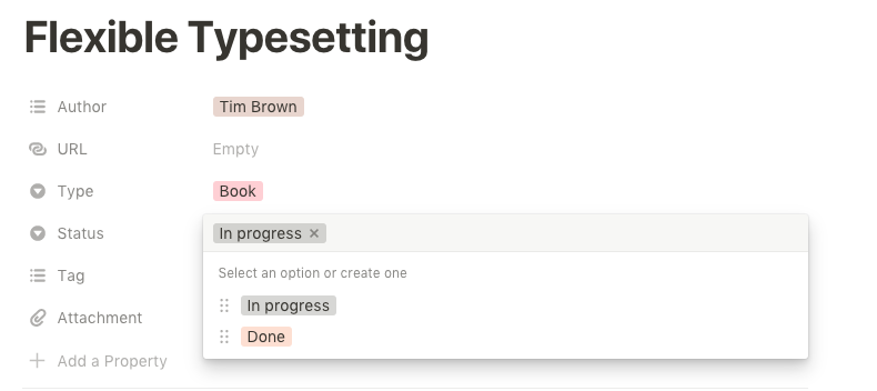
In ArcGIS Online, the current tags widget requires the user to type something first to get the autocompleted tags. There is feedback that users want to see a list of existing tags, and then decide whether to create a new tag. This will help reduce unnecessary/repeated tags.

The tags widget in in Notion seems to be a good reference:

Screen Shot 2019-07-24 at 4 11 34 PM

image

@paulcpederson paulcpederson added the new component Issues tied to a new component. label Aug 3, 2019
@macandcheese
Copy link
Contributor

Chips will be a requirement for this #47

@macandcheese macandcheese changed the title <calcite-super-select>- Flexible filterable multiselect component Component: "Super Select" - Typeahead select / filter Oct 15, 2019
@driskull
Copy link
Member

driskull commented Dec 31, 2019

We have a need for this component as well with a few modifications:

Modifications

  • The select option should have a slot to take custom content on the leading and trailing side.
    • This will allow for a thumbnail or control on either side of the option.
  • The select box on the dark theme should be dark as well as the dropdown
  • The selected visual state could be defined by a background color and/or a border on the item instead of a dot.

Notes

2019-12-31_11-28-50_565

Our use case doesn't need multiple but it wouldn't hurt to have it.

It would also be good to just have the dropdown part of the component available for use within the calcite-value-list and calcite-pick-list or these components could be deprecated.

cc @asangma

@driskull
Copy link
Member

driskull commented Dec 31, 2019

Permanently open (with user defined height) or open on select - for charting components

I think we could have the permanently open as its own component that this one uses internally.

Maybe calcite-select-menu uses calcite-select-list internally?

Or it could just be an option like proposed. Maybe like appearance: "list" | "menu"?

@driskull
Copy link
Member

driskull commented Dec 31, 2019

Added API to top.

@driskull driskull self-assigned this Dec 31, 2019
@driskull driskull added design Issues that need design consultation prior to development. discussion Issues relating to a conversation where feedback is optional. help wanted Issues that the core team needs help with in a sprint. question labels Dec 31, 2019
@asangma
Copy link
Contributor

asangma commented Jan 8, 2020

dzine
image

@asangma
Copy link
Contributor

asangma commented Jan 8, 2020

Should we leave the "summary" portion out for now? I see it in both the examples that @janett-baresel included in Esri/calcite-app-components#383.

@asangma
Copy link
Contributor

asangma commented Jan 9, 2020

Thanks for updating the api @driskull.

re: chips
Per recent discussion in the sync meeting, we thought it would be good to separate out the chips requirement. It could be its own component that interacts with this select component or something else. @macandcheese cool cool?

@macandcheese
Copy link
Contributor

Yes, agreed! in fact they already have an open issue :) - #47.

Lots of use cases for chips to exist on their own - in tandem with tree nav selected items, marketplace type filtering experiences, "user tags with avatars", etc. Should support icon, image, "click to close", etc.,

This component would just leverage those I think.

@janett-baresel
Copy link

@asangma if we get some text and thumbnail, it would already be good. We can see how we can extend the summary part inside SV if its out of scope for you right now.

@macandcheese
Copy link
Contributor

macandcheese commented Jan 10, 2020

Edit: saw summary in attached screenshots. I think we already provide "title" and "subtitle" slots in accordion title etc, we could provide it here but with less strict style overrides to allow the font used in examples attached.

Sounds like we need a "selected-appearance-type" attribute to allow selection between dot, check, border, or outline (probably something useful for other components too like dropdown and tree nav that have a selected state, down the road), in a standardized way across components.

@driskull
Copy link
Member

Sounds like we need a "selected-appearance-type" attribute to allow selection between dot, check, border, or outline

I think a slot would be better so we can handle the color ramp use case.

@macandcheese
Copy link
Contributor

Would that be handled by slot for thumbnail?

Or does the selected outline ring change based on color ramp?

I just meant being able to choose the manner in which a selected item is highlighted. Could be a "none" option for those that want greater customization but I think we want to give folks matching styles to the other "selected items" in components if they don't need that.

@macandcheese
Copy link
Contributor

macandcheese commented Jan 10, 2020

Couple more gotchas:

Looks like we'll need options to,

"remove from list when selected" - once an item becomes an appended chip, remove it from the filterable list of choices (and reciprocally, return to list when chip is dismissed), and,

"create chip from string" - and then emit that in an event for an app to use.

Based on our wonderfully consistent tags and category options currently on the Content page in Online:

Screen Shot 2020-01-10 at 8 11 28 AM

@patrickarlt
Copy link
Contributor Author

Requirements from the Developers site tags component

  • Generally follow the WCAG guidelines for combobox
  • Display of the component should be a text box with chips for the selected items.
  • Chips display a "X" icon to deselect the item represented by that chip.
  • A list of available options should appear when the input is focused.
  • Keyboard navigation can be used in the list to select items (up down enter)
  • If the input in empty and the user hits delete the last selected item is selected
  • Chips can be navigated and deselected by keyboard (left right enter delete)
  • When a chip is removed by keyboard the next chip is selected
  • Add an options so users can hit "Enter" and add a new item to the available options. This is selected by default.

There are lots of detailed interactions in the WCAG document above which we implemented for the developers site. For example hitting Esc in the text box clears the selection, focus never leaves the text box, tons of ARIA attributes ect...

@macandcheese
Copy link
Contributor

macandcheese commented Jan 13, 2020

"Lookup" terminology here seems useful, this differentiation and nomenclature makes sense to me if we want something better than "super select"

https://uniform.hudl.com/components/selects/design

@pr3tori4n
Copy link
Contributor

We spoke briefly at the end of the meeting about the name of this component. Super select may not be the best descriptor. What about calcite-combobox or perhaps calcite-tag-manager? Any ideas?

@driskull
Copy link
Member

driskull commented Jan 15, 2020

Is it necessary for the arrow keys to mimic that behavior as well?

I think so. Its a requirement of the listbox role which is what we're pretty much going for.

https://developer.mozilla.org/en-US/docs/Web/Accessibility/ARIA/Roles/listbox_role

ARIA: listbox role
The listbox role is used for lists from which a user may select one or more items which are static and, unlike HTML elements, may contain images.

@driskull
Copy link
Member

Can we call this component calcite-select or calcite-listbox?

@driskull
Copy link
Member

It seems like we have two components that we're discussing here:

  1. An autocomplete/combobox component which main use cases are for selecting tags or values from data by typing and showing an autocomplete menu below.
  2. An enhanced Select component with the ability to display custom HTML in the menu and options. as well as nesting indentation. Would also handle multiple selection as well. Potentially the ability to filter items. (not sure if this is necessary)

Should we close this issue and split them up into separate issues?

@asangma
Copy link
Contributor

asangma commented Jan 16, 2020

I agree with @driskull and think we should separate this out into two issues and close this one. I think it's causing some cunfuzedness.

@macandcheese
Copy link
Contributor

macandcheese commented Jan 16, 2020

I think that's fine, so long as "1" also supports nested items and their selection. I'd suggest also having a "native select" option with a custom styled input and natively rendered <options> (https://www.carbondesignsystem.com/components/select/code/)

@driskull
Copy link
Member

I'd suggest also having a "native select" option with a custom styled input and natively rendered

That might be a 3rd component then. Because it wouldn't be able to do the nesting or custom HTML if the native select is used as the menu.

@macandcheese
Copy link
Contributor

Maybe I'm being dense here... What's the difference between the "1" and "2" options above? One has option items that are limited to plain text, and the other allows custom html in option items? And both can have nested children, where a parent item can either select itself and all children or be selected independently?

@macandcheese
Copy link
Contributor

macandcheese commented Jan 16, 2020

Is this correct?
<calcite-select> - populates input with a single selected plain text item - renders native option elements, no nesting
<calcite-multi-select>/<calcite-lookup> - uses chips to indicate selection of one or multiple plain text items - renders plain text, styled options, can be nested supports filtering
<calcite-something> - allows for custom HTML for each option - single item selectable, supports filtering

@driskull
Copy link
Member

I think its more like this:

<calcite-select> (populates input with a single selected plain text item - renders native option elements, no nesting)
<calcite-combobox/calcite-autocomplete> (uses chips to indicate selection of one or multiple plain text items - renders custom slots of plain text, can be nested)
<calcite-custom-select> - allows for custom HTML for each option - single item selectable

Autocomple/combobox
https://material-ui.com/components/autocomplete/#combo-box

Selects
https://material-ui.com/components/selects/


I think 2 & 3 could be the same component if we can decide on the single UI to allow selection.

https://esri.github.io/calcite-app-components/?path=/story/components-calcite-pick-list--basic

Combobox

  • Many potential items to select, may perform network query to find matches (think tags)
  • In multiple mode: allows typing in an input box to filter/query for results
  • Shows selected results in the input box area like tags

Custom select

  • Limited number of items to select
  • In multiple mode: Displays results as a list like a native select. Selected items are shown in place, not in the top box.
  • In single mode, shows selected result like a native select

@julio8a can we setup another meeting for these? There are two different sets requirements here.

@driskull
Copy link
Member

@asangma could something like this:

image

replace this:

image

Both do multiple select in two different UIs and I'm not sure if that is justified.

https://jedwatson.github.io/react-select/


It would be nice if we had it all ironed out about when a dev would use...

  • A calcite-select
  • A calcite-combobox
  • A calcite-pick-list
  • A calcite-value-list
  • etc.

@julio8a julio8a changed the title Component: "Super Select" - Typeahead select / filter Component: Combobox Jan 23, 2020
@julio8a
Copy link

julio8a commented Jan 23, 2020

  • Phase 1 for this component: just a text list with multiple selection. Can have hierarchy with parent/children. Includes chips Component: Chips #47
  • Phase 2: Allow a slot for leading or trailing graphics.

@driskull driskull removed their assignment Jan 24, 2020
@bpatterson88
Copy link
Contributor

bpatterson88 commented Jan 31, 2020

Along with multiple selection, it would be nice to have aggregate selections, such as:

  • Select all
  • Deselect all
  • Select only this item

This would help support the Dashboards category filtering feature, which could use this component.

@macandcheese
Copy link
Contributor

@bpatterson88 do you have any UI examples of that? Use case makes sense and can imagine what it might look like but could be helpful to add here. Thanks

@bpatterson88
Copy link
Contributor

This is a screenshot from the upcoming 8.1 release of Dashboards. You can see the UI to select All or Clear selection in the top right.

Screen Shot 2020-02-14 at 3 35 39 PM

The screenshot from Google Data Studio shows the "select only this item" use case. A bit more niche than select all / clear.

Screen Shot 2020-02-14 at 3 38 07 PM

@driskull driskull assigned driskull and unassigned pr3tori4n Mar 2, 2020
@bpatterson88
Copy link
Contributor

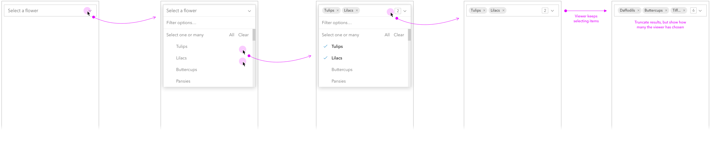
Here is an in progress mockup for Dashboards. In most cases the dropdown input will be no wider than about 300px, so we need an additional filtering input outside of the chip area. Otherwise there won't be enough space for the user to filter the list.

Screen Shot 2020-03-04 at 10 34 23 AM

@dhrumil83
Copy link

use case to consider as this is being worked on:
https://devtopia.esri.com/WebGIS/arcgis-app-components/issues/54

image

@driskull driskull assigned macandcheese and unassigned driskull Mar 23, 2020
@driskull
Copy link
Member

Installed

@macandcheese macandcheese removed their assignment Aug 13, 2020
alisonailea added a commit that referenced this issue Aug 29, 2023
chore: merge main into manuela's branch
alisonailea added a commit that referenced this issue Aug 29, 2023
Merge pull request #61 from Esri/chore/merge-conflicts
Sign up for free to join this conversation on GitHub. Already have an account? Sign in to comment
Labels
design Issues that need design consultation prior to development. discussion Issues relating to a conversation where feedback is optional. help wanted Issues that the core team needs help with in a sprint. new component Issues tied to a new component.
Projects
None yet
Development

No branches or pull requests