📖 Estimated reading time: 3 minutes (730 words)
Table of Contents
👉 Check out the Landing Page mockups here:
- Desktop version — https://filipago.github.io/payup-desktop-site-prototype/
- Mobile version — https://filipago.github.io/payup-mobile-site-prototype/
PayUp is a mobile app to manage shared expenses, receive and pay debts, without the need to expose banking information. All you need is a mobile phone number.
The project was developed with Lília Correia and Marta Casal, under a Postgraduate Diploma in Digital Experience Design.
Our goal in creating PayUp is to help Millennials solve problems with splitting and tracking shared expenses, collecting and paying off debts among friends, by developing a mobile app that is better than MB WAY, Verse and Splitwise because it integrates into a single product the possibility to send and receive instant payments at any time, in a fast and easy way, without the need to disclose banking information, as well as track shared expenses. (Elevator Pitch)
PayUp's marketing landing page targets Millennials, our product's target audience.
Its' main goals are:
- Converting new users into downloading the app (early adopters).
- Presenting the product's features and the solutions to the problems it solves;
Before creating the wireframes, we mapped out the website's main structure. This process helped the team understand the website at a high level before getting into the details of the wireframes.
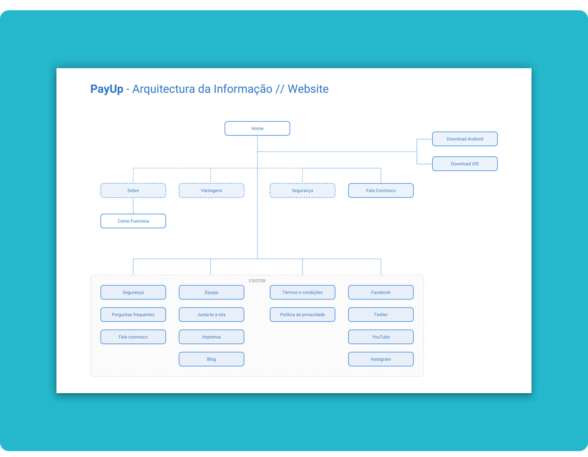 PayUp's website information architecture.
Before diving into the wireframes, we also worked iteratively on the content strategy and the copywriting for the landing page. This helped us think thoroughly about the sections and content blocks arrangement in order to effectively “sell” our product.
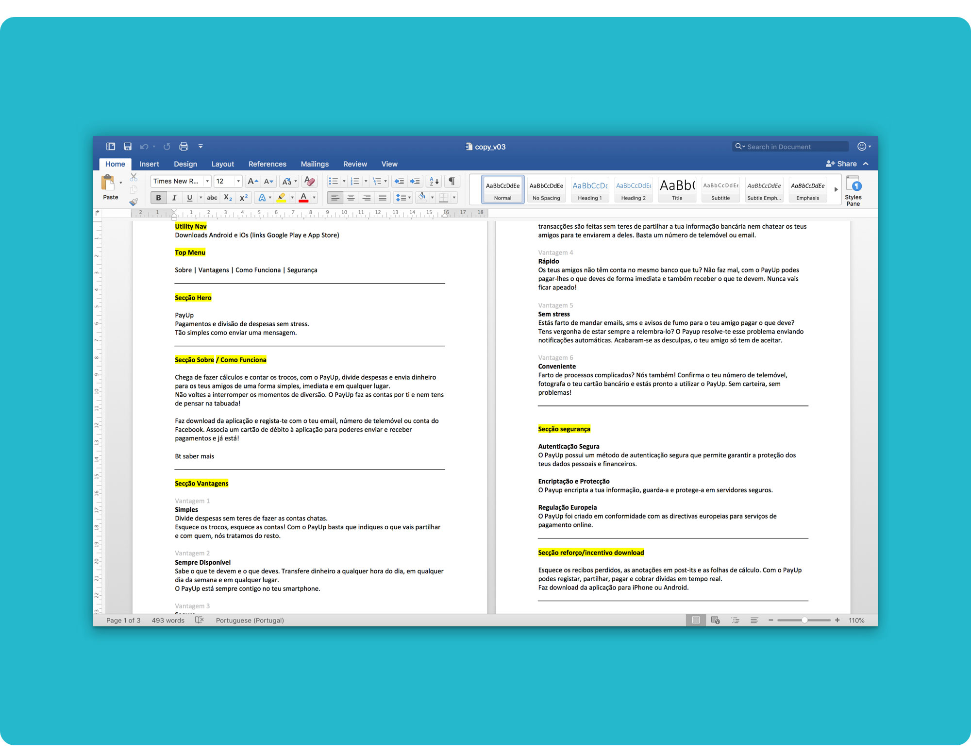 Copywriting draft and section's structure for the landing page.
We further explored how to present the content in a natural way, funnelling the user into downloading the app, with the medium-fidelity wireframes.
To convert people more easily, we decided to place the download CTAs on the top of the page but also at the end, after presenting the product and it's core features. This way, we both cater to users who are already familiar with PayUp and to those who have never heard of it.
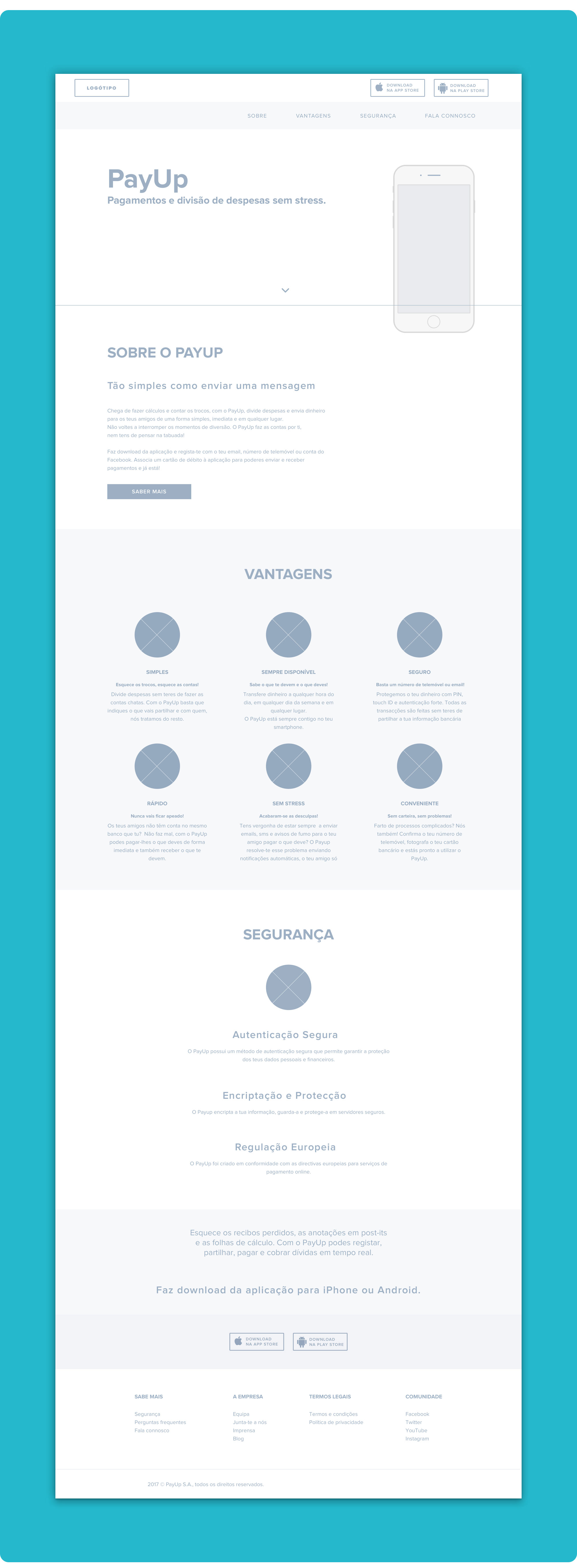 Landing page wireframes.
We settled for our base colour palette with two shades of blue and purple, trying to harmonize the app and the website's look and feel. We used grey for the text and plenty of light tones to keep the page clean.
During mockups stage we made some tweaks to the layout, going for a more edgy and funky vibe, more suitable for our users.
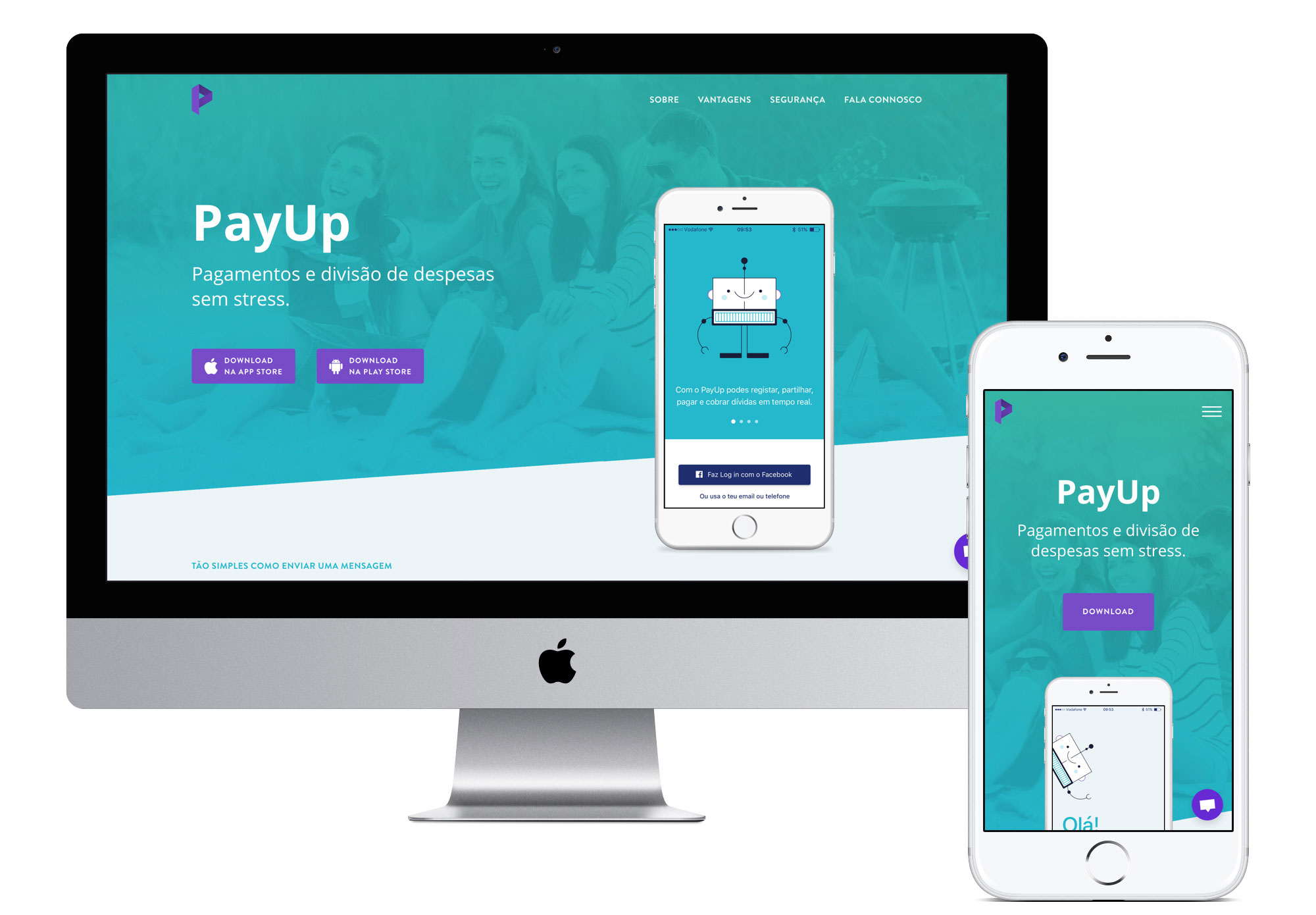
 Our landing page mockup on desktop.
We also improved the copy and changed the main CTAs position by placing them inside the hero, which gave them more prominence and contrast.
Being a new product, we thought it would be wise to let people know what other users think about PayUp, so we added a slider with a couple of reviews to provide social proof.
 Our landing page mockup on mobile.
To easily present our solution in a more engaging way, we uploaded the mockups to InVision:
👉 Desktop version 🖥️ — https://filipago.github.io/payup-desktop-site-prototype/
👉 Mobile version 📱 — https://filipago.github.io/payup-mobile-site-prototype/
I implemented the landing page using Webflow 🤟 and some custom code to:
- Build the feedback slider;
- Get the browser's width to responsively calculate the angled image's width on larger breakpoints;
- Prevent the body from scrolling when the mobile menu is open;
- Change the navbar on scroll;
- Improve the SEO...
I also used Slick Carousel and Sticky-js to build a more engaging feedback slider and control the placement of the mobile phone that showcases our app demo.
The main challenge I faced during this stage was implementing the design as faithfully as possible to the pixel-perfect mockups.
👉 Check it out at https://filipago.github.io/payup-landing-page/
- Work on the remaining copy;
- Sketch, design and develop the remaining website pages;
- Get advice for writing the “legal stuff”; 🛡️
- Design the newsletter;
- Test; 👎🏼 👍🏼
- Strengthen our social media marketing strategy.
If you'd like to know more about PayUp app, you can read the full Case Study and check out the Invision prototype here 👉 https://github.com/FilipaGo/payup-app-prototype.
For more on this project, Download our Keynote Pitch Deck.

Thank You!