[Feature Request] Preference Page reorganization and cleanup. #7306
Comments
|
breaking down the preference is a good idea but "Appearance" is not a good title to have units and startup settings IMO. Additionally to the stuff proposed here IMO it would be a good idea to move the Tools->Customize stuff into the settings dialog, or at least some of it like the workbench list, which can be merged with the current "Workbenches" preference page. |
|
Here's a start on a possible hierarchy. We can debate the names for the sections and tabs.
|
I had the same idea for the workbenches list! And the 'Workbenches' section can get further folded into the startup section. A couple of the other things in the 'customize' tool could get moved to preferences. Specifically the custom macro creator and the spaceball stuff. The 'commands' page of 'customize' doesn't actually do anything. Can it move to 'help'? Is it useful at all? The 'toolbar' and 'keyboard' page could get moved to preferences as well. If we did that, then the 'Appearance' section would have about six or seven tabs again. We might need to break the 'Appearance' group down further. |
|
IMHO The left pane is confused:
|
I have to disagree. Also, the preference screen is a bit unique in that its contents changes depending on what workbenches the user has loaded. Because of this, sorting alphabetically would add to the confusion. The sorted list changes after you load a couple workbenches. I hate it when things move around. It makes the application feel flimsy. |
|
If we stop using icons we can go into a list view and use indents like that other program: I do like the indented options, like the tabs to be indented of the main settings instead of being tabs. |


|
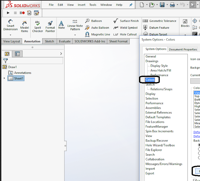
Please don't post proprietary program screenshots |
|
Is this an issue? I'm pretty sure any UI dev department would use screenshots of other examples too discuss. If we don't do this we would cripple our self. |
|
Yea, there is a thin line. Maybe this post is justified, I just am seeing a lot of flagrant posting that i'm trying to avoid issues in the future about. |
|
I don't know, a complex tree view for settings doesn't look like much of an improvement to me, might be necessary considering how many settings pages we have though. |
|
Regarding screenshots: If we're talking about UI/UX concepts, they should be fine and are helpful. In that case screenshots of Gimp would be just as valid as screenshots of F*360. When we're looking at a screenshot with the idea of duplicating or emulating functionality, I think we should avoid it. It runs an unnecessary risk and isn't very helpful anyway. Like @luzpaz said, it's a fine line. |
|
Regarding the indented list: It's very economical and lends itself to translation. I mentioned on the forum that I (personally) like the icons, especially because the contents of the list changes as workbenches are loaded. It's visually easy to see that a new group of settings is now available. |
|
yeah that's a good point, if it's not static navigating it can be though if it's text only. IMO it's better to focus here on reorganizing only rather than trying to change the fundaments of the preference page, to keep it achievable. |
|
No reply necessary, but you did say at the outset this was about new user experience. A new user has a very different experience to that of the experienced user like yourself. The new user has to digest all the available information, comprehend it and finally make a decision. Structure plays a critical role. The screen in question IMHO makes this process unnecessarily tedious. Sometimes less is more.
… On 6 Aug 2022, at 2:27 am, sliptonic ***@***.***> wrote:
IMHO The left pane is confused:
* The icons only add to the congnitive load and are visually tacky. Should be deleted.

* The name texts are unordered. Sort alphabetical. Split to logical groups as necessary.

* Being centred gives false impression of hierachy
I have to disagree.
I always found the icons kinda nice because they establish a correspondence between a group of settings and, in some cases, a workbench or part of the application. Eliminating the icons means you have to think more and actually read to find something. Imagine if the preference group simply had the text label 'Path'. It would be ambiguous. Do you mean file paths? extrusion paths? path workbench? But with the icon, it's unambiguous.
Also, the preference screen is a bit unique in that its contents changes depending on what workbenches the user has loaded. Because of this, sorting alphabetically would add to the confusion. The sorted list changes after you load a couple workbenches. I hate it when things move around. It makes the application feel flimsy.
—
Reply to this email directly, view it on GitHub <#7306 (comment)>, or unsubscribe <https://github.com/notifications/unsubscribe-auth/AAEXAYP7WFKJU37VR6DMZL3VXU6G7ANCNFSM55QDFR4Q>.
You are receiving this because you commented.
|
|
Would it be an idea to just use the same layout as we do in the features? |

|
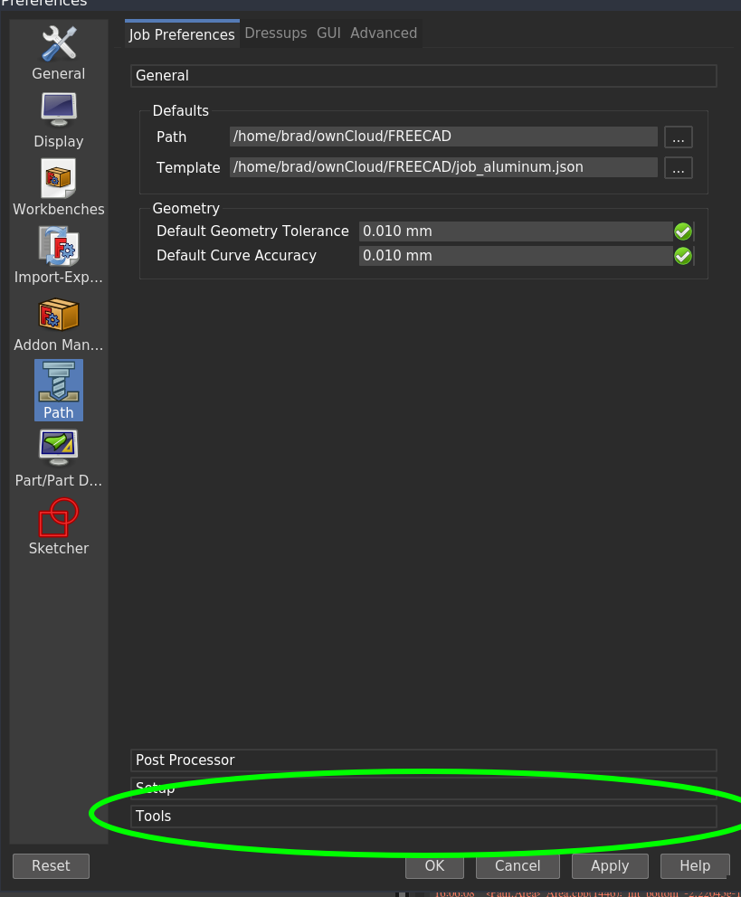
We use these vertical tab/pages things in Path Preferences. They're economical. Also, I haven't gotten much feedback on the proposed hierarchy above. I really think that's particularly important. Grouping settings together in an intuitive way to avoid hunting.
|
|
@sliptonic can you asign qsint to those pulldown menu? |
I don't know what that is. This is a toolbox widget with multiple pages. |
|
QSint is the custom QT class for the actions in the action sidebar! |
|
This issue has turned out to be much larger than just a reorganization. It has resulted in numerous other issues and Pull Requests. I propose to close this issue in favor of a Github Project to track all the related work. @PaddleStroke and I have started gathering issues into this project. |
I'm starting to reconsider my position on this. The left pane icons inherently limit the organization. You can only have so many before scrolling is required. And there is no hierarchy. A tree would let us have WAY more groups of settings and still keep it tidy with some organization. It would encourage smaller groups of related settings. All the workbench specific setting groups could be alphabetized under a 'Workbench' top level node so changes from loading/unloading workbenches would be isolated to one part of the tree. @berniev since this was your idea, how about opening an issue specifically to discuss this? |
|
maybe silly question: wouldn't it begin to look like the parameters editor then? And then, why not work on that one instead? |
The parameter editor is a two-pane window with a tree on the left. But that's where the similarity ends. The preference editor has complete purpose-built qt task panels on the right. |
|
I'm up to my eyeballs trying to figure out some stuff at the moment, but I am happy to share some opinion. The exercise here was to "fix" one tiny part of the system in isolation. I think this is the opposite to what should be happening. Each tiny part is part of the whole and if the fundamental design criteria are set for the whole then doing one part is relatively simple. Design is part art, part science. There are people who are good at it, just like some people can draw while others (like me) can't. But most of us recognise really slick design, mainly because it is unobtrusive. Programmers are notoriously bad. Witness how the discussion goes round in circles almost every time a change is proposed. But whose opinions do you listen to? Are they based on UI/UX knowledge? Can they explain in human engineering terms? Users are useful but not perhaps in the way they think. Their frustrations are manifested in different ways and filtering these to identify underlying issues is not easy. For mine, there needs to develop a culture of respectfully listening to users and reading beyond their words. Old saying: "if you don't find the bugs, your users certainly will". Users are a tremendous resource, not to mention your customers. And there's a lot more of them than you. It seems QT is capable of magnificent UI. How? I think the deceptively simple question that really needs answering is "what are the defining characteristics of the UI we want to have", and then apply that consistently. |
Brooke Baldwin, UX Research Lead at WhatsApp Inc |
Is there an existing request for this?
Forums discussion
None
Subproject(s) affected?
Core
Idea description
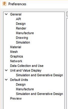
The preference screen has grown disorganized over the years. There isn't much consistency to how the UI elements are used and some of the quirks present serious stumbling blocks to new users. I'm not proposing any new feature. Rather it's just reorganizing where the different preference setting appear to make it more intuitive.
One major problem with this is the large number of tabs in the General section. Because there are too many tabs to display, the QT tab widget adds additional buttons to scroll right/left. These are difficult to see in some themes and difficult to click. Worse, the Units tab is at the very end. This is an area that users often have to change and it's almost impossible to find.

I propose that we clean up this panel:
The left icon section would consist of preference 'areas' that group preferences logically.
'Appearance' - For Language, Units, themes, Icon size, and Startup settings
'3D Window' - For settings how the Canvas looks and behaves, Selection, Navigation
'Documents' - Authoring, Compression, Storage
'Tree' - Mode
'Python' - Editor, Macros, Python console
'System' - Output, cache, logging
Workbench icons added just like current functionality
For each icon, there's at least one page of settings. If there are multiple tabs, the first tab always has the same name. For example, on the 'Appearance' Page, the first tab would be 'Appearance', The second tab would be 'Startup Settings'
Never include more tabs than can display without the 'extra' buttons. We could set a limit of say 4 or 5 tabs. Import/Export tab is the only other one that would violate this. We can address that later.
The first group should be the visual settings that the user is most likely to change. Specifically, theme, language, and unit schema.
The 'Workbenches' icon group can be eliminated and incorporated into the Appearances->Startup tab.


Here's an example looking at what I see going into the Appearances group.
Anything else?
No response
Code of Conduct
The text was updated successfully, but these errors were encountered: