Heatmap visualization of in silico mutagenesis and variant effect prediction for a single genomic feature. #27
Assignees

Comments
|
In addition to the heatmap, we should try to generate the motif plot on top as the sequence. |
|
Addressed in #28. Should wait until #25 is merged and mutagenesis is added so we can actually incorporate the plotting function. Right now I am just converting the encoded sequences and predictions into a matrix. |
|
Should this include modes for showing changes relative to normal as well as absolute values? |
|
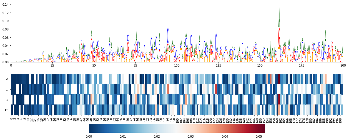
@kathyxchen Here's an example of the output for some of the I have to work on adding some methods to make it cleaner in general though. I also need to update things to allowing negative values in the logo. |
|
Closed by #28 |
Sign up for free
to join this conversation on GitHub.
Already have an account?
Sign in to comment
We would like to include a module or function that allows users to visualize the effects of single base substitutions. This would be a heatmap of the changes in model prediction for a single genomic feature, where the columns of the heatmap correspond to each base position in the input sequence. The rows of the heatmap are the base substitutions.
In in silico mutagenesis, the rows would be all 4 bases (with the reference/original base grayed out) because we substitute in all other bases.
@jzthree I forgot what we decided for visualization of variant effect prediction. Would you be able to provide a description here?
The text was updated successfully, but these errors were encountered: