Skip to content
New issue

Have a question about this project? Sign up for a free GitHub account to open an issue and contact its maintainers and the community.

By clicking “Sign up for GitHub”, you agree to our terms of service and privacy statement. We’ll occasionally send you account related emails.

Already on GitHub? Sign in to your account

Pretty Print OpenID Client Config #1040

Closed
nynymike opened this issue Jul 16, 2018 · 15 comments
Closed

Pretty Print OpenID Client Config #1040

nynymike opened this issue Jul 16, 2018 · 15 comments
Assignees
Labels
enhancement libs update, re-factroring, etc.
Milestone

Comments

@nynymike
Copy link
Contributor

The client form is so long, it's impossible to get a screenshot. It would be nice if we had a "Config Summary" button at the top, which prints a condensed summary of the configuration for the client, omitting any empty values. This would help the support team to ask customers to share their client config.

@nynymike nynymike added the enhancement libs update, re-factroring, etc. label Jul 16, 2018
@nynymike nynymike added this to the 3.1.4 milestone Jul 16, 2018
@shekhar16
Copy link
Collaborator

image

shekhar16 pushed a commit that referenced this issue Jul 29, 2018
yurem added a commit that referenced this issue Aug 8, 2018
#1040 : Add client config summary popup
@natt-tester
Copy link

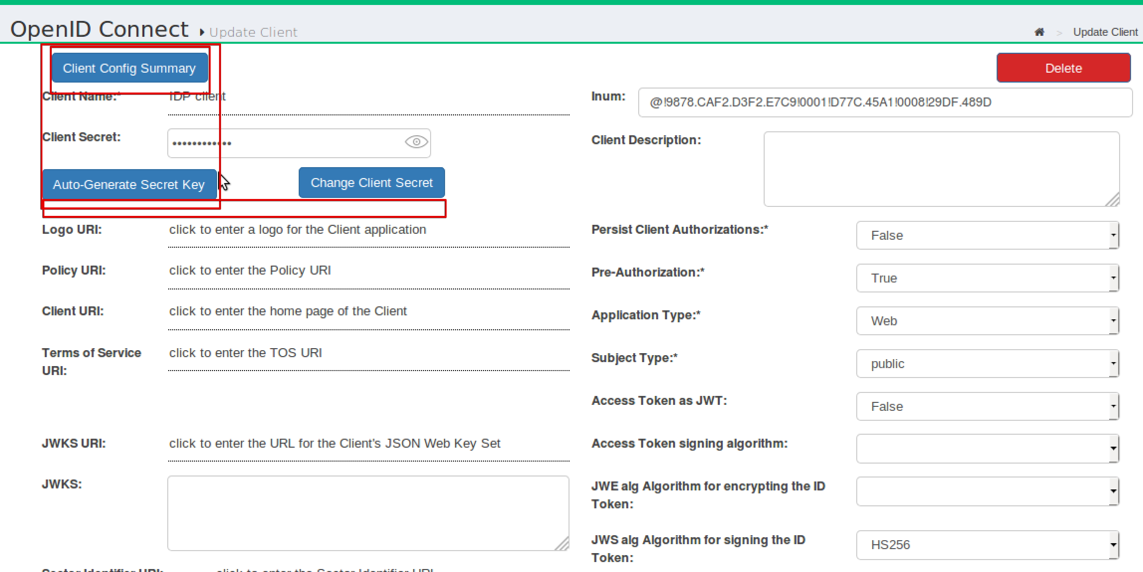
@shekhar16, I see that there's a button included in the client summary -- I think it's obsolete, could you remove it?

I think the only button we could need here would be a "Copy All" button as ctrl+a copies everything, also beyond the pop-up. To make the copying convenient, we either need to set boundaries for the pop-up only, or add a button to do that. Can it be done?

Also, the header font looks a bit blurry to me. Could you make it sharper?

2018-08-10_17h58_03

@shekhar16
Copy link
Collaborator

@natt-tester I removed the button from summary popup.
For header and boundaries, we have a defined UI theme, all dialogues/popup's designs are similar .We have header in bold font for all popups.

@shekhar16
Copy link
Collaborator

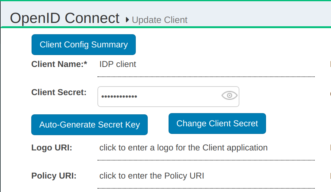
here is latest screen shot of my fix.
image

@syntrydy
Copy link
Collaborator

@shekhar16, i think you work break some feature on that page:

Before you change, the scopes was added to the form one after another as the user pick then from the DialogBox, currently all added are visible only when the user hit the update button.

@shekhar16
Copy link
Collaborator

@yurem I think primfaces and richfaces libs are conflicting on this page.

@shekhar16
Copy link
Collaborator

@yurem please merge the PR #1161

yurem added a commit that referenced this issue Aug 29, 2018
yurem pushed a commit that referenced this issue Aug 29, 2018
@natt-tester
Copy link

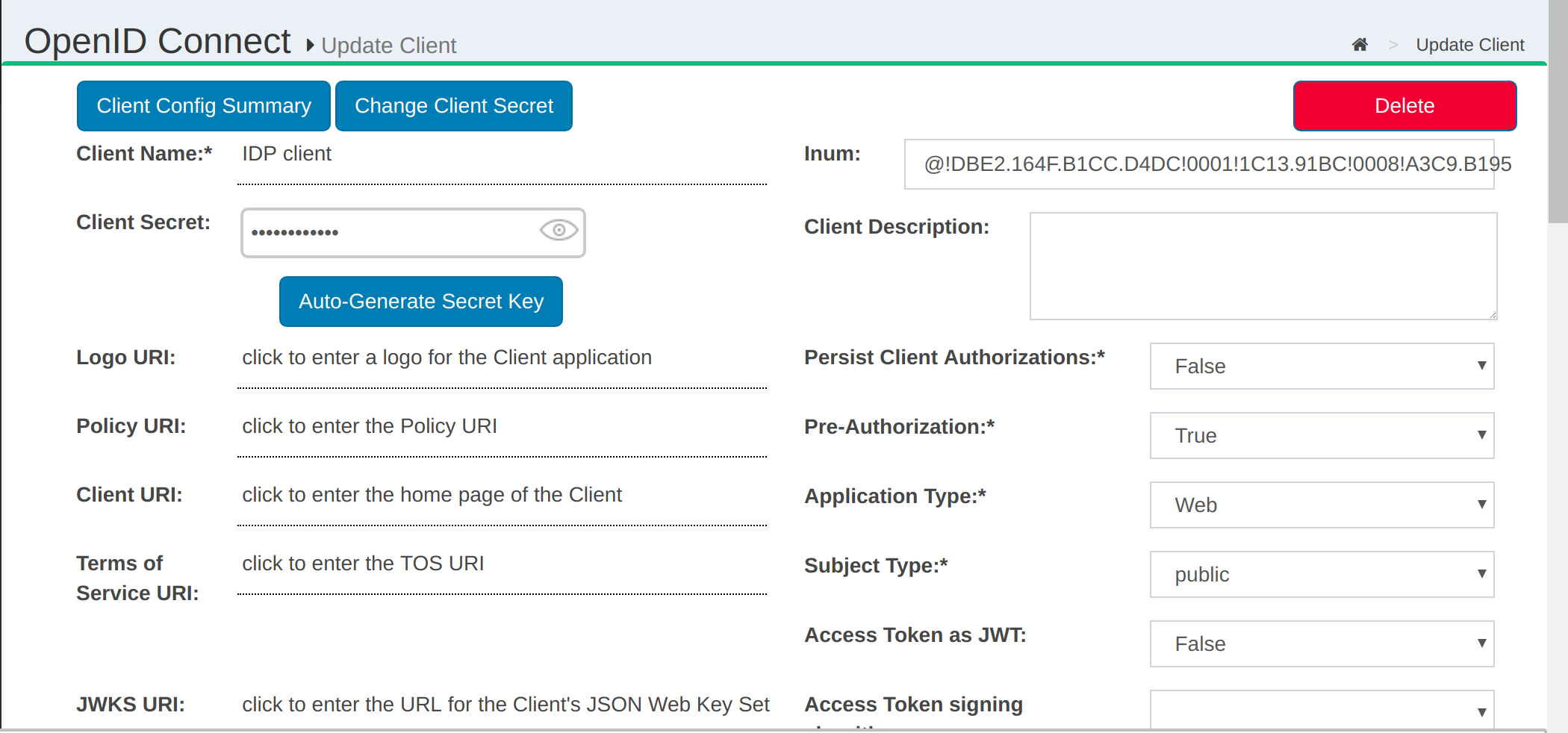
@nynymike said if would be nice to have the Client Config Summary at the top, but now it's at the bottom. @shekhar16, could you move it to the top? The UX would be better if the user didn't have to scroll all the way down to click the button.
bottom_button

Apart from that, it's done and the details are printed correctly:
client_config

@natt-tester natt-tester reopened this Sep 6, 2018
@syntrydy syntrydy self-assigned this Sep 6, 2018
@syntrydy
Copy link
Collaborator

syntrydy commented Sep 6, 2018

@natt-tester Already fixed.

image

@syntrydy syntrydy closed this as completed Sep 6, 2018
@willow9886
Copy link
Contributor

willow9886 commented Sep 6, 2018

@syntrydy let's left align the auto-generate secret key button, and then add the change client secret button to the right of that. It also would be good if the inum didn't expand past its field.

@natt-tester
Copy link

@syntrydy, please align the buttons so that none is slightly higher/to the side. Also, I think we should maybe align the Change client Secret button with the end of the client secret field?

align

@natt-tester natt-tester reopened this Sep 13, 2018
@syntrydy
Copy link
Collaborator

image

@syntrydy
Copy link
Collaborator

May be your browser need QA ahhahaha.

@natt-tester
Copy link

May be your browser need QA ahhahaha.

I'm checking c7.gluu.org and it looks the same as I reported. Must be the 15" Mac screen, then!

@willow9886
Copy link
Contributor

Must be the 15" Mac screen, then!

The UI should be responsive.. 15" is a fairly large screen size. It should look OK... can you confirm @syntrydy ? Do we need to make any additional fixes for the next RC?

Sign up for free to join this conversation on GitHub. Already have an account? Sign in to comment
Labels
enhancement libs update, re-factroring, etc.
Projects
None yet
Development

No branches or pull requests

5 participants